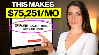
today I'm going to show you a Fast Fix to start getting more conversions and leads from your landing pages and here's the secret it's upgrading your call to action buttons so today's training is backed by The Proven psychology that it takes to persuade and motivate someone to take action I've launched over 450 funnels and landing pages I've run countless split tests and I've watched hundreds of hours of user sessions on landing pages today we're going to focus on three things how to write the copy where to put your call to action and what color your
call to action should be plus if you stick around until the end I'll reveal the two call to action power-ups that'll help you to take your conversions to the next level so firstly what is a call to action or a CTA as I might call it throughout today's video basically it's the button that's going to move somebody through your funnel or to get them to take the next step or to take up the offer on your page it's the action we're asking somebody to do and it should be connected to the golden hippo offer which
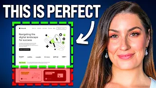
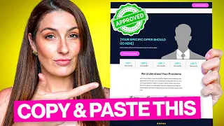
is the core to your page for example the offer on this page that we created with lintry is to get a free trial or to join their Pro subscription for free or this one for another client wayflyer where it is to download a free ebook you can see here the buttons on the pages are encouraging them to take the action we want them to take and it's connected to the offer the whole point of the CTA button is to get the user to do what we want them to do but as we all know it's
not as simple as just wanting somebody to do what you want them to do right we need to show what's in it for them to actually persuade and motivate them to take action and that's where number one comes in the copy and the most important part of your button so there's a few rules that you can follow ideally it's three to five words Max right like you don't want a really long button that takes a lot of thinking or takes a lot of time to process and you don't want the button to go over several
lines on mobile because most of your users and Prospects will be viewing your pages in Mobile the next thing to remember is to make sure you're not getting cute or clever with the words on your button you want to make sure it's an action word and that the copy actually describes what you want them to do the next tip is to make sure that it's focusing on with them or what's in it for me as a quick example consumers don't want to buy that's them giving you something their money they want to get which means
that they're receiving something from you right and see how that psychology of a slight word change can totally change the perception of the value transaction a few examples of buttons that I've tested in the past would be sign up versus join you can feel sign up as like oh I have to take work and like I have to do things and that sounds annoying whereas join that has a much more positive connotation it sounds like I'm going to be joining into something fun and exciting but I've also seen in Split tests that go the other
way and it's important to note there is not a one size fits all you need to test these out but this video is going to help you to think about the why you know not just the how and the what but the why so that the Strategic thinking behind your execution you know you can front load the work and you can give the control or what you publish first it's best chance at life another one that I've split tested and has been a big winner especially for lead magnets is to have a big promise in
the headlines so discover how you can create a business in two weeks and earn millions of dollars and be living in the Bahamas without a care in the world and then the call to action would say yes show me how so the call to action is actually affirming that big promise like they're making a commitment that they want to achieve what was promised in the headline another one that we've tested out before is download now versus get my free training now or get my free ebook now so this is giving a bit more specificity about
what they get and also relating it back to them so download now or get my free ebook right there's a very difference in the what's in it for me so what why should I care but here's the simple test when it comes to your copy does it benefit you the business or does it benefit them the prospect so if you go and scan your call to actions on your website now do they say get in touch chat with sales get a quote because that's boring and nobody wants that of course like imagine if you met
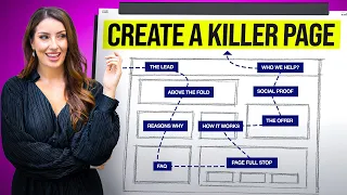
somebody and you're like chat with sales they don't want that right but imagine if you understood their dream outcome and it's like speak with a onboarding specialist and discover how to achieve black dream outcome okay cool now I start to see the value of taking the action you want me to take next is the location most of your landing pages will have it above the fold big headline a few bullets call to action above the fold and then you'll have the call to action sporadically throughout the page where it makes sense right where like the
copy is asking for a call to action now on this page you can see we've got something called a pattern interrupt or a call to action section so instead of just having a button we actually have something called a pattern interrupt which stubs people's eyes while they're reading a lot of people create these clean designs that are like smooth as butter and easy to scroll through but that's a problem because the copy and the offer you want to attract the attention to important things so by using these pattern interrupts all these call to action sections
that can actually increase your conversions as well I've seen it work for some clients most clients but not all of them and you have to test these out now there are examples where you don't have a button above the fold because you want to force consumption when I've worked with million dollar courses for example we don't always put a call to action above the fold because we want the person to consume the information on the page there's a much bigger purchasing decision or maybe we've found them earlier in their buyer's journey and we actually need
them to consume the information before we're like yo give us two thousand dollars we need them to see the testimonials and see the results and to resonate and skim through the headlines so there are examples where you might put a call to action not until the bottom of the page but not often throughout the page it's just more important to have visibility and Clarity than to really labor over where does it go but ultimately if you fail to have it somewhere the reader doesn't know what action to take next is the color and I've added
this in because most people are obsessed with it and there's a couple of things to keep in mind but like testing a call to action color is like the lamest thing that you can do but it's the thing that everyone talks about for split testing like in a prioritization framework for our clients split testing a call to action color like nearly never unless yeah they're like really established and going really well so the one thing that I'll tell you about is the isolation effect and because the whole point of the call to action is we
want people to understand that's what they click to take an action the isolation effect is where you only use that color on the call to action so a lot of Brands like have their brand style guide which means that their accent colors their primary colors their call to action everything's all mushed together and so the button doesn't actually stand out what you need to do is just have one color go with that that's like heuristics or best practice and then test that out first okay so that is copy location color and now we're going to
get into the two power-ups you can test number one is removing the friction to click so we want them to take action we need to show what's in it for me it's pretty daunting to click a button and not know where you're gonna go next so what you can do is just underneath the button like the one I'm showing you right now is have some social proof underneath there trusted by 1 000 other ambitious Brands to grow their business or you could have something underneath like 100 free 100 no credit card needed or whatever it
is you need to understand the objection or the friction that is existing in your consumer's mind to click that button and then remove it underneath the call to action second you need to test this but pretty much 98 of the time it works for me which is having a button sticky on mobile so once somebody starts to scroll below the fold you have the button sticky not at the top necessarily but at the bottom because like the rule of thumb no pun intended that's how their thumb can reach the button a lot easier so a
sticky just means that it's present whenever somebody is scrolling okay team that is the end of today's training on call to actions and how to get a Fast Fix on your landing page let me know in the comments what are you going to implement or what was your number one takeaway and just like with any video If you have a page you want me to tear down whether it's yours or another company put it in the comments and I'll tell you three ways to improve conversions fast thanks for joining me in another training and I'll
speak with you soon