Hello everyone! I'm Jaime, a graphic designer at Imborrable, ready to teach you everything I know about graphic design. In today's video, we'll discuss the visual elements of graphic design.
In the previous video, we reflected on the role a graphic designer should play in the professional sector. It helped us understand the tasks we perform as designers. .
. and we also explained why communicating visually correctly is crucial in all the pieces we create. If you haven't seen it, I'll leave it here.
But today, we need to continue advancing in theory and discuss what are considered the key pieces of graphic design: VISUAL ELEMENTS. And yes, I know many of you are eager to start working, but before we get our hands dirty and start sketching, it's important to fully understand the basis and pillar of graphic design, since it's what we'll use to compose all our creative work. Knowing these graphic design elements well, and also the principles of graphic design, which I'll discuss in next week's video, will help us improve as designers and create optimal solutions.
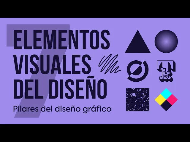
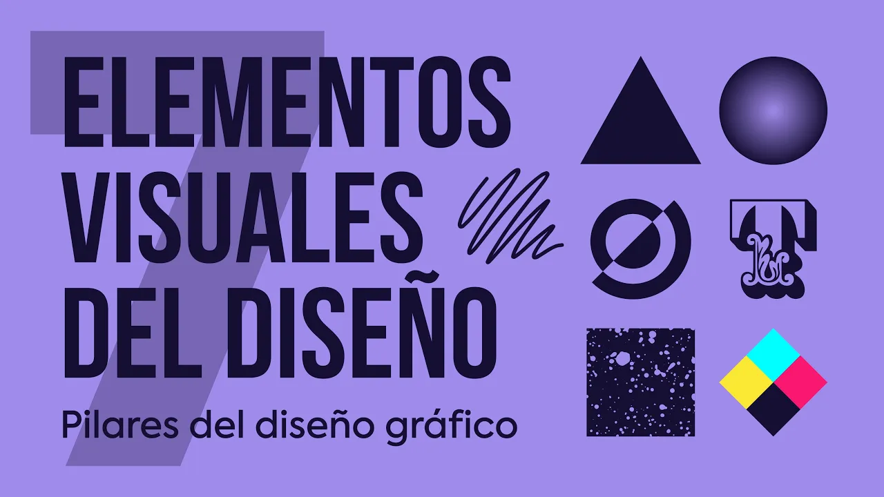
The visual elements we'll combine to create in graphic design are: LINE, SHAPE, OBJECT, TEXTURE, SPACE, TYPOGRAPHY, and COLOR. We'll use any of these design elements within our digital canvas, seeking to communicate an idea or meaning. So, let's review, one by one, all the visual elements of graphic design.
The first visual element we'll discuss is THE LINE. The line is the basic element of all graphics, which is simply a succession of points, connecting one point to another. A line often expresses dynamism, movement, and direction.
When working with lines, pay attention to qualities such as: thickness, color, texture, and style. These qualities can greatly impact how your design is perceived. .
. so keep them in mind. Lines can be found invisibly in aligned text and paragraphs.
Thanks to lines, we can create tension, emphasize concepts, separate graphic space, or even guide the viewer's reading. Of course, remember that a line can be more than just a stroke. Here are a few examples of what I'm talking about.
The next visual element is THE SHAPE. A shape is a closed, flat space, limited to two dimensions and measured by width and height. We can categorize shapes into two groups: GEOMETRIC SHAPES, which include all the figures we learned in math class and can be drawn with a ruler or compass.
. . and ORGANIC SHAPES, which are freer and resemble those found in nature.
Shapes can be defined by lines, color. . .
or even by negative space, which we'll discuss later in this video. In graphic design, placing two shapes together creates a relationship between them. This relationship can generate emotions, communicate messages, empathize with an audience, emphasize a part of the composition, or even evoke movement.
We'll explore this in more detail in the next video on design principles. Shapes are crucial for communicating concepts visually. They help give weight to our ideas, making them more recognizable.
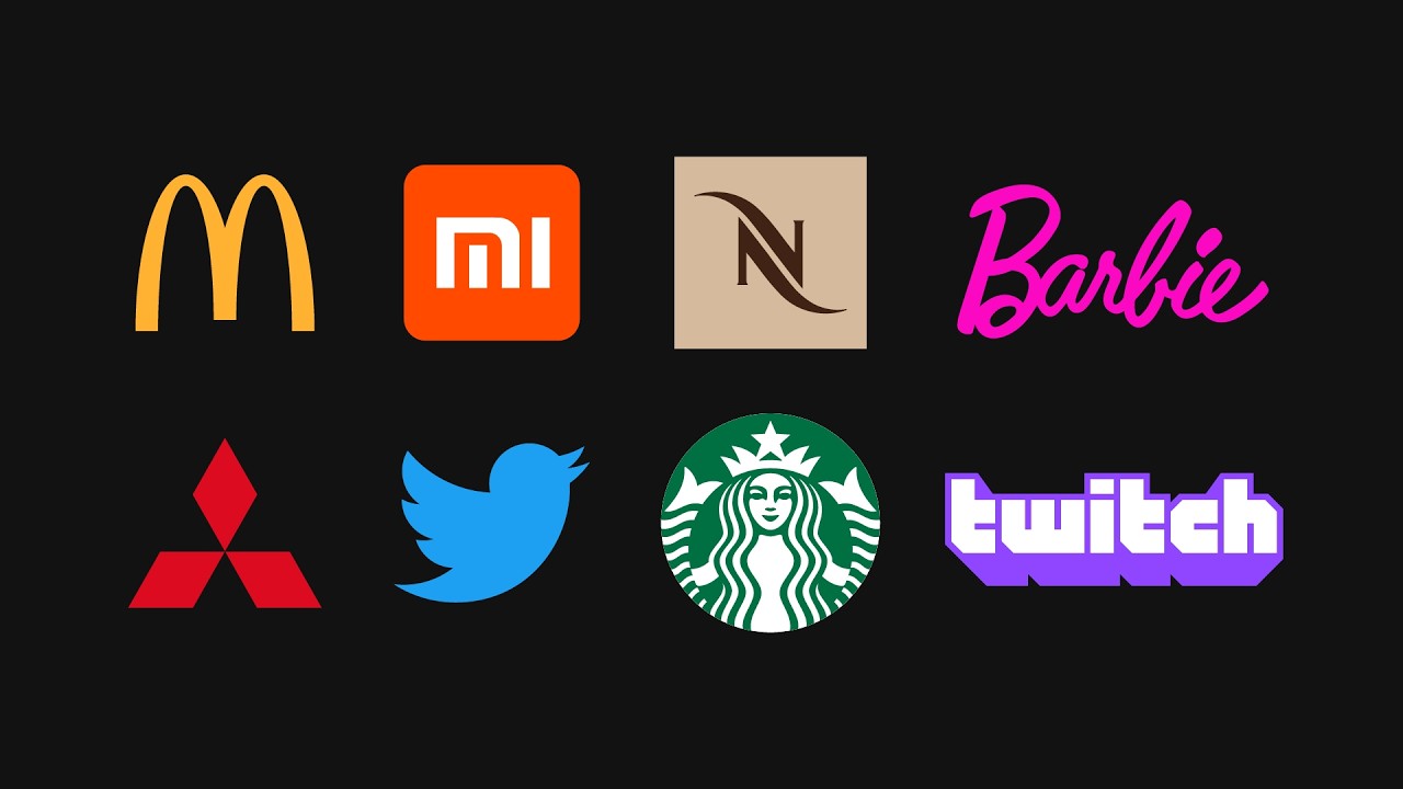
Thanks to shapes, we can understand traffic signs, symbolism, and even abstract art. A perfect example to show the power of shapes in communicating concepts are logos. Thanks to the use of shapes in logos, companies can associate their brand with specific values and emotions.
Each shape evokes specific feelings. For example, geometric shapes are characterized by producing a sense of order and control. More specifically, the square is a stable and permanent shape, associated with stability, permanence, honesty, rectitude, and balance.
The third visual element is THE OBJECT. When a shape gains three-dimensional properties, we call it an OBJECT. To create the illusion of depth and enhance an object's volume, we use light, shadow, and perspective.
Objects are essentially shapes with three-dimensional characteristics. Objects can be measured by width, height, and depth. Like shapes, objects can also be divided into GEOMETRIC OBJECTS and ORGANIC OBJECTS.
The next, equally important, visual element is SPACE. Space is the distance or area around or between the elements of our design. Thanks to space, we can create the visual essence and dynamism of a composition.
When designing, consider not only the elements you'll include (such as images, fonts, shapes. . .
), but also how you'll arrange and group them within the composition. In this example, we can see how the change in space and the grouping of elements creates a completely different feeling. The image on the left evokes order, harmony, and security, while the one on the right conveys chaos and confusion.
There are two types of space: Positive Space and Negative Space. Positive space includes the shapes of the objects or where the design's focus primarily lies. Negative space, on the other hand, is the area around the elements.
. . the empty space between them.
Negative space can be as crucial as positive space, as it frames and contains the composition. It may be tempting to fill the entire canvas with elements, but it's important to let our compositions breathe. The next visual element is TYPOGRAPHY.
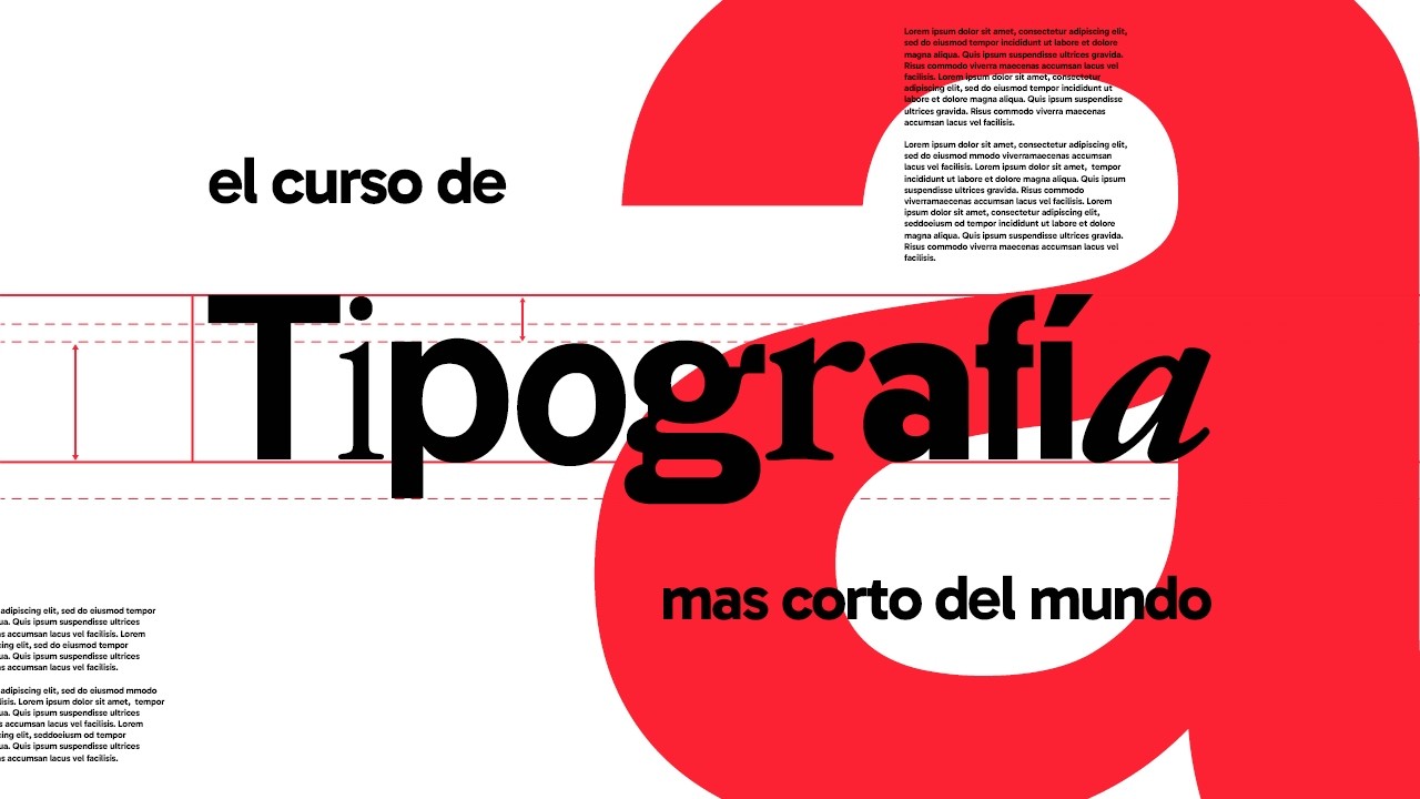
Typography is one of the most used visual elements in graphic design. It's one of the most direct ways to communicate visually, through headlines or paragraphs. If we analyze a typographic character, we'll see that it's formed by a combination of geometric and organic shapes, resulting in a new shape: the letter (or character).
All the characteristics of fonts can be broken down into what's known as 'Typographic Anatomy'. The type of shapes included in the anatomy of characters is what gives typefaces their unique style and look. They can be rough and straight, like in SLAB SERIF fonts, or more organic and harmonious, like in SERIF fonts.
Typography is important not only because it communicates words, but also because its style and layout can add meaning to our compositions. Some fonts belong to large families with different weights, which can help emphasize ideas or create hierarchy within our compositions. The next visual element is TEXTURE.
Texture refers to the physical quality of a surface and how it feels. In graphic design, we can't physically feel an object, but through texture, we can create the illusion of touch. Textures can be created using patterns or repeating images, and they can make flat objects appear realistic and three-dimensional.
Textures can be found in many resources, such as fonts or brushes, and they help add depth to our shapes. But a tip: don't overuse textures, as too much can easily overwhelm your design. The last element we'll discuss is COLOR.
Color plays a major role in graphic design, as the human eye can distinguish up to around 1000 colors. Color is the amount of light reflected off an object, so light is crucial when discussing color. Thanks to color, we can create emphasis, add harmony to our compositions, and even alter the perceived size of objects.
Additionally, each color can evoke different meanings. This happens unconsciously, and sometimes personally, but we can associate each color with specific concepts or feelings. This is known as 'Color Psychology'.
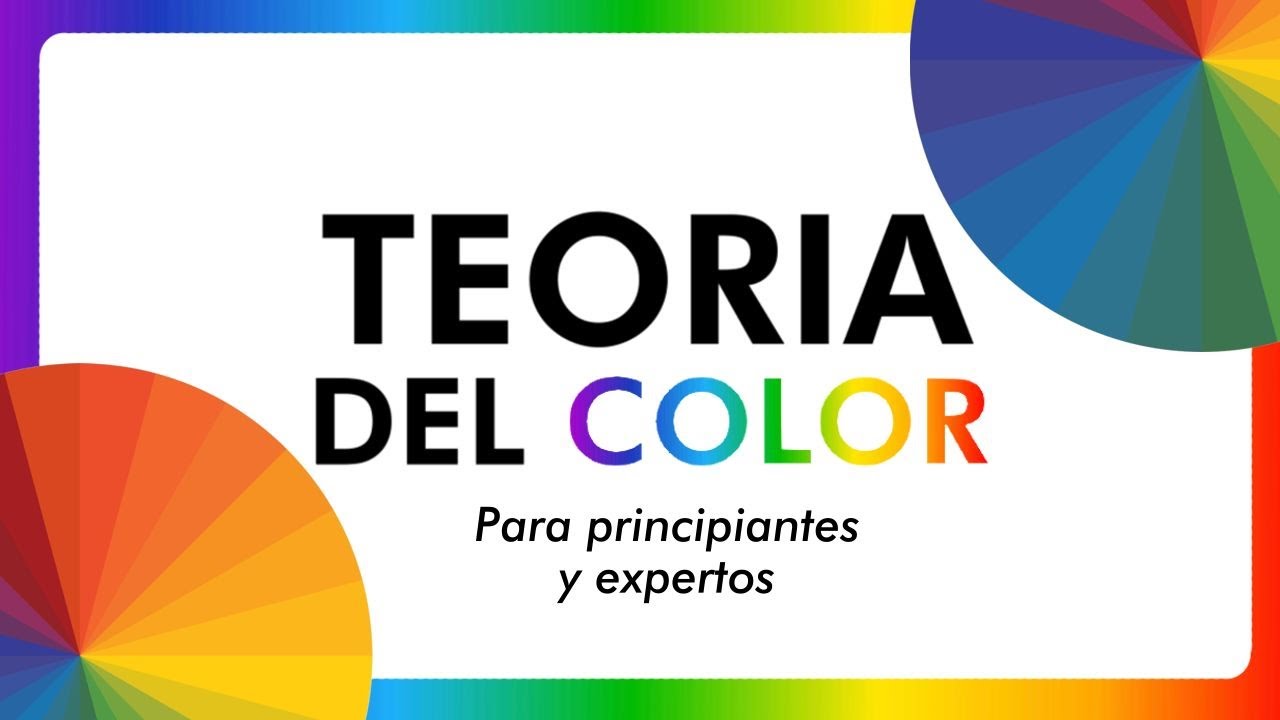
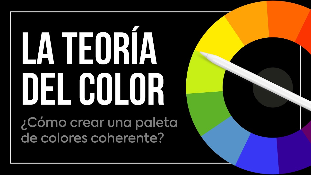
It shouldn't be confused with 'Color Theory'. Color theory is the technique that, using the color wheel, provides guidelines for choosing colors to achieve harmony in our designs. We'll explore both color psychology and color theory in a future video dedicated to color.
This video, like others I'll record, is part of the Graphic Design Course playlist on our channel. Check it out to ensure you haven't missed any videos so far. And that's all for today, everyone.
If you found this video helpful, please give it a Like, and if you want to keep improving your graphic design skills, don't forget to subscribe so you don't miss future videos.