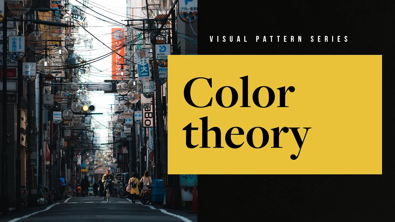
hello my lovely photos welcome back to another video welcome back to the visual pattern series the series where we break down visual language into visual patterns so that we can understand the heuristics of visual language and how to best apply it to our photography now if you don't know what any of those terms mean make sure to check out the very first video in the series where i break down all of those terms and exactly why you would want to use visual patterns over something say like photography rules now in this video we're going to
be covering color theory for photographers and this is a an impossibly a large video topic to cover in just one singular video but we're going to try and do our very best now color is a fantastic way to elevate your photography if you use it in a methodical and intentional way it's not only great for photography but it's also great across all disciplines of art as well so it's a really good skill to understand for your creative process now there's a lot to cover and i wanted to start this video with understanding terms so let's
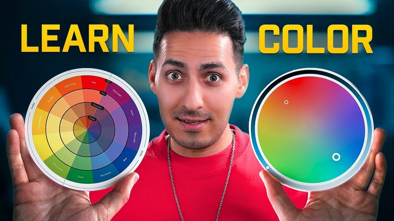
start with hue now hue is just color selection plain and simple it is pure color without the tint or the shade some people like to complicate this a little bit but simply it's just the color that you're selecting and most of the time it's presented on a scale of adjacent colors next to it the next term is saturation saturation refers to the intensity of color so once we take a color do we increase the saturation and make it more intense and more vibrant or do we make it less saturated and more muted and understated the
next term is luminosity which refers to how bright or how dark a particular color is what we can do is we can add white to a particular color to increase how bright it is but doing so will also decrease how saturated it is as well conversely we can also take that same base color and add black instead to it making it darker and also increasing the richness of its saturation as well the next term is temperature temperature refers to whether colors in general are cool or they are warm cool colors gravitate towards the color blue
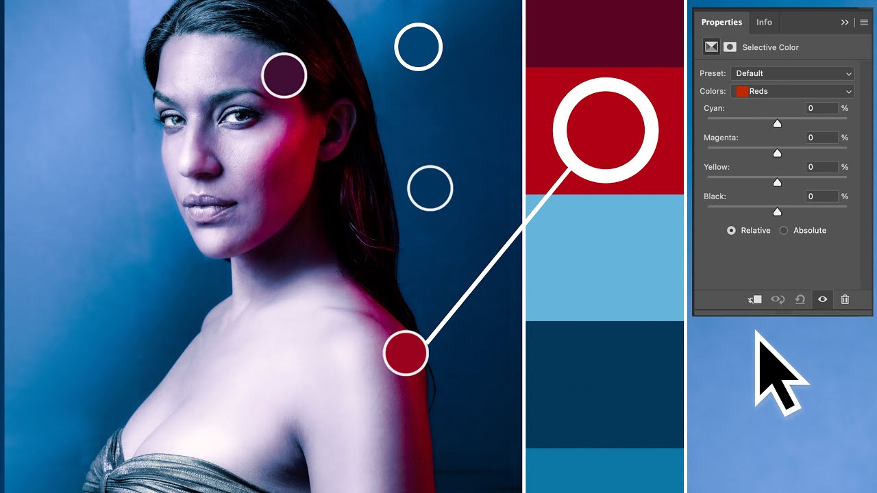
and warm colors gravitate towards the color orange okay from here i want to talk a little bit about color models but this can get really really technical really really quickly so i will try and keep it short now unlike in primary school when you would mix finger paint together the colors that you would mix together back then would become darker and they would become more rich whereas in the digital space actually the opposite is true in the digital space we work with a color space called rgb and that doesn't actually work this way you might
have heard of rgb before or you might have heard of srgb as the color space before what this means is that because we work on screens when we're taking digital photographs and we're looking at monitors and what have you the screens actually project light at us each color red green and blue is an individual light and when the lights are combined together they equal more light until you get eventually white now the whole thing about rgb gets a whole bunch more complicated than that but that's another video for another time all you really need to
know is that as a photographer you will be using the srgb color space and will be working in rgb colors all right now we get to the interesting part color psychology now these are objective truths these are not subjective truths although they do have some subjective variants to them the psychology of color has been greatly studied for a very very long time now and so a lot of these ideas are well established and have been proven but as i mentioned about subjectivity some of these colors have different meanings for different people depending on what kind
of culture you're from depending on what kind of background you have depending on external factors like branding and how submersed in that particular brand you are and what that means to you things like upbringing things like environment a whole bunch of external factors can change the overall subjectivity of what these colors mean to you but in general these are what the colors mean red is the color of danger passion excitement love and energy orange is the color of creativity of happiness friendliness and confidence yellow is the color of warning optimism prosperity and joy green is
the color of health nature freshness and luck blue is a color of calm serenity trust and reliability purple is the color of luxury wealth virtue and comfort black isn't a color it is a contrast but it can be seen as having sophistication power authority and being evil and white can be seen as clean and pure simple and innocent the effective and selective usage of these colors in our photography can really help elevate our meaning in our images and help us tell the stories that we're trying to tell so now that we know all of the
meanings of these colors what we can start to do is actually group them together in ways that look harmonious in ways that look natural together so we can do so with what's called color harmony groups color harmony is simply the grouping together of colors in ways that look visually appealing and there are some ways that are more appealing than others now what we can do is start to gravitate towards a particular palette that we create and we can start to accentuate this palette within our photography now a tool that i love using when it comes
to color and understanding color harmony in general just playing around with all these different colors it's called adobe color i love this tool i've used it for over 15-ish years in my previous career and it's still something that i used to this day this is not sponsored but it's just a product that i love that's free and you can play around with all the sliders and palettes and all that kind of stuff and it's great so what i want to do is introduce you to three of the most common color harmony groups so that you
can get a good understanding of those and then from there you can dive into different color harmony groups if you would like now the three color harmony groups that we have commonly in photography are analogous monochromatic and complementary the analogous rule is three or more hues that are evenly fanned out from a key middle color on the wheel you can often find these color schemes in nature especially in things like sunsets or gradients of the sky or the texture of the ocean and so so much more the next common color harmony rule is monochromatic which
uses a single key color and accents it with colors of a different saturation and different luminosity this is super super easy to use in photography both to find in the world and to edit in post-production and the last common color harmony group that i want to introduce you guys to is complementary the complementary color harmony rule takes a key color and supplements it with the opposite color on the wheel this creates a color contrast which is quite appealing and because of the contrast stands out quite a lot now you'll see this color harmony group in
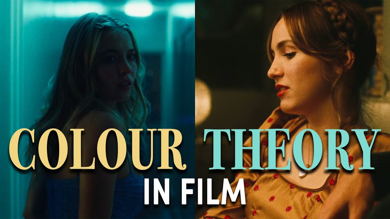
film in movies in photography pretty much everywhere nowadays and the most common color selection from this particular group is teal and orange right now now as i mentioned there are of course a bunch of other different color harmony groups here as well so feel free to dig into any one of those there is no right or wrong answer on how to use different color harmony groups it's just a suggestion of a palette that you may or may not be able to apply to your photography now for me and my photography i play around with three
different colors i play around with like a kind of between a light baby blue to a cobalt blue and then a lot of white and then a lot of orange so oftentimes i'm actually using analogous colors when it comes to my orange and for the blues i'm tending towards a monochromatic palette with the whites and the blues working together alrighty now that we know all of this information now we can put it all together in something that's actually practical and we can actually put into practice now when you're out shooting go and ask yourself when
you're shooting why are you shooting the things that you're shooting and how can you use color specifically to accent or to bolster or to even help the story that you're trying to tell try and push yourself to deliberately incorporate color into your work and specific colors and do it with intention now if you're looking for a habit-based practice to go out and do yourself and at the risk of sounding like a broken record because i feel like i give this advice every single time but in different ways spend the entire week with one singular color
and shoot that color every single day of the week shoot 10 of that same color different compositions every single day so that you end up at the end of the week with 70 different images of the same color now this might sound really simple and mundane and kind of boring but i assure you it is extremely difficult it is very hard and it is going to push you and stretch you creatively in order for you to find these compositions and be able to identify these things in the real world now this practice works really well
and i'll tell you why when you physically get out there and physically take that image that burns that particular item of that composition into your subconscious so at the end of the week you'll end up with 70 different compositions that you can quickly recall for that particular color when you need it you might not need it now you might not need it next year you might not even need it a couple of years down the road but knowing these compositions exist based on this color is something that's super super powerful for your recall for you
to be able to use to give meaning and help tell the story that you're trying to tell in your photography now consider this example you're doing straight photography and you decided to pick the color red this week and you find this amazing red brick wall now people are walking past this wall and you taking a photo of someone plus this red wall it would be a pretty good composition but because you're doing red if you are practicing red then you would know that green is a complementary color to red and so if you are studying
red for that particular week rather than just taking a photo of any person walking past this wall if you were to wait for a person that was wearing green that would make the composition a whole bunch stronger potentially or at least you would have the foresight to be able to put that together in order to potentially tell that story that you're trying to tell now it is this really fast recall and this practice that enables that recall that is the crux of this particular practice which is why i keep recommending this style of practice all
the time we call them photo assignments so you can think of it like that you are assigning yourself a task to do so that you can practice it so that you can get good at it so that you can recall it quickly down the line and really start to improve your photography alright i think that's going to be it for this particular video on the visual pattern series this was color theory in photography i'll see you in the next video but until then get out there and make something that matters peace


![I Replaced ALL my ADOBE APPS with these [free or cheaper] Alternatives!](https://img.youtube.com/vi/5EfqHg49kMk/maxresdefault.jpg)