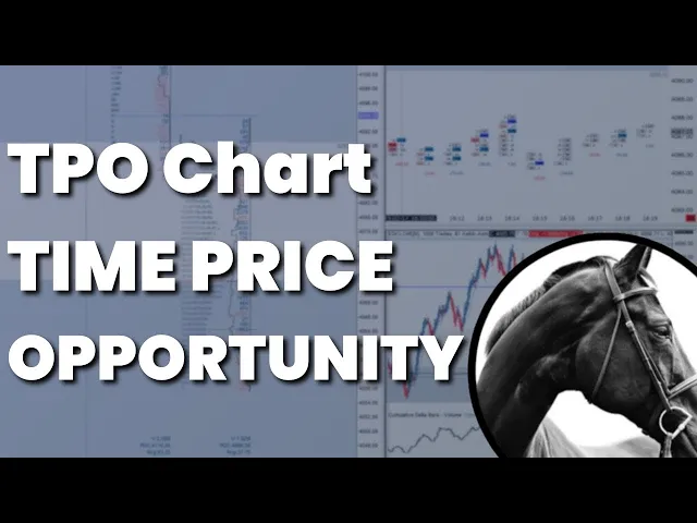
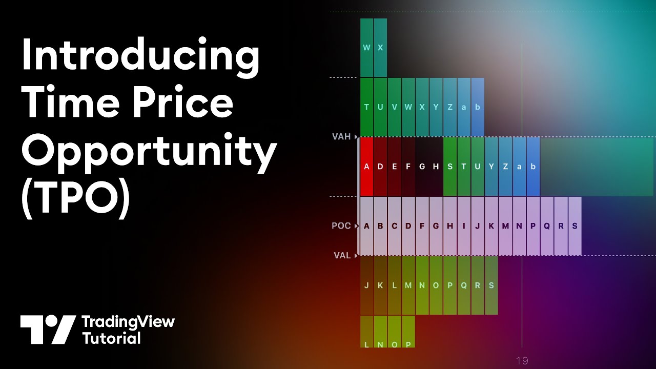
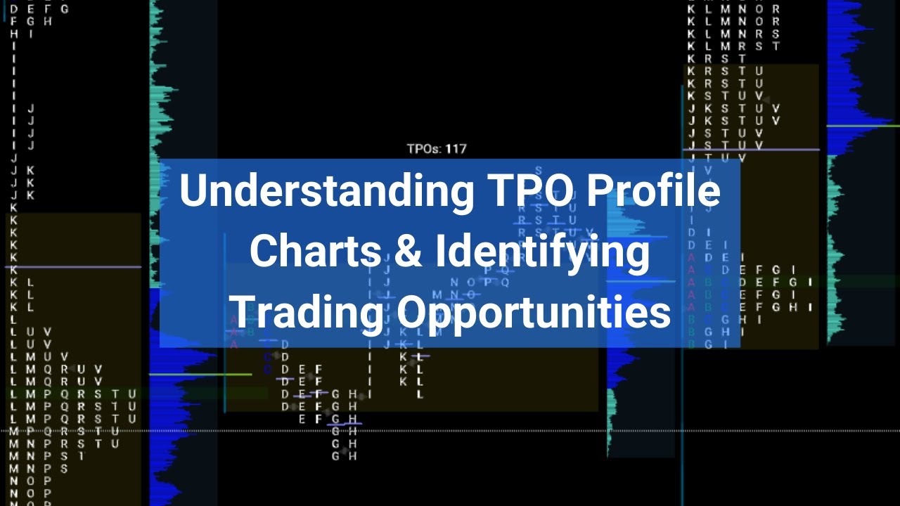
all right so the first thing that we need to go over is the tool that we're going to be using so the TPO chart so when you're using Market profile you're using a TPO chart and TPO stands for time price opportunity so the setup that I have right here is the exact setup that I'm going to be using when I'm trading cryptocurrency it's also the same setup I'm going to be using when I'm trading any traditional assets using this chart as well now I mentioned that because there are certain things within a TPO chart that
are not as useful when trading crypto as opposed to traditional markets and one of them is actually something I have left on the chart and this is something that some people might prefer to keep on some people might not we're going to get into this and this is the initial balance but what we're looking at within a TPO chart and as you can see I have the letters used right now more commonly I will be using just single blocks with shading is we're looking at how the day has evolved over the course of half hour
periods so each one of these letters each one of these sub-periods represents 30 minutes throughout the day so think about each one of these a period capital b period Capital C period as 30 minute Candles now the capital letters are going to represent the first 12 hours of the day the lowercase letters in this case are representing the last 12 hours of the day so we're looking at a 24-hour session crypto is a 24-hour market and that is why we only go up to X period for the first 12 hours and again X period for
the latter 12 hours so there are 26 letters in the alphabet everyone knows that and each one of these letters is showing us how we have progressed through half hour periods throughout the day so a period This is the first half hour of the day beer period this is the second half hour of the day and so forth now for the sake of this tutorial I'm going to be setting this back to my traditional setting which is just to use the blocks so you can use blocks you can use letters you could use horizontal bars
whatever you feel comfortable using now the benefit of using the letters is that when we look at any location within this box or within this TPO chart but we could have an immediate idea of where that within the day occurred so if I'm looking at this compressed right now it's not really easy for me to tell you know where this period was in relation to this period unless I have this opened up okay if I see that when we're using letters that you know this is b period over here and this is X period over
here I can begin to understand you know where these occurred with relation to each other without necessarily opening up this chart so a lot of the times you're going to see that we're going to be using the chart compressed and then also opening up the chart just to get an idea of how the day has unfolded now you can also use the shading so what I can do is actually I could go to study settings and I could open this up and essentially make it so that it is shaded so what we'll do is uh
it's actually not there shade there we go so we could shade these and it'll show based on you know a transition from essentially we're looking at light to dark uh how we have evolved over the day now I'll just keep these solid because sometimes depending on your contrast settings or your color settings and these settings in particular uh it might be hard to distinguish and for the sake of all of our modules and for the sake of our course we've always just kind of opened these up regardless so we're not just going to be looking
at this compressed we're going to make sure that we understand it as it's opened up so that's what we're looking at within individual rotations so each one of these bars represents a 30 minute period during the day okay it does not show us you know if you're looking at a Candlestick chart you would see the high the low but then you'd also see where the open and the close of this candle was for the sake of the TPO chart we're not really interested in where each one of these candles opened up we just want to
know where we've been so where we have been over time not necessarily yet how much volume has been transacted so TPO charts to begin with when they were used they were used under the assumption that each one of these boxes was actually representative of a certain amount of volume so this was before the volume was able to be sort of reconciled as the day progressed so only until the last 20 years we're able to really figure out what volume was at a certain level throughout the day so now trading systems trading platforms are far more
sophisticated we can see in real time how volume is progressing but originally TPO charts were taken under the assumption that if we had a lot of these boxes in an area it meant that we had a lot of volume transacted so we're talking about you know time in an area price and the amount of volume but for the sake of that we actually were going to talk about the next part of this chart what I have is a volume profile that is also integrated with this TPO chart so as you can see right now there
is an outline and it's red and that is turning to Black once it gets to a value area back to red and what that is is the volume profile so this is going to specifically show us the volume at certain levels which is good because as you see we'll be talking about how volume is confirming price over time so the next thing we're going to talk about is the initial balance so this is the initial one hour period from the open okay so where price spent the first hour of the day now this is not
something that is I would say as useful in crypto dough in a 24-hour market when opens and closes are not as important every single day as they might be maybe through key contextual level so this is the first hour of the day which is Market open if you're talking about traditional markets you know Market open is a pretty significant time you're going to see you know how buyers and sellers interact in this hour and it might be something that is useful in determining how the rest of the day would progress so if we're looking at
the initial balance and seeing that you know it is very wide you could start to say that we're forming a more balanced range to begin with versus having a very tight initial balance where trading occurs over the first one hour period that is very constricted followed by an expansion out of this level very quickly so the initial balance this is just showing us where we have opened for the first hour of the day the range of prices so if we open this you'll see that the initial balance is the first TPO period and the second
TPO period from high to low and before moving forward these TPO periods as you can see they're broken down by individual boxes these are just representative of your tick setting so in my case I have each one of these boxes being a 10 increment of each one of these half hour rotations okay so this box doesn't represent a specific amount of time it doesn't represent any kind of equal amount of time over time so it's not like you know we spent let's see if we had you know this rotation right here was a half an
hour it doesn't mean that in this white box we spent 15 minutes there in the blue box we spent 15 minutes there again it's just presence and these are calculated based on the tick settings that you have which if you're following along with me is a ten dollar increment for the 30 minute rotation per box so moving back to the initial balance the first hour period of the day now some Traders will shorten this some will lengthen this again this is something that I don't personally think is as useful in crypto unless as I said
we have a close through a major contextual level so we haven't gotten to that yet but you'll see as we get further into this what I mean by a closed through a major contextual level because normally then you'll see that the bar that opens if we're looking at a daily close through a major level there should be an immediate response within that open so you would want to see that if we closed through a major contextual level that something like this initial balance was very wide okay so that it was very wide and it was
in very much just One Direction so there was an immediate one-sidedness from the open so moving away from the initial balance you see how this chart is multi-colored so we have a green box we have a slight blue box over here I don't know what color blue you would call that and then we have these triangles so we have red over here so just to cover what these are really quick before getting into some of the other more obvious shadings so the green for me is where we open so you could change this in the
settings by all means if you want to go to the study settings and and change this you go down to your colors and you see that I have my open marker as green so the red triangle is just where we closed so at all times I kind of have an idea of what you know how the day has progressed I know that for example you know if I just take out my drawing tool really quickly I pretty much just highlight this this was what the candle looked like okay so from open to close all right
in this case this was a green day so we opened closed slightly higher but really this was our range right so this was you know not the most attractive candle as an example but we have an immediate idea of where we are when we opened where we closed and from there as we get into you'll see how we determine what this means moving forward right was the day one-sided did we progress from from immediately from the open to close right are we balanced are we right back where we ended up or are we right back
where we began so this is the open this triangle is a close this blue right here is the midpoint of this structure so you can have this setting if you want I think that this is useful because at all times when we're making any kind of composite when we're compressing any of these as we'll get into I want to know where the midpoint is because the midpoint is a lot of times going to be referred to as the EQ of a larger structure so just having this setup can really be helpful and you just go
into settings and and highlight the midpoint of the structure and if we're going to compress these charts if we're going to compress let's say this higher range we'd immediately have an indication of where the midpoint was just from a high to low divided by two standpoint right the other shadings that are a bit more obvious that are not shadings but are completely different colors the blue and the white so what we're looking at right here in the white is where we spent 70 percent of our time this is referred to as the value area 70
of the time throughout this distribution right so the blue is the remainder it's obviously the remaining 30 percent the red line right here is where we spent the most amount of time so the point of control for the TPO chart is where we spent the most amount of time where we were present throughout the day the most right so what we're looking at is essentially if we unravel this this is where we had the most boxes line up throughout the course of this distribution so again remember this is time okay so 70 of the time
within this value area the most amount of time over the course of that range was spent right here at this specific price now as you can see when I open this profile up you have a similar change in color within this structure as I referred to and this is the volume value area so this black area right here I have it shown to specifically indicate where the volume value area was which is in my settings 70 of the volume was transacted so as we get into Market profile more you'll have an understanding of why we
want to understand where these values exist or where these lines are kind of drawn from there we see that I have a point of control for the volume profile as well so the TPO point of control on the TPO chart this line right here this is the point of control for the volume profile and the point of control for the volume profile is where most of the volume was transacted from here you can see that I also have lines extending so the lines extending from these charts are going to show me moving forward where these
value areas are for both the TPO chart and the volume profile chart as well so in this case you can see that they're pretty identical for this structure right here so this would be referred to as the value area high the value area low and the same idea within the volume profile the value area high the value area low the TPO chart the value area high that's the border of where the value area meets the non-value area and the value area low where the border of the value area meets the non-value area at the low
end and again this is sort of going to be your exterior of that value area so the value area high value area low point of control is where most of the time occurred within the TPO chart and the point of control for the volume profile is where most of the volume occurred now on the structure we have things that we're going to get into more specifically we're going to be talking about extension Tails single prints and just to cover that really quickly a tail is any structure like this that exceeds two of these subperiod boxes
so we're looking for Tails more often than not at the highs and the lows so we'll refer to things such as poor highs and poor lows and that's where there is no tail present when we refer to single prints we're looking at a structure like this where you have a single line of prints so a single TPO print right through no more than two boxes we have multiple single boxes No Interruption nothing like this right so if we unravel this you'll see that we have two prints into the high when we compress this we do
not have any single prints at the high we do not have any indication of a tail so a tail indicates that the market came into this level and very quickly left it right if we look at this and we say this is a half hour period the market only spent a very little amount of time in this area before completely coming back so we have a tail the low as well so again two of these boxes we don't have more than two okay we don't have in this case we just have one box that's what
I mean we have two boxes below but we have a single print into this low this is referred to as a tail So within a structure this would be more commonly referred to as single prints so if you're looking at over here you see that we have a single line right here of these TPO boxes when we refer to single prints you'll see that this is I use this interchangeably to refer to any level where there are just a single line of boxes so the concept will apply moving forward in roughly the same way for
one of the setups that we're looking for just understand that this is a very thin area right we didn't spend much time here whatsoever we didn't spend much time here whatsoever we didn't spend much time here whatsoever now we'll see that there is a difference though between the amount of time we spent in an area sometimes and the amount of volume that's transacted so sometimes you'll have an area of single Prints but you'll actually have volume that's transacted in that area that wouldn't really be obvious if you're just looking at the TPO chart so again
this is why we look at a volume profile with the TPO chart we always want to see and this is sort of a further iteration of what was originally the sentence that volume is confirming price this was traditionally meant as the presence alone was confirming these prices so if we were to say you know breaking above 7660 was an important area and we needed to see volume confirmed price before volume was again reconciled throughout the day you would have seen just the presence of these tpos alone and say volume was confirming price but now when
we're looking at volume profile as well we could make sure that the volume was actually confirming that presence so when I refer to things such as presence I mean the fact that we were there well when I refer to things as participation I mean that we actually had volume transacted at that level to confirm it so sometimes we'll be going throughout this module in this course and we'll see portions in which for example you'll have presents but you won't have participation you might have a very thin volume profile but you might have a relatively thick
TPO or Market profile so these are the more common things that we are going to be covering in using tpos within crypto there are some other settings that you might find traditional Market Traders will use they might use slightly different settings if you're trading one asset to another but you can pretty much take all the things that we're generally going to use from this structure and apply them within traditional markets as well right like I said you might be tinkering with something like the initial balance you might be tinkering with some people might use for
example the value area calculation as 68.4 percent and as we get into the next portion of this module you understand why that value is the way it is we've covered this before in the road maps as well when we've gone over the value areas and auction market theory and remember to refer to this none of this course is going to be talking about auction market theory and just Theory right so if you want to understand that make sure that you watch the roadmap on that specifically which is also listed in here as well the last
thing to touch on that we're going to get more into as we move forward these values right up here so above each one of these sessions you'll see that I have four different values and we're going to be using these frequently so the first one is aspr that stands for average sub-period range so each one of these bars remember each one of these sub-periods is a 30 minute candle so the average sub-period range is just the average size over the course of the day so average size from a high to low standpoint of each individual
30 minute rotation within this structure so in this example we see that this day has been completed and the average 30 minute candle size was 35 points or 35 dollars now the volume value area range so remember the value area is where 70 percent of the volume took place for the volume value area so 70 of the volume took place within this black box so you can see that is designated as a darker shade so we have red and then the value area as indicated by a black outline and the volume value area range is
just the high to the low of that range so in a point value from the value area high to the value area low the size of this range so in this case the size of the volume value area range was 70 or 70 points RF stands for rotation Factor this is similar to hike and ashy right and I don't mean that it's similar to hiking ashy in that it's the calculation is it's just going to show us how one-sided the market was so was the market continuously controlled by the Bulls or controlled by the Bears
how hard are we trying to move upward a very positive value and we're going to get into specifically how this value is derived a very positive value is going to show us that the market was pretty one-sided in its attempt upward a negative value is going to show us the opposite so this RF this rotation factor is going to basically show us with a very simple metric in what direction the market was trying to move so one of the questions that we asked one of the things we've gone over before in the modules is which
way is a market trying to go we try to best answer is it doing a good job of getting there but the RF the rotation factor that gives us some quick insight into which direction the market was trying to move again a very positive value means it was trying to move up a very negative value means it was trying to rotate down and then a neutral value would be around zero whether or not it's positive or negative but it would be relatively neutral meaning the market was pretty much ranging and not trying to make an
aggressive move in either direction last thing we have is your TPO value area range again the TPO value area is where we spent 70 percent of the time so the volume value areas where seventy percent of the volume occurred the TPO value area as indicated by the change in color from Blue to White so the white is the value area this is where we spent 70 of the time within this Market profile structure and the TPO value area ranges again very similar to the volume value area range just to high to low of that so
from the value area high to the value area low what point value that was so you can see that in this case the TPO value area range was ten dollars greater than the volume value area range so these are things that we're going to be looking at moving forward and we're going to be referring to these to sort of decide whether the market is showing signs of exhaustion or loss in momentum on a higher time frame whether the market is nearing a point of a break if we're looking at a market compressing over time we're
going to be referring to these values a lot so this is just a basic overview of how they are derived and what they are