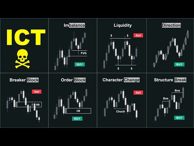
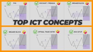
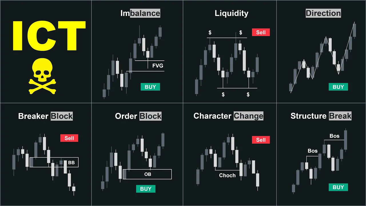
Hey guys, this video is an advanced tutorial on some of the most effective ICT concepts that we found incredibly useful for successful trading. Today, we'll explain the definition, fundamentals, and correct application of each topic on the chart to help you enter highquality trades. If that's something that you are interested in, as always, hit the like button to show your support and subscribe to our channel if you're new.
See you after the intro and disclaimer. [Music] Let's start with the first concept, imbalance, inefficiency or fair value gaps. The SMC trading plan is purely based on price action and tracking institutional activities or so-called smart money on the chart.
Smart money refers to extremely large orders placed in the market by banks, hedge funds, brokers, and other institutions with substantial capital. But how do we identify smart money on the price chart? We can identify smart money by identifying imbalances.
Imbalance, inefficiency, and fair value gaps are highly similar concepts. When smart money enters the market, it creates an imbalance between buyers and sellers causing significant price movements with large candles that have gaps between the wicks. If this is the case, the price is considered sellside inefficient and we have fair value gaps between the wicks.
The fair value gap is a three candlestick pattern where the wicks do not meet. Here you can see examples of efficient and inefficient prices. In the first example, we have a clear bullish fair value gap between the shadows indicating sellside inefficiency.
On the contrary, if you look at the second one, you'll notice the wicks meet in the middle. Therefore, we do not have fair value gaps and the price is efficient. Now, how can we use this to our advantage?
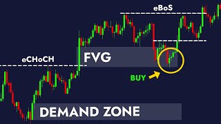
When the price moves significantly and leaves fair value gaps behind, it usually returns to these areas to fill the gap and restore balance. These areas become extremely important supply and demand zones, offering potential trading opportunities. In this example, the price is moving in an uptrend.
In this area, the price has created fair value gaps indicating buyside imbalance and sellside inefficiency. Below the imbalance we can find the demand zone as this demand zone has contributed to the imbalance. Let's imagine the price creates another pullback and we have another demand zone.
The key difference is that the second demand zone has no imbalance. Therefore, there is a greater chance for the price to make a deep retracement to the demand zone that created the initial imbalance. This is because the inefficiency will act as a magnet for the price to come and fill this gap.
So witnessing this scenario on the chart, we will aim for the demand or supply zone that created the imbalance. This zone has a greater chance to reverse the price compared to zones associated with efficient movements. With all being said, the imbalance is a strong SMC signal and one of the first things we spot on the chart.
However, just like similar concepts, it needs to be used in combination with other factors to make a well-informed trading decision. The second concept is liquidity. Liquidity is essentially determined by the placement of stop- losses.
Where stop- losses are positioned, liquidity is found. Smart money relies on triggering stop losses to strategically enter the market, allowing them to establish their positions effectively. Every swing high and swing low contains liquidity.
We know that if the price pulls back to this area, many price action traders will go long and put their stop losses below this level to benefit from the bull market. As the price approaches the swing high, traders will take their profits or even go short at the resistance area. Thus, we have liquidity below the swing lows and above the swing highs.
In an ideal uptrend, the correction will happen inside this range and the price will continue pushing upwards once it has gathered enough bullish momentum and liquidity. Many price action traders are observing the chart and looking for a signal to go long. This is why forming a bullish engulfing candlestick can also be a strong liquidity area.
Many traders will take it as a sign of bullish momentum and open long positions with their stops below the engulfing candle. However, as smart money traders, we want to enter the market after the stop losses have been swept. That's why if we find a demand zone below this candlestick, we would wait for the price to enter our zone and then open a buy position.
There are many forms of liquidity in the market. But we mainly pay attention to equal highs and lows. As the name suggests, equal lows are formed when the low points are at about the same level.
And similarly, the price will form equal highs where the highs are about the same level. What does this signify in terms of price action, the double or triple bottoms created on the chart are great places to look for trading opportunities for many retail traders. They expect a rejection to the upside once the price taps into this area again.
So, they enter long positions at these levels and place their stop- losses somewhere below this area. The same scenario happens in a bearish market as well. When the price taps into the resistance area, retail traders go short as they expect a rejection towards the downside.
Their stop losses will be somewhere above this zone. So, a lot of liquidity is gathered above this area. If smart money wants to sell this pair, the conditions are ready to push the price above this resistance area to grab the liquidity and then push the price towards the original bearish direction.
The third concept is the market maker model. Now what is the market maker model? In institutional price swings, there are two types of liquidity in the market.
Buy side and sell side. Liquidity above a high or a group of highs represents buyside liquidity. When the price approaches this level, bearish traders will go short or they will protect their previously opened short positions.
On the other hand, breakout traders will go long if the price breaks through this level. The animated movement aimed at grabbing this liquidity is called the buyside delivery. It runs high to engage the liquidity above these relative equal highs.
The algorithmic price delivery engages the liquidity by trapping traders on both sides and then the smart money goes short. Now let's apply the same concept to the bearish scenario. Liquidity below a low or a group of lows represents sellside liquidity.
Like in the bullish scenario, when the price approaches this level, bullish traders will go long or they will protect their previously open long positions. On the other hand, breakout traders will go short if the price breaks through this level. The animated movement aimed at grabbing this liquidity is called the sellside delivery.
The algorithmic price delivery engages the liquidity by trapping traders on both sides and then the smart money goes long to engage the buy side liquidity. When the price creates supports and internal structures before reaching a demand level, it increases the chance of bouncing off that level. This is because all these supports attract traders to buy the asset.
Their stop- losses are considered sell orders. And if smart money wants to buy this asset, it needs sellers in the market. This dynamic creates a scenario where the price tends to bounce off the demand level as buyers step in to take advantage of the perceived value and sellers orders are absorbed by the buying pressure.
With all that being said, forming liquidity grab patterns inside the supply and demand zones are great confirmations for short-term market structure shifts. After the formation of liquidity grab patterns, the market will move towards the liquidity zones on the other side. Market direction.
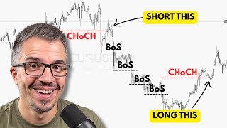
Who is in control? Identifying the market direction is generally the first step in analyzing a price chart. We want to identify the trend and determine if the buyers or sellers are in control.
We always aim to trade aligned with the controlling side of the market. How does the system work? The system operates on mitigations.
When the price mitigates a demand level, demand takes control over supply. Conversely, when the price mitigates a supply zone, supply takes control over demand. Imagine the price is moving in an uptrend, creating a series of higher highs and higher lows.
Each time the price breaks the structure to the upside with inefficiency, a demand zone is formed. These demand zones remain unmititigated until the price taps into them, offering a perfect opportunity to follow the dominant trend. However, if the price breaks below a valid demand area, this is called a change of character, indicating two things.
First, supply has taken control over demand. Second, a valid supply area has been established. The price then continues to move downward forming supply areas until it reaches the next unmitigated demand area.
At this point, there is a battle between supply and demand. Sometimes we see a period of consolidation and a ranging market between these two zones. Breaking either zone indicates who takes control.
Here we have one, two, and three moves that break above the previous market structure, indicating that demand is in control. We have an unmititigated demand area which will act as support when the price returns to this level. Once more we have a temporary correction and the price breaks the high with imbalance creating a strong demand area again.
Still the market sentiment is bullish as long as the price trades above the extreme demand. Now we can see that the market has tested the demand level and failed to create a new higher high due to a lack of buyer strength. After breaking below the low point, we can conclude that the buyers are no longer in control and we might witness a reversal.
If we consider this point as the start of the impulsive move that caused the market structure shift, here would be our supply area. Continuously, the market breaks the structures to the downside, showing that supply is in control, creating multiple supply areas. Each of these supply areas could be a potential selling opportunity until we reach this unmitigated demand area in front of the price.
This zone can be a potential interest area for the buyers to step into the market. So at this point, we have a battle between the buyers and sellers. Therefore, we must wait and observe the further price action to determine the market direction because this level can be a turning point for the price or we might at least witness a temporary correction.
Now, here is an important point. We cannot control the market. However, we can prepare ourselves for the different scenarios that might happen.
Now, let's continue with the next topic. But before we continue, if you are an experienced trader looking forward to getting funded, check out Funded Next. Funded Next is one of the top rated prop firms on Trust Pilot that provides one of the lowest spreads and commissions in the industry.
They offer a variety of plans for traders with unique services. If you're seeking a prop firm that genuinely supports your trading journey and provides financial needs, register with the link in the description to get a 10% discount with our exclusive code and experience their exceptional services for yourself. Order blocks.
Generally, order blocks are optimized supply and demand areas where buying or selling orders reside. The market has rejected these levels once. So when it returns to these levels, it might react to them again.
Every order block is a supply or demand level, but not every supply and demand area qualifies as an order block. Let me show you how. Every reaction to a price level creates a supply or demand area.
It shows that for whatever reason, traders have opened massive buy or sell positions which cause significant price movements. So when the price returns to these levels, we closely monitor the price action to find possible trading opportunities. However, trading every supply and demand area would not be effective over time.
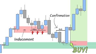
And by observing repetitive patterns on the chart, we have noticed that when supply and demand areas are accompanied by certain conditions, the chance of success significantly improves. One of the key supply and demand areas is order blocks. So first let's see what conditions are required to consider an area of valid order block to trade.
Then I will show you how to effectively mark them on the chart. Rules of a valid order block. The first and second rules are having inefficiency and collecting liquidity which we discussed previously in the video.
The third rule for having a valid order block is breaking the market structure. In a bullish scenario, when a price movement breaks the latest market structure and closes above the recent high, the origin of the price movement becomes highly important. It shows that the demand area that created this movement is not an ordinary level, but an influential area in the market structure.
With all that being said, a supply or demand zone is considered a valid order block if it leads to a structural break. The same concept applies to the bearish scenario. When a price movement breaks the latest market structure to the downside, the origin of the price movement becomes highly important.
It shows that the supply area that created this movement is not an ordinary level but an influential zone in the market structure. So these supply areas are considered valid order blocks. Here we have a moving uptrend.
This is the most recent break of structure which shows that demand is still in control. All these demand areas are considered an opportunity to go long. But here is an important point.
The origin of this bullish price movement is highly important and provides the best trading opportunities. There is a high chance that the rest become a victim of a liquidity grab. That's why we have to use a lower risk when placing trades in these areas.
But always remember if a profitable trading strategy helps to grow your account, the riskmanagement plan help you to survive in the market. You can risk 2 to 3% of your capital per trade and only have up to three open trades at the same time. Block is a failed order block that turns into another supply or demand area on the chart.
From basic price action, we know that whenever the price breaks through a resistance level, it becomes support due to the behavior of market participants. Similarly, whenever the price breaks through a support level, it becomes resistance when the market taps into that area. Again, the same concept applies to order blocks as well.
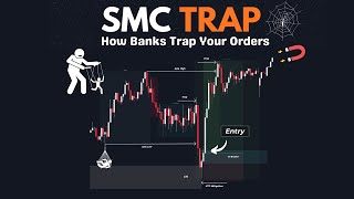
The market could ignore an order block supply and demand due to many reasons, including a shift in market structure, being overvalued or oversold, tapping into a higher time frame key level, and more. When a valid demand order block fails to reject the price and the price breaks through, it becomes a supply level. We call it a breaker block, expecting that the market will reject this area.
So right here, this is what a bearish scenario might look like. We have a break of structure above this higher high with inefficiency. This move creates a valid order block zone that can provide us with an opportunity to go long.
However, the market makes a change of character caused by this aggressive move breaking below the previous low. As a result, the directional bias has changed to bearish and our demand level will turn into supply after this break occurs. The psychology behind breaker blocks is that the traders who went long in the order block are now trapped after the bearish market structure shift.
So they would want to wait for the price to get back to their break even spot where they can close their longs for no loss. Additionally, traders will go short here since they see this area as a key area of supply. The outcome of this double action is what makes the price reverse from this area.
The last concept on the list is the market structure. Now, what is the market structure exactly? Market structure refers to swing highs and swing lows, supply and demand areas, order flow, and overall market condition.
We have two market behaviors, trending and ranging market. In an uptrend, as the name suggests, the market moves towards the upside, creating new higher highs and higher lows. Here you see an ideal ascending structure.
The ideal means that the market respects the lows and continues pushing upwards. The important point is that in the uptrend, the market has a greater tendency to break the highs to the upside. Although the market might not always move this clearly, this is the general definition that is commonly seen in the market.
Even if you look at the one minute chart, you can see that the upward movement is created by making higher highs and lows. So, as long as the price continues to break the structure levels to the upside, we are still in an uptrend. Now that we've talked about breaks, let's see what breaking really means and what conditions we consider in a break of structure.
But before everything, this is the general anatomy of a candlestick formation on the chart. They might come in different sizes and shapes. However, they become an important subject when we are talking about breaks and liquidity concepts.
Structure and liquidity are two inseparable parts of the market. Many liquidity areas find meaning through structure and many structure levels become invalid with liquidity concepts. It can be hard to understand, but we'll cover it all today.
Now, how does a breakout occur? A breakout occurs when a candlestick clearly breaks the previous market structure with the body. This means that if the price can close a visible amount like a couple of pips above the previous level, we would have a so-called break of structure.
But here comes an important point. How can we ensure this break is valid and not just a liquidity grab? In case of a fake out or liquidity sweep, the price immediately gets back into the range.
So, let's make our concept more advanced. If the price wicks above the previous market structure and closes back inside the range, we won't have a valid breakout which we previously discussed. But in order to have a valid break, the following candle needs to close above the previous one.
This is a strong sign that the sellers have failed to push the price back inside the range and the buyers are in control. Similarly, a double confirmation for a break of structure with a closed body would be to wait for the following candle to violate the highest point of the previous candle. This indicates a strong continuation momentum to the upside rather than a liquidity grab.
Remember everything we discussed here is applied to the bearish scenario as well. Now let's move on to the next topic reversals. We previously mentioned that we have two kinds of market behavior, a trending and a ranging market.
Sometimes it's hard to identify the direction of the market or it feels like the price has been trapped in a box. The subject of the ranging market is out of the scope of this video. So, let's focus on when an uptrend turns into a downtrend and vice versa.
Or in essence, when should our overall bias be bullish or bearish? As we mentioned earlier, the break of an origin creates a change of character. A breakout occurs when a candlestick closes a visible amount through a level of market structure.
So, first we must locate the sources to identify the reversal points. But here is an important point. Scales matter in identifying the change of character.
For instance, here both of these levels are considered a source because they have broken above the previous market structure. However, we won't consider this break a valid change of character. The reason is that the failure of such a small movement is not supposed to be considered a reversal of the trend.
So, here is another rule for a change of character. A valid change of character occurs by breaking below the lowest point of the latest impulsive move that is at least half the size of the previous one. For example, look at this chart.
If we apply the concepts of market structure, we would have three impulsive moves like this. All of them have created a new high. So breaking below the source of each one is considered a change of character.
But look at the size of the third impulse. It's barely even half of the previous move. So in this case, if the price breaks below the swing low, we won't consider that as a valid change of character.
So basically we compare the scale of the latest impulsive movement with the previous one and it should be at least half the size to consider it a valid reversal. So if the previous move is 40 pips the latest impulse must be at least 20 or else we have no valid change of character. Here in the bearish scenario these are our impulsive bearish movements.
Breaking above this is considered a valid change of character because this impulsive movement is obviously larger than half the previous one. Keep in mind that we always compare the latest impulse with the previous one on the chart. No matter what your entry strategy is, trading along with the dominant market direction will instantly improve your win rates and risk-to-reward ratio.
But remember, before using any setup with your real account, you should back test it on different pairs to evaluate the trading strategies performance using historical data. We do plenty of back testing as well, but unfortunately it takes a lot of time. That's why we recommend Trader Edge.
Step. We use the Trader Edge platform for back testing our exclusive trading strategies. If you're interested in using Trader Edge as your back testing tool, be sure to check out the link in the description below.
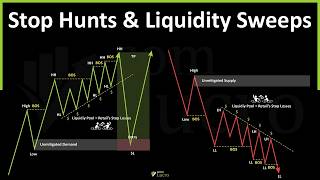
Now one of the most critical concepts in identifying the trends and reversal points on the chart is liquidity. Talking about liquidity generally there is liquidity above the top and below the bottom. If we consider this as the market structure the price has more tendency to grab the liquidity below the recent low and then continue pushing higher to grab the liquidity above the recent high.
But most of the time liquidity is used for trend continuation. This means that in a bullish market, we usually witness the price sweeping the liquidity below the lows to gather the fuel for upward movements. Candlestick formations are important in identifying liquidity sweep movement.
In the bullish scenario, a long wick at the bottom of the candlestick represents a liquidity grab movement. Imagine if this area is our previous support. So, we have lots of buy orders gathered here, which means that the stops are somewhere below this level.
So a long wick breaking through this area is considered a liquidity grab, but only if it won't have a long wick at the top as well. This would be a great sign that the price can start its movement to the upside. It is not possible to define a mechanical structure for all cases.
But what we want to see is a wick penetrated through the level and quickly returned. However, this wick should be at least half the size of the body. Now we have mentioned previously that for a reversal a source must be broken.
But here is an important point. When we combine the liquidity concepts with market structure, a liquidity sweep above the higher high is also considered a sign of possible reversal. For example, here we have the recent source that has broken the market structure to the upside.
When price sweeps the liquidity above the recent higher high and fails to create a new high, this is considered a sign of possible reversal. Liquidity sweep against the dominant trend is very different from liquidity sweep in the direction of the trend. Meaning that grabbing the liquidity above a high represents a temporary reversal.
But we do not expect the price to drop much. A true reversal is confirmed when the price breaks and closes below the most recent origin point. Then we can confirm that the uptrend is truly over and the price can continue pushing lower.
The same concept is true for the bearish scenario. Sweeping the liquidity below the latest low indicates a possible short-term reversal for the dominant downtrend. From the price action view, the sellers have failed to create a new low which shows momentum loss.
When the price immediately gets back inside the range, it indicates upward momentum which has the ability to push the price to the supply level in front of the price. And if the price breaks above the origin point, the reversal is confirmed and we have a change of character. Here we have gold in the 5-minut chart.
The market sentiment is bullish and the market continuously makes higher highs and higher lows. These equal lows are the source of the break of structure movement and contain lots of liquidity. Therefore, a liquidity sweep pattern formation at this level serves as a strong upward continuation signal.
On the contrary, forming a liquidity sweep pattern above the high signals that a temporary reversal is coming. This reversal is later confirmed by breaking below the recent source point that has led to a break of structure. Then we can expect the price to change the direction and possibly continue pushing downwards.
Practicing these concepts on your chart will definitely improve your chart analysis, help you understand the fundamentals of price movements, and optimize your trade entries. So guys, I hope this video provided value to you. If it did, please go ahead and smash the like button to show your support.
And if you're new here, consider subscribing to our channel. See you in the next episode.