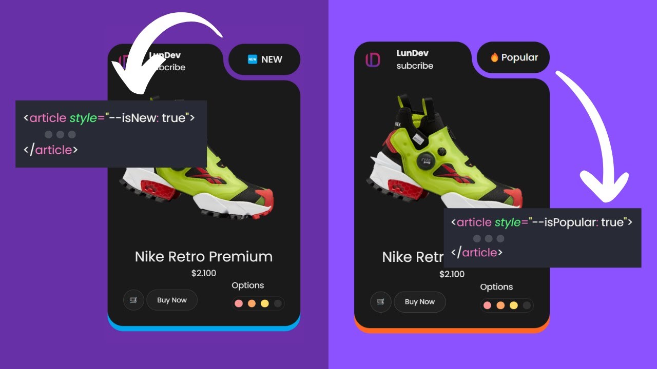
in web design and programming there are two kings of layout flex and CSS grid Flex is powerful for one-dimensional layouts while grid is great for more complex two-dimensional designs but you know what there is one type of layout design which neither grid nor Flex can do well it's masonry layout masonry layout is a design pattern created to handle a list of elements of different sizes they will be divided into different columns then the remaining space will be filled but that's not the most special thing the most impressive thing here is that the rule for dividing
items into different columns is not based on quantity but based on the size of each item with the mandatory requirement that the final size of each column must be relatively equal in this video I will guide everyone to handle this impressive design with just one line of CSS code don't forget to like And subscribe to the channel to continuously update interesting videos about programming and web design thank you very much everyone here I prepared a list of images in advance the characteristic of these images is that they have completely different ratios and the programmer will
not control it in advance my task now is to find the most suitable method for this layout the first method that I thought of was to use a display grid along with the rule of dividing it into three equal columns at this time the items were divided into three columns but because the aspect ratio of each original image was not the same it caused this layout to have many any empty areas which were very unsightly so let's go to the second way I use flexbox CSS add Flex wrap to allow the element to wrap now
we see that the image is distorted just add object fix cover and the image will no longer be distorted looking at the website we can see that the gaps have disappeared because the images have been resized to be equal but this is clearly not what we wanted from the beginning what I want is for the images to still maintain their original proportions so let's move on to the Third Way in the list class where the list of all images is located I declare columns count property with the value being the number of columns I want
to create immediately all images will be divided equally into three columns keeping the original proportions of the images but still able to fill the entire space the images will be divided equally ensuring that the length of each column is not too different and that's the one line of CSS code I want to talk about no not yet there is still a big issue here which is responsiveness if I use count then to make it responsive I need to do one more step using media screen where Max width is the screen size I want to edit
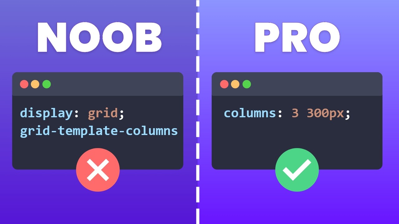
for example on mobile I want to split it into two columns instead of three like the original it is still correct still works but it is not a single line of code anymore instead delete all of these lines of code because the only thing we need is columns 300 pixel done when we set columns 300 pixels the system will use 300 pixels as a standard to divide the column which means that as long as there is enough space to divide another column with a size of 300 pixels there will be another column when the screen
gets smaller the screen size is no longer large enough to contain three columns with each column being 300 pixels the number of columns will automatically decrease that's why we don't need to spend time doing the responsive step anymore because it's automatically responsive but but if you are thinking that the width of each column is currently 300 pixels then unfortunately that is the wrong answer imagine this on a specific screen when columns are set to 300 pixels then columns with a width of 300 pixels will be placed next to each other everything will be fine until
there is no more space for the next column then the columns already on the screen will also become the number of columns for that layout but it doesn't stop there the remaining space will be divided among these three cones to fill the screen thanks to which the design will always fit the screen it is clear that the width of these cones has changed no longer 300 pixels as before so with just a single line of CSS code we have handled an extremely complex layup and also met its responsive work in addition in this video I
will give everyone an interesting tutorial on its other uses here I have a very long text in the Box class and the column property in CSS can also affect it it for example I want to divide it into columns with each column being 300 pixels then the text inside is also arranged in columns with relatively equal length everyone recognizes this is also a type of content layout that often appears in blogs and we have solved it hopefully what I share in this video will be useful to everyone thanks to everyone's support this channel has recently
gained a huge number of subscribers now just a little bit away from reaching 100,000 subscribers I am really happy about that because it helps me know that what I am sharing will be useful to someone if you find the content interesting please leave a like and a subscription to watch many interesting videos about programming and web design and that will also help me reach 100,000 subscribers as soon as possible thank you very much everyone again see you in the next interesting video [Music] [Music]


