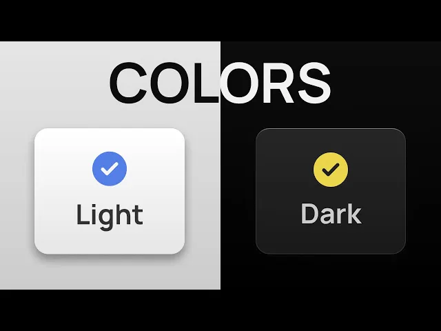
Colors are one of those things where the more you learn, the more you realize how much you didn't know before, and it gets complicated real fast. But for UI stuff, you don't need to become a color scientist. In my experience, colors are honestly the easiest part of the UI.
The tricky bit is knowing when to stop playing and just pick something that works. Here's what actually works. Neutral colors for background, text, borders, and a lot of other elements.
the brand or primary color for main actions and to add a bit of character. And finally, maybe some semantic colors to communicate different states. These are all the colors you'll ever need to design apps and UIs.
When I say colors, what I actually mean is shades. You will see this everywhere on a UI, like when you hover over a button or a gradient background. To create shades, you need to pick the right color format.
Most people are familiar with hex and RGB color values, but they are the worst when it comes to creating a color palette. Like these three shades of gray we have for our background colors. They look very similar visually, but the code doesn't.
Now compare that with a more intuitive color format, and the code actually makes sense. You have hue or the actual color on the color wheel that goes from 0 to 360. Then the saturation, which goes from 0 to 100, controls the intensity of that color.
In our case, we have set it to zero. That means no matter what color you choose for the hue, it's always going to be neutral. And finally, we use the lightness value to create a bunch of shades.
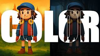
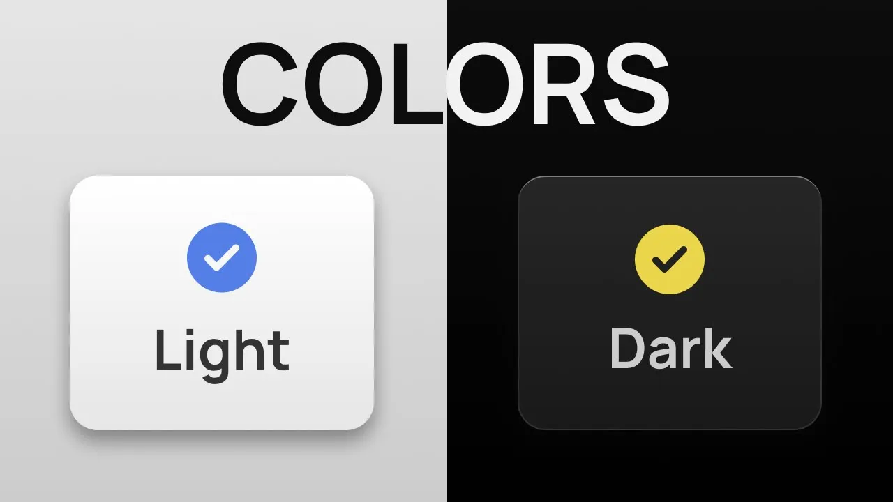
Simple and easy math to create a harmonic palette without any guesswork. Now that we've learned how to play with colors, let's create the most prominent colors of a UI, background and text colors. I'll start with dark mode because let's be honest, it slaps.
But yes, we will cover light mode as well. Saturation can stay at zero because we are creating a neutral palette. Without saturation, hue doesn't matter anyway.
I will cover hue and some other important things later in the video. With hue and saturation both set to zero, we will start with 0% lightness for our base color. Then 5% for the next shade that can be used for cards and other surface elements, and finally 10% to highlight the most important or raised elements.
The lighter elements appear on top and feel closer to the user. So obviously only use them for important stuff. Same thing with text.
Keep a sharper and high contrast color for headings and important elements and use a slightly muted shade for the rest. Still legible, just not in your face all the time. That's why we don't use 100% lightness for the headings.
It would look too harsh on the eyes. Speaking of harsh, let's flip these colors for light mode. Start by subtracting the lightness value by 100.
That'll give you a good starting point. Then we'll use our eyes and some common sense to adjust the values manually. For example, why does the top element have the darkest color?
Light usually comes from the top, so it should be the lightest and the base color should be the darkest. That's why I name my background colors as BG dark or BG light. So BG dark will be the darkest and BG light will be the lightest shade, whether it's dark or light mode.
But we can't do that with text colors. So use names that make sense for both cases. If you're into this kind of logic meets visual thinking, you'll love Brilliant, the sponsor of this video.
Brilliant is a learning app designed to be uniquely effective. Each lesson is filled with hands-on problem solving that lets you play with concepts, a method proven to be six times more effective than watching lecture videos. Plus, all content on Brilliant is crafted by an award-winning team of teachers and professionals from top tier organizations, so you can become a better thinker and problem solver with every lesson.
Whether you're learning to code, build formulas, design electrical circuits, or explore cuttingedge topics like AI to understand how these large language models actually work, Brilliant literally has everything, and you can try it all for free for a full 30 days. Just visit brilliant. org/sid or click the link in the description.
Plus, you'll get 20% off an annual premium subscription. So, we have our background and text colors. Before we move forward, let's quickly recap how we got here.
We picked the HSL color format so the colors actually make sense in code. We kept hue and saturation at zero because we want a neutral color palette and without any saturation, hue doesn't matter anyway. Then we just played with the lightness value to create three shades for the background and two shades for text colors.
And finally, we flipped these colors for light mode by subtracting the lightness value from 100. That gave us a good starting point. But BG dark and BG light didn't make any sense.
So, we switched them out to get our final colors. And that's all we've done so far. All right, let's shift gears and write some CSS.
First of all, set your colors like this. Your default theme goes in the root and then the other theme can go in the body selector like this. Then, one line of JavaScript to toggle it back and forth.
Or just wrap your light mode in this media query to automatically adapt to user's preferred theme. There are many ways to do this and your implementation will depend on your framework or how much control you want to give the user. But the main task is defining your colors.
The rest can be handled by the agent. For this video, I'm going to stick with this simple logic. Define my color variables like this and then use those variables to set the background and text colors.
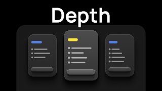
At this point, our UI looks too boring. So to fix that, we are going to use four more properties. As always, let's start with dark mode.
The border should be clearly visible but not too distracting. Then create a simple gradient using our background colors. If it feels too distracting, we can tweak it a bit and reveal the full gradient on hover.
This way, it looks shiny on top, like the light is coming from above. To really sell this effect, we can use a lighter color for the top border. And I'm calling it, you guessed it, highlight.
Now let's see how this looks in light mode. Since we haven't defined our gradients for light mode yet, it's still showing the dark mode version. So let's just copy the border gradient and highlight into light mode first.
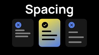
This is nice, but we can make it 10 times better. First of all, the highlight and light mode doesn't look like a highlight, but a plain border. So let's bump the lightness all the way up.
Now the border doesn't make any sense and looks ugly as hell. To solve this issue, I'm going to create a new variable that can be applied directly as the border. Then, we'll change the border color to match the background color in light mode, so it blends into the card.
And finally, let's add a nice shadow to create some depth because where there's light, there's a shadow. Shadows need some transparency, so you'll need to use an alpha value that goes from 0 to one. Always mix a darker and shorter shadow with a lighter and longer one to achieve a more realistic effect.
But did you notice we've come this far without even touching hue or saturation? So, let's see what hue and saturation can do for your designs. I've made a tool that lets you do just that in real time.
I've already set the right contrast, gradient, highlight, and shadows. All you need to do is play with hue and saturation. Want a cool and vibrant look or something warm and neutral?
This lets you try everything and find the perfect balance for your project. Then just flip this switch and see if the light mode needs any tweaking. Make sure to check all the colors, especially your primary and secondary ones since they're mainly used for buttons and hover states.
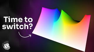
Once you're happy with the results, just click this button to copy the colors. What the hell is okay LCH? And why is it the default color format?
Forget the okay part for a second. Just look at LCH. L and H are lightness and hue, which you already know from HSL.
C stands for chroma, which is kind of like saturation, but instead of going from zero to 100, it goes from 0 to 4. And for UI work, you rarely need more than. 15 or 2.
As I said in the beginning, colors are one of those things where the more you learn, the more you realize how much you didn't know, and it gets complicated real fast. Hue is the same as before, 0 to 360. Chroma goes from 0 to 02 and lightness goes from 0 to 1.
Actually, LCH is a color format on its own. OKLCH is the newer and better version of it. With the V4 update, Tailwind has also switched to OKLCH as the default color format.
So, let's compare these three color formats and see how they differ. With HSL, the biggest issue is how it handles lightness. The dark and light shades lose all saturation.
with LCH and OKLCH, the increments look way more natural. By the way, I'll show you some more variations and leave it up to you to decide which one looks better. Feel free to pause or take screenshots since I'll be going through them quickly.
So, what do you think? You can still just copy the HSL code if you want. The theme includes everything, both color formats for dark and light mode.
Just copy paste the code into your CSS file and start designing. I'll leave the link in the description right below these beautiful buttons.


