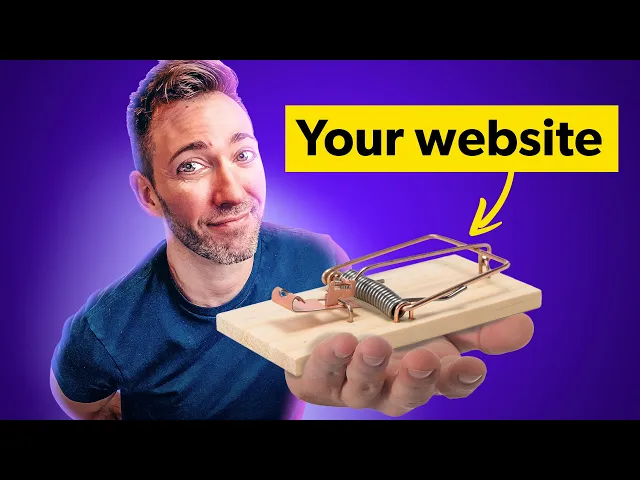
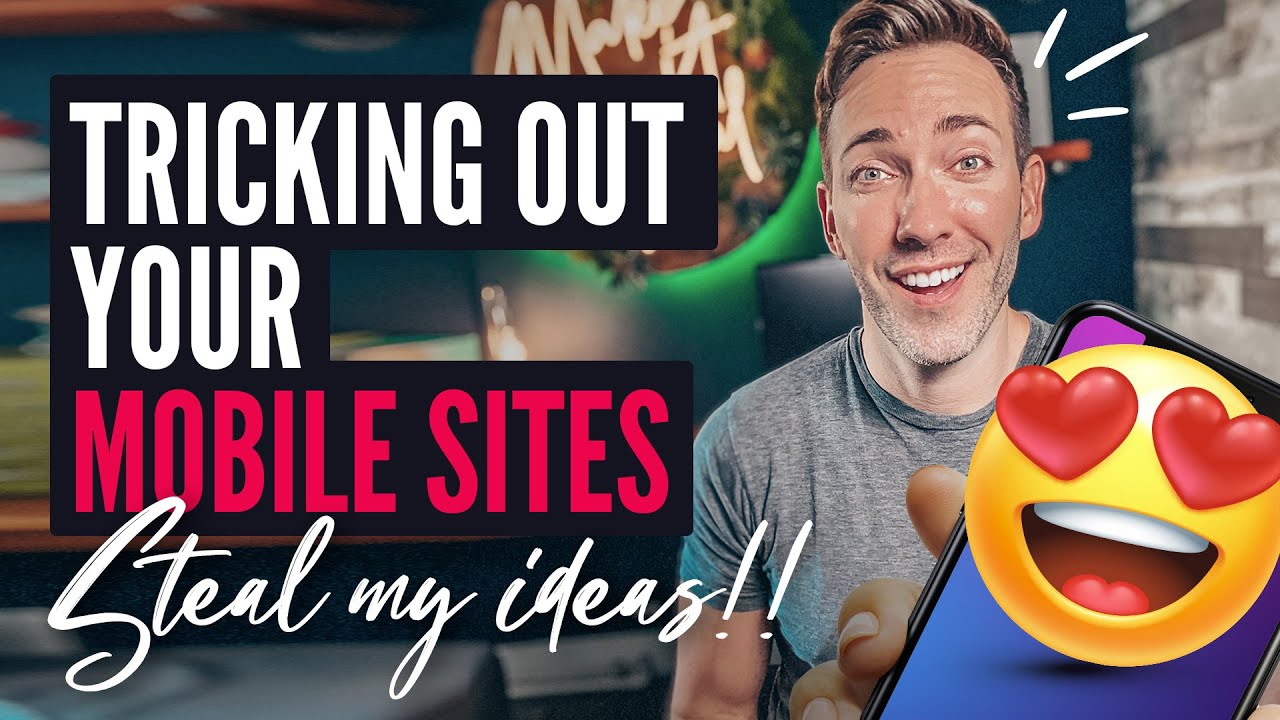
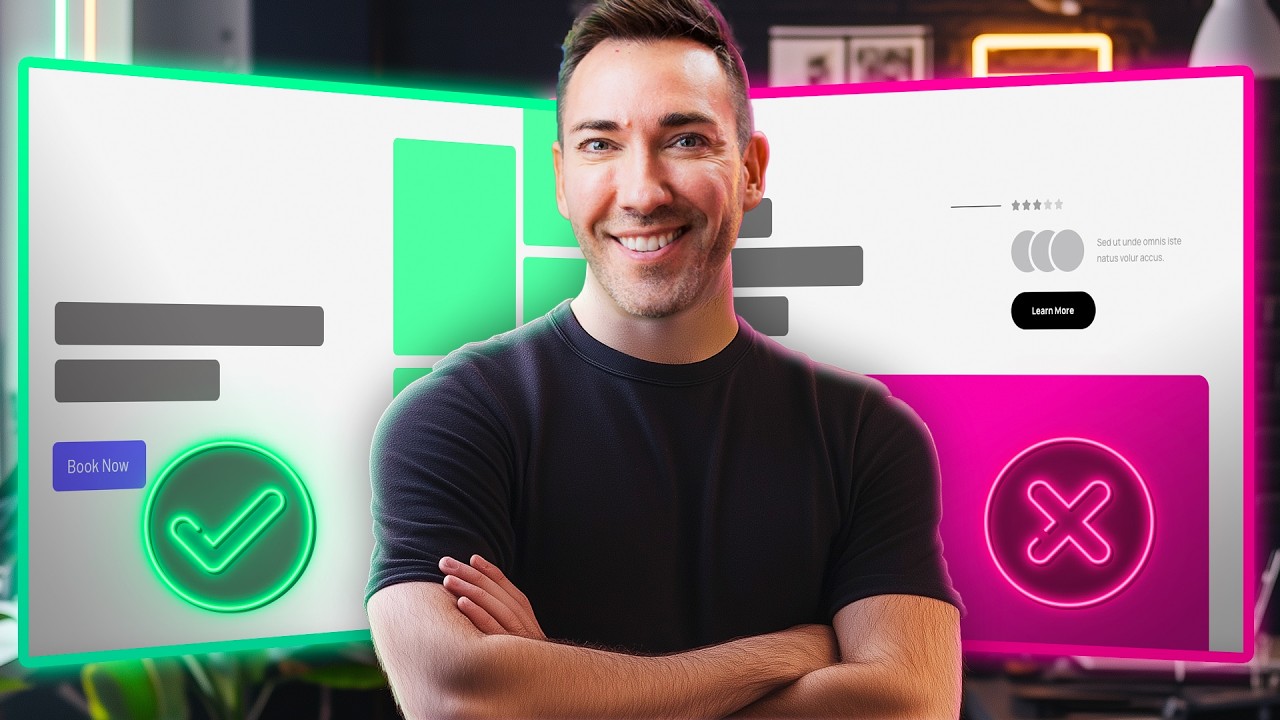
what if your website's actually turning new customers away forever I dug deep into some of the highest performing business websites on the planet and discovered five proven features that they used to keep their prospects hooked much longer making them much more likely to convert into a paying client and what you're about to learn will finally help you work out for yourself how to turn your flimsy website into a true customer trap as well as which of these features you should actually use on your site if there were some magical thing you could put on your
website that was proven to keep people there almost twice as long you'd be interested right well that was not a hypothetical the average internet user spends 88% more time on a website with video then without videos just have a dynamic way of keeping your potential customers engaged and sticking around just because it provides them with valuable and really easily digestible information according to Forbes 95% of a message is retained when watched in video compared to just 10% when read in text that is a massive difference in something that you just can ignore when crafting your
website although they're not a small business anymore MZ started as a small SEO consulting company in Seattle and one thing about Seattle is they have a lot of SEO companies but MZ quickly stood out from the pack in large part due to leveraging video content right on their website to build a strong online community and customer customer base their whiteboard Friday video series where they explain really complex SEO Concepts in simple terms became hugely popular and really quickly led to M's becoming a household name in the SEO Niche but don't just slap any old video
on your site you know the type and the quality of your video content matters a few video types that I've seen work really well are those teaching Style videos like maz's whiteboard Friday series a video where you talk about the problem you solve for your clients and how video testimonials and video FAQs and the cool thing is you don't have to go all out on production value on any of these videos just use your smartphone and do what you can do to make the settings seem professional but that's really all you need to do to
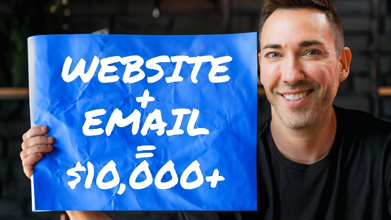
make website video work in your favor now making your website into more of a trap doesn't just mean keeping them there longer on their first visit it also has to do with keeping them coming back for more because I don't know if you know this but re repeat website traffic is eight times more likely to convert into a sale or booking a call with you than those first timers and the way you get people back all starts with getting their email address so there are tons of types of lead magnets out there everything from checklists
to free templates they can use but nothing's working better for this right now than quizzes first of all a quiz is going to keep people engaged on their first visit because people Love interactive elements on a website and and they can't help but find out what result they're going to get on the other side I'm curious like a cat so it keeps them there longer on the first visit but if you were to use your quiz to capture their email just before you reveal their results you can then follow up with them to let them
know when you have a new helpful article or video or podcast episode and when you have a new offer or promotion on your site but there needs to be a payoff you know do they get a quote at the end of the quiz a personalized plan the score they need something juicy so that they'll be motivated to give you their contact information in order to get that final reward in my case I ask a series of questions about your website and then give you a custom playlist of all of my videos that are going to
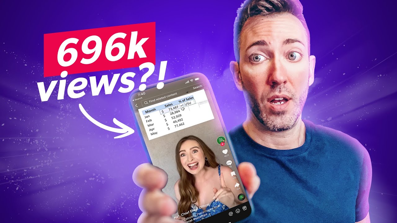
help you in your situation the most and I used interact to create my quiz and it's gotten me over 2,000 leads in the past year that's thousands of real people that I can bring back to my site over and over again and it just runs in the background 24/7 and it's never been easier to create a quiz like this thanks to interacts brand new AI powered quiz creation tool and once it's created you just embed it right on your website but would you really stick around to take a quiz on a site that's just bursting
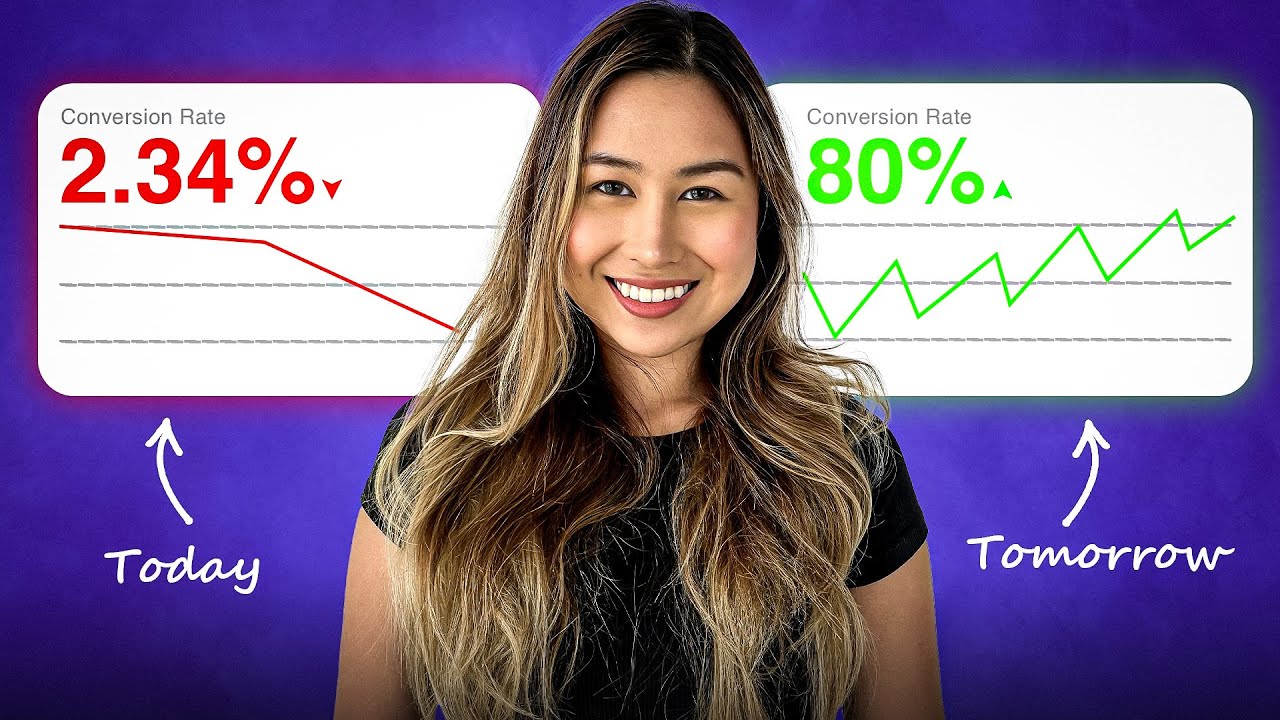
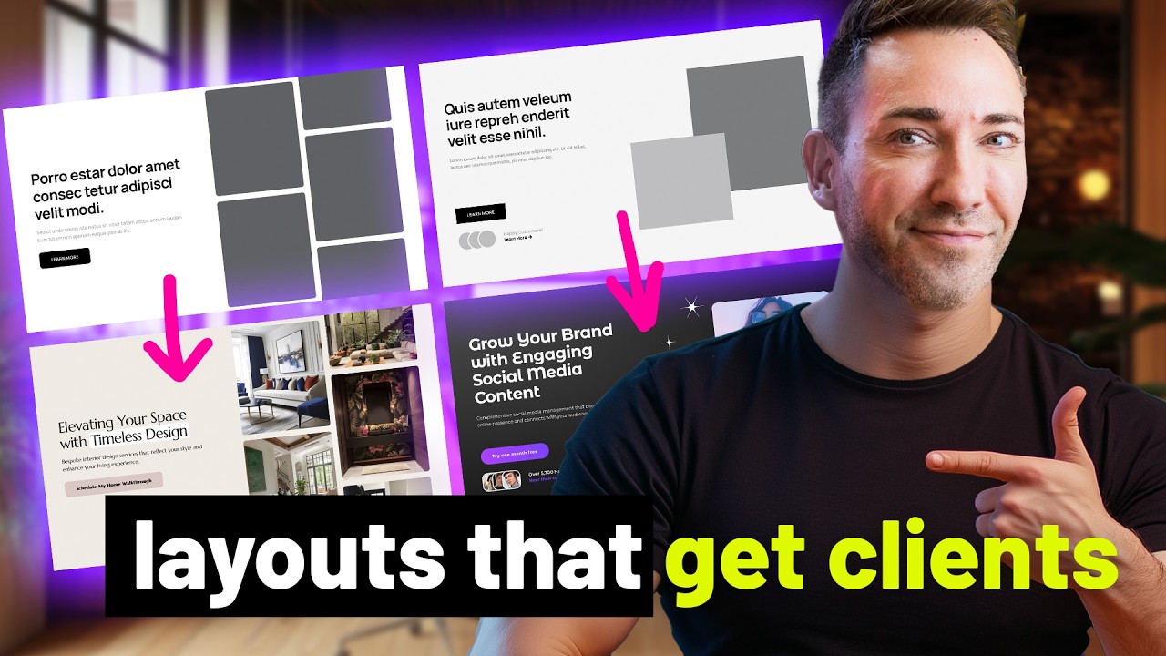
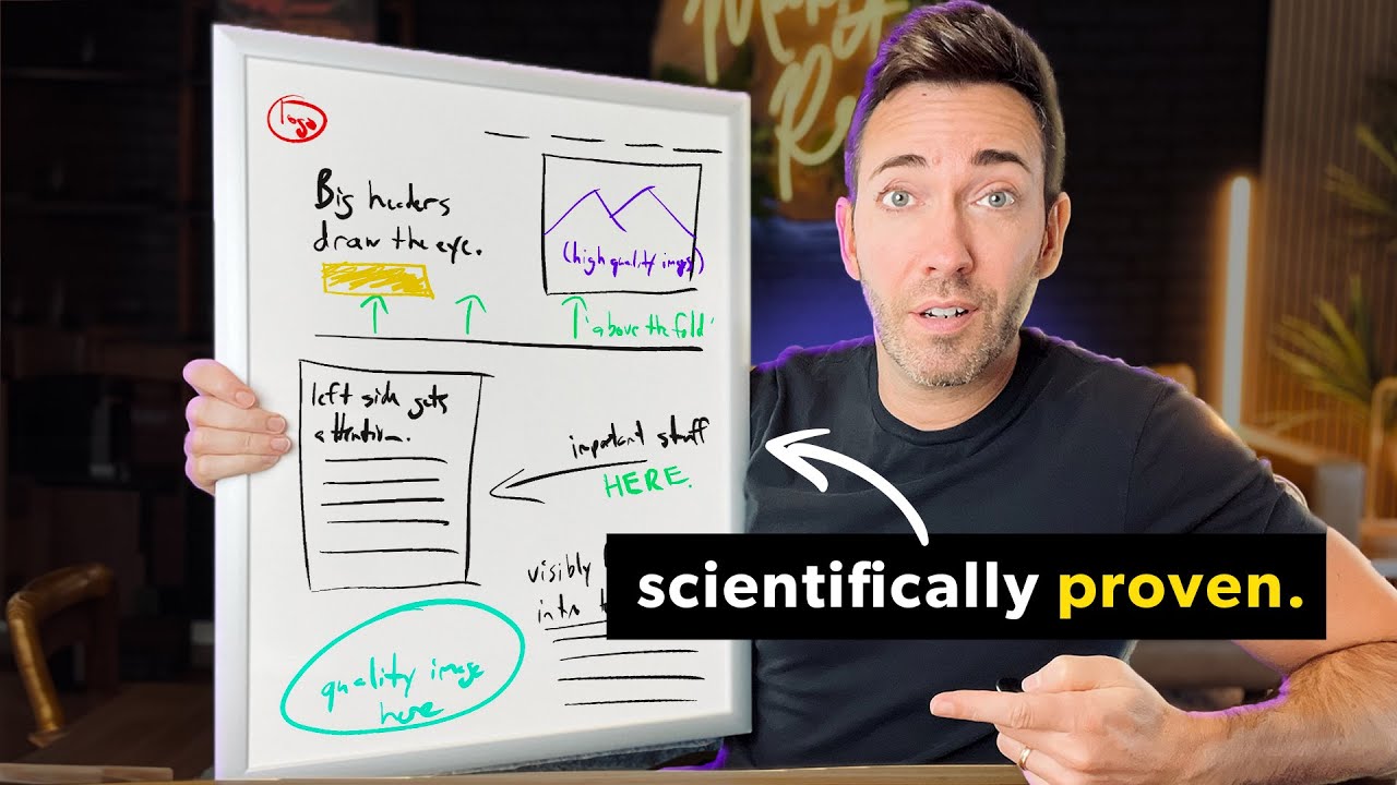
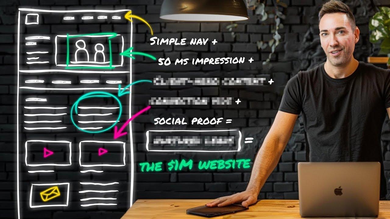
at the seams with information images popups and clashing colors probably not right the Clutter the chaos it's not just unsightly it's overwhelming you know our brains on a very instinctual level prefer order and simplicity websites over loaded with design elements and too much information can really create a sense of stress and confusion pushing people to abandon your page Google actually discovered that visitors are going to judge a website's Aesthetics within 50 milliseconds So within that brief blink of an eye an uncluttered simple design is perceived as much more visually appealing and trustworthy and it's not
just about looking good it's about providing a stressfree user experience in fact hubs spot found that 76% of consumers consider the ease of use as the most important factor in a website so it's all about striking the right balance the aim here is to create a website that's both aesthetically pleasing and functional a site that doesn't overwhelm visitors but invites them to stay explore and see why you're the best choice for them and this is where the principles of minimalist design really Shine by cutting out the noise the distractions the unnecessary I have to break
this to all of my students it doesn't matter how much love you put into that about us page your site visitors will skim it and that's not even a bad thing in fact it's an opportunity to cater to their browsing habits you can use lots of white space bullet points bold headlines and captivating images all to grab their attention and get your message across it's all about delivering your content in really bite-sized easily digestible pieces but what if you could take that one step step further you know what if you could not just tell your
customers about your services but show them how you stack up against the competition comparison charts provide context something that's often missing when a customer visits your website let's say a client's searching for a Spanish tutor you know they click on some random person's website the tutor says they're certified in a bunch of stuff that the customer probably doesn't know anything about but the tutor looks nice the website looks nice what's missing is context now if this tutor uses a comparison chart illustrating the value of a month of lessons with him versus a month of lessons
on du lingo or Rosetta Stone that paints a different picture it lets people compare apples to apples seeing a simple series of check marks and X's that show why he's the better choice and the best part the tutor gets to set the goalposts you can even use these to shate different versions of your service so people can see at a glance what they're going to get with your your premium package that they wouldn't get with your basic one cuz trust me here if that isn't Crystal Clear people won't know what to choose so they'll choose
nothing but let's be real while crucial it's not all about comparisons and bullet points to really stand out in this Digital World sometimes you need to surprise your visitors in a good way of course surprise and Delight elements are those unexpected interactive components that not only enhance your website's look and feel but also create a m mble enjoyable user experience it's like adding a cherry on top with a well structured userfriendly sunde that we've been building so far one great example here is the use of L animations unlike static icons L animations are small lightweight
animations that can be scaled up and down without losing quality making them perfect for modern responsive design personally I love a little L on a site but it's very easy to go L crazy once you've got that kind of power so so my advice is to keep it subtle and please make sure that they match each other style-wise or it's just going to come off looking a little too homemade all you need to do is go to ltif files.com and find the ones that are most appropriate for your business and you can also include subtle
interactive elements such as hover effects and scroll triggered animations these kind of elements not only make your website more engaging but also give it a personality it's really an opportunity to show your Brand's unique character and just build a stronger connection with your audience and when it comes to keeping people glued to your website there are a ton more must have elements that any truly sticky website has and I've got my top seven in this perfect website checklist video so click here to watch and see what you'd better include if you want to make growth
a priority this year so click here I'll see you over there