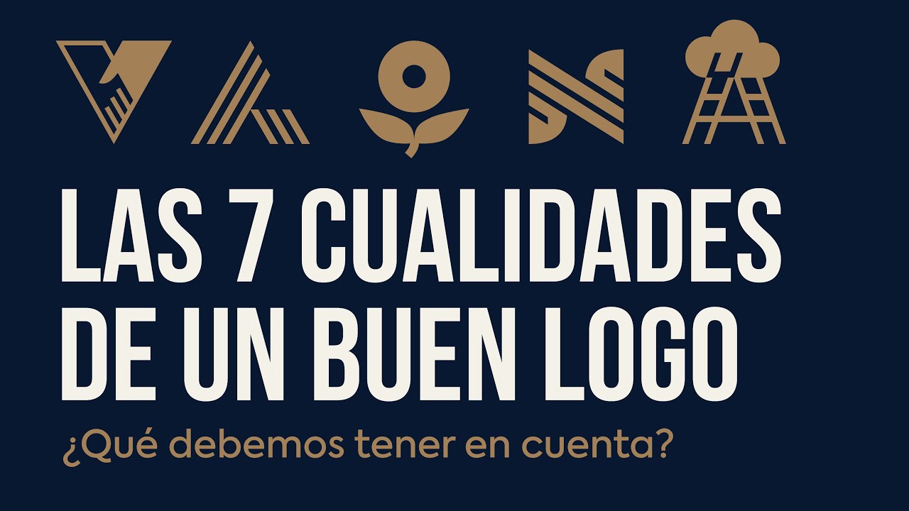
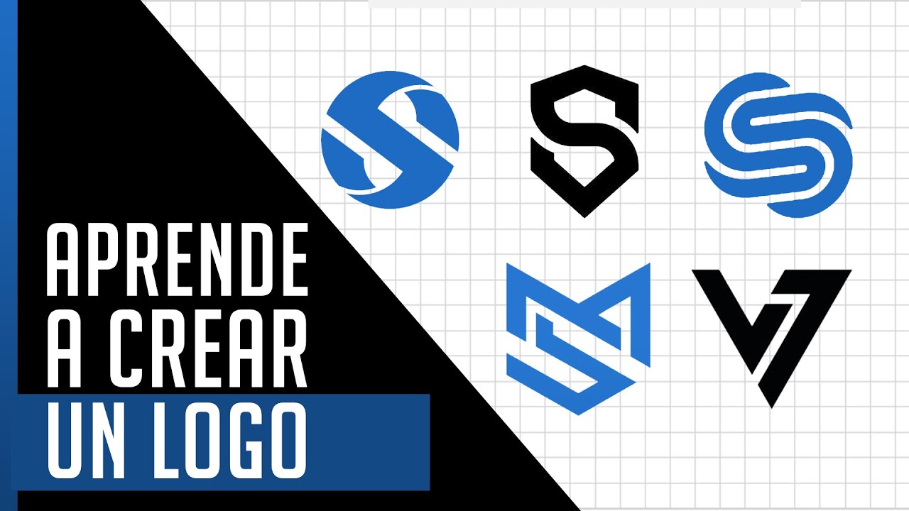
Hello public! What makes a really good logo? Although designing a logo may seem simple, the truth is that finding a perfect result requires time and dedication.
“Hitting the nail on the head” is not something that is usually achieved quickly. In today's video, we are going to review this fascinating creative process and discover the 7 keys to logo design, which will help us stand out and connect with our audience. Come on, let's get on with it!
Today's video has a surprise I was looking forward to showing you. BenQ has contacted me again, so that I can show you this huge monitor in the next 90 seconds. It is the PD3220U model, and I have to tell you.
. . what a gem!
A monitor that BenQ has designed especially for graphic designers, and with many details designed for Mac users, so pay attention! Quite a professionally designed 32-inch and 4K monitor, but let's analyze this impressive screen in a little more detail. It has a wide range space, with which we can make use of 100% of the sRGB or Rec.
709 color space, and up to 95% of the P3 with IPS technology, thanks to which we achieve a very wide viewing angle. Each monitor comes individually pre-calibrated from the factory, and includes a letter with the certification report, but the screen also comes configured so that the colors perfectly match those of the Macbook and Macbook Pro. And it's not just that, the PD3220U monitor also has AQCOLOR technology, developed by BenQ and aimed at maintaining high precision in the reproduction of creative works in graphic design or video editing, where the screen also supports HDR technology.
From the BenQ Display Pilot application, we can modify many other options. And activate M-Book mode for Mac users. Regarding its connectivity, there would be a lot to comment on, but I will highlight that it has two USB-C ports with Thunderbolt-3 connectivity for ultra-fast synchronization.
And as expected, this monitor also has its own Hotkey Puck, a device with which we can specify many options and store 3 shortcuts to the functions we want. The PD3220U is a comfortable and super flexible monitor, we can move it vertically with a very smooth movement. And from it's main support you can regulate the height and its inclination, of course.
An ergonomic design to create comfortably in our ideal position. And don't forget, new buyers of BenQ SW and PD series products can get a free year of the new Pantone Connect Premium. It is a platform that allows us to access more than 15,000 Pantone colors, as well as other color-related functions, from mobile, web and design applications, such as Adobe Creative Cloud.
You know, if you are looking to change your monitor, you should consider taking a look at this model: the BenQ PD3220U monitor. Let's continue ;-) If you have seen some of my previous videos, you will know that the logo is a fundamental piece in any brand identity. Whether you are designing your own logo or entrusting this task to a graphic designer, these 7 keys will be of great help to evaluate if the result is going in the right direction or if there is some room for improvement.
But stop, stop, stop. . .
before we dive into the details, please, I want to make it VERY, VERY clear that these 7 keys are not an exact science, and that the best logo for a given project does not have to be the one that strictly follows these keys, but the logo that is conceived taking into consideration the context of each company and each situation. In fact, you will be able to see that perhaps some logos presented during this video do not comply with all 7 at the same time. .
. So come on, making this clear, let's learn the 7 keys to logo design. #1 should be SIMPLICITY.
A good logo needs to be simple. It should be clean and clear. The ideal would be to avoid adding decorative or superficial elements.
Think that a logo is nothing more than a “graphic identifier” of an abstract concept such as a brand. So perhaps it would be better not to choose to include decorative or superficial elements that could hinder the communication of the message. So, review your design and reflect.
If an element diverts attention from what is important, it may be more appropriate to delete it. These are some great examples of brands that have simple and clear logos in their identities. You surely recognize them.
Moreover, if we focus on some of these brands and study how their logos have evolved over time, we will see that many have chosen to simplify their forms. And they have evolved this way because simplicity has many advantages. Think that simple logos tend to be easier to remember, favoring their retention; and also that simple shapes help with correct scalability and adaptability, for example when we need to reproduce the logo in very different sizes and proportions or under a single ink or color.
Don't worry, you will see it more clearly as the video progresses. Key #2 would be ORIGINALITY. I think this one is pretty obvious, right?
The logo needs to be distinctive. It must be original, easily remembered and recognizable. By this we mean that you need to focus on being different and unique compared to the rest of the companies in our sector.
Think that the more distinctive and original a logo is, the more likely it will be remembered, and that it will be positioned in people's heads before other brands of your competition. The more original and distinctive a logo is, the more identifiable and recognizable it is. For this specific key, I think that technology companies can be a great example to watch.
We are interested in knowing how they use their logo and their identity to get ahead in a sector of constant change. But perhaps we cannot say the same about some brands in the luxury sector, which in recent years have been simplifying their logos even further towards plain or more minimalist fonts, thus indirectly contributing to eliminating part of their originality. This trend is called BLANDING, and perhaps we will cover it in a new video.
Key #3 would be REPRESENTATIVENESS. When we are developing a logo, it is important that we always keep in mind the context of the company or organization that we are looking to identify. A good logo should be able to be placed under the umbrella of a brand, to help reinforce the message that is intended to be sent from its visual identity.
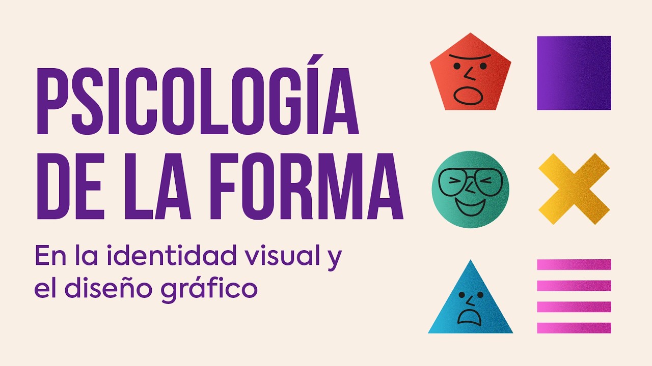
Now, we know that within a logo we cannot synthesize all the values or messages that a brand would want to communicate. But we can work so that its development is representative of its personality, and because its shapes can evoke some positive concepts more related to it: how we can achieve, for example with the help of the Psychology of form, Another video that you can review when you finish with this one ;-) That is why we must put special emphasis when designing a good logo, and avoid taking paths or graphic resources that have nothing to do with the personality of the brand or its history. A good logo should focus on ideas or concepts that are representative or defining of the brand, and by also looking to simplify it, is where we can encounter some difficulty.
Let's look at it in a different way. You remember this MTV logo, right? Do you think the personality of the project would be represented the same if it were the following way?
Would it connect in the same way with its audience? And what about the McDonalds logo? If its symbol / isotype had another shape, it wouldn't reflect part of the company's history and its famous golden arches, right?
You know, go for graphic resources that connect more with the personality and history of the brand. We will be able to represent it better and give more meaning to our logo. Let's go with key #4: SCALABILITY.
We live immersed in an era characterized by the omnipresence of social networks and constant digital interaction. All of this has led to adaptability being consolidated as a crucial factor for any visual identity, and logos are no exception. A good logo needs to be reproducible at any size and adaptable to various formats.
This key is directly related to the simplicity of the logo, of course. The fewer decorative elements and simpler shapes, the fewer scalability problems we will encounter and the more guaranteed its reading will be. Because when we say that a logo needs to be scalable, we mean that it should be reproducible at various sizes without losing legibility: from a small embroidery to a sign for the entrance of a building.
When making smaller scales, notice that their shapes or text can be read and recognized without difficulty. If your logo has a typography, do not forget to check this point and carry out all the tests you need to guarantee correct scalability. Pay attention to the thickness of the layout and that the characters are not too close together.
And as I imagine you already know, to comply with the scalability key, it is important that the logo is always developed as a vector image. And don't overlook its adaptability. Nowadays logos also need to be able to adapt to very varied proportions.
Key #5 would be MEMORABILITY. Does this word sound familiar to you? Let's quickly see how the Royal Academy defines it.
Memorability is the ability of any visual form to capture attention and be remembered by the viewer. A good logo needs to be remembered. It needs to be memorable, leaving a mark in the memory of whoever observes it.
This key is also directly related to simplicity. Think about it, a very ornate logo, or one with many elements, will be more difficult to retain in memory than a simple one, don't you think? Here I leave you some examples of logos, which I consider to be very memorable.
And regarding this point, would you like to know if any of your logos maintain a good or bad memorability? There is a very simple exercise to do with family and friends to study the memorability of a logo. You can summon them all and show them the logo you have designed for a short period of time, for example for 10 seconds.
After a few days, ask them to draw the logo shown on a piece of paper and assess how much they remember about it. We are interested in knowing long-term memorability, so it is important that you ask after a few days. #6 and penultimate key is DURABILITY.
By durability I mean the ability of your logo to be more durable over time than you, despite fashions, trends and changes of decade. Whenever possible, of course, study the needs that the brand could have in the future. And when you think you're done with your design, stop for a moment and think about whether you're 100% sure that it won't need any more changes in the future.
I advise you because changing a logo is not only an extra cost for the company, but it can greatly confuse your audience. And we already know that if a company opts for a bad logo, it is very likely that sooner or later they will have to redesign it, with the costs of time, money and resources that this involves. Here you can see brands that chose to change their logo, in some cases very few years apart.
And here you can study all these others, which do have appropriate durability, and have been used for years without hardly updating them. Remember: a logo should not be based on fashion, its design needs to respond to justified reasons. And the key #7, but no less important, would be RELEVANCE.
A good logo could try to evoke concepts that allow us to connect with our audience in a more positive way. Because your logo design needs to be attractive to your target audience. It must be relevant, as we seek to make an impact to get your attention.
That's why it's important for you to know well who the brand is targeting and to have the audience profile correctly defined. Mattel's Barbie logo is an example of a logo relevant to its target audience. Although today it may seem somewhat cliché, with the pink and the lettering the original logo directly impacted a percentage of the young female audience who might be interested in its product.
Or the Twitch logo could be another great example to study, which with the help of the shapes of its typography manages to evoke a feeling of nostalgia and drag us back to that time when video games began. Sometimes it is difficult to leave your subjectivity aside and try to have a critical eye. Maybe the variant that works best is not the one you like the most, but it is important to always make thoughtful decisions and strive to find a balance between aesthetics and practicality.
In conclusion, when designing a logo, opt for it to be. . .
SIMPLE, ORIGINAL, REPRESENTATIVE, SCALABLE, MEMORABLE, DURABLE and RELEVANT. Don't forget these 7 keys that a good logo will ideally have. And we are reaching the end of the video.
Do you think I've left any other keys along the way? Please share it with everyone in the comments. Don't forget to give me a Like if you found these minutes of your time useful, and subscribe if you don't want to miss my next videos.
Be good and good luck with those logo designs! See you later!


![✏️ Como hacer tu LOGOTIPO en 5 Minutos con Adobe ILLUSTRATOR 🔥 [3 Mejores formas]](https://img.youtube.com/vi/YRHHqRkj2-Q/maxresdefault.jpg)
![Las 5 MEJORES paginas de IA PARA CREAR LOGOS [ 100% GRATIS ] Tutorial de crear imágenes con IA](https://img.youtube.com/vi/2-8uL22aIy8/maxresdefault.jpg)