SPEAKER: Storytelling is the oldest form of teaching. Humans have been sharing knowledge through stories for tens of thousands of years, back when TVs and computer screens were the walls in a cave. In fact, scientists have confirmed that cave paintings were created by early humans who used their art to convey the stories of their imaginations.
Today, storytelling is still the most natural form of education. That's because stories make learning easier by helping us process and remember information. Everyone tells stories, even if we're just sharing how our day went with a friend.
Many experts believe that human brains automatically organize events with a beginning, a middle, and an end. Thinking about things in this way, like stories, helps us make sense of the past, the present, and the future. On top of that, stories also help us relate to other people and create important human connections.
It's no wonder that people are so captivated by stories. Over the course of history, many important inventions have changed how stories are told. For example, the invention of the printing press led to newspapers, magazines, and books.
The invention of motion picture camera made movies possible. And soon we had TV-- videos, on demand, and streaming services that let us enjoy all kinds of stories anywhere, any time. The invention of data visualization tools changed the way people tell stories once again.
As you've learned, data visualization is the representation and presentation of data to help with understanding. Coming up, you'll discover how to use data visualization to transform data into a meaningful story that people connect to and care about. You'll also start working with dashboards and dashboard filters.
A dashboard is a tool that organizes information, typically from multiple datasets, into one central location for tracking analysis and simple visualization through charts, graphs, and maps. And just like filters and spreadsheets and queries, a dashboard filter is a tool for showing only the data that meets a specific criteria while hiding the rest. Soon, you'll know how to use these tools to tell stories that motivate and persuade people to take action based on the data you present.
Finally, you'll understand the key attributes of data-driven stories and effective ways to communicate them in all sorts of business situations. Ready to become an expert storyteller? Then let's turn to the next chapter of your data analytics story.
[MUSIC PLAYING] Stephen Few, an innovator, author, teacher, and data visualization expert once said, "Numbers have an important story to tell. They rely on you to give them a clear and convincing voice. " Facts and figures are very important in the business world, but they rarely make a lasting impression.
To create strong communications that make people think and convince them to take action, you need data storytelling. Data storytelling is communicating the meaning of a data set with visuals and a narrative that are customized for each particular audience. A narrative is another word for a story.
In this video, you'll learn about data storytelling steps. These are, engage your audience, create compelling visuals, and tell the story in an interesting way. Here's an example from the music streaming industry.
Some companies send their customers a year-in-review email. It highlights the songs the users have listened to most, and sometimes congratulates them for being a top fan of a particular artist. This is a much more exciting way to share data than just a printout of the customer's activity.
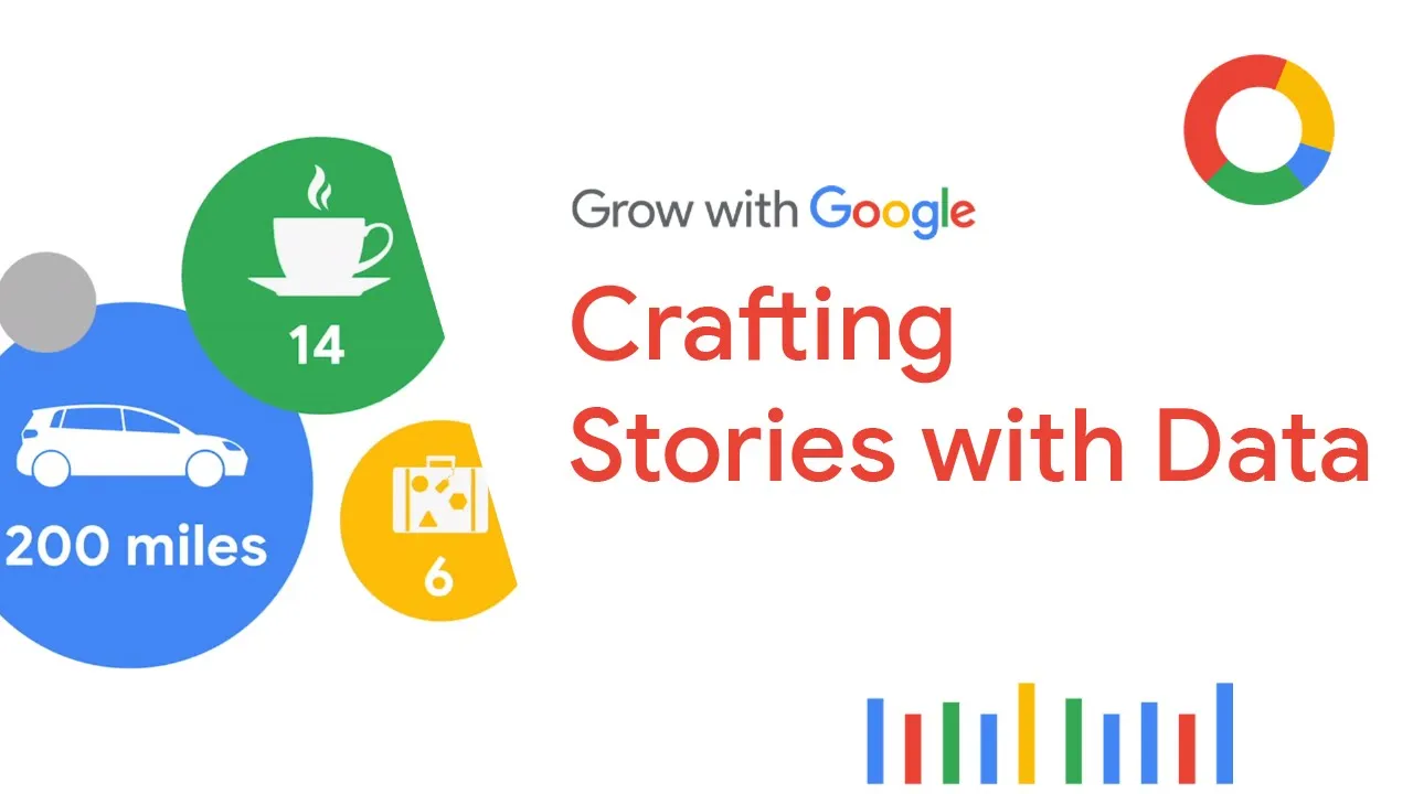
It also reminds the listener about how much time they spend enjoying the service, a great way to build customer loyalty. Here's another example. Some ridesharing companies are using data storytelling to show their customers how many miles they've traveled and how that equals spending less money on gas, reducing carbon emissions, and saving time they might otherwise have spent fighting traffic.
It makes it really easy for the rider to clearly see the value of the service in this simple and fun visual. Data stories like these keep the customer engaged and make them feel like their choices matter because the companies are taking the time to create something just for them. And importantly, the stories are interesting.
Knowing how to reach people in this way is an essential part of data storytelling. Images can draw us in at a subconscious level. This is the concept of engaging people through data visualizations.
So far, you've been learning about the importance of focusing on your audience. Coming up, you'll keep building on that knowledge. You'll discover that there are three data storytelling steps.
And the first is knowing how to engage your audience. Engagement is capturing and holding someone's interest and attention. When your audience is engaged, you're much more likely to connect with them and convince them to see the same story you see.
Every data story should start with audience engagement. All successful storytellers consider who's listening first. For instance, when a kindergarten teacher is choosing books for their class, they'll pick ones that are appropriate for five-year-olds.
If they were to choose high school-level novels, the complex subject matter would probably confuse the kids, and they'd get bored and tune out. The second step is to create compelling visuals. In other words, you want to show the story of your data, not just tell it.
Visuals should take your audience on a journey of how the data changed over time or highlight the meaning behind the numbers. Here's an example. Let's say a cosmetic company keeps track of stores that buy its product and how much they buy.
You could communicate the data to others in a spreadsheet like this. Or you could create a colorful visual, such as this pie chart, which makes it easy to see which stores are most and least profitable as business partners. That's a much clearer and more visually interesting approach.
Now, the third and final step is to tell the story in an interesting narrative. A narrative has a beginning, a middle, and an end. It should connect the data you've collected to the project objective and clearly explain important insights from your analysis.
To do this, it's important that your data storytelling is organized and concise. Soon, you'll learn how to do that using Slides for a discussion during a meeting and a formal presentation. We'll discuss how the content, visuals, and tone of your message changes depending on the way you're communicating it.
And speaking of business communications, one of the many ways that companies use visualization to tell data stories is with word clouds. Word clouds are a pretty simple visualization of data. These words are presented in different sizes based on how often they appear in your dataset.
It's a great way to get someone's attention and to unlock stories from big blocks of text where each word alone could never be seen. Word clouds can be used in all sorts of ways. On social media, they can show you which topics show up in posts most often.
Or you can use them in blogs to highlight the ideas that interest readers the most. This word cloud was created using text from the syllabus of this course. It tells a pretty engaging story, where data, analytics, analysis, SQL, and spreadsheets are, unsurprisingly, some of the lead characters.
All right, let's continue turning the pages of your data analytics story. There's lots of action and adventure to come. [MUSIC PLAYING] When you want to communicate something to others, a great story can help you reach people's hearts and minds and make them more open to what you have to say.
In other words, stories make people care. As you learned before, the first of the three data storytelling steps teach us that, for a story to be successful, you need to focus on who's listening. Data analysts do this by making sure that they're engaging their audience.
That's what we'll explore together now. First, you need to know your audience. Think back to the example of telling someone a joke they've heard many times before and expecting them to laugh at the punchline-- not likely.
To get the response you're seeking, you've got to understand your audience's point of view. That means thinking about how your data project might affect them. It helps to ask yourself a few questions.
What role does this audience play? What is their stake in the project? And what do they hope to get from the data insights I deliver?
Let's say you're analyzing readership data from customers to help a magazine publisher decide if they should switch from quarterly to monthly issues. If your stakeholder audience includes people from the printing company, they're going to care because the change means they have to order paper and ink more frequently. They also might need to assign more staff members to the project.
Or if your stakeholders include the magazine authors and editors, you'll want to keep in mind that your recommendations might change the way they work. For instance, they might need to write and edit stories at a faster pace than they're used to. Once you've considered the answers to those questions, it's time to choose your primary message.
Every single part of your story flows from this one key point. So it's got to be clear and direct. With that in mind, let's think about the key message for the data project about our pretend magazine.
Maybe the readership data from customers shows that print magazine subscriptions have been going down recently. You discover, in survey data, that this is mainly because readers feel the information is outdated. So this finding suggests that readers would probably appreciate a publication cycle that gets the information into their hands more often.
But that's not all. Your reader survey data also shows that readers prefer shorter articles with quick takeaways. The data is generating a lot of possible decision points.
The volume and variety of information in front of you may feel challenging. So to get the key message, you'll need to take a few steps back and pinpoint only the most useful pieces. Not every piece of data is relevant to the questions you're trying to answer.
A big part of being a data analyst is knowing how to eliminate the less important details. One way to do this is with something called spotlighting. Spotlighting is scanning through the data to quickly identify the most important insights.
There are many ways to spotlight, but lots of data analysts like to use sticky notes on a whiteboard, kind of like how archaeologists make sense of the artifacts they discover in a dig. To do this, you write each insight from your analysis on a piece of paper, spread them out, and display them on a whiteboard. Then you examine it.
It's important not to get bogged down in every tiny detail. Instead, look for broad, universal ideas and messages. Try to find ideas or concepts that keep popping up again and again or numbers and words that are repeated often.
Maybe you're finding things that look like they're connecting or forming patterns. Highlight these items or group them together on your whiteboard. Next, explore your discoveries.
Find the meaning behind the numbers. The idea is to identify which insights are most likely to help solve your business problem or give you the answers you've been seeking. This is how spotlighting can lead you to your key message.
Remember to keep your key message clear and concise, as an overly long message, like this one shown on screen, has less chance of conveying the most important conclusion. Here's a clear, concise message that's likely to engage your audience because it's short and to the point. Of course, no matter how much time and effort you put into studying your audience, you can't predict exactly how they'll react to your recommendations.
But if you follow the steps we're discussing, you'll be much more likely to have good results. [MUSIC PLAYING] Have you ever been driving a car when one of the warning lights on the dashboard suddenly comes on? Maybe the gas gauge starts blinking because you're getting low on fuel.
It's handy when you have that alert right in front of you clearly showing you that you need to pay attention to your gas level. Can you imagine if cars didn't have dashboards? We'd never know if we're about to run out of gas.
We'd have no idea if our tire pressure was low or if it was time for an oil change. Without dashboards, if our car started acting differently, we'd have to pull out the user manual, sift through all that information inside, and try to figure out the problem ourselves. Car dashboards make it easy for drivers to understand and respond to any issues with their vehicles because they're constantly tracking and analyzing the car's status.
But as you've been learning, dashboards aren't just for cars. Companies also use them to share information, get people engaged with business plans and goals, and uncover potential problems. And just like a car's dashboard, data analytics dashboards take tons of information and bring it to life in a clear, visually interesting way.
This is extremely important when telling a story with data, which is why it's a big part of number two in our three data storytelling steps. You've learned that a dashboard is a tool that organizes information from multiple datasets into one central location for tracking, analysis, and simple visualization through tables, charts, and graphs. Dashboards do this by constantly monitoring live, incoming data.
As we've been discussing, you can make dashboards that are specifically designed to speak to your stakeholders. You can think about who will be looking at the data and what they need from it and how often they'll use it. Then you can make a dashboard with the perfect information just for them.
This is helpful because people can get confused and distracted when they're presented with too much data. A dashboard keeps things neat and tidy and easy to understand. When designing a dashboard, it's best to start simple with just the most important data points.
And if, later on, you discover something's missing, you can always go back and tweak your dashboard or create a new one. An important part of dashboard design is the placement or layout of your charts, graphs, and other visuals. These elements need to be cohesive, which means they're balanced and make good use of the space on the dashboard.
After you decide what information should be on your dashboard, you might need to resize and reorganize it so it works better for your users. One option in Tableau is choosing between a vertical or horizontal layout. A vertical layout adjusts the height.
A horizontal layout resizes the width of the views and objects it contains. Also, as you can see here, evenly distributing the items within your layout helps create a clear and organized data visual. You can select either tiled or floating layouts.
Tiled items are part of a single-layer grid that automatically resizes based on the overall dashboard size. Floating items can be layered over other objects. In this example, the map and scatter plots are tiled.
They don't overlap. This really helps make clear what the data is all about, which is valuable because the majority of people in the world are visual learners. They process information based on what they see.
That's why sharing your dashboards with stakeholders is such a valuable practice. Now, there's something important to keep in mind about that. Sharing dashboards with others likely means that you'll lose control of the narrative.
In other words, you won't be there to tell the story of your data and share your key messages. Dashboards put storytelling power in the hands of the viewer. That means they'll craft their own narrative and draw their own conclusions.
But don't let that scare you away from being collaborative and open. Just understand the risks that come with sharing your dashboards. After all, sharing information and resources means that you'll have more people working on the solution to a big problem or coming up with that next big idea.
This leads to more connections, which can result in really exciting new practices and innovations. [MUSIC PLAYING] So far, we've focused a lot on understanding our audience. Whether you're trying to engage people with data storytelling or creating dashboards designed for a certain person or group, understanding your audience is key.
As you've learned, you can make dashboards that are tailored to meet different stakeholder requirements. To do this, it's important to think about who will be looking at the data and what they need from it. In this video, we'll continue exploring how to create compelling visuals to tell an interesting and persuasive data story.
One great tool for doing this is a filter. You've learned about filters and spreadsheets and queries. But as a refresher, filtering means showing only the data that meets a specific criteria, while hiding the rest.
Filtering works the same way with dashboards. You can apply different filters for different users, based on their needs. Tableau lets you limit the data you see based on the criteria you specify.
Maybe you want to filter data in a data set to show only the last six months. Or maybe you want to see information from one particular customer. You can even limit the number of rows or columns in a view.
To explore these options, let's return to our World Happiness example. Say your stakeholders were interested in only a few of the topics that affect overall happiness. Filtering for just gross domestic product, family, generosity, freedom, trust, and health, and then creating individual scatter plots for each would make this possible.
You can also use filters to highlight or hide individual data points. For instance, if you have a scatterplot with outliers, you may want explore what your plot would look like without them. However, note that this is just an example to show you how filters work.
It's not OK to drop a data point just because it's an outlier. Outliers can be important observations, sometimes even the most interesting ones. So be sure to put on your data detective hat and investigate that outlier before deciding to remove it from your dashboard.
Here's how to do it. To filter data points from the view, we can choose a single data point or Click and Drg in the view to select several points. Let's choose just one.
Then, on the Tooltip that appears, we'll select Exclude to hide it. Or we could have chosen to do it the other way by keeping only selected data points. Here's another example.
If your data is in a table, you can filter entire rows or columns from your view. To do this, we'll select the rows we want in the view. Then, on the Tooltip that appears, we'll choose to keep only those countries.
Again, we could have also selected the data points we wanted to exclude and picked that option instead. Or if you like, we can even pre-filter a Tableau dashboard. This means that your stakeholders don't have to filter the data themselves.
Basically, by doing the filtering for them, you can save them time and effort and direct them to the important data you want them to focus on. Personally, I think the best thing about filters is they let you zero-in on what's important. Sometimes I'm working with a huge dataset, and I want to concentrate only on a specific area.
So I'll add a filter to limit the data displayed on my dashboard. This cuts the clutter and gives me a simple, clear visual. I use filters a lot when working with data about advertising campaign performance.
Filters help me isolate specific tactics such as Search or YouTube ads to see which ones are working best and which ones could be improved. By limiting and customizing the information I'm looking at, it's much easier for me to see the story behind the numbers. And, as I'm sure you've noticed.
I love a good data story. As a data analyst, you'll often be relying on spreadsheets to create quick visualizations of your data to tell your story. Let's practice building a chart in a spreadsheet.
To follow along, use the Spreadsheet link in the previous reading also included in the video. We'll be using Google Sheets. So this might look a little different in other spreadsheet platforms like Excel.
We'll begin by filtering just the data on how many customers purchase Basic, Plus, or Premium software packages. To start, select the column for the Software package, and Insert a Chart. The spreadsheet suggests what it thinks is the best type of chart for our data.
But we can choose any type of chart you'd like. Spreadsheet charts also let you assign different styles, access titles, a legend, and many other options. Feel free to explore the different functionality later on.
We'll also cover this more in a reading. There's lots of different options to choose from. Let's say we also have data on which countries our customers are from and their overall satisfaction score for the software they purchased.
First, highlight columns A and B. Then click on Insert, and then Chart again. Under Chart Type, you'll want to select the first Map option.
Voila. Now we have a map that summarizes the customer survey scores by country. We can also customize this chart by clicking Customize in the top-right corner.
Let's say we wanted to change our colors from red and green to a gradient so it's more accessible. We can do that by clicking Geo, and then change the Min color to the lightest shade of blue, the Mid color to the middle shade of blue, and the Max color to the darkest shade of blue to show the spectrum of scores from low to high. Now, we have a map chart that shows where respondents are most satisfied with their software in dark blue and least satisfied with their software in light blue.
And this will be easier for anyone in our audience with color vision deficiencies to understand. Tableau and spreadsheets are common tools for creating data visualizations. By using their built-in functionalities, like filters and charts, you can zero-in on what information is most important and create compelling visuals for your audience.
And now that we've explored some ways to create visuals, it's time to start preparing our data narrative. Coming up, we're going to talk more about telling stories with data and organizing presentations. I'll see you soon.
[MUSIC PLAYING] Businesses everywhere know the power of using data to solve problems and achieve goals. But all the data in the world won't get you anywhere if your stakeholders can't understand it or if they can't stay focused on what you're telling them. So you want to create presentations that are logically organized, interesting, and communicate your key messages clearly.
An effective presentation supports your narrative by making it more interesting than words alone. It starts with how you want to organize your data insights. The narrative you share with your stakeholders needs characters, a setting, a plot, a big reveal, and an aha moment, just like any other story.
The characters are the people affected by your story. This could be your stakeholders, customers, clients, and others. When adding information about your characters to your story, you have a great opportunity to include a personal account and bring more human context to the facts that the data has revealed.
Think about why they care. Next up is the setting, which describes what's going on, how often it's happening, what tasks are involved, and other background information about the data project that describes the current situation. The plot, sometimes called the conflict, is what creates tension in the current situation.
This could be a challenge from a competitor, an inefficient process that needs to be fixed, or a new opportunity that the company just can't pass up. This complication of the current situation should reveal the problem your analysis is solving and compel the characters to act. The big reveal, or resolution, is how the data has shown that you can solve the problem the characters are facing by becoming more competitive, improving a process, inventing a new system, or whatever the ultimate goal of your data project may be.
Finally, your aha moment is when you share your recommendations and explain why you think they'll help your company be successful. When I'm working on a presentation, this is where I like to start, too. Using these basic elements to outline your presentation can be a great place to start, and they can help you organize your findings into a clear story.
And once you decided on these five key parts of your story, it's time to think about how to pair your narrative with interesting visuals because, as you're learning, an interesting and persuasive data story needs interesting and persuasive visuals. Coming up, you'll learn even more about how to be an expert data storyteller. [MUSIC PLAYING] Now that you know how to prepare the key parts of your data story-- the character, setting, plot, big reveal, and the aha moment-- it's time to think about the visuals and how your slideshow should look.
It's always good to remember that your presentation reflects on you. If it's messy, disorganized, or full of images that don't support your story, your audience could easily lose confidence in your results and recommendations. On the other hand, if your slideshow looks professional and appealing, you've got a better chance to capture your audience's attention and keep them focused on your main points.
Themes are a great tool for this. They control the color, font types and sizes, formatting and positioning of text and visuals. Some themes are fun or creative, while others have a more professional look.
By choosing a theme that matches the tone and information you're communicating, your presentation will have a consistent look and support the argument you are trying to make. Next comes the title. It's good to include a title and subtitle that describe what you're about to present.
You should include the date of your presentation too, especially if you're including data that's likely to change over time. Specifying a date, such as a date created or date last updated, gives anyone viewing your presentation important context. A good slideshow guides the audience through your main communication points.
But it doesn't repeat every word you say or give a lot of written information. Part of your job is to choose what information to include. This might be a description of what's being shown in a visual, the first step in a process, a set of directions, or an important message that you want to be sure your audience understands and remembers.
Also, be sure to adjust the font size so your audience can easily read what you've written. A good rule is to keep text to less than 5 lines and 25 words per slide. Basically, you want your audience focused on what you're saying, not busy reading the slides.
Also, choose your words carefully. It's always smart to avoid slang terms, abbreviations that people might not know, and words or phrases that are specific to one particular region. Now, let's discuss visuals.
Visuals help the audience quickly understand the content of each slide. They can help you make a point in a way that words might not be able to alone. Great visuals don't leave room for interpretation, because the meaning is instantly understood.
When you include visuals on a slide, try not to share too many details all at once. Choose just the data points that support your points, especially your key message. I like to ask myself, what's the single most important thing I want my audience to learn from my analysis?
That helps me decide which visuals will be most likely to get the point across. If you have several important things you need to include, don't cram them all on one slide. Instead, create a new visual for each point.
Then add an arrow, a callout, or another clearly labeled element to direct your audience's attention toward what you want them to look at. And finally, when you get to your big reveal and aha moment, your visuals must communicate these messages with clarity and excitement. These are the most powerful discoveries from your analysis.
Make it feel that way. Before you go, there's one last thing I'd like to share. It's a quick tip for knowing when to copy and paste, link, or embed a visual into a slideshow.
This can be challenging for new data analysts, but there are some simple points to keep in mind. When you copy and paste a visual into your presentation, you can edit it directly within your slideshow. If your visual or its data points exist in other places, such as a Tableau dashboard, any changes you make will not affect them there.
Now, this also means your visuals won't be updated if the original dataset changes. This means your visual might not be reflecting the latest information. But if you link your visual within your presentation, the visual lives within its original file and the slideshow connects to it with the visual's URL.
Because the two files are now linked, when you make changes to the original file, say a spreadsheet, the changes will automatically appear in your presentation. This can be useful if the data is likely to change over time. Your slideshow will always be up to date.
Finally, an embedded object also lives in the original source file, but the difference is that it doesn't get automatically update if the source file changes. The embedded copy is completely independent. Similarly, you can make changes to it in your presentation without affecting the visual or data points from the original source file.
So the main difference between pasted, linked, and embedded objects has to do with where you store them and how you update them after you place them in your slideshow. Now that you're beginning to understand how to make great slideshows, take a few minutes to practice what you've learned. Create a new slideshow.
And select an appropriate theme. Add your text, visuals, and an exciting reveal at the end. Try pasting, linking, and embedding visuals from different sources to see how they behave differently.
You can design a presentation about any data set that interests you. It doesn't need to be long or have a ton of information. Just take the first steps, and have fun telling your own data story.
[MUSIC PLAYING] As a data analyst, communication is a big part of what I do. I'm very comfortable with it now, but that wasn't always the case. Early in my career, I wouldn't think very strategically about the meetings I organized, and I dreaded making presentations, even to small groups of people.
But with practice and experience, I've learned some things that can help any analyst become a better communicator. Data analysts need to know how to use all sorts of communication methods for sharing their data insights. In this video, we'll go over two common ways, informal meetings and presentations.
You'll learn how to adjust your visuals, tone, and the content of your message depending on that situation. Let's start with informal meetings. One of the best things about meetings is that they can get everyone on the same page and help get rid of any confusion.
Whether meetings are face-to-face or by phone or video, they also give people a great opportunity to ask questions, provide feedback, and brainstorm together. The problem is, people often complain that meetings are too long, not well prepared, don't lead to any action, or even that they're a complete waste of time. To help make sure your audience feels your meetings are valuable, follow these steps.
First, choose participants thoughtfully. Decide if your meeting would be most effective if it's large or small. And always consider if people will add value before inviting them to attend.
Once you've chosen the participants, give them plenty of advance notice so they're able to add your meeting to their schedules. In an informal meeting, you might not need to share any supporting documents or visuals. If you do, make sure to keep handouts to a minimum.
Give people concise, easy-to-read materials. If you're using a whiteboard or screen share, be sure all participants can see what you present. It helps to use the skills you learned in earlier videos about creating effective visuals and slideshows.
When speaking with groups of people in a meeting, make sure people feel involved. Make eye contact. Ask for feedback.
And encourage discussion. It's also a good idea to ask someone to take notes, or have a way to take notes yourself in case something comes up that you want to work on later. Keep an eye on the clock.
When you get to 5 or 10 minutes before the end, recap the meeting's events. Include any decisions made and next steps so they're fresh in people's minds when they leave. And always thank your participants for their time and contributions.
OK, now let's switch over to presentations. Presentations are more formal, generally involve a large group of people, and should include visual aids. And as you've learned, when you've written a compelling story with well-designed visuals, you'll have a great opportunity to engage your audience.
To start, it's important to be prepared, have an attention-grabbing opening, an interesting and persuasive story, and effective visuals. Let's start with preparation. Being prepared is key.
It's only natural to get nervous when you're standing up in front of a crowd. But if you practice and organize your thoughts, you're much more likely to be successful. As you're preparing, always think about whom you're speaking to, why they care about your topic, and what they're probably hoping to learn from your presentation.
Next, think about your opening. You can grab people's attention with a surprising statistic, an inspiring quote, or a thought-provoking question. This gives your presentation an easy-to-follow structure.
As we've been discussing, it helps to break down your presentation into three simple sections. Your data story-- it needs a beginning, a middle, and an end. Again, remember what you've learned about good slideshows.
They should support your story, not be the story. Your presentation should include evidence that backs up your messages, including facts and quotes. Always try to look at your audience, not your slides, when speaking.
And just as with meetings, ask for feedback and encourage discussion. It's great to ask your audience for feedback. You can learn from them, too.
You might get some challenging questions. If that happens, it's OK to say you need some time to research the answer. The conclusion of your presentation is when you loop back to your original statement and give the audience some key takeaway and next steps.
Finally, don't be afraid to mess up. The fear of a mistake can make you incredibly nervous. Whether you're presenting in a casual gathering with people inside your own company, speaking at a more formal meeting with a client or partner, or another audience altogether, be sure to practice and get feedback from your team first.
This will help build your confidence and calm your nerves during your presentation. And if something does go wrong, it's not the end of the world. Just be genuine.
Admit the mistake. And maybe even have a laugh. No one's perfect.
The important thing is that you proudly share your narrative. And the tools you've been learning-- data visualization, dashboards, filters, and more will help you make it a great story. By now, you can apply ways to present your data to help with understanding.
You can transform the data you present into something meaningful that people will connect with and actually care about. And you can apply different methods for organizing information from multiple datasets, turning them into simple visualizations. Most importantly, all of these skills will help you motivate and persuade people to take action based on your data insights.
This will make you an even stronger data analyst. You'll be more able to answer business questions, solve problems, and help take your company to a successful future. TONY: Congratulations on finishing this video from the Google Data Analytics Certificate.
Access the full experience, including job search help, and start to earn the official certificate by clicking the Icon or the Link in the description. Watch the next video in the course by clicking Here.