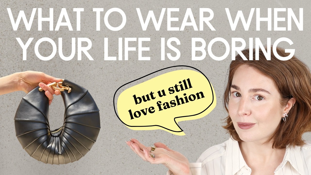
You've probably seen a million colorful outfit ideas online, but nobody really tells you why they work or why they don't. And let's be honest, you might still feel like colorful fashion is just not for you. Well, today I'm breaking down both the big mistakes and the small ones people make with a color and showing you exactly how to fix them step by step.
a little different than all the rest. I'm quite oldfashioned, wear a hat, sometimes play chess, and when I'm out, I'm looking. This could have been a long and detailed webinar, but think of this video as a shortcut, so buckle up.
It is going to be a very valuable and intense video. Let's get started. Outfit number one and mistake number one, the clash of undertones within the same color.
So, let's talk monochrome. And we're starting with something that I've been mentioning several times here on my YouTube channel, but let me explain why. So, let's talk monochrome.
People treat it like the holy grail of styling. It's all over Pinterest. But here's the truth.
It's actually one of the trickiest color palettes to pull off using just what you already own. Why? Because one color isn't just one color.
Different pieces can have different undertones and those undertones, they can clash badly. Like this dress, it's a warm green. Then I threw on this cooler undertone green scarf.
Especially these two pieces paired in one look. For me, it's a nogo combo. Just feels off.
I know a wool scarf with a satin dress, not ideal. But that's not the point. I'm just working with what I have in my wardrobe.
It's about the colors, not the fabrics. All right. So, how do we fix it?
And what does a good monochromatic color combination look like? So, check out this video clip. What do you see?
Some leaves are darker, some leaves are lighter. The ones closer to the light way brighter, but it's still the same hue of green. That's the key.
Let's take this little masterpiece from nature and see what it means for styling. So, I take one green and break it down into different levels of lightness, the same green, different tints and shades. That's how the perfect monochromatic palette should look like.
I just grab a random tint and a random shade of the same green and pair them. And don't stress about getting the teens to match perfectly. As long as the undertones are kind of similar, you're good.
And that's it. I love this outfit. It's perfect for that late spring elevated casual vibe.
And a very important side note here. So when I talk about nature as the ultimate creator, that's not because I love hiking or walking in the forest. That's not the point.
It's because as humans, we have evolved over tens of thousands of years surrounded by natural landscape. So for over I don't know 40,000 years this was the visual world we lived in. So whether we realize it or not our brains still respond to that.
We tend to see natural color combinations as the standard of beauty. So when something looks like it could have come straight from nature, it feels right. It feels balanced, familiar, thus beautiful.
Okay. Now, moving on. Outfit number two.
And this is something that might just actually blow your mind, so buckle up. Khaki green is actually not green at all. I know it looks greenish, but technically it's not.
Khaki is actually a dark desaturated yellow. Yes, yellow. And that's why pairing it with butter yellow, which by the way is the color of summer 2025.
That's why this color combination works so well. It's monochromatic, but still feels rich and layered, kind of unexpected, but super polished. And if you need a proof, here it is.
Look at the color map for yellow. If I push the tone towards the lighter end, you get butter yellow. Slide it towards the gray side, that's khaki.
Same base hue, totally different feel. All right, now let's finish up the look because this combination feels a little bit unfinished, like raw. So, I want to add something with contrast just to give it more dimension, more depth.
So, I'm throwing on a dark red cardigan and a bag to match. And that's it. Now we have got this super chic elevated vibe.
Still trendy but balanced out with some grounded classic colors. And I forgot to mention that all the fashion pieces I'm wearing here are linked down below in the description box along with all the needed information for you to recreate my outfits. I do not like to take lots of sponsors to support my channel.
So always remember that when you shop using my links, you support my team, you support my channel and we are moving on. Color mistake, I call it like a color trap you might fall into after watching all these tutorials, colorful tutorials here on YouTube. A complimentary color combination.
So a complimentary color combination is often seen as one of the most cohesive color palettes out there. Just pick two opposite colors on the color wheel and you're good to go, right? Well, not exactly.
There's a catch here. When you pair two pure opposite colors, it creates this super intense kind of aggressive vibe. That's why, by the way, sports brands love using their combos.
They want to energize you, push you to run that marathon or hit the gym. And that works for sports. But we don't really want that aggressive energy in our everyday styles, right?
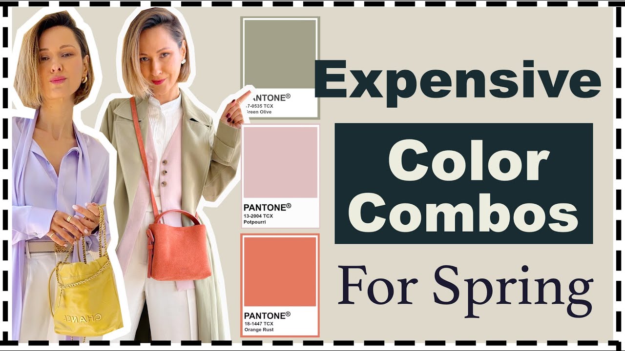
So here's how a chic and elegant complimentary color combination should look like. You take both colors but soften them. Instead of true red, go with a soft pink.
Instead of bold green, use something like pale sage. Same concept, just more refined. And then play with the proportions.
Avoid those harsh one one to one horizontal splits that create strong contrasting lines. Try a layout that's more like 80 to 20 if it's possible. Let one color lead and let the other support and vertical lines more work work better here I would say.
So this way the complimentary duo still works but it feels more delicate, more balanced and just way more chic. Let's take a closer look at this light pink. It's a such a great color for the spring summer season and it's all over the social media right now.
I'm following the same monochromatic approach we used with the first outfit. I'm breaking this warm red down into a monochromatic palette. So, I take one tint, one shade of the same warm red color.
That's it. And then I add white because honestly white is the best neutral for spring summer looks. And here we go.
A chic, soft and elegant color combo. Totally gives me flower vibes. Super easy on the eyes.
And the same approach but different duo of the same red color. Now I'm going with the same light tint of red, which is my beautiful light pink linen dress, but pairing it with a deeper shade. And here's how this color palette looks in action.
And I've got to say this one, this is hands down my favorite outfit in today's video. I'm layering a knead long line top over a linen dress. And yes, I know this kind of layering is not for everyone.
And it might not suit every body shape or every lifestyle, but my goal here is to inspire you to show you the full potential of the colors. And then you can look at your own wardrobe and ask yourself, okay, what do I have that could pull off this color combination in my way? And if you feel like recreating my outfits the way they are, you're so welcome to use my links.
And before we continue, just a gentle reminder, especially for those of you who are new to my channel, I have developed a very simple yet highly effective style quiz. Take this quiz. It will take just a few moments, answer a few questions, and you will get your personal wardrobe plan absolutely free right to your mailbox.
This plan is designed to help you understand what you might be doing wrong while shopping or while creating your outfits and guide you towards better style decisions. Follow the link in the description box and always remember that you are just one click away from transforming your style together with me and with my team. The next one is more like a motivational moment to get you to go for a color.
Beige and brown. It's a go-to combo for a lot of us. But take a look at this same outfit just with a touch of pigment added.
Beige turns into this soft apricot orange and brown. It shifts into a purpleish brown. Such a small change, but it brings so much more life, more energy, more personality.
I'm wearing a set from Mango. this slight orange shade that almost looks like beige, but it's not. And the top, also mango, is that rich purpleish brown.
Even indoors. No jacket, no bag, just the chunky bracelets, it still feels polished and chic. Think about that.
This color combo feels so rich and elegant. Totally reminds me of a thing. What about you?
What does it remind you of? Drp a comment and we're moving on. Okay, let's say you have put together that perfect monochromatic look.
Not tints with shades that I've mentioned earlier, but like a total match, same color top to bottom. Now the flip side of that especially in summer when we cannot rely on layering or heavy textures is that the combo can look a little bit flat. There is no contrast, no depth.
So here's my suggestion how I would fix this outfit, how I would elevate it, add contrast, but just in the accessories. I'm going with bright pumpkin orange, a bag, a bracelet, just a little pop to bring the outfit to life. And honestly, even indoors when all you have is the bracelet, it's still enough.
It keeps the whole look feeling intentional, polished, not boring. And the vibe kind of reminds me of a sunset in the warm season. That moment right before the shadows go totally black, they appear purpleish black with the orange sun at the horizon.
Oh my god, such a beautiful color palette. And here's the last one for today. Let's take a more specific approach to combining colors.
So, if you ask me, Elena, can I wear maroon with butter yellow and red and delicate pink all in one outfit? I'd say, yeah, technically those colors can work together. But here's the thing.
Why mix so many bold pigmented colors in one look? Sure, nature does it, but nature has infinite space. a whole field of flowers stretching from one horizon to the next one.
And our bodies tiny canvas by comparison is just a small canvas. So even if you are a color lover like me, I would say stick to three pigmented colors max in one look. Like here, I would swap the red flats for black ones and leave the outfit as it is.
That way you've got three pigmented colors. maroon, butter yellow, and pink. Playful, colorful, I would say pretty adventurous for many of us, but definitely cohesive.
Or flip it the other way around. Switch out the butter yellow top for a white one, and then you can still wear red ballet flats. Now you've got just two pigmented colors, red and maroon, and two neutrals, white and black.
So, the main takeaway here, if you love mixing colors, go for it. But stick to two or three pigmented colors max. Let the rest be neutrals.
Black, white, gray, whatever works for you. It's a foolproof way to keep your outfit bold without going over the top. And that's it for today.
I hope this inspired you to stop shying away from this beautiful, energizing world of colors. Drp a comment with your thoughts and share your ideas what you would love to see next on this channel. You know the drill.
Follow me here on YouTube, follow me on Instagram, and hit that notification bell because otherwise YouTube won't show you my updates. And see you in the next one.