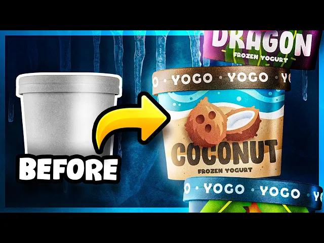
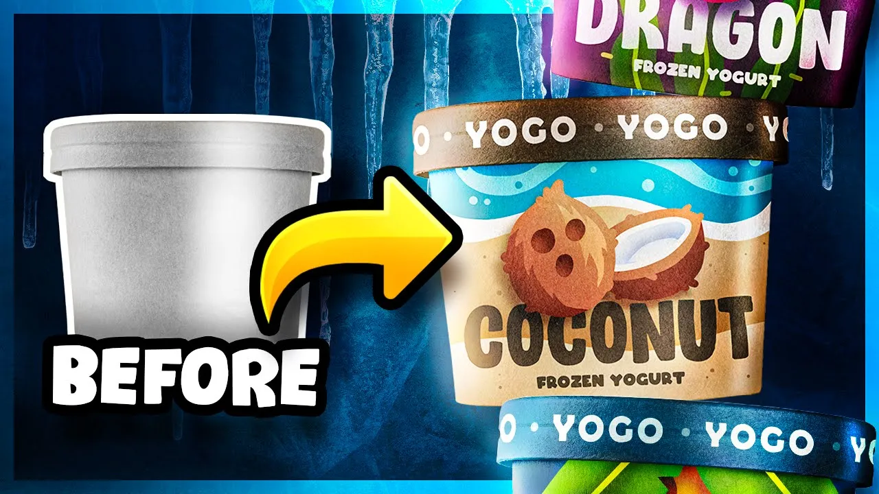
how's it going my friends welcome back i'm brandon and this channel is all about design i mainly make videos where i create designs from scratch and i take you along throughout the entire process so if that sounds like something you're interested in go ahead and hit that subscribe button now today we're gonna be diving into the wonderful world of frozen yogurt so this is the container our yogurt's going to be in i'm going to be designing the side of this package as well as the lid and you know i've actually had a lot of people
ask me where i get mock-ups like these at as well as some of the other image assets i use throughout my videos and so i actually get everything from adobe stock and that's a huge library of stock images with a ton of quality shots they've got mock-ups and images and vector graphics pretty much the works i really recommend it and i've actually got a link in the description that you can use to get your first month of adobe stock completely free that'll give you 10 free images right off the bat and that's plenty to get
started with and if you do use that length and purchase a monthly membership just like i do then i'll get a little kickback from that so if you want to help support the channel and get some free images while you're at it go ahead and click that link in the description now back to the project so i'm kind of imagining these frozen yogurt containers as being pretty small kind of like a snack sized treat you know you could eat as a quick dessert on the go and as for an overall brand i've always associated frozen
treats with really fun experiences like going to the beach or even just a warm summer day so i'm thinking we need to keep these really fun pretty colorful and using these exciting vibrant colors will really help us attract customers attentions as they walk through the store and look at all the different options there are now to kick things off we need to decide what pieces of content are going to go on the side here so i think we're definitely going to want a logo we'll probably want the words frozen yogurt somewhere on here so people
know what it is the actual flavor of the yogurt and then some type of visual representation of that flavor besides just the text now for that flavor i'm thinking we should go with something pretty tropical for this so how about banana and we'll probably want to make that pretty large on there since like i said these containers are going to be really small and we want people to easily be able to read this we might as well go ahead and capitalize that as well just to really help it stand out let's just slide this frozen
yogurt text right underneath that and we can make that a bit smaller since we want most of the focus to be on the actual flavor so i think i'm going to leave the logo out right now because i really just want to focus on the visual elements of this package and based on what we do with this we can come back in and add the logo in a place that makes sense so as for the visual part of this package what do we want to do you know i've done several packaging designs on this channel
that use realistic images of food which is a great way to showcase a product but why don't we try something a little different here instead of using images how about we make some custom illustrations i think that way we could give this brand a really fun stylized look and i actually think this will give us a lot more control over the amount of detail we have on here and that way everything will look good at this small scale so i think it's time to illustrate a banana and one thing i almost always recommend doing before
illustrating anything is to look at some reference images that way it'll help us pick out the core characteristics that make this object recognizable you know we don't need every piece of detail here we just need the major things so for our banana here easily the most iconic thing about it is the shape and i think even just from that most people will be able to guess that that's a banana but we can take it a step further and put in some of these secondary elements like these brown ends now it is feeling a little flat
right now so let's add in some depth looking at our reference you can see it's this hard edge right here that really helps give it that 3d shape now we could just draw a line representing that edge that just feels a little cartoony to me and still a bit flat so instead we can actually separate these two sections by using a different color for each of them and now we can simulate some light by removing some of this layer to form a gradient and one last thing i really like about a reference image here are
all these little spots on the banana peel so i think i may add a few of those in as well now we can just slide this right over here and i want to make sure this banana is pretty large on the package that way people can easily see it so i think to do that we're going to have to scoot our text down a little bit and we can squeeze this in right here now i do like the look of this little guy but i'm just not sure he has quite enough visual impact all by
himself so how about we give him some friends and in stores you usually buy bananas in clusters because that's how they grow on the trees so let's sum these together and speaking of trees i wonder if we could actually add the entire banana tree on here somehow that way we give the impression that these bananas are still growing on the tree meaning they were picked extremely fresh for this yogurt so this is what a banana tree looks like it's got this big husky kind of rough trunk with these long leaves that have all these slits
in them so if we're going to make this why don't we go ahead and start with these leaves and just like the banana i'm going to start out just by making a simple shape for these as you can see from the reference we have kind of a branch that runs down the middle of these leaves so i'm just going to make a simple shape to represent that and now for the slits and the leaves we obviously don't want so many because that would just be too much detail for this so i'll just make a handful
of slits in this to give it that similar effect just in a much more toned down way [Music] now normally looks like these leaves are a bit darker in the center and as you move outward it gets lighter and almost tends to more of a yellow color so to make that darkness in the center we can just simply give our stem a drop shadow and then we can just paint some nice light yellow around these edges and to make our tree we're definitely gonna need more than one leaf so i'm gonna make a few copies
of this but i'm gonna make some changes to each of them that way they don't all look exactly the same and now we want to lay these out so i'm thinking probably we'll just place them somewhere at the top like you know that's the top of the tree just span them out a little bit now we can move these bananas right up into the center here just like they're hanging down from the tree and of course our tree can't just be floating here so we need to give this a trunk if we remember back to
the reference the trunk was pretty rough it was just kind of all over the place i want this to be easily identified as a tropical scene so i may take a bit of artistic liberty here and make this in a bit more of a stylized manner now that may look a little bit more like a palm tree trunk but i think it's okay people should get the idea from this we can add a little bit of depth to this though by painting some of these downward facing parts in shadow so we've got a cool illustration
for our tree and bananas but our background is lacking a little bit what if we made this background blue that way it kind of acts like a sky sitting behind our banana tree and i actually really like this because now it feels like our entire package is one cohesive scene let's go ahead and move our text above the tree and we'll definitely want that white and it's refined for this i definitely think we should use something really playful to match our fun tropical illustration so i just moved a couple things around a bit just to
try to find a better composition looking back at these fonts real quick you'll notice that i gave the frozen yogurt text a different font than the banana text and i did that for a bit of separation but also i wanted a font down here that wasn't so tall and it was still thick that way the text would fit nicely in a small space down here but it'd still be easy to read i think our layout's pretty good right now but the scene does still feel pretty flat and i think we could remedy that by adding
in some shadows just a touch of shadow between these bananas here just to separate them a bit better i think i'll add a touch of shadow on these letters too from the bananas i'm still thinking we need to spice up this background just a little bit i don't want to clutter it up too bad though so maybe just something simple what if we just added something like some waves in the background you know they could just simulate the clouds or the wind blowing just to add a little movement in here and i think our overall
sky could probably use a little bit of color variation too with that new sky in there some of our other imagery looks a little bit desaturated right now so i'm gonna liven that up a bit and just to make our letters a little bit easier to read i'm going to add a slight shadow behind them i think one finding a little detail we need to do here is to change some of these spots and bananas that way they're not all exactly the same and as for the lid i'd like it to match the rest of
the scene pretty well but stand out just a little bit and i think this dark blue color accomplishes that pretty well now if you remember there was one last piece of content that we still need to add on here and that's the logo now we don't actually have a logo right now so let's whip something up real quick so since these are little mini snack sized frozen yogurts you could easily imagine them being eaten on the go so what do you call yogurt on the go a yoga i'm not sure if that's already brand out
there somewhere but this is what we're going to use for our purposes for fun let's get something that's pretty clean but also has a bit of personality i like this quite a bit but i do think i'm going to get rid of this little tail on the g just kind of weird and i'd rather have it match the roundness of these o's more and i think that'll work just fine for a quick logo but now we need to figure out where to put it so usually we would probably stick this somewhere right around here towards
the top in the middle i really don't want to cover up so much of our illustration and it looks like the only clean area we have right now in the package is on the side of the slit that is a little small there but i think the bigger problem is that this lid isn't always guaranteed to be rotated in a way that this logo is visible from the front for example if it's rotated off to the side looking at the front of the container you're not going to see the logo which is obviously not good
but i do think i have an idea to fix that now as far as the size is concerned it's a little small but i think as long as we give the logo some really heavy prominence on the top of the lid it's okay for it to not stand out too much here but to fix the problem to where you can't see the logo of the lids rotated i think what we can do is just duplicate this logo all the way around the lid and i think we'd add some dots in between these to better separate
them now no matter which way the lid is positioned you're always going to be able to see the logo and since products in the store get rotated around all the time i think that's a really strong feature and two it's these types of things that can really make a brand memorable you know if you're walking through the store and you see all of these containers with this logo printed around the lids if you've seen this before you're going to instantly recognize the product well i think we've wrapped up this side of it why don't we
turn our attention to the lid now my goal here is to have people really attracted to this illustration and so for the lid i'd like to keep it pretty clean and simple we can start by making this whole thing the same dark blue that our lid is over here in our side view and if you remember the idea was to make the logo really prevalent on top of here and you know that might actually be the only text we really even need on here but i would like to show the flavors somehow you know just
in case somebody sees the top of this package and not the side we still want them to be able to tell what type of frozen yogurt this is so to keep us from having to use any more text why don't we just drag these bananas over here that way we get a nice representation of what flavor this yogurt is without actually having to spell it out now it would be ideal this image could be shown pretty large right here in the center of the lid that way it's just super easy for people to see but
it definitely covers up a good chunk of our logo so it'd be great if we could find a way to make the logo more visible now we can't really just make it bigger because then it gets cut off on the edge of the lid and you can't read it that well but what if instead we broke this logo up into two different lines we can add a little spacing between these letters then we can just put our bananas in a position to where you can easily see all of the letters of the logo you know
i actually really like that i think these big simple letters could really stand out in the store if we had multiple flavors we could use this exact same type of format right here to showcase all of them for every different flavor we could just take their illustration and stick it right there on the center of the lid and speaking of different flavors how about we make a couple more i'll leave our banana package right here that way we can reference it as we design for our other flavors that way we can make sure the styles
are consistent now to stick with our tropical theme how about we do a design for say maybe a coconut flavor now i'm pretty sure i know what a coconut looks like so i'm a little bit on the edge and just forget the reference this time and i know usually these bad boys are pretty hairy so i'm going to add some small twigs around the edge of this [Music] and of course we'll need to add the customary three holes to this and now for some shading for this we don't want to do a smooth stroke because
that doesn't really help us show the coconut's texture so instead what i'm going to do is make a bit of a rough selection and we'll just fill in that shape do the same thing for the highlight now i think when it comes to coconuts it's usually important to show the inner white part since that's what people actually eat so i'm going to make another one of these but this one's going to be cut in half that way we can see that inside now i can just add in that inner part here now for the background
we can't just place these in a tree since it'd be pretty odd to find this broken one still hanging up there and that leaves the only other place you're likely to find coconuts at out in the wild the ground and more than likely some kind of beach so that'll be our sand and add in an extra splash of color how about we have these be laying right against the edge of the ocean and i think a little bit of foam along this edge would be pretty nice maybe some secondary waves to add in a little
more detail now how about we break up this big flat slab of sand by painting a little ridge through it and maybe just to add in a little bit of finer detail we can put some speckles in the sand i'll leave our text here this dark color because it really stands out against the background well and i think i'll just make the lid that same color too and the last thing we really need to do is give our coconut some shadow [Music] everybody knows all good things come in threes so let's make one less flavor
now this time i'm thinking of going with something pretty exotic in case you've never seen one of these before this is a dragon fruit apparently it kind of tastes like a cross between a kiwi and a pear i've never really had one so i can't quite say but i do think it'll make for an interesting illustration so let's roll with it and just like the reference image we can fade these green parts into the pink and now i think we can just mimic this diamond pattern by drawing some jagged lines across this and maybe using
some gradients i think that'll pretty much wrap up the fruit it turns out that these dragon fruits grow on a plant that looks like this its limbs are kind of like a skinny cactus seems kind of dangerous but i'm thinking we need to add some of these into our scene i'll add in a tiny divider to these to mimic this inner part of the plant and we can finish these off with some of these prickly parts give these a little shading now now for the background as far as color is concerned i'm thinking of vibrant
pinkish or purple to match the fruit and it'll act as a clear signal to customers trying to find this particular flavor now we need to make our text white and of course we'll add some shadows to these stems and just to help fill in the background a bit more i think it would be really cool if we added in some silhouettes of these stems kind of like there's more of these things growing behind here now we can make this lid the same dark purple as these stripes and now just a few last minute lighting adjustments
and some color tweaks [Music] and i'm pretty sure that is a wrap well guys here's our final result i really like the way these turned out they just kind of make me feel happy when i look at them if you like this video why don't you join the rest of us and hit that subscribe button i'll be making a lot more of these types of videos so make sure you don't miss out on them also be sure to hit that bell icon and set it to all that way you'll actually get a notification when i
post a video and don't forget you can get one month free of adobe stock with that link in the description make sure to check that out once again thank you guys so much for watching i really appreciate it and i'll catch you in the next one you