today we're going to talk about Trends and Etsy because there's so many videos out there on YouTube saying these are the top trends for Etsy do these Trends and you'll get a ton of sales but we all know that's not true because many of us have been doing that and we're not seeing any results if we are doing the so-called trends that will make us rich why are we not seeing results I have helped thousands of etsy sellers inside my brand new program that just came out we have found that the real key to having
success with trends on Etsy is in the execution because if you do not do a trend in a trendy way and if it looks outdated and not trendy it will totally kill the potential of that listing you might as well not have even tried that Trend in the first place for these examples I'm going to show you the trends that I predicted for this year on Etsy some of you are just not seeing any results and it's because of how you implemented those Trends I'm going to dive into some examples of your actual listings and
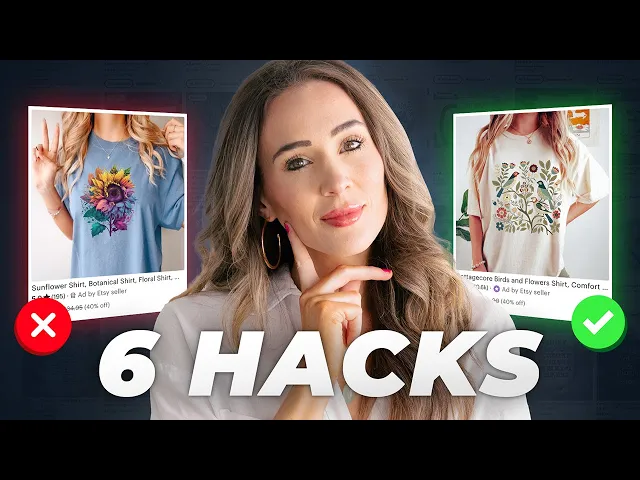
I'm going to show you how to fix it so by the end of this video you should be able to go into your shop and evaluate if you missed the mark and what you need to do to fix it so that you really hit the nail on the head for that Trend one of the first trends that I want to talk about is the large all over floral print Trend and I've talked about this because floral it is a spectrum and it is a fine line between trendy floral and Grandma 1980s floral this print right
here this might be a great wallpaper but I would not recommend putting it on yoga pants the way that this is done is not in a trendy way for example the colors right were looking very Christmas and if you're going to do Trends you have to have the right mockup that is trendy the way this looks is with the kind of cat eye black sunglasses and the Capri length floral print it's looking very vintage almost like 1950s inspired so instead I would actually take this print I would move the elements much closer together rotate them
so it's not such a perfect pattern it looks a little more organic and I would put that on something like wrapping paper I think that would be much better use of that print here is another floral Trend now it's combined with a retro font Trend but the way that this is done is you know a very kind of cartoon like way with the little smiley faces especially if it's a heather gray it's really difficult to put color on that and have it look good so I would say with this I would go with a much
more kind of monochromatic look with the font color and something that's going to pop whether they stick with like the lavender theme the yellow theme and I would totally change out the flowers they're using to be something a little bit more sophisticated the fit of the mockup and you know her hair little tattoo everything the the wash of the denim it does not match the style and the aesthetic of those florals that is where the mismatch happened here here is a good example of a floral Trend so this is a very appropriate thing to put
an all over floral pattern on you can see the colors are on point the mockup is on point the green ties into kind of the greenish yellow in the print and the mockup is enhancing the print it is making the product that they're selling look better and more desirable so you're doing something retro inspired but you're doing it in a modern setting that is what makes it trendy you don't take something that's retro inspired and put it in a retro setting because that's going to make it look outdated right now this is interesting this is
a tote with you know both floral and then the butterfly trend on it and you can see it says best mom ever this wouldn't look so outdated if the mockup was completely different the issues are the fit of this shirt the shoulder and then the background a path in the outdoors to me I think this is a nursing home and this person is walking around the path that's around a nursing home that like that's where my mind goes and there's so much white around it I think there's just a lot missing on the design part
of this it would look better and it would look younger and more trendy if it wasn't on a model for example now let's go to Pinterest you can see very trendy all over floral print absolutely trendy again here we see all over Prints but it's not so uniform it still looks kind of organic this one is interesting if you've seen my video about the bird Trend right now you'll see like anthropology is doing it Urban outs is doing it it's all over Pinterest right but this is not the way we want to execute the bird
Trend you can see this says like Japanese Spring Garden cushion but this feels more like not trendy Japanese Spring Garden it feels more like Grandma's Japanese Spring Garden type of thing so I would say this is definitely not trendy the way that we are seeing the trendy bird theme here's a great example of this I just found this through Pinterest you know not a lot of white space in the background it's kind of tropical inspired there's symmetry there's kind of some cool overlap going and this is much more trendy here's another listing that is kind
of playing into the bird Trend now in a subtle way but what I want to point out here is okay this says Nanny okay that's for a grandma we want to make sure our mockups and our designs align so she does not look like a grandma to me I don't know what you think the black hearts they look kind of like they were sharpied on and it's super high contrast next to something that is much more delicate and I think putting a bird like that in there it's kind of like a Valentine's Day little like
love bird on your first graders Valentine's Day cards right it's just not quite the trendy bird Vibe okay much more trendy right we have this kind of collection on a blush background you know same thing here right it's kind of like a scene with Birds integrated but it doesn't scream bird it's more of like a lush outdoorsy kind of leafy scene with birds integrated into it so now let's take a look at the Citrus Trend which I have not talked a lot about this is an example of how I would not do the citrus Trend
I think the idea started from a good place but I think the execution fell apart in a couple of areas specifically number one the background color chosen was something so bright and colorful I would not choose a background color that is the same kind of intensity of brightness that is just kind of clashing the top left the blue jean color would have done better and this is a trendy Comfort color shirt right so that has the potential to do really well I think if that yellow was a slightly different color yellow on the lemons this
would have done well AI mockups tend to not look as trendy and the fit tends to not be as trendy either this is probably the best bet for the main listing photo now here's an example of a good kind of Trend in this food Citrus theme we're coming back to the shower curtains so this is a great place for florals for citrus themes really for implementing any Trends because shower curtains are something that people change out right it's something people change out more than they would change out bedding or furniture or rugs right a shower
curtain it's kind of like a blanket it's something that you can swap out for different seasons and it also has a lot of purpose and utility and it's not something that someone's going to just tuck into a drawer the color is great the green and the yellow the way they integrate the multiple shades of green that's great and the little white subtle flowers that adds so much if this didn't have those little white subtle flowers it would not look as trendy it's very clean there's not other patterns going on a lot of different wood tones
adding depth and dimension and the window also makes it look much more realistic so let's take a look at the strawberry Trend which we have talked a little bit about again we're seeing this on a pillow that is not very trendy so if you're going to do the strawberry Trend I recommend not having it so much as like an accent within a pattern I recommend just going going hard at it integrating a tiny little element of a trend into a print that is overpowered by other things then the trend doesn't really come through in a
powerful enough way let's take a look at a better way okay this is probably one of the most trendy ones that I have seen okay we have all over strawberry prints combined with some floral little bit of green but still very focused on the strawberry and then the light pink background it kind of goes with that tone on tone same color family Trend that we're seeing clean lines modern legs on that furniture this type type of plant very trendy much better than like eucalyptus and things that a lot of people used previously this is not
exactly the trendiest way to have that strawberry Trend in a kitchen towel now the background of this towel being almost like a painting I think that does detract a little bit from the idea of this being something that will clean things up in a kitchen I think it would be much better if it was something like this much more trendy again we have kind of it almost looks like a light blush color okay it's a little bit more of a tan in the background so that is a much trendier way to have it again on
the kind of gold accents and Gold Hardware in that kitchen very trendy now let's take a look at the butterfly Trend so this one is interesting this is not popping on this background at all uh this is the wrong background color choice I would say remove that option completely and only have this option here I think sometimes including color options that are not making it look trendy can hurt your listing if you if this person only had the one option like maybe this one and this one I think it would do a lot better okay
let's take a look at this one it looks like a photo and it's on a cosmetic bag this is not a trendy way to do the butterfly Trend I wouldn't even say the silhouette of a makeup bag is trendy unless you have words on it so that would really be probably the only way that this would become trendy or if it had a very trendy pattern or print this first way was much much better the variety of butterfly Styles it's clearly you know drawings they're not realistic looking and that that really helps the overall case
as well as the mockup now let's take a look at the Retro font Trend this is not a way we want to do this so with this mug right it's a little bit confusing I'm not sure what kind of color everything will be will that purple wrap all the way around what will that look like and the font it's so small on that you know if the this person was going to do that kind of font and coloring I would keep the background white and just take out all of the things around it and it
looks like they might be trying to play with the color gradient Trend which I think they're doing well except for the background color is not a solid color and it kind of takes away from the gradient they have going in the lettering so I would just keep the background white and I think that would help a lot all right let's take a look at this one this is interesting this is an AI mockup and the fit is not trendy it's kind of a yellow Hue Happening Here I think if they removed the hearts it would
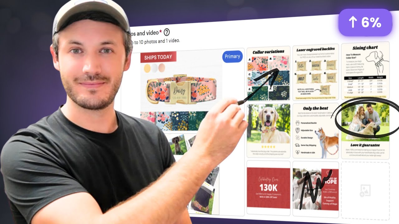
be a lot better this is even better you know I would say for for the fit this I wouldn't do the coloring is just not going with that black I would probably only have this in there and I'd be removing the hearts and even on like the the size chart like we don't want to have anything that's not trendy on your size charts now this is an example of something that's almost there I think the fit is amazing the PE sign the background everything's good except for I do think I would work on just the
layout just to make sure things don't get too distorted when you're doing this groovy font otherwise I think it's it's great but I do think we are getting a little bit distorted even if gymnastics was a little bit taller Mimi was a little bit shorter regular Mimi also a little bit taller I think that would help here's an example of a retr font where the layout in the spacing great but the words I would change when you're doing something trendy I recommend trying to stay away from kind of vanilla words and having some trendy words
in here so instead of Mind Body Soul right I would look up trendy yoga words 2024 or whatever year it is even ask chat gbt with this one this is interesting because I like the idea Superstar Mama right great for mothers but they're they're pictured on a very kind of rustic Butcher Block countertop which is is a mismatch right and it's a lot more modern with the kind of metallic handle and the background is also kind of a tile that feels misaligned with kind of what they're going for so the good things about this listing
Superstar mama I think the concept of that great I think the font is great I would change the color of the lettering and the color behind it if you're going to go for like a gold I might go for something like a hot Barbie pink with like a white outline or something I wouldn't really do these little stars all over I think they could still do star accents but maybe larger stars that balance this a little bit better and aren't so concentrated on the top 60% of of the mug this is probably the best photo
they have but I still would change up the coloring this is a great example of The Groovy trendy font and I also want to call it it's doing the kind of color gradient Trend very well now the thing that are great about this are the color scheme the elements are easy to read the spacing is right it's not off and I think the the focus cheer that's really clear at the bottom the way that they put that groovy font onto kind of a groovy looking megaphone thing that looks great this mockup I also think it's
great cuz it's you can see there's like a silhouette of a cheer leader in the background super subtle it's better than this because the white outline doesn't blend into the background as much as this mockup I do think that this is probably the best for the thumbnail and I think overall this this is just a great example of this trend I will do another one of these soon with all different Trends because I think it's so important that if you're going to put your time and effort and energy into getting Trends into your shop it
is so worth it to do it in a trendy way so that you actually reap the benefit of this now if you would like myself and my team to help you with this we actually provide 24/7 oneon-one private coaching for you as as well as 208 coaching calls there's four coaching calls per week for you for an entire year plus unlimited one-on-one private coaching and if you would like to learn more about that I will leave the link to schedule a free demonstration with myself and my team so you can visually see what this even
looks like it's called the ultimate Etsy course we just launched it and I took all of the feedback from our original program that a couple thousand people went through and I used all of that feedback every single piece to build this brand new program and it has has been incredible the results have been incredible and it's definitely worth just meeting with us and seeing it for yourself if you think you might be interested in getting some real guidance subscribe to the channel if you liked this type of video um but I'll see you guys in
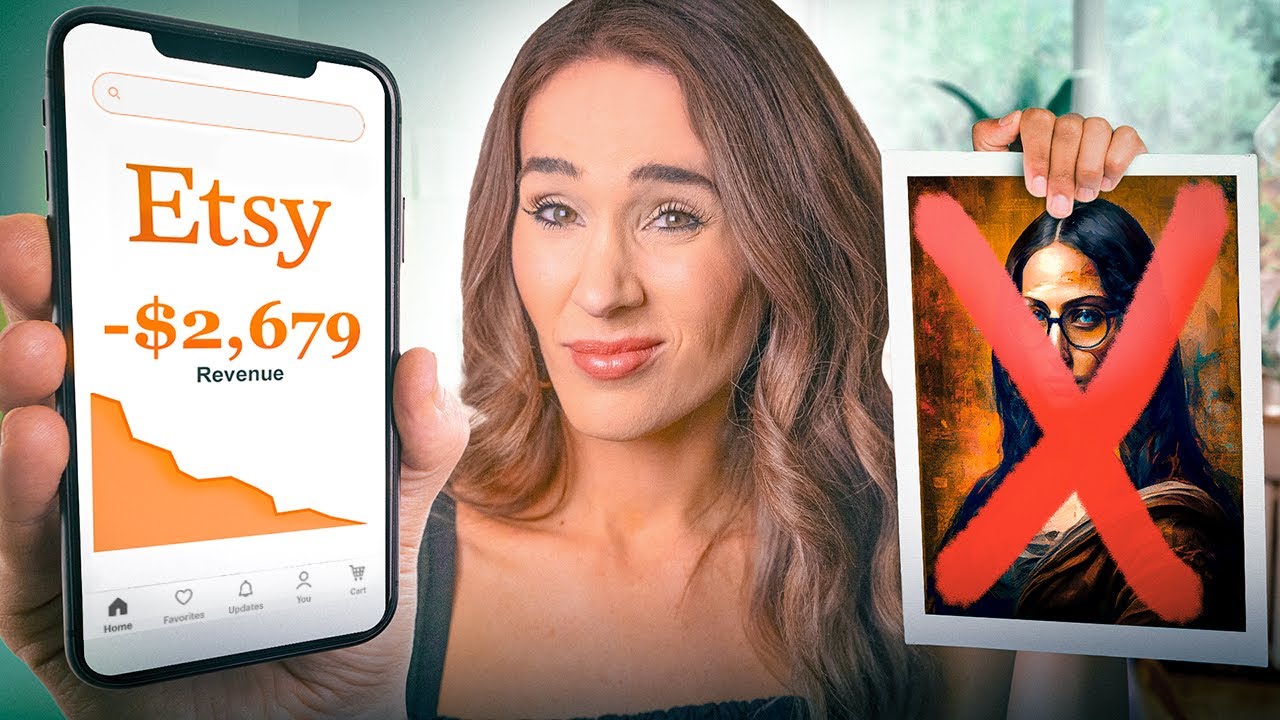
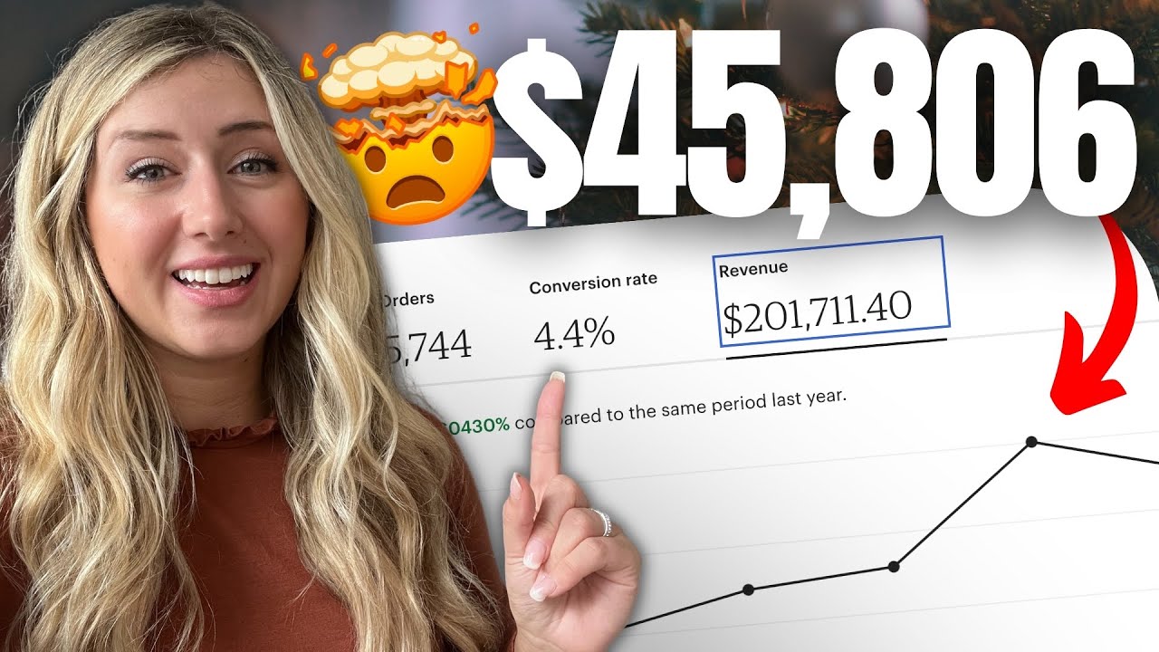
the next one the month before I started the program I made $696 the first month after joining the coaching program I made $4,149 and that came from1 133 orders in my fancy shop