[Music] Sokol if you have to just give three tips to listeners on how to improve their storytelling with data skills what would they be so my first would be to be really specific about who your audience is and design everything you're doing with that audience in mind so I think too often we design the communication write a PowerPoint deck say for ourselves or our data or our project it's really easy to do it's actually a much harder but more effective thing to step out of ourselves and think about how do we design this first and
foremost for our audience which means thinking about things like who are they what do they care about what keeps them up at night yeah because if we can frame what we need our audience to know or to do in terms of those motivating factors then we get their attention and can get our message across I think first would be audience second and I mentioned this earlier but would be think about where you want your audience to look and creates pairing contrast to achieve that and the easiest way to do that is sparing use of color
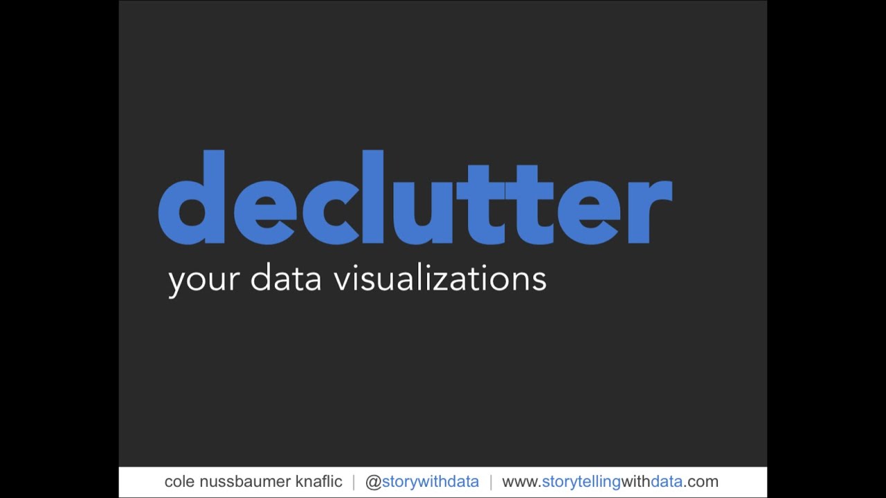
yeah and if we think about not designing anything to be colorful but rather working in grayscale and then using color really intentionally as a cue to our audience that tells them where they're meant to look that can be really effective for more quickly getting our audience to the point that we're trying to make yeah and then thirdly would be words use words I think sometimes when people think of data visualization they think it should all be numbers and pictures and that words have no place but words play a very important role in making those numbers
and pictures understandable for our audience so that means we need to title it every axis should have a title if there is a key takeaway which if you're at the point of explaining something there should be put that down in words right if we do those three things we think about our audience we design with them in mind we use color sparingly to focus attention and words that tell our audience why we want them to look there and what the takeaway is that's a successful scenario for communicating effectively with data perfect well I was fortunate
to attend one of your workshops a couple years ago and I do remember the tips around color and I have actually taken that forward since Adam and I do seem to get more speaking gigs so maybe maybe I owe you some permission or something so as I said fortunate to attend a couple years ago and one of the other things that really struck me during the the master class that you ran was around the narrative part that you took from classic storytelling and how you applied it to presenting data um I think that'd be something
our listeners would really enjoy hearing about sure thing so if we think of a story stories typically follow this narrative arc where you start out there's a plot tension is introduced that tension builds in the form of a rising action it reaches a point of climax there's a falling action a resolution turns out we are hard-wired to remember stories that come at us in that form challenges the typical business presentation doesn't look anything like that right typical business presentation follows a linear path where maybe we start off with the question right what did we set
out to solve for in the first place then the data where did we get it what did we do to it what assumptions did we make than the analysis what were the actual statistical methodologies we employed and then finally our findings or a recommendation this is the typical path of a business presentation and that's because this is the path that comes most naturally because it's the path we typically go through when we're analyzing data but it is a very selfish path because at no point along that typical linear path do I have to give any
thought to my audience and for me that's the biggest shift that happens when we think about our business communications not along a linear path but reframing them making use of this narrative arc because to have an arc you have to have tension and it's not about making up tension right if we there's no tension you'd have nothing to communicate about in the first place and also it's not the tension that matters to you and it's coming back to audience it's the tension that matters to them if you can identify that you can get their attention
build credibility and drive them to the action you need so we teach the narrative art we teach in our workshops both books go into this as a framework to be able to use as another way to think about how you might communicate data-driven findings in this series we will be speaking to a range of senior leaders who are pushing a data-driven and digital HR agenda make sure that you subscribed by your podcast app of choice and also by our YouTube channel for free and regular interviews with the digital HR leaders of the future