Hello friends today we are going to design a school management dashboard using nextjs and Tailwind for each user role will display a different dashboard if the user is an admin they will see this homepage we have the user counts here we can see the events by date and here we have some animated charts we can H over and see the details and all these comp components are fully responsive you'll learn how to design React components for different screen sizes on the menu we have some list items but all these items are visible together only if
the user is an admin if we log in as a student we'll see only a few items and on the homepage there is the class schedule which shows all our lessons we can also change the UI and and display them daily also we can log in as a parent and it's going to display the schedule of the children we can see their exams Results and the other student details and finally we can log in as a teacher let's see the teachers we have a beautiful table here let's see one of them here is the user
information some details the teacher SCH schedule and a small animated chart here of course we cannot update the users but if we log in as an admin we'll see this icon to update the user and on the list page we'll see this delete and create buttons In the form components we'll be using react hook form and you'll see how easy to validate form inputs here is the student list the student page and the other lists it's a great project to understand the latest versions of react and nextjs and improve your design skills and in the
next tutorial we'll create our backand and fatch all these data from a database so let me know in the comments what technologies you want To see for the second part of this tutorial I'll read your comments and start creating the next video if you want to see more projects like this one please like the video if you are ready let's get started okay I created a new folder and inside this folder I'll install my nextjs application to do that you can open your terminal and right here MPX create next app but if you do that
you will have to Delete some unnecessary codes and you will have to upload all the images that we are going to be using during this tutorial and most importantly if you watch this tutorial in the future it will probably install a different nextjs version so you may encounter some problems to prevent this I highly recommend you use my GitHub repository the link will be in the description and as you can see we have the starter Branch here and at the end of the video I'm going to add here the completed version and in this branch
we have all the images and we don't have any unnecessary folders Styles or HTML so we will create everything from scratch and as always this is an open-source project you can use it wherever you want so I would appreciate if you could give this project as star after doing that you can fog this project and it will create a new Repository on your account as you can see this is my test account so right now you'll be able to push your changes to your own repository right now you can come here and copy your url
but I'm going to be using my own account I'll will copy here comeb back and I will say get clone paste your url here Dot and enter as you can see our folders are here let's install the Dependencies mpm install and our libraries are here right now we can start our application so I will say mpm run Dev I will enter so let's visit the Local Host I'll will come here paste my URL and our application is ready and let's see our example and as you can see it opens this admin dashboard and here we
have two main components this menu and this content and we are going to change the Content according to user but this menu and this nbar are common components so even if we visit the student dashboard or teacher dashboard we are going to keep seeing this menu and now so instead of writing down for each page again and again we can write them in our layout so let's create our pages and change our layout I'm going to open my source folder and inside the app directory I'm going to create a new folder and it's going to
be Admin and inside I'll create my page let's create our function by the way if you don't know how I'm using this shortcut you can visit my GitHub repository cipit and here you can find my react cipit and as you can see it creates a react component with Tailwind class name after copying here just search for cipit and since we are using TSX file I'm going to choose typescript Jsx and paste them here this is how you can use these shortcuts okay let's say admin page let's create two more student folder and page and finally
teacher and one more I forgot it's going to be parent okay let's check I can close here I will say admin admin Page okay it works so right now let's change our layout as you realize we have the layout component here and whatever I write here will be reflected to our Pages as you can see teacher admin always here so what can I do is add my menu and this nowar so we will not have to write them for each page and after we can change our content according to our user type but there is
Something important here we are also going to have a login page let's create one more page here let's say sign in and as you can see this text is still here that because this is the root layout but for the login page we are not supposed to see any menu or nowb bar we are just going to have here a component that we can enter our username and password so what I'm going to do is create a new layout and put my dashboard Pages inside that layout so let's create a new folder I'll say dashboard
so I'm going to add my pages here students and teacher and right now I can add different layout here let's copy here and paste and I will say dashboard layout you don't need body anymore I'll say do and let's say Dashboard and right now as you can see that comes from the root layout but if I visit dashboard and admin okay it's not found because it's outside the app directory it should be inside okay dashboard is here this is what we want if you want to you can get rid of this dashboard I want to
reach my page by writing just their names just like that admin student or whatever to do that I'll will come here And rra the name of the folder just like that so next CHS is going to ignore that part and we can reach our Pages by writing their name okay so let's delete this text and add our components firstly I'm going to separate my layout we are going to have this left and right part I will come here delete this let's close here and this Menu and let's give here a class name the height will
be full screen and I will say flax box so our items will be horizontal let's get rid of this children for now and let's create our this I'll say left and right just like that as you can see they are horizontal and in our example the left side is much smaller than the right side so I can give here any Size just like that so here is going to be five times bigger than the left side just like that let's give a color so we can see better he let's make 200 okay if you want
to instead of giving here a number as you can see it's the actual size you can directly give your percentage like this it's going to be a little bit smaller it can stay like that let's open Our console and take care of the responsive design actually let's open here as you can see for the small screen we can see only icons here when I make this larger it's getting bigger but in the medium screen here we have another component here and in this case the menu should be smaller and after this medium screen again it's
going to be bigger actually it's overflowing Here we can fix that so let's come back and give different size for the MD screen I'll say if it's empd here is going to be smaller here is going to be bigger and if it's large again it's going to be exactly the same or if you want to you can increase here to prevent that overflowing and if it's x large it's going to be exactly the Same 14% okay there's a mistake here okay so let's see this is the small screen I'm going to expand it's smaller and
after the medium screen again it's going to be bigger and here is going to be a little bit smaller again this is our main layout so let's add our items after that we can see Better I'm going to add here my logo and this menu and on the right side we are going to have a now bar and here is going to be the children so let's close everything open our menu and inside the source folder I'm going to create a new folder and it's going to be components let's create our first component menu. TSX
and now and let's use them inside the Dashboard this is the root layout we are going to be using dashboard layout and inside the left side firstly I'm going to create my logo to do that I will use nextjs Link and when we click on this link we are going to be redirected to homepage and inside let's add our image it's going to be logo. PNG let's give a size 3et 2 and Tet2 and I'm going to add my application name I know it's not that creative but it can stay like that let's give a
class name hidden so for the small screen we are not going to see our text here it's going to be only this image but if it's algae it's going to be block hidden basically means display none and if the screen is bigger it's going to be display block let's separate our logo and this name they are going to be Horizontal let's Center them and gap between image and text will be two by the way I forgot adding here slash and perfect let's shrink this page as you can see only logo and logo and text and
after adding this text they don't have to be centered so I will say if it's algae justy will be start just like that let's give a padding here okay right now I can add my Menu again for the small screen and medium screen we are going to see only our icons and for the LG screen we are going to see our texts let's see our example we have a bunch of menu items here and also we are going to have menu titles let's add our menu here I'm going to open and here we are going
to have our data as you can see title menu and inside we have the items each menu item Has an icon label and the URL and the others so let's use them here I'll say menu items do map and for each item Insight we are going to have a d and we should pass here the unique key let's say item. title let's add our title here and after that we are going to be using our lists again we are going to be using a map and for each list item we are going to Create a
link I'll will say items. map for each item create a link that comes from next Jazz let me show you and inside we are going to have the icon and the text in which that comes from next image source will be item do icon let's give a size it's going to be 20 Pixels and here is going to be item. HRA of course there's a warning here that because we don't have any uni key let's add and it's going we let's say label it's Unique and after this icon finally we can add our text which
is item. label let's see okay let's give a style firstly I'm going to give here a space and the text will be small and after that I'm going to Separate my items let's say flag but it's going to be vertical and gap between each item let's give a style for this title at the beginning it's going to be hidden and for the LG screen it's going to be block let's give a color font will be light and I'm going to give margin for the top and the bottom just like that actually let's get rid of
those backgrounds we don't need them Anymore okay so let's make them horizontal and give a space between them I'll say class name flax item Center just y center but remember after the LG screen doesn't have to be centered so I will say start gap between icon and the Tex will be four let me close this menu let's give a color it's going to be 500 and again py and is going to be two and if it's the small screen we are not going to see our Text so it's going to be exactly the same just
like that okay let's give a background for this content and after we are going to create our naar I'll open my dashboard and I'll say BG and I'm going to give a specific color here let me copy and paste and also I'm going to give here our flow scroll let me open our Example and here as you can see I can scroll this is why we are using this and inside the right side I'm going to add my nowbar and here is going to be the children for each dashboard page we are going to see
different content okay let's open our nowb bar and let's see what we are going to have as you can see we have the search input here and this icons let me shink this Page and for the small and medium screen we are not going to see this input so it's going to be hidden at the beginning let's come back firstly I'll say Flex item Center just five between I'm going to separate my items and I'm going to give a padding here and inside let's say search bar and icons and user and this search bar will
be hidden at the beginning and if it's empty it's going to be Flex let's add our items we are Going to have the icon and this input search.png I'm going to give my sizes let's import this by the way it comes from nextjs image and here is going to be the input I'm going to add a placeholder let's say search there's a typo and on the right side we are going to have two icons the username and the user Avatar here is our first icon inside I'm going to add my Image it's going to be
message.png and 20 any pixels and I'm going to give here a background it's going to be white round it will be full let's give a size just like that I'm going to Center my icon inside to do that I can use flexbox item Center justy Center okay it's centered also I can click here so I say cursor Pointer let's create one more and here is going to be announcement let's make them horizontal I'll say flx item Center gap between each item will be six and after those icons let's add our username again it's going to
be flx but this time flx column because we have two items here the name and the title let's say John do and Admin I will give a class name here first say text will be X small I'm going to decrease the line height leading three and the font will be medium okay what about this it's going to be even smaller so let's say 10 pixels it's going to be gray and text will be right so we are going to see it on the right side and finally we are going to add here our Avatar Let's
say 36 and it's going to be a circle rounded full okay let me zoom out perfect and I can add this item here its Position will be absolute and it's going to be on the top right so let's come back and inside this D I'm going to create a new D let's say one and here is going to be position absolute the top will be minus 3 right will be the same let's give a Size and Center this number align item Center just by content Center and the background color will be purple 500 and the
text color will be white okay as you can see it's here that because if you are using the absolute positioning the parent should be relative just like that okay let's make this a circle it's going to be full and the text will be X Small okay awesome what about this search I'm going to delete this background and give here a border so I will say item Center gap between the icon and input will be two text will be xmal the round it will be full and I'm going to give here a border to to do
that we can use a ring 1 and2 pixels and I'm going to change the color and finally I'm going to give padding on the left and right side just Like that what about this input let's go a padding get rid of this background color and I'm going to give a specific width I'll say class name is going to be 200 I will give a padding and background will be transparent and when we click on this we are not going to see this outline just like that for the small screen as you can see only the
right items but we should align them to the Right side to do that I'm going to come here and I will say justy and okay they are still here because if it's not full size it contains all these D and aligns our items at the end of the div now for the medium we are going to see our search bar okay perfect so we finished our common components right now we can take care of the admin page I'm going to close here let me zoom out I will come Back close CL them and open the
admin page and again we are going to have two parts the left side and the right side and at the beginning as you can see the right component is right under the left component so they are going to be vertical at the beginning and for the large screen sorry MD screen they are going to be horizontal and as you realize the right side is twice smaller than the left Side firstly I'm going to give here a padding I will say flx gap between items will be four and flx will be column and if it's MD
flx will be row and inside that say left and right at the beginning they are going to be full size and for the LG screen here is going to be two and here is going to be one let's say left and right let's see I'll open my application Here is going to be the admin page as you can see left and right if I make this smaller they are going to be vertical let's see what's inside our left component I can close here as you can see we are going to have four cards here to
do that we can create a new component because for each user type we are going to fatch different data I will open my menu inside the components I'll say user card we are going to have here A Type in the next lesson we are going to change here but for now it can stay like that because we don't have any database yet let's come here and let's say user cards we are going to have a list here and let's call our component four times first type will be student after teacher parent and stuff okay that's
separate them Flex gap between items will be four justy will be Between let's give a style of course firstly we are going to add our items firstly I'm going to give a minimum width and after I will give some padding they are going to be rounded and as you can see the first and the third items are purple but the second and the fourth items are yellow so for the old childs we are going to give this purple for the even Childs we are going to give the yellow color firstly I'm going to give rounded
to x large for the old Numbers background will be purple but we have here a specific color if you want to you can use it just like that but we are going to be using exactly the same colors on our other components so instead of writing them again and again we can extend our Tailwind team what I mean by that I will scroll down as you can see we have Tailwind configuration here and inside the theme object we can extend our Fields I'm going to add some more Colors the first one will be Lama sky
this color this blue color and also we are going to be using this light sky blue so let's add one more and I will say Lama Sky light and I'm going to add my color here so this is how we are defining a new color so let me copy and paste the others just like that and right now I can use them by using their names I can Close here and I I'll say llama purple as you can see this is our purple color and for the even numbers BG will be Lama yellow let me
close this menu and I'm going to give here a padding let's see okay we don't have anything inside let's say test perfect but I want to expand my items remember we have a gap between each item Here Gap four so I'm going to give here a full size I can use flex one okay so let's add our items we are going to have this top section which includes the date and this button and after the count and the user role so I'm going to create a new div firstly we are going to have a span
let's say the date the season of the skull and I'm going to add here an Image and it's going to be more. PNG let's give our size 20 pixels and after that we are going to have the user count let's give any number for now and here is going to be the type name let's say H2 just like that but we don't have any minimum withd let's say 100 30 Pixels but this time when I shrink my page it overflows to prevent this I'll will come here and say flx WRA instead of overflowing they are
going to move to the other line let me make this bigger as you can see this is what we want let's move this icon here I'll say flx justy between and align items will be Center just like that let's change this color and size is going to be really Small let's say 10 pixels I'm going to give a background it's going to be white heading X padding Y and round it will be full and the text will be green let's say 600 okay what about this text is going to be bigger to x large font
will be semi bolt and then Margin y will be four so we are going to have space between these and these items okay and finally I'm going to change this text it's going to be gray and by the way I can change the first letter I'm going to capitalize and we are going to make them poal so I'm going to add here s okay let's say Tex small font weight will be medium and the text color will be gray 500 Okay it was really easy right now we can create our first chart let's come back
and as you can see we are going to have three charts and the first one will be this radial chart to create them we are going to need a library there are different kinds of libraries but but my favorite is rechart I'm going to open my terminal and I'll will say mpm install rechart let's see by the way it's not rechart it's Going to be recharts let's take this back and there is no dash here okay and let's see our examples as you can see there are many options here and for the first item we
are going to be using this radial bar chart firstly we should pass here our data and after That we are going to have a container we will have our bar we can show here the legend so let's create that I'm going to copy here of course we are going to change this data I'm going to come back open my menu and inside components I'll say count chart let's create our component I will paste this here and since we are using a visual animation our component should be a Client component use client let's close here and
let's copy our container after that I'm going to explain I'm going to come here firstly we are going to have this section the title and the icon after we are going to have the chart and finally we are going to need this bottom section let's create three D here is going to be Title Here is going to be chart and bottom let me quickly pass this here and I will say h one tag and what was the name students and image that comes from next image source will be more. PNG but this one is white
so I will say dark it's going to be 20 pixels and let's separate them Flags justy between and align items will be Center okay I forgot to add my component here after user cards I'm going to add one more div and here is going to be the middle charts and one more and it's going to be the bottom chart here is going to be middle and here is going to be bottom and here we are going to have two items let me open my console and at the beginning their size Will be full but after
the LG screen here is going to be twice bigger than the left side so let's come back I'll say Flex gap between each chart will be four at the beginning is going to be Flex column but for the LG screen Flex will be row we are going to have two charts let's say count chart an attendance chart at the beginning with full if it's algae it's going to be Small just like that and I'm going to give here a specific height here is going to be 450 pixels and I will do the same thing here
but here is going to be bigger okay right now I can add my chart here count chart and let's see right now okay because we didn't pass this style but it's not important let's come back and get rid of this chart for now and here is going to Be slash okay as you can see title and icon let's give a background for our container I'll say white round it will be x large and I will say width full and height full and let's give a pading just like that but as you can see there's no
space here let's come back and I will say flexbox flx column and gap between items will be eight okay let's create this bottom section And after that we are going to open our chart we are going to have two items and each item has this circle do the count and this text I'm going to give space between them and I'm going to Center so let's say Flex justy Center and gap between items will be 16 and here is going to be a d it's going to be the color let's give size and its color will
be llama Sky and round it full okay this is our color after that the count we can give any number and finally this percentage just like that let's separate them flx flx column and gap between items will be one let's give a style for the H1 tag it's just going to be bolt F bolt and here is going to be text X Small and it's going to be gray just like that let's do the same thing for the other one just like that here is going to be yellow and girls okay let's change this number
it's not important but anyway I can change this title it's going to be large and the font will be semi bolt okay right now I can open my container I'm going to delete this style this angle and clockwise let me close this menu and instead of giving here withd and height I can give it to The Container I will say withd full and the height will be 75% because if I say 100 is going to contain all our container we don't want to do that but in our example we are going to have just two
Items I will get rid of them we are going to have two items and its name will be girls the field name will be count let's see 50 girls and 50 boys we don't need this and these are numbers not percentage so let's change here to understand better and right now we are going to be using this field as you can see in the example it was UV but this time it's going to be Count and our our progress is 100% but if I add here a total number we will see the exact percentage so
I'm going to come here and add one more item let's say total in this case it's going to be 106 and this time we can see that the 50% of the total is the girls and the other half is the boys and here is the total number but I don't want to see that so basically I can make here white it's not going to be visible just like That I don't want to see this Legend let's get rid of this just like that and I can change my style here I can give different bar size
firstly I'm going to make this 40% and 100% and the bar size will be bigger 32 just like that by the way I can change my colors it's going to be blue and yellow and what else we can do we can get rid of the label so we are Not going to see the numbers here and finally we can add our image here as you can see we have an image and it's in the middle of the container so basically its Position will be absolute in this case the parent should be relative and after this
container I'm going to add my image The Source will be what was the name let's check male female PNG it's going to be 50 and I'm going to give a class name and its Position will be absolute let's Center this top Center left Center and I'm going to use translate effect on the X and Y AIS I'm going to close this menu okay it's centered on the x axis and y AIS let's see okay I forgot again SL here and perfect it's that easy I'm Going to refresh we have this awesome animation and it's exactly
the same right now we can create another chart again we are going to have title this icon but this time we we are not going to have any bottom section let's create one more component atance chart is going to be a client component and let's use it in our admin dashboard here let's Import let me show you here I'm going to close this menu and let's see which chart we are going to be using I will come here and there are many options here this is the single one and this is multiple we can use
this again I'm going to copy here after we are going to change our data let's paste it actually let's change right now it's going to be the name of the week days so I'll say Monday Tuesday and the others I can delete the others and we are going to have two items present and absent and here and we don't need this one I'm going to delete and let's change the numbers they are too big it really doesn't matter you can write whatever you Want okay let's use our chart I'm going to come here copy this
container out of course I didn't add my title and the icon more dark.png and the width will be 20 height will be 20 and after that I can add my chart here just like that we don't have the container so I can change this height let's say 90% we have the data here I can delete This margin and again I can give the bar size is going to be 20 so it will be thicker let's see actually okay it's not here because we don't have the height for the parent as we always do I will
say background white rounded alga I'm going to give some padding and height will be full remember in the admin page we gave here height so it's going to be 450 Pixels okay it's here but we don't have the data because we have different data Keys let's change them just like that okay the legend is here but in our example as you can see it's on the top let's change it's here I'll say align left and the vertical align will be top okay let's give a space here to do that we are going to be using
wrapper Style by the way you can find every detail in the documentation I'm not going to show everything one by one I don't want to waste your time I'll say padding top it's going to be 20 pixels and the padding button 40 pixels just like that I can also change this shape it's rectangle right now but I want to make this circle I can come here and say Legend Style sorry type and it's going to be Circle I'll do the same thing for the other one by the way we don't need this and this and
perfect let's change the colors again I'm going to be using this blue and this yellow just like that I can also make them rounded I'm going to change this top left and top right so I will say radius top left top right and the others will be Zero just like that because we are not going to change here and here and also I can get rid of this line on the Y and X AIS to do that I will come here and access line it's going to be false okay let's check our example as you
can see we don't have the vertical dots let's get rid of them I'm going to come here and I'll will say vertical and it's going to be False and also I can and change the color it's going to be this gray color okay I can also change the text color on the X and Y AIS I will say tick and it's going to be this light color and also I want to get rid of those lines tiak lines and it's going to be false okay let's do the same thing for the Y AIS if you
want to you can change this Tool tip style I will come here and say content style and the Border radius that's say temp pixels and I'm going to give border color and it's going to be light gray okay and let's separate them and give a style for this title remember it's going to be plx box and and here is going to be Tex large and Semi bolt okay it looks pretty nice so right now we can add our last item this last chart it's going to be bigger with full and the height will be let's
say 500 and let's create our component inside components I'll say Finance component sorry chart as we always do use client and let's use it here it comes from Components okay let's come here and quickly add our title this icon and give our background actually it's going to be exactly the same let's copy this paste here I'm going to import this image just like that let's see our chart documentation and we are going to be using this simple line or okay let's use this one of course we Are going to increase the thickness I'm going to
copy here and paste let's change our data quickly it's going to be name of the months and the first one will be income and the second one will be expans September October November and one more and it's going to be December let's change this name it's going to be income and here is Going to be expense and I'm going to get rid of here okay let's add our chart after this du I'm going to add it here and again I'm going to make this 90% and let's see okay let's change our keys here is going
to be income expense and again I'm going to change the color I'm going to change this color get Rid of this line and this tick it's going to be exactly the same for the X and Y just like that I'm going to add my Legend here let's copy again but this time it's going to be Center and I can decrease here and here it's going to be smaller okay let's change color of this component remember how we are doing this stroke And this gray color okay and also I can give margin between this text and
the chart and I can do the same thing for the x axis I'll say tick margin and let's say 10 actually it can be bigger for the Y okay and what else its thickness is bigger so for each line by the way we don't need this I'm going to give stroke Width and it's going to be five we are using stroke all the time because it's using SVG it looks awesome let's check here it's exactly the same of course data is different but style is the same okay it's that easy guys and if you want
to you can add more components by using different charts you can find here pretty much everything but for our example it's Enough for now for the other dashport we can use different charts but for now it can stay like that so let's take care of this right side as you can see we have a calendar here let's open up the documentation react calendar it's a really simple Library let's install I will open my terminal mpm install react calender after that I can create my component and and it's going to be event Calendar and again it's
going to be use client and let's copy here and we are going to need the use State hook so when we change the date we can fatch different event and here is going to be the calendar component just like that okay let's add this to the admin dashboard let's see first what we are going to have we are going to have two Items this component and this component and they are going to be vertical so I will say fla fla column and gap between items will be eight and the first one will be our component
here let me close this menu and this terminal and the other components okay let me give here the background Color the padding and round it as you can see there is no style let's check we can use this style and after we are going to customize okay as you can see it's not 100% and there is a border here and the font family is different let's take care of them to do that we can inspect our item here let me zoom in the class name is react calendar we Can use this I'm going to open
my Global CSS and inside I'll write my class name parly I'm going to add the size is going to be 100% but since we are using here a CSS I have to overwrite so I'll say important I'm going to get rid of the border and the font family will be enter and as you can see this is what we want let's check our example this color is different it's sky blue let's change That I'm going to come here and again inspect and as you can see this active color and I'm going to change this background
and this color here is going to be this sky blue and the text color will be black and one more thing I can increase this font weight let's inspect and I'm going to take this class name and Perfect and after this component we can add our events for each event we are going to have a title time period and the description so let's create a data here I'll will just paste of course it's going to be temporary when we have a dat database we are going to fetch this data let's say temporary and using this
array I can create a div after our component I'm going to Create a new div I'll say flax flax column and for each item we are going to have this Gap let's map through our item event do map for each event create a div let's give here the unit key is going to be event. ID remember we have different IDs and firstly I'm going to create this section that includes the title and date of course I'm going to separate them Justy between and first one will be H1 event. title I'm going to write here this
pen event do time and after them we are going to have a P tag and here is going to be event. description okay and also we are going to have our title events and this more icon so let's come here and create a different D flag item Center justy Between and the first one will be the H1 tag which is the title and our image it's going to be 20 pixels and more dark.png let's give our class name Tex will be x large font will be semi bolt and I'm going to give margin on the
top and bottom okay and for each item I'm going to give a port order and Padding let's say five I'll say rounded MD let's give a border or ring doesn't matter and Border color will be gray but I'm going to increase the height of the top border and it's going to be four and for all items its color will be blue if it's even it's going to be purple so I will say b top Lama sky and if it's even b top Lama Purple just like that let's give our style for the text for the
H1 tag it's going to be semi Bolt and the text will be gray 600 and for this pen again gray but this time it's going to be lighter and the Tex will be X small okay and finally this P tag firstly I'm going to give here a margin margin top two Tex will be gray 400 And the text will be small okay and finally we can create this component let's copy this open our menu do TSX and I'm going to add it here okay I will close this menu and again I'm going to give this
background and padding just like that and after we are going to have a title but This time it's not going to be this icon instead we are going to give this text so let's create our section Flex item Center justy between and the first one will be H1 tag and the second one will be a span and view all I'm going to give my class name it's going to be X Mo and it's going to be gray okay and let's increase this one x large and it's going to be semi Bolt now finally I can
add my announcements the first one will be background L Sky light it's going to be rounded MD and the padding will be four okay and I'm going to give here a space actually let's create a container that contains all our items and I'll say flx flx column gap between each announcement will be four and I can give here margin Top okay let's see what we have inside again our top section title and date and description it's pretty similar it's going to be easy I'm going to create my top section Flex item Center justify between and
inside h2 tag let's generate a random text of course it's going to be short just like that and a span and here is going to be the Date let's give a class name it's going to be small text Gray 400 I'm going to give a background color it's going to be white and we are going to have a border radius rounded MD and I'm going to give PX and py just like that let's check change this font weight it's going to be medium and let's create other Announcements I'm going to copy this and paste two
more times and this time here is going to be purple light and here is going to be yellow light of course I forgot adding description let's choose our items and after this do I'm going to create a P tag and a random text here and again it's too long let's delete Here and give a class name it's going to be small and text Gray just like that by the way I can give here a space so margin top one I can change this logo by the way I will open my dashboard layout and I will
say font Bolt okay guys we finished our admin dashboards homepage right now we can take care of The other Pages I'm going to close here and all the pages here and right now we can design our student page but before I'm going to open my menu and I'm going to add here one more field because we are going to show different list items according to user role if we are the admin we are going to see all these list but if we are the student or parent we are going to only see our exams assignments
results and Events so let me update my menu items you don't have to do that because when you install the starter Branch you will get these items remember the link is in the description and as you can see for each list I item we are going to check this array if it includes the user role it's going to be visible so let's scroll down and update our menu of course we don't have the authentication we don't have the database for the test purpose we are Going to be using our temporary data if you open your
menu you are going to see this data again it's going to be inside the starter branch and as you can see we have the rooll here and for now it's admin let's use it I'm going to cut here and I'll say if item do visible includes our user Ro it comes from library and Data we are going to return our link let's see right now as you can see they are still here here if I change here right now we can see only these items or the parent again exactly the same and for the teacher
we are going to see more items of course in the second tutorial we are going to protect our routes using middleware but for now it can stay like That by the way there is no how effect here let's add let's check first as you can see we have a background here firstly I will say rounded MD and if we hover over the background color will be Lama Skylight just like that by the way I can give here a padding I'll say if it's empd PX will be two okay awesome let's change this data admin so
we can see everything okay right now Let's design our student page I'm going to open my example we have a big calendar here we can see this subjects weekly or daily and on the right side again we are going to need these events and announcements let's create our layout and after that we are going to need a one more Library I will come back close them open up the student page and I'm going to give my style remember in the admin page this was our Container we had left and right s and for the small
screens they are going to be vertical and if it's LG they are going to be horizontal so we will do exactly the same thing here but this time it's going to be horizontal if it's x large again I'll say left and right and I will say with full and if it's X is going to be twice bigger than the right Side okay since we are using exactly the same items let's copy and paste from the admin here is the right side I'm going to copy this and paste it here of course I'm going to change
here and import my components okay right now I'm going to create here one more div and add this title so I'm going to come here and create a new div and its height will be full I'm Going to give background a padding and around it will be mty and inside let's write our H1 tag schedule and I'm going to write here the class name let's say for a of course this class name will be dynamic after the authentication we are going to show here the class of the student and let's give a style text will
be x large and the font will be semi Bolt Okay so let's create our big calendar here to do that we are going to need a library react big calendar let's copy this open our terminal and I will say mpm install react B calendar and also we are going to need one more Library here for the localization we are going to need a date Library you can choose any of them but in the example it uses moment let's copy this and paste and I'm going to install them and after that we are going to create
our Calendar I'm going to copy here let's close here and open our menu and inside the components I'm going to create one more component and it's going to be big calendar let's paste it here as you can see there is a warning because we don't have the types let's install them again I'll open the terminal mpm install types react big calendar okay right now there is no Problem let's change this name and let's export this and as you can see we are going to need the events array and again you can find it in the
data if you scroll down you are going to see that we have some events here and it's going to be the student lessons and again we are going to fatch this data from the database but for now for the design we are going to be using this array I'm going to paste this Here we don't need any props and let's see and I'm going to use this calendar here after this H1 tag let's see and there's a problem here that because our component is interactive in this case it's going to be a client component so
I will say use client of course we don't have any style let's check and as you can see the CSS file is here I'm just going to import this okay of course we are going to fix The design but before let's take care of these buttons when I click here we are going to see the vqi let's check here just like that and when I click here it's going to show a single day let's do that yeah not going to use all of them we are just going to need week and day but in the
example as you can see it shows only work week so weekend are not here I'm going to come here and I will Say views and as you can see our options are here it's going to be work week or day and by default we are going to see it to work week you can directly use the name but if you do that you will not be able to click here and change the UI to do that we are going to need a use State hook we are going to store our view and when we click
on those buttons we are going to change it so let's say Const view set view view State and we are going to be using big calendar view type so let's import this views that comes from react big calendar and work week by default it's going to be work week so let's use this here just like that and I'm going to write my type here and again we are going to use a type that comes from react big calendar and of course this is a Component so I'm going to return this HTML let's wrap this and
say return and here is going to be curly bracket okay actually we don't need do let's remove let's see okay it's exactly the same so let's change our event to do that I'm going to create here a function const handle on change View we are going to take a view let's say selected view I'm going to write its Type and we are going to update our state set view will be selected view let's use this here on view event and handle on change view okay right now when we click on our buttons it's going to
hire this function and change our state here let's see I'm going to click and perfect let's change this height it was 500 but I'm going to say 98% so I'm going to give a small space here by the way we don't have to show Every single hour here let's say School opens at 8 and closes at 5 so we are going to show only this range to do that we can give minimum and maximum dates I'm going to create a new date you can write here any year month day it doesn't matter the important point
is our so it's going to be 8 a.m. and I will do exactly the same thing for the maximum and here is going to be 5 p.m. which is 17 Let's see right now and awesome okay this is what we want right now we can give our style remember when we give a style for this calendar we were using the global CSS and we are going to do exactly the same thing here we are going to inspect our items and change our style let's see what we have here by the way I can close this
Library as you realize we don't have any buttons here we are going to remove them we are Going to change the color of these buttons move our text here and after we are going to take care of the calendar let's fix them first I'm going to come here and inspect and as you can see the container is react big calendar button group let's copy this class name and paste it here and I'll say display none remember we are overriding so I will say important and it's gone but as you Realize our other buttons are gone
too that means they are using exactly the same name as you can see so what we can do is use here the first child just like that so the second child will be visible what about this text I'm going to inspect as you can see toolbar label I'll say text align right of course important right now it's on the right I Can give here a padding let's change our buttons this time I'm going to be using the last child and I will say font size 13 pixels they are going to be smaller right now and
inside this group as you can see we have our buttons let's check what we have inside there is a border here we can get rid of this and we can give a background color I'm going to copy and Paste and this time I'm going to select the buttons and the Border will be none by the way that's right here important also in any case and I'm going to give a background color and it's going to be this light color and for each button I'm going to give margin left so they are going to be separated
and as you can see for the active button there's a shadow Here and its class name is RBC active so let's get rid of this Shadow and give a different background color let's see again the class name we can choose it just like that I'm going to change the background color and I'm going to remove to back Shadow okay it looks much better and let's change this border I'm going to inspect and inside this container CER as you can see there's a border but I'm going to change this color it's going to be lighter so
let's select our class name and Border color is going to be lighter just like that and there's a header here let's see it's here we can get rid of this we are just going to need this content so I will say display none okay but there's something wrong here let's check our content as you can See there's a border on the top let's get rid of this border nonone awesome and right now I can decrease this font size let's see I can select all these items let's copy this class name and it's going to be
smaller font size okay let's check what we have here we have the time slots actually I can give a padding Here let's duplicate this and I'm going to choose the group and I will say padding Zero from the top and button H and to many from left and right okay it's much better right now and let's change the background color I'm going to choose all these groups and background color will be this blue color and what about this content this is the main de I can change my Tex size is going to be Smaller T
size will be 14 pixels just like that and let's check the items inside I'm going to close here as you can see there is an event container here so we can change the background colors using this event let's check first if it's the correct one or not okay right now for each item I'm going to give different color to do that we can select each child Here for example let's choose the first child just like that but its color will be blue so I'm going to paste it here by the way we can get rid
of this border let's copy this for each event I'm going to delete the border the text color will be black and I can give some padding insight and margin I can reduce this size so let's say 99% okay let's see our example and let's change those colors I can directly copy and paste as you can see we have eight items I just assume that the maximum number of the lessons will be eight so for each lesson we are going to have a different color just like that let's change the color of this text as you
can see RBC event label it's going to be gray and let's give margin Button let's close here and open the week view and as you can see it looks much better right now for the day View and as you can see it's responsive our other items are here and if it's the LG screen sorry X screen is going to be horizontal okay awesome so I can do exactly the same thing for the teacher page let's come here copy them open the Teacher page paste here I'm going to change the name of course we don't have
any class and we don't need this calendar I think okay but as you can see its height is not 100% so let's check the parent remember it's in the dashboard layout and as you remember inside the content section we have the ne and children so what I can do here is I can Give a flex box and flex column and for the teach page I'm just going to say flx one so it's going to fit inside the entire container just like that and what about parents we are going to show exactly the same thing by
the way let's remove here open up the parent page paste it here just like that but remember a parent can have multiple Children so let's write here the student name so if there is one more child we can add it under this first schedule and we completed the homepages for each user so let's take care of the lists I will come here close everything and inside the app directory I'm going to create one more folder and it's going to be list let's see I'm going to click here and we are on the list and teachers
page so let's Create inside the list I'll say teachers folder and page. TSX let's create our component teacher list so when I click here we are going to see our page but of course I forgot to add it inside the dashboard layout that's why we can see our menu and nowbar so I'm going to grab this list and pass inside the dashboard and perfect so let's see what we have here firstly as we always do we are Going to create a do give this border radius background and after I'm going to create one more de
insight and it will include this page title and this right section and inside that right section we have the search input and and three buttons let's create I will say background white padding for and round it MD and again I'll give Flex one so it's going to fit inside our container let's Give a margin here perfect but here is too much we already have a space here so I'll say margin top zero okay let's create our top section I'll create a do and after that we are going to have two more sections this list and
this pagination and inside this top section we are going to have the title and one more section that includes our search bar and the buttons but for the Search bar I'm going to create a different component because for each list page we are going to have exactly the same input so inside the components I'll say table search and I'm going to use it here and after that let's create these buttons firstly a container and inside we are going to have three buttons and inside those buttons we are going to have the Icons the first one
is filter. PNG that's give a size I'm going to create two more buttons but before let's give our class names for the H1 tag text will be ALG and the front will be semi bolt but for the small screens it's not going to be visible let's make this hidden at the beginning and if it's empty it's going to be block by the way let's give here a flex Box just High between so our items will be horizontal let's take care of the right side at the beginning this search bar and buttons will be vertical let
me show you as you can see they are vertical but if the screen is empty they are going to be horizontal so I will say flax flax column and if it's empty FX will be row I'm going to Center my items give between each item let's give a background and See okay so I'll say with full but if it's empty it's going to be Auto okay this is what we want so let's create our search input here I can delete this background right now open my table search component and inside we are going to have
an image actually it's going to be a similar component let's get this from the Naar here I'm going to import this image but this time it's not going to be hidden I'll say with full but if it's empty again it's going to be AO because for the small screen it's going to contain all our D here it's going to be full but on the MD screen its size will be smaller let's give a flex box okay by the way this text is okay there is a mistake here let's open our Nowbar okay and let's take
care of our buttons they are going to be yellow and if the screen is small we are going to align them to the right so I will come here and say Flex item Center gap between each button and self will be Ant so they are going to be aligned and for each button I'm going to give my size Flex I'm going to Center my items let's make this Circle and the background will be llama yellow so let's create two more buttons here is going to be sort and here is going to be plus just like
that let me showing this page and perfect and what about this list actually before that let's take care of this pagination again I'm going to create a different component I'm doing this because in the next tutorial we are going to fch our Data here but when it comes to pagination or table search our components will be client components let's create our component here and paste inside our DU actually we don't need this du we can directly use pagination or here let's add our items we are going to have three sections this button these numbers and
The next button first here I'm going to give here a padding I'm going to separate my items using Flex box just WIP between and the text will be gray and inside the first button I'm going to give some padding it's going to be rounded let's say empd change the background and the text will be xol font will be semi bolt and if it's disabled its opacity will be 50% and we are going to give this cursor effect so I will say opacity 50 and the cursor will be not allowed let me close this menu okay
its color is dark but if I say here disabled as you can see its opacity is 50% okay let's create one more button this time it's not going to be disabled and I will say next and between them let's create a do and add our page Numbers now for each number I'm going to give a padding and if it's active its background color will be this blue color so let's say px2 I'm going to give border radius and if it's active it's going to be Lama Skai but for the others we are not going to
have any background just like that of course text will be small let's give Flex boox item Center gap between in each item and the text Will be small okay right now we can create our table but there is something important here if I open the students list again we are using exactly the same table and here or any others so that means it should be a reusable component so let's create a new component I will open my menu inside the components I will save table. TSX let's use it Here of course in the next lesson
we are going to pass our data but for now we are going to be using our temporary data here let me close here as you can see for each list we are going to have different data and for the teachers we are going to be using this array we have the user ID teacher ID name email image phone subjects classes and address so let's create our table and use them here and here is going to be a table its width will be full and I'm Going to give a margin here just like that and after
that let's create our columns first see I'm going to create ahead and inside I'm going to write my column names as you can see we have info teacher ID subjects classes phone and address and actions of course we should take them as a prop so let's open up the parent component let me close them by the way it can stay I'll close here and here and this menu and let's create our columns I'll say const columns and each of them will have a header and accessor basically we are going to use this text here in
our head dra and also we should give different class name for each item because let me shrink this page as you can see at the beginning we have only in for but if the screen is empty we can see teacher ID subjects classes and action and if it's even bigger we can See subjects and phone at the beginning the info will be visible so I'm not going to give any class name but for the second one let's say teacher ID I'm going to give a class name and it's going to be hidden but if it's
MD it's going to be table cell of course here is going to be column again one more it's going to be subjects it's going to be exactly the same Classes again MD table cell but if it's phone it's going to be visible if it's the LG screen and I will do exactly the same thing for the address and one more and it's going to be actions okay let's pass this just like that I'm going to take this as a prop let's write its type it's going to be an object that includes Header accessor and class
name but remember it's not required so I'm going to put here a question mark and it's going to be a string okay so let's create our first row and I'm going to map through my Columns of course it's going to be an array do map for each column return th and here the name which is call. header of course we need a unique Key just like that let's see okay they are here let's change the style firstly they are not going to be centered I'm going to align them change the color and the Tex will
be small okay and what about Buddy again we are going to take our data from the parent and for each item inside that data we are going to return a row but for each cell we are going to need different items just like this one we Have an image here and a container that contains this name and email so instead of directag this sending a text we should be able to create a custom cell so let's do this in the parent and send it to our table I will come back and I'm going to create
a function called rander row and it's going to take all the data items and using that item it's going to create our Row let's add here A type actually I can create here it's not important because in the next lesson we are going to take this from the database for now let's say teacher we are going to have an ID teacher ID name we are going to have email but it's not required let's say Photo phone s subjects but as you can see a single teacher can have multiple subjects so it's going to be an
array string array and classes again string array and finally address let's remove them and use this type here and let's create our row and the first it item will be the info section that includes image and those Texts so let's say image it's going to be item. pH let's give the size 40 pixels and I'm going to write my class name that's showing this page as you can see everything is visible here but for the MD screen we are not going to see the image so I will say if it's empty it's going to be
hidden if it's x l it's going to be visible again so let's say block by the Way let's give our size because I want to make this rounded it's going to be a circle and the object fit will be cover and after that I'm going to create a do and it's going to include this name and email let's say H3 item do name H4 or let's say ptag item and email remember it's not required let's separate them Flex Flex column and for this text font will be Semi and here is going to be xol and
the text will be gray and the other items will be easy because they are just texts so after this I'm going to create one more item and here is going to be item. teacher ID here is going to be address phone classes but remember it's an Array we are going to take each item and we are going to give comma between them so I will say join and comma and I will do exactly the same thing for the subjects just like that and of course we need our class names let's check again at the beginning
only info will be visible after feacher ID subjects classes and phone and address at the beginning they are going To be hidden if it's empty table cell and finally I can create one more item and it's going to be our actions we are going to have two buttons here let's separate them first I'm going to create a div which is a flx boox item Center and gap between buttons will be two the first one will be a link when we click on this link we are going to visit a single teacher page so let's say
list Teachers and the teacher ID which is item. ID let's create our button inside this button we are going to have this icon so I will say image view.png it's going to be 16 pixels and let's give this background and Border radius for this button I'll say flx item Center justify Center and round it will be full and the background will be L Sky and here is going to be delete button and it's color will be purple I'm going to create one more button outside of this link but there is something important here if we
are not the admin we cannot delete Any teacher so again we are going to be using our Ro it comes from library and data if it equals admin we are going to show this button and here is going to be delete.png let's change this background Llama purple and our row is ready let's pass this as a prop just like that and we are going to need our data and again it comes from our data file and its name is Teachers data because for each item we are going to be using this function and it's going
to create different items let's import this and let's change our type right now we are going to have two More items render row and data and let's write them here we are going to take an item and it's going to return an HTML block which is react do react not and finally a data and again it can be anything but it should be an array so using this data we can create different different rows using this function so let's say t body I'll say data do map for each item Inside we are going to call
render row and pass here our item of course I should drop this just like that okay by the way since we are using a map we need a unique key so I'm going to come here and pass my unique key here which is item. ID by the way there is a problem void is not assignable to react Not because as you can see we are not returning this HTML block I should change this curly bracket let's see again and there is no problem let's check as you can see there's a warning here because we are
using an external image by default nextjs doesn't allow us to use an external image to prevent this we should add this do name to next configuration let's open up next config or let me show you Here as you can see next. config and inside this object I'll say images remote patterns and inside this array I'm going to add an object which includes the host name just like that so if you have multiple external domain just edit using this object okay I'm going to save let's refresh and as you can see our items are here but
we don't have any Style let's check okay I'll say class name flx I Center I'm going to give a gap and a padding just like that as you can see these texts are smaller and there's a border here and for each even number we are using different backgrounds remember how we are doing this firstly I'm going to give here a class name let me close this menu and I'll say border button and and I'm going to change its Color let's say 200 if it's even its color will be this color text will be small and
when we hover over again we are going to change the background and it's going to be Lama purple light just like that okay let's check our responsive design when I shrink the page the image is not visible and there is something wrong here because we didn't use our class Names I'm going to open my table and for the columns I'm going to add my class names column do class name just like that okay so right now everything will be easier we are going to be using exactly the same component and create different lists of course
we don't have this page yet let's check here as you can see it's exactly the Same here instead of this email we are going to show the class here we have the student ID grade phone and address let's do this quickly I'm going to close them open my menu and inside the list I'm going to create one more folder and page and it's going to be students and the page actually we can directly copy and paste from here student list page and let's open our Data I'm going to close here and I'm going to pass
this student data it's really similar I'm going to copy this and paste this data let's change this title I will close this menu and by the way if we are not an admin we shouldn't see this button so I'll will say roll and if it equals admin remember this Ro comes from library and data let's do the same thing for the teachers page teachers List just like that okay right now I can change my data let's see our columns again we are going to have the info we are going to need the student ID and
great and we don't need this they can stay like that and let's change our type it's going to be student we are going to need the ID student ID name email photo phone is not required because they are going to be Primary School students and let's say grade is going to be a number and let's say class and that's all I think let's pass this here and change our row this time instead of email we are going to show the student class and here is going to be student ID here is going to be great
I can remove here and that's all I think let's See and and perfect as you can see class names let's shrink this page and check the responsive design okay awesome it's that easy guys right now I'm going to do exactly the same thing for the other Pages for the parents again we are going to have an info section but we don't need any parent image here is going to be student name but remember each parent can have multiple Child phone number and address let's do this quickly I'm going to copy this open my menu inside
the list I'll will say parents page. TSX I will paste let's change the name parent list page here is going to be parent which has an ID name here is going to be students which is an string array we don't need photo phone number will be required but the email is not Required let's move this here okay let's pass our type here but before before that let's take care of the columns we have the info student name phone and address let's say students and student names we don't need here uh what about our row I
can delete this image here is going to be again email we are going to have students but remember it's an array let's separate Them using join phone and address and what about our title let's change and the data will be parents data that comes from library and data let's remove this and as you can see our items are here let's check okay perfect and the next one is subjects we are going to create our page and after that we'll have the subject Name and teachers because each subject can have multiple teachers let's create our page
I'm going to copy here and paste change the name and here ID can stay name can stay and here is going to be teachers and that's all let's say subject name teachers and actions here is going to be Subject the title will be all subjects and we will have the item name and item teachers is going to be required and let's separate them I can delete here here and here and that's all let sent our data subjects data from library and data we don't need this okay I made a mistake here of course we don't
have the info section it's going to be directly item Name and let's copy this and get rid of this two and I'm going to create one more TD and it's going to be our teachers let's give the class name hidden and table set okay let me shink this page and this is what we want and the next one is classes all our text again so it's going to be easy we will have the class name capacity grade and Supervisor let's copy this create a new page inside the list classes and page you already know what
we are going to do I'm going to quickly change the component name last list here is going to be class it's going to have an ID name here is going to be number and here is going to be number and here is supervisor which is a string let's change Them it's not going to be hidden but let's copy here here is going to be great and I'm going to paste it here and one more and it's going to be supervisor let's change the type class here is going to be classes data will be classes data
and let's change our rows it's going to be Name great and here is going to be capacity and finally supervisor just like that let me check quickly okay there's something wrong here because we don't have class name let's copy this and paste here okay what about lessons we have the subject name class name and the teacher Name I will copy this create my list page lessons page. TSX I'm going to paste it here change my component name change my data lessons data and the title here let's change our type it's going to be lesson ID
here is going to be the subject name here is going to be the class name and Finally a teacher let's remove them and pass this type here by the way we can remove here okay and inside columns we are going to have the subject name the class name I can remove here it's going to be visible and let's say teacher and I can remove this one let's change the row it's going to be subject name the class name in any case is going to be visible so I can remove this class Name and finally teacher
I can remove this this let's see our page okay actually we can change those buttons because there is not that much information to show to a user we have the name class and teacher so we don't have to create a single page for the lessons instead I can change this button and show here an edit button so we click here we can update the Lesson so let's come back and instead of this view I'll say edit okay I can do the same thing for the classes subjects and parents because again we have all the information
here we don't need something else but for the student and teacher we are going to create a single page so let's change them quickly classes subject and parents Okay let's create the next one let's come here okay we have the subject name the class name teacher and the date let's come here copy from these lessons open our menu and create a new page page. TSX I will paste it here change the component name and the type ID subject class teacher and additionally we are going to have a Date it can stay as string as I
said after the database we are going to change our types let's create one more and here and I'm going to change the title okay it's not here because we didn't pass our exams data okay the assignments will be exactly the same I will copy here is going to be exactly the same but Instead of date I will say due date assignments data of course here is going to be due date just like that okay and here we have the results the subject name the student name it's core teacher and class and and dat let's create
our page I will copy here result list page we have the ID subject class teacher here is going to be Student and we can write the type of the result I don't know if we need this or not but anyway let's say exam or assignment I'm going to add a date and finally a score let's say number I'm going to add student let's add here the score is going to be hidden at the Beginning I'm going to move this class here again it's going to be hidden and finally we are going to have a date
okay let's change here student score teacher class and date let's see the small screen okay there is something wrong here because it's not hidden but here it's hidden let's remove this okay so let's take care of the events we have the title class date and Times I'm going to copy as we always do event list page ID title class we don't need this we are going to have the date start time and end time let's change here here is going to be date and two more start time and and time okay let's change here here
is going to be Class date and the times let's remove this change our title and this data okay let's see this is our page perfect okay and the last one is announcements and we have the title class there is something wrong here we are going to fix that the date and Actions I'm going to copy create my last page I'm going to change the component Name ID title class and date let's remove them and here and the data will be announcements data okay of course I'm going to change this data but for now it can
stay like that we finished our list pages right now we Can create a single teacher page when I click here we are going to show a single page and using this unique ID we will patch the teacher information let's see what we are going to have and let's write here any number and as you can see we have the user information some small cards here the teacher schedule there's a small chart here announcements and here we have the shortcuts basically when we click on any Of these links for example if I click here here it's
going to open the lessons list page but additionally it's going to add here a search param so the teacher ID will be the ID of the user so when we visit this page it's going to automatically fatch the data that belongs this teacher so let's create our layout again we are going to have two sections left and right here is going to be the information and this schedule But at the beginning the left and right side will be vertical so we will be using flag column and if the screen is x large as you can
see they are going to be horizontal let's create firstly I will create my page and after I'm going to create this layout let's close everything here and inside the list page p and teachers I'm going to create a new Folder and since we are using the unique IDs I'm going to write it like that basically it represents the teacher ID here it's going to be dynamic and inside I'm going to create my page let's create the component I'll say single teacher page and let's give here flx one P4 is going to be a flx box
but at the beginning it will be vertical but if it's x large it's going to be row and also I'm going to give a space Between items just like that and let's say left and right remember how we are giving size width full and if it's x large here is going to be two units and here is going to be one unit I'll say left and right okay let's shrink our page as you can see they are vertical okay so let's create our first component here the user card I will come here let's write a
comment let's say info cart I'm going to create a div and let's see what we have inside we have two sections actually before this information we should create a rupper for all these components because here is going to be the top section and here is going to be the bottom section so firstly I will say Top and it's going to contain our user info card and the small cards let's create one more and after the top I'll say bottom and here is going to be the teacher schedule okay let's give a style for this top
section at the beginning they are going to be vertical and at this point it's going to be horizontal so let's say flax flax column If it's algae it's going to be flax row and gap between each item here and what about this card I'm going to change its color it's going to be Lama Sky I will give some padding round it will be empty and the size of this card and this small cards container will be the same so I can use flex one and I can use it here also and finally I will say
flx and gap between items will be four and inside This card we are going to have two sections the user image and the user information let me make this small again and as you realize this section is twice bigger than this section so again I'm going to give a specific width let's create our image container and the text container and here is going to be one unit and here is going to be two units let's add our image Insight it's going to be a big Image 144 I'm going to give a class name let's give
our size because it's going to be rounded full and object fit will be cover let me copy and paste my image here I will close this menu and inside this section we are going to have this title description and those items so again it's going to be Vertical so let's see flexbox flx column justy will be between and gap between it will be four let's create our H1 tag I'm going to write here any random name and a P tag of course it's too big let's make this shorter and after I'm going to create a
do that contains our items and each item has an image and text but there is something important here at the beginning they are vertical but if I make this bigger as you can see there Are two items in a single row that means we are going to be using flag drop first see I'm going to give style for the title and description and after I'm going to handle here text will be x large and font will be semi bolt and here text will be small and it's going to be gray okay okay and here I
will say flexbox item Center justy between and gap between our Items will be two I'll say Flex wrap text will be X small and the font will be medium so let's create our first item I'm going to add here the image blood type it's going to be 14 and here is going to be the text let's write the blood type let's create other items here is going to be the date here is going to be the mail And the phone number let's give a style for them for each screen type we are going to give
different size let's check at the beginning their size will be full if it's mty 1 out of three let me open my example by the way they should be horizontal I'll say Flex item Center and gap between the icon and text will be two let's come back here as you can see after the MD screen We are going to see two items and if it's LG our layout will be horizontal in this case the right side will be too small for this text so I can increase the size but let's see with full again just
like that and if it's 2 x large again we are going to see two items here just like that what about the other cards at the beginning they are going to be vertical and again the container There will be flag scrap so when we expand this page as you can see we are going to have two rows so let's come back I will say Flags gap between items justy between and flex will be rra and inside we are going to have four items let's create the first one inside we are going to have the image
the image name is going to be 24 and also I'm going to give a class Name and my size and after that I'm going to create here a div and this div contains this text and this text let's say H1 tag 90% And A Spen and I'm going to write the title let's give a style text x large pH semi bolt and text will be small and its color will be gray let's say 400 and I'm going to create my other Cards let's change the title and description and of course the images Okay so let's
give our background and after we are going to give different size for each screen type as you can see the background is white and at the beginning their size will be full so I'm going to choose all my cards here and inside the class name I'll say with full before that let's give our background padding round it will be MD And it's going to be a flex box and the gap between the icon and the text will be four and on the MD screen we'll have two items but I cannot write here with half because
if I do that we are going to see here a single item let me show you this is the small screen and MD this is happening that because remember we have here a gap that means I cannot give here 50% so let's give Something smaller for the 8% just like that and if it's x large again there is only one item per row because our layout is horizontal right now that means I need something smaller so I will say if it's x large it's going to be 45% and finally if it's to x large again
it can be 48% and let's see okay there's something wrong because there's a mistake here I Forgot giving with and perfect right now I can add here the teacher schedule I'm going to give here margin in top background will be white rounded MD I'm going to give a padding and remember we are going to use a big calendar here that means we need a specific height let's say 800 and inside we are going to have a Title and it's going to be teachers schedule of course we should don't use a single code here so let's
use this just like that and after I'm going to add my big calendar component that comes from components and big calendar and perfect we are going to fetch the teacher schedule in the next lesson for now it can stay like that and let's take care of the right side Let's see what we are going to have the shortcut links a small small chart here and the announcements we already have this let's add that component and I'm going to create a component that includes our links again PG will be white padding will be four and the
rounded will be MD and inside we are going to have a title that is shortcuts text will be x large and the font will be semi bolt and after that I'm going to create a new D let's give a space between this D and the H1 tag it's going to be Flex gap between each link will be four and I'm going to be using flag strap text will be xmal and finally the text will be gray let's create our links I'm going to import this link that comes from nextjs link for now it can stay
empty and let's say teachers classes students exams and Assignments let's give a class name for each of them first see the padding will be three rounded MD and I'm going to give different background for each item the first one will be L Skylight l a purple light yellow light let's give here pink color and again llama Skylight just like that by the way I need to give space between my Items so let's say flx flag column and gap between each component will be four and finally I'm going to create one more component here and and
it's going to show this pie chart let's remember our documentation we are going to be using a pie chart this one so let's copy here open our menu and create our component let's create the function and remember if you are using something interactive Your component should be a client component and I'm going to paste my library items and inside the data we are going to have only two items this blue one and yellow one so let's see 92 2% and 8% I can give a specific color it's going to be our blue color and this
yellow color let's add our chart I'm going to copy this responsive Container just like that but before that we are going to need one more container here that includes this title and this icon and of course for the container we are going to give fight background border radius and this padding rounded MD let's give a specific height here and after that I'm going to create one more div that includes our H1 tag and the icon let's import more dark it's going to be 16 Pixels and here is going to be bigger text x large and
the font will be semi of course I should separate my items Flex align item Center justy between let's see of course we did add our component let's add here and perfect let me close this console and let's see what we are going to have here firstly I'm going to Increase this inner radius because we are going to have a text here let's come back I'll open my component and instead of this outer radius I will say inner radius and let's say 70 so you can change the thickness of this bar if you say 20 it's
going to be thicker and if you say 90 for example it's going to be much smaller let's make this 70 and I want to get rid of those Labels let's remove this perfect and right now I can add my text container here remember how we are doing this its Position will be absolute and if you are using position absolute the parent should be relative I will say relative and after this container I'll say div and I'm going to Center my items remember how we are doing this transform Effect I'm going to move it on the
X and Y AIS and Center my texts let me close this menu and inside we are going to have two items it's going to be the score and a P tag let's see just like that I just made up something Lama total score you can write here whatever you want and let's give a class name it's going to be really Big 3x large of course not style class name and the font will be bolt and here is going to be small and the text color will be gray let's say x small and the text will
be gray 300 just like that and again I'm going to add one more item here this text so I'm going to create another do and again it's position will be absolute because this chart contains all our container remember we have the width And height here by the way we don't need them we already have size here okay so right now let's give position absolute for our text actually let's make this h2 tag font will be medium position absolute I'm going to give the POS position is going to be 16 I will give left zero right
Z and if I say margin Auto it's going to fit inside our container and if I say Text center it's going to Center my item okay let's refresh the page we have this beautiful animation and we finished our single teach teacher page let's do the same thing for the student page I'm going to change here and let's see our example it's going to be similar by the way not student students and here we are going to change this title and those cards and these Links it's going to be really easy so let's copy everything here
not here single teacher page and let's create one more page and it's going to be inside students again I'm going to be using Dynamic IDs page. TSX let's change the name single student page let's change this image he is too old to be a student and I'm going to change this Name just like that let's change this one I'll say sixth grade lesson numbers and here is going to be the class name let's change here here and the others so I'm going to choose all of them and I will say student let's change here students
lessons teachers we already have exams and Assignments so let's say results just like that and perfect so we finished our single pages right now let's create the components for the data mutation for example if I click here we are going to open a model here that we can add a new teacher but for each page we are going to have different requirements so we should add different components for each list here let's close Here and everything here I'm going to scroll down and inside the components I'm going to create one more component and it's going
to be form model it's going to be a client component because we are going to be using a click event let's create our component and right now for each request we are going to return different buttons if we want to add a new item we are going to be using this button if we want to edit we Are going to be using this button and if we want to delete the item we are going to be using this delete button and if you want to delete the item you are going to need the item ID
and if you want to edit the item we are going to need all these data so basically we are going to need four items the table name the request name post update or delete the item ID and the item data when we create you are going to understand better I'm going to come here and say Table Quest type data and ID I'll say table it can be a teacher student and other table names I'm just going to copy and paste and we are going to have the request type which can be create update or delete
we are going to have here the data let's say any for now but it's going to be optional because we are going to need it only when we try to update Item the ID will be a number again they are not important for now for the design because we don't have any database they can stay like that in the next tutorial when we create our schema we are going to take the type from the schema okay let's return our button I will say button let's have close this I will say class name and for each
button type we are going to give different background colors and Different sizes because remember this one is bigger than those let's see again I'm going to open up any list page here as you can see for the update and delete button the width will be seven but for the add button the width will be eight and its background color is yellow so let's write our class name here I will say const size and I will write my condition if the type equals Create it's going to be a eight if it's not it's going to be
seven I can do the same thing for the background color and I will say if the type equals create it's going to be yellow if it's update it's going to be Lama sky and if it's delete it's going to be BG Lama purple let's use them here I'm going to pass here the size and The other common class names they all are the same so we can use it directly like that and finally I'm going to pass the background color and one more thing we close this here but I forgot adding the image we are
going to have our icons it's going to be delete PNG update PNG or plus PNG let's actually make this create and this is going to be update and the delete is here Okay so I can change here right now and it's going to be type. PNG so it's going to be create PNG update or delete PNG and here is going to be 16 and right now I can use my button on the list Pages let's open up the teachers page and here and instead of this button we can use our model and the table name
is Teacher and the type is create I'm going to save refresh the page and as you can see it's still here nothing has changed let's do the same thing for the delete button here the type will be delete but this time if we want to delete this item we are going to need its ID so let's say item. ID and again nothing has changed so Let's do exactly the same thing for the others I will copy here students I will import it's going to going to be create we don't need this ID I'm going to
comment this out and paste my component okay what about parents right now we are going to also add this update Button let's open up the parents here so let's remove this paste our model the table name is parent by the way I didn't change here it's going to be student and also I'm going to change here it's going to be update and we are going to pass all the data we have just like that by the way we can update this item only if we are the admin so I'm going to move it here let's
use React fragments just like that and here and I'm going to delete this let's refresh and perfect so let's do exactly the same thing for the others let me do it quickly okay I added my buttons for each pages right now let's close everything and open up our model component again and when we click on those buttons we are going to show here a model so we are going to need a use State here let's Create somewhere here const open set open use State at the beginning is going to be closed and when we click
on this button it's going to be open so let's write an onclick event set open and it's going to be true so let's write our model here I'll say if it's open show here a div and it's going to contain all our application and we are going to give a background color and after that we are Going to create our model here so let's say screen size is going to be full screen the position will be absolute left zero top zero and the background color will be black and I'm going to reduce the oppacity let's
say 60 let me close this menu and it's going to be over everything so let's give Z index and I'm going to Center everything inside this div align item Center justy Content Center so inside let's create our model let say do it's going to be white I'll give a padding rounded MD let's just say hello and let's try I'm going to refresh my page I'll click and as you can see our model is here let's try the others I'll click here perfect and let's come here and try to update and awesome and also I can
add Here a close button I'll create one more I'll add an image it's going to be close PNG and its size will be 14 pixels let's move it somewhere here on the top right so again I'm going to be using absolute let's give the position I will say csor pointer and of course it's going to be inside this parent div and of course the parent should be Relative okay let's give here a size so we can see better at the beginning is going to be 90% if it's empty it's going to be small 70% for
LG it's going to be 60% for x large and two x large let's say 50 and 40 let's see okay our button is here let's check our responsive design as you can see at the beginning 90% 70 60 50 and 40 okay and when we click on this button again we are going to change our state this time it's going to be false just like that okay for each table we are going to use different forms but there is something Comm come on here and it's our delete request when we click on this button we
are going to show a model that asks if We want to delete the item so since we are using exactly the same model we don't have to create a new component I can directly write it here let's create a new form and I'll will write here my condition if the type equals delete and also remember when we want to delete the item we are going to need the ID we set here optional so it can be undefined to prevent this I'll say also if there's an ID show Here a form if not let's say create
or update form for now and inside this form we are going to have a span and we are going to ask are you sure all data will be lost are you sure you want to delete this item and for each table we are going to show different name here remember our table name is here we can use It and and after that we are going to create a button and delete let's give our style I will say P4 flag flag column and gap between button and this text will be for for this span I'll say
text Center and the font will be medium and finally for this button I'm going to give a danger color something like That the text will be white let's give some padding it's going to be rounded I will delete the Border let's see I'm going to copy this and paste inside my model here I will save and let's see I'm going to click here and as you can see our form is here let's make this smaller with will be maximum content and I'm going to Center this button s Center and perfect so when we click on
this button we are going to run this action we are going to send the item ID and using server actions we are going to delete this item and of course it's going to be in the next tutorial this is the subject page but even if I use different component here different list page when I click on this button it's going to always show this model but when it comes to Create or update we are going to show different forms for each item we are creating different forms because we need different requirements for example for the
subject we are just going to have the subject name and teacher but for the teachers we are going to upload an image we will be able to select some subjects and there are tons of different information here this is why we need to Create different forms for each list here let's do that I'm going to come here open my menu and inside the components let's create a new folder I'll save forms and the first one will be teacher form again use client create our component we are going to return a form and we will get
the type again it's going to be create or update so we are going to handle both of them In a single form so when we create here an input and if we try to create a new teacher we are going to enter a new text and if it's the update mode we are going to add here the default value and we are going to use our previous data and use its field just like first name surname whatever it might be in this case again we are going to need the Data but I will say it
will be optional because for the create we are not going to need any data and for now again I'm going to say any because we don't have any database yet so let's create our inputs to do that we are going to be using react hook form let me open the documentation it basically allows us to validate our form inputs of course we can do it without using any library but I really like this Library it's Lightweight its validation is awesome it doesn't render your component and it's really popular so let's see how to use it
firstly we are going to create here our inputs and right here their types like string number date or whatever it might might be and after creating our form and inputs we are going to register our object field into this input and after that we will be able to write our requirements like required minimum and maximum or any other condition but for The validation I want to use zot if you watch my previous tutorials you know how to use Z let's open up as you can see we are creating a z object and inside our inputs
and here is going to be our validation requirements but how we are going to use zot with react hook forms it's really easy they have an awesome library for that book form resolvers and I'm going to choose S and this is the the main structure of our form we are going to create our schema right here our requirements and then we use react hook forms we are going to pass here the resolver it's going to be Z resolver and we are going to pass here our schema and after that only thing we should do is
create our inputs and register here our schema field like name age or any other fields and after doing that we will be able to show our input errors just like that Errors do field name here and message let me create and after you are going to understand better firstly I'm going to install my libraries react hook form I will open my terminal I will say mpm install we have hook form zot and also hook form resolvers after that let's create our schema I can close here and this Menu and let's write it here I'm going
to import and firstly we are going to have username it's going to be a string minimum let's say three and we can write here different message like username must be at least three characters and I can add different requirements like maximum let's say 20 of course we don't need this comma and let's change here and after we are going to have Email again it's going to be string and its type will be email and if its type is incorrect we are going to show a different message let's say invalid email address let's create other ones
password it's going to be a string again I'm going to give minimum and it's going to be eight just like that if you want to you can add here different requirements but I'm going to keep it Short we going to have a first name let's copy this and paste I'll say minimum one that means this field is required so let's say first name is required I'm going to add a comma here and if you have any optional field you can just write here optional but it's going to be required I just wanted to show you
so let's create the others last name phone number Address birthday and let's change here by the way here is going to be date so I can add my message here and we can also use a select element let's use it here to do that we are going to be using inum and inside and array we are going to write our options and let's write our message here and also we are going to have the user image to do that we are going to be Using instance of and file let's write our message image is required
let's add here a comma and that's all for now for this tutorial it's not that important because we don't exactly know which fields we are going to need in the next tutorial but I just want to show you how you can validate your inputs let's see what we are going to do after that we are going to use use form and inside the resolver we are Going to pass our schema let's copy this and paste it here I'm going to import just like that let me show you hook form resolver sort and use form from
react hook form okay there's a typo here and after that let's create our inputs and show our errors let's see our example I'm going to open up teachers let's try to add and as you can See we are going to have a title the section title and for each input we are going to have a label the input itself and here is going to be our error let me show you I will just write one character I will create and as you can see it shows our errors and the best thing is if I write
here two more character this error is going to be disappeared let's try 1 2 and as you can see it's gone let's write here a correct Email perfect this is why we are using this form it's really easy to validate your inputs so let's create them firstly I'll will say Flex Flags column and gap between each item let's add our Title Here create a new teacher text will be X lar and semi bolt and after that we are going to write our section title authentication information and personal information Let's create a span text will be
X small and gray and the font will be medium let's create one more and it's going to be personal information and we are going to have three inputs here username email and password and I'm going to spread register and right here the input name let's remember again it's Username let's give a class name quickly I'll will just give a rink let's say 1 and half pixels I'm going to change its color it's going to be gray 300 I'm going to give a padding round it will be MD and finally text will be small and after
that we can show our error let's remember errors and field name and message if it exists we are going to show it inside this Ptag just like that of course its type will be string let's say to string and that's all let's see it should be a string minimum 3 and maximum 20 let's try of course we should import our form first when we click here we are going to see our component here so let's open up our model of course for each page we are Going to show different form but for the test purpose
let's directly call it here teacher form and let's give a type create and let's see okay it's here of course we don't have a submit button let's create I will say if the type equals create we are going to write here create if not it's going to be update let's give a style quickly it's going to be blue Tex will be white let's give a Padding and round it will be MD let's see okay let's check our unsubmit event let's say unsubmit let's create a function and we need to use here this handle submit and
it's going to include our data and after that you can do whatever you want you using this data let's say console lock let's write a character and create and as you can see our error is here if I write two more letters and it's gone if I take it back it's here it's gone this is how it works of course it's color should be red let's write here a class name text will be X small and red okay and also we are going to need a label here let's remember again we have the label so
before this input I'm going to create a label and let's say Username text X small and gray okay so right now we can create other input items each item has a label input and error so I can wrap my items here just like that I will say flax flax column and gap between each item will be two and at the beginning let me show you I'm going to shrink this page as you can see full screen and we can scroll here after that we are going to see three items per Row so let's say with
full and if it's empty it's going to be this size I'm not writing three here because we have a gap it will be smaller than that and the input will be with full so it's going to fit inside all our container here okay this is what we want right now instead of writing exactly the same thing again and again I want to create a common component and pass my values as a prop So let's say input field TSX I will create my component and and let's write our types here firstly we are going to have
the label this text type of the input and by default it's going to be text we are going to need to register remember we are spreading here we are going to need to input name which is here and if it's the update mode as I told you we are going to need a default Value we will have the error and if we need anything else in the future we can pass them using input props let's write the types actually let me write these types here input field props label will be string typee will be string
but it's optional by the way it should be semicolon it's not an object and register let's say Any the name the default value again it's optional error and its type will be field error that comes with from react hook form and input props and we can pass here any other attributes so let's say react input HTML attributes and we are going to pass here the type of the element and it's going to be HTML input element so let's pass this Here just like that there's a typo here okay after taking our items we can return
our input so I'm going to copy this let's cut and paste here just like that and here is going to be label type will be type register and here is going to be name and if we have any other prop we are going to pass it here just like that and since we are using field error here We can directly send its message just like that of course if it exists okay and also I'm going to pass this default value and let's use it on our teacher form the label will be username name will be
username default value if we have the data yeah are going to pass the username here register will be register and the error will be errors do the field name which is Username let's import this just like that I'm going to save there's something wrong here by the way let's check error message its type is field error by the way here is going to be optional oh we didn't pass here any field values it takes it as any to prevent this we can use our schema Type I'll say type inputs S type of schema so we
are going to pass our schema here it's going to take its type so we can pass our inputs here and right now we don't have any error okay let's see I'm going to refresh open my component here okay there is something wrong because I used curly brackets here but it's already JavaScript here we don't need to do that So I'm going to pass it directly like this let's see I'm going to click and as you can see it's exactly the same let's test and perfect okay right now I can add my other inputs like email
password that's come back two more let's say type email we don't need to do this actually but Anyway here is going to be password and I'm going to add here type because I don't want to see a plain text here and after that the others I'm just going to copy and paste the first name last name phone address and blood type it's exactly the same but I'm going to leave them because they are a little bit different I will come here and paste them okay there is something wrong here because we didn't add let's Add
blot type okay and after that we are going to need a date so let's create one more its label will be birthday and only thing I should change here is the type of the input and it's going to be date that's all just like that by the way our items are not horizontal let's create here a do Flex just F between Flex will be Rra and gap between items will be four let's cut this and pass after our last input just like that and I will do exactly the same thing here let's copy this paste
here and close our do okay and what else we are going to have a select element here so instead of input field I'm going to create a select element I will copy This paste here I'm going to change the label this time we are going to need a select let's give our class name here it's going to be exactly the same just like that and we are going to pass here the register and the field name and the default value let me close this menu just like that and inside we are going to have the
options the first option Will be mail and female let's fix this error let's see okay perfect and finally we are going to add this this upload button again I'm going to create a new D change the label but this time we are also going to need this image so let's say flx align item Center and gap between image and text will be Two and I will say cursor pointer and I'm going to add here nextjs image it's going to be upload. PNG 28 pixels and let's add here a span and I will say upload a
photo and here is going to be an input but its type will be a file let's change here I will spread to register here and the field will be which let's See okay it's here but as you realize our input is here let's get rid of this class name and it's going to be hidden but whenever we click on this label it's going to run our input to do that we should write here HTML 4 and add here any ID let's say image and I I have to add this ID here just like that so
when I click here as you can see it opens my image folder but why it's Vertical because our D ends here let's move it underneath our last input just like that and perfect let's enter this I will just say justy Center okay let's try I'm going to write any letter here and create and as you can see all our errors are here let's test this one remember it can be only male or female if I change those values you can see that there is an error here okay it works this is how we are Creating
our forms and if we are on the update page let's actually open our single teacher page here and let's say after this name I want to show my model table will be teacher request type will be update and to update our table we are going to need the previous data let's add our items I'm just going To copy and paste we are just testing it's not important I'm going to save let's open our single teacher page and when I click here it opens the create mode because remember on our form model we were using here
a test form let's say update and pass here our data and as you can see all previous items are here right now we can just change here and update our item okay it Works by the way let's change here I'm going to create here a do Flex item Center and GAP okay if you want to you can change this icon but it can stay like that so right now we are going to do exactly the same thing for other forms let me create one more and after you are going to use the same way and
create other forms and they are going to be easy because we just have couple of inputs they won't be that complex so Let's create for students I will open my menu and inside forms actually let's copy this and paste and change its name and the component name let's see our schema again we are going to have username email and password first name last name phone address actually they all are going to be the same so we are not going to change anything here except this Title authentication information personal information and as I said this is
not important because we don't have any database yet in the next lesson we are going to update our forms because because probably we are going to need more items here but for now for the design purpose I think it was a good example right now you know how to create different forms for each request let's test It I will say student form Ty will be create again and let's remove here I'm going to click and as you can see we are on the St student form so what about our condition for each table we are
going to show here different form to do that we can create here an object let's say const forms and we are going to pass here our table names so let's say key is going to be a string And for each key we are going to get our type and data and return our components I will say type it can be create or update and we are going to take our data for now it can be any and it's going to return a jsx element let me create and after you are going to understand better firstly
I will say the Teacher Key we are going to take the type and data and we are going to return let's say Teacher form we are going to pass the type here and the data and right now for each table I'm going to do exactly the same thing for student we are going to call the student form and pass our type and data they can stay like that for for now because we have only two forms so right now we can use this object and choose our component according to this key so let's come Here
and right now instead of this student form I'm going to be using my forms and I will say the table name and pass here type and data of course there is a problem here because it can also be delete but for our form we said it can be create or update so let's write one more condition here remember if it's the delete method we are showing this form and I will say if it's the create or Update it's going to be this form and if it's not let's say form not found okay let's see we
are on the students page when I click here it's going to be the student form and on the teachers page when I click here it's going to be the teacher form so we can create different forms for each page and pass them here but there is something important since we are using client Components now nextjs is not going to apply Cod splitting by default so when we import all our forms here and render our model they all are going to be looted Let me refresh my page as soon as I click here we are going
to see our form here that because it's already loaded but if you want to optimize your application instead of importing them like that you can use nextjs dynamic so let me comment this out and I will say const teacher Form I'm going to be using Dynamic that comes from next Dynamic just like that and inside I'm going to write my import let's copy this and you can write here your configuration let's write here a loading indicator so you can see it better I will just return H1 tag and loading I can do exactly the same
thing for the student and right Now let me refresh the page I'm going to click here as you can see it was loading and after that we see here our form let me open my console and choose Network I'm going to refresh my page let's clear here when I click on this button you are going to see that it loads our teacher form I will click and as you can see the teacher form TSX is here okay this is how you can use lazy loading for this application it's not That important but if you have
some complex components it's better to use it like that and again if you are using client component for the server components you don't have to do anything so right now I'm going to create my other forms and add them here let me quickly copy and paste I just copy and paste because we are not doing anything different it's exactly the same thing again and again and as I said in the next lesson we are going to change them So we don't have to waste time they can stay like that I'm just going to import my
other forms and paste them here just like that okay and in the next tutorial we are also going to choose different server actions for each table but for now we completed our design we have great dashboards for each user we have great list Pages we are able to call our mutation forms just like delete update or create Forms we have the single user pages and if we missed something we are going to complete in the next tutorial don't worry and that's all thanks for watching if you learned something new today please like the video you
can support lad by joining the channel or by using the link in the description don't forget to follow lamad dev's social media accounts I hope I'll see you in the next tutorial goodbye
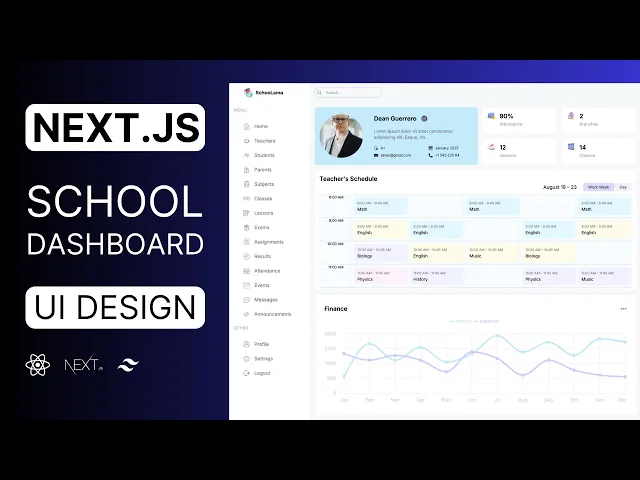


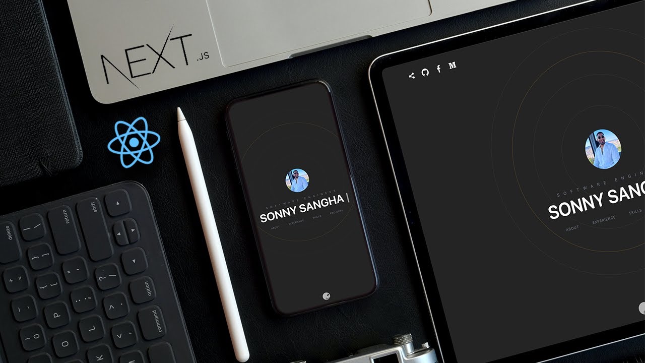
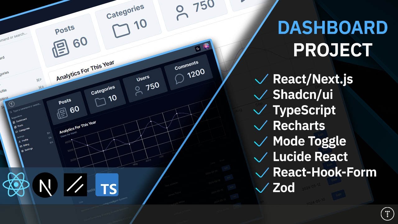

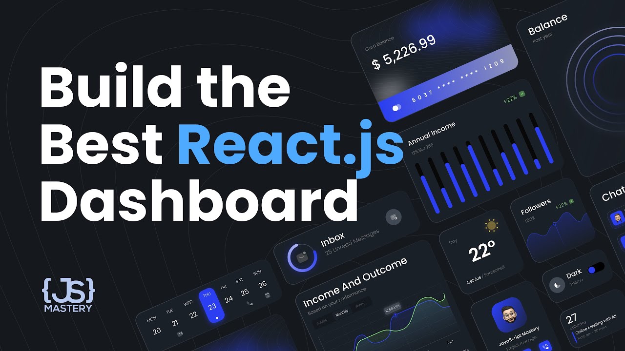


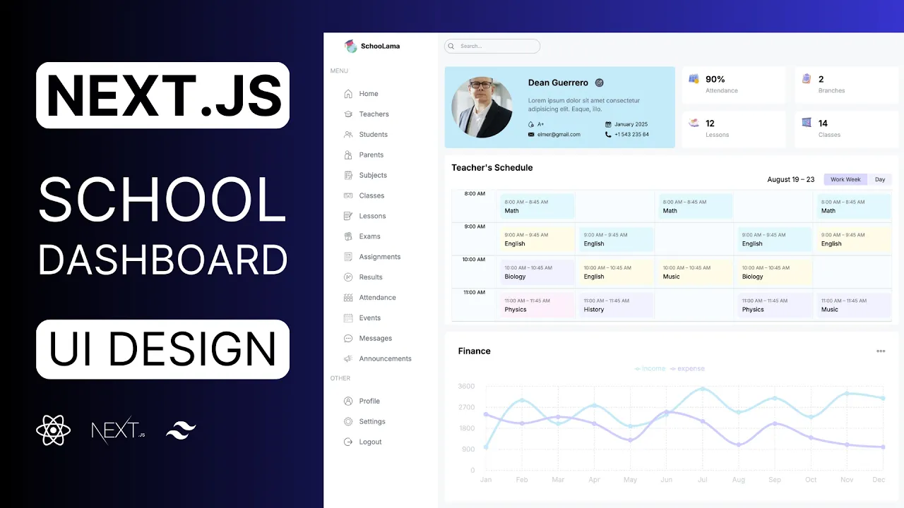