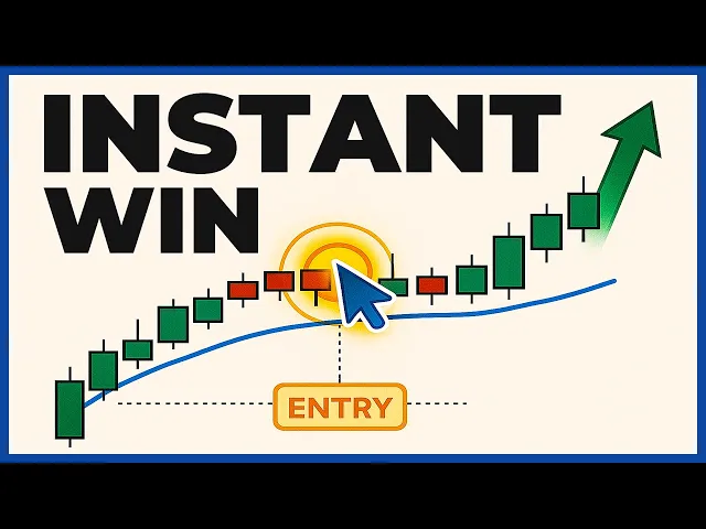
In this course I'm going to teach you everything you need to know about getting started with technical analysis no matter if you are new to the trading game or your intermediate or Advanced Trader this course will help you read any Market with precision and consistency we'll break down technical analysis into easy to understand Concepts and will cover everything from Market structure Cycles candlesticks Patterns volume and many more so like subscribe and let's get started Market structure must be the foundation of your analysis the first part of any trading plan is to establish which side of
the market is in control demand or Supply buyers or sellers when reading Market structure you have to pay close attention to one thing on a chart price price is King and will tell you all you need to know when price is moving influenced by supply and demand this Great strengths an uptrend also called a bull trend is pictured by higher highs and higher lows the trend will continue in that direction until a lower low is created by the price the trend begins to show signs of weakness when it fails to create a higher high a
downtrend also known as a bear trend is the price action of lower lows and lower highs The downtrend will continue as long as new lower Highs are created once a higher high comes into the price the trend might end the sign that the trend may be reversing is when price begins to print higher lows in addition to higher highs a sideways trend is a trend that has approximately equal highs and equal lows price trends in a Range during this point of the market or better set is in a consolidation phase and markets can Move in
a period of consolidation for a long time this trend is broken if the price breaks out from the top or bottom of the range this could be the beginning of one of the first two trends these are the obvious Concepts regarding Market structure now let's go deeper and let me share the subtleties of the market structure the first principle is the most obvious one for a market to be in an active Cycle its most recent structure must be one where price creates a high that breaks the previous high this is the case of a bullish
cycle a down cycle will be established if the latest swing low in the price breaks below the most recent low in this example you can clearly see the market in an upcycled phase with higher highs and higher lows to confirm that the bullish Trend or an upcycle is evolving in a healthy manner Not only we need to see the high created being higher than its previous High what we also should expect at least several closes above that high this is further evidence that the market is accepting and building value above it a failure for price
to remain above that High may translate into a false Breakout and while this price move still qualifies as a new high in the cycle the momentum the speed of the move is weak you must conduct your Market structure Analysis on multiple time frames you must avoid the Trap of being short-sighted by only sticking to one time frame when conducting your analysis it's all about finding confirmation from higher time frames what this means is that if you are planning to enter on the hourly time frame for example you should then understand what type of conditions are
dominant in the higher time frames the most popular in this case would be the four hour and the daily charts we'll Talk about later about how you should analyze multiple time frames markets don't always Trend and will come to the point in the market structure where the dominant Trend starts losing momentum while you are in an uptrend reading the market structure is straightforward but you must determine when you've transitioned from a trend into a consolidation here's my method let's consider an Uptrend transitioning into consolidation first you must see a failed test of a recent High
this means that price is unable to break the recent High second a failed test of the most recent swing low would confirm that we have entered a consolidation phase which would last until the most recent high or low is broken with at least several closes above or below level Meaning price remains for a longer period above or below that level in this context don't forget that the consolidation is still within the context of an uptrend until price manages to break and hold below the latest valid swing low the strength remains to the upside the break
of structure is the first sign that the market is telling you that it's about to get weaker or it's about reverse Let's say we have an uptrend higher highs and higher lows we have a break of structure when price makes a new lower low and a lower high this tells you that this trend could be weakening or it could reverse for a downtrend the same concept lower lows and lower highs we have a break of structure when price makes a new higher high and the higher low there's no guarantee that the trend is Over but
this is a warning sign a sign of weakness in the previous downtrend another major sign that will help you determine the strength of the cycle is the type of progress made by the Dominion side in control of the cycle you need to ask the following question are the new swings in the cycle increasing or decreasing in magnitude here despite having entered a period of consolidation if we measure the latest wings from the last low to the most Recent High we see that this is bigger versus the previous wave this means that buyers are increasing their
commitment on each new cycle High when it comes to the distance the price moves the magnitude is only half of the equation the other one has to do with the velocity of the move or the speed was the new wave created after a fast and impulsive move or did price make a new lower high with the momentum being sluggish and taking Too long to form A good rule of thumb is to count the approximate number of candles it took to achieve a new leg in this case you can see that the second leg was created
with a lower number of candles this means faster speed this is the simplest way of analyzing a market the big advantage in analyzing Market structure this way is the fact that you keep your charts clean and uncluttered now let's talk about Market Cycles [Music] price action in the financial markets doesn't occur randomly it appears in a structured manner involving distinct faces price action follows four distinct Cycles accumulation markup distribution and markdown [Music] accumulation is the first cycle this Phase is characterized by increased demand for a market it typically occurs when the price has decreased significantly
to a point where a market appears to have sold too much in this area buyers start accumulating positions as they begin to take advantage of extremely low prices while accumulation is characterized by buyers winning the battle against sellers price action tends to remain flat struggling to make any new highs In this case the price oscillates in a Range making lower Highs but no new highs even if price remains range Mount the buying pressure dominates the accumulation phase before the price breaks out of the accumulation phase it is common for price to move below the lower
level of the range this movement is a false breakout giving buyers another reason to buy low Markup face is characterized by Price breaking out to the upside the cycle occurs as buyers gain enough power and control to steer the price above the upper level in the accumulation phase price breaks out of the upper level of the range and starts making higher highs and higher lows this confirms buyers are in control and poised to drive price to new highs distribution phase occurs after the Price has increased significantly and sellers attempt to regain control as a result
the price action on the chart appears flat with a price trading again in a Range lower tops and flat bottoms generally characterize the range before the price breaks out of the range in the distribution phase it is common for it to move through the upper level at the top this false breakout at the top offer sellers another opportunity to Sell High then price moves aggressively below the lower level of the range Paving the way for the next phase a markdown phase is the last stage in the course as sellers over power buyers and steer prices
below the lower level of the distribution phase cycle appears as a strong downtrend after it breaks the lower level of the flat range knowing these Cycles is an important Part in your technical analysis process this will allow you to predict price action based on the prevailing phase this analysis offers an edge in recognizing upcoming price modes for instance if you pinpoint the end of the accumulation stage you'll enter at the beginning of the markup stage an opportunity to profit from prices moving to the upside likewise you want to enter at the end of the distribution
phase and at the beginning of the markdown thus Preparing to profit from a solid price move to the downside support and resistance is one of the most widely used Concepts in technical analysis support is an area where a price has shown a tendency to stop falling think of support as the floor beneath the market so why did this particular area become the floor perhaps the buyers have decided that this is a good price to take a buy position and therefore buying Pressure emerges when the price reaches this area preventing the price from falling further or
perhaps the price has decreased to a point where the sellers are no longer comfortable selling they'd prefer to wait in the hope of selling at a higher price for whatever reason the price has shown a tendency to stop falling at this point resistance is an area where the price has shown a tendency to stop Rising Think of resistance as the ceiling above the market perhaps the buyers no longer wish to buy once the price has reached this level and they'd prefer to see the price drop before buying more or maybe the sellers have determined that
this is a fair price at which to sell and their influence Supply selling pressure at that price for whatever reason the price has shown a tendency to stop rising at this point how to draw these levels many Traders Make the process of drawing support and resistance levels a lot more difficult than it needs to be there are six main rules look for extreme swing highs and swing lows meaning look for the highest and the lowest points that price has reached in the recent time look for at least two rejections of an area you want the
level to be obvious meaning it jumps right out at you you should be Able to spot the level right away when looking at the chart the move away from the area was significant the level acted as both support and resistance and it was respected from both sides and the level was recently respected were formed in a recent time period now very important you don't need all these conditions when you draw a level the more rules the level fulfills the Better but you don't need the level to check all six conditions now here's a big misconception
regarding support and resistance levels the more times the level is tested the more valid it is this statement is one of the biggest lies in technical analysis like I said really strong support or resistance levels immediately push price away from them there is enough buying pressure at Support enough buyers waiting to buy at that level that the market is immediately moved up and away from the level if price can hang out around the level or quickly comes back to the level it suggests a certain lack of conviction on the part of the buyers if the
market is able to retest the level many times then you have a potential setup for a breakout through the level a move below it If you look at this example the orders at the support level are absorbed each time price revisits the area until buyers lose their power price then plunges through the Zone with little difficulty and also look at this resistance level the upper Zone was tested several times and sellers came in pushing the price down this resistance level was gradually eroded as the more and more sellers had Their orders filled eventually there were
less Sellers and price broke through personally I avoid buying a support which has been tested multiple times in the past the greater the number of times a zone is tested the more likely it is to break once all buyers have gone price can move through that level to the next area don't need to draw every level you can find on your charts many Traders fall Into this trap and they end up taking too long to draw on every little level they can find what they end up with is a really messy chart that basically does
more harm than good you need to learn to draw only the significant levels on your charts then you have a useful framework to work from [Music] your support and resistance levels shouldn't be drawn across the exact Highs or lows of the price bars oftentimes support and resistance are more zones than exact levels you'll see a key level that is indeed an exact level but more often than not price will break your line or will turn before it touches the level point being you don't always have to draw the level exactly through the high or the
low of the bar we talked about Market structure Cycles Trends support and resistance now let's Go even deeper and talk about candlesticks candlesticks are basically A visual representation of what is going on in a market by looking at the Candlestick you can get information about the Open high low and close of the price which will give you an idea about the price movement Candlestick analysis will help you understand this changing psychological factors in the market by showing you how Buyers and sellers interact with each other most Traders prefer to set green candles to access bullish
and red candlesticks as bearish a bullish Candlestick simply means the price opened lower and closed up higher after a certain time period which can be one minute five minutes one hour and so on a bearish Candlestick simply means that the Candlestick opens up at a higher Price and closed lower after a certain time period the candle body represents the distance price has moved from the opening price to the closing price high is the highest price that was reached during that time period and the low is the lowest price that was rich during that time period
foreign candlesticks that are considered bearish and bearish candlesticks that are Considered bullish to really understand this concept you need to understand buying and selling pressure you see every Candlestick that is formed tells your story about the battle between the buyers and sellers who dominated the battle who won at the end and who is weakening all of this is reflected in any Candlestick you see the length of the body of the Candlestick as well as the Shadow or the wick tells you a story about the buying And selling pressure let's look at this green Candlestick it's
a bullish Candlestick right yes but you can see that it has a very short body and a very long week or a tail or a shadow it tells you the sellers were dominant if this Candlestick was to form after hitting a resistance level it will be considered a battery signal even though it's a bullish candlestick you can apply the same sort of logic to all of the other candlesticks and read The story each one is telling you if the upper week is very long it means price opens and got pushed Higher by the buyers but
then at the highest price sellers got in and drove it back down if the lower week is long it tells you that there is a lot of buying pressure sellers drove the price down but buyers got in and drove the price back up if the lower week is short it tells you there's very minimal buying pressure if the upper week is short it tells you That there is very minimal selling pressure [Music] and what about the length of the body of the candlesticks a longer body of the candle indicates a very strong buying or selling
pressure a short body of a Candlestick indicates little price movement and therefore less buying or selling pressure sometimes the candles will have no upper or lower Shadows but with very long Bodies these are the same as standard candlesticks but are anyone stronger indication of bullish or negative Market sentiment in the case of a bullish candle prices never decline below the open in the case of a bearish candle price never traded above the old one what Traders do is over complicate their Candlestick trading and focus on things that are not necessary you'll make a big Mistake
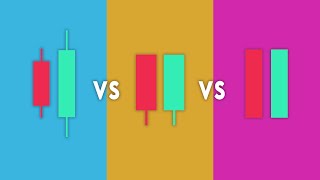
if you start memorizing 40 or 50 types of Candlestick formations because when you start analyzing a market you'll have to consider 50 variables before making a decision so let's simplify Candlestick trading among the dozens of Candlestick formations there are six basic Candlestick types [Music] the long Candlestick indicates a lot of momentum among buyers or sellers the lack of Shadow or tail or weak indicates Exceptional strength for one side or the other a long Candlestick may have no Shadows or a small one at the top or at the bottom of the real body the significance of
the long Candlestick relies completely on its location for example a long green Candlestick appearing within an uptrend could be a strong confirmation signal but if the same Candlestick appears after a downtrend it could act as a potential Reversal signal the same for a long red candle 6. within a downtrend it tends to confirm it and when it follows an uptrend it is more likely to Signal or reversal Candlestick with average or relatively small range signals a general agreement between buyers and sellers that the current price is reasonable however when short candlesticks appear following a period
of strong Trend in either direction especially when long Candlesticks have shown up they can indicate a struggle between buyers and sellers and a possible reversal in the trend or slowing down in price momentum the appearance of a single short candle is not meaningful by itself when a series of short candles appear it may show declining momentum in the current Trend or be a symptom of sideways movement the candle with no real body or a very narrow range one in which the open and The clothes are the same represents a significant development the fact that price
opens and closes at the same place has greater significance when the doji also has upper or lower Shadows or both the longer Shadows reveal an attempt by buyers or sellers to move price in the desired Direction however the effort failed when price returned to close at the same price as the open when a doji appears at the bottom of a downtrend and also has an exceptionally long lower Shadow it shows that sellers tried to move price lower but couldn't this hints at the likely reversal and the possible movement to the upside if adoji appears at
the top of an uptrend and also has a very long upper Shadow this may indicate a possible reversal and a possible down movement in the first place doji candles indicate a loss of momentum and based on the appearance of any Shadows May provide reversal signals [Music] one of the most interesting signals is an exceptionally long Shadow or weak appearing on both sides of the real body when such Shadows are found in both upper and lower ends it shows that neither buyers nor sellers had enough power to move price beyond the opening and closing range this
failure of both sides to control price movement could be a sign of a period of consolidation When a Candlestick is up with Long Shadows on both sides and the current trend has been underway it can signal the end of that Trend even though both sides were unable to create more movement [Music] when a candle contains an unusually long upper Shadow it signals that buyers have lost momentum or failed in an effort to take momentum away from sellers if this pattern unfolds at the top of an uptrend It's a signal that the trend may be about
to end if it shows up within a downtrend it may conform more established continuation buyers try to reverse the downtrend but failed a long upper Shadow candle often appears at the top of a knob move and is off on the lowest point in the downtrend and signals a reversal point the appearance of a Candlestick with a long lower Shadow indicates a failure by sellers to move price slower which leads To the immediate conclusion that either the current downtrend is ending or an existing uptrend is continuing however the pattern can have either a bullish or a
bearish interpretation depending on where it appears the real body may also be either green or red without affecting the interpretation of the candle along a lower Shadow candle often appears at the bottom of a Down move and is often the highest point in the uptrend and signals The reversal point the multitude of Candlestick patterns you should pay a closer attention to engulfing candles this Candlestick formation consists of two bodies the first body being smaller than the second one in other words the second body engulfs the previous one in the case of a bearish engulfing bar
this pattern tells us that sellers are in control of the market when this pattern occurs at the end of an uptrend This indicates that buyers are engulfed by sellers which signals a potential Trend reversal buyers are losing control of the market and sellers are trying to push the market to go down the bullish engulfing bar tells us that the market is no longer under the control of sellers and buyers are gaining strength when a bullish engulfing candle forms in the context of an uptrend it indicates a continuation signal when a bullish engulfing candle Forms at
the end of a downtrend it signals a potential reversal inside bars are another formation you should incorporate in your analysis inside bars are either one or more candlesticks which are contained within a range of one candle this Candlestick is usually referred to as the mother candle the second small bar is completely contained by the first one which is the opposite of the engulfing bar pattern The inside bar is seen as a reversal pattern because it indicates that the market trend is likely to change especially when it's located at tops or bottoms the inside bar formation
also indicates a period of consolidation in the case of a bullish Trend it reflects that balls are not buying any further on the second candle and this is represented by a small red candle after a strong uptrend Bar is without a doubt one of the most powerful and reliable price action trading signals they are very simple Candlestick patterns but when paired with a solid context they can foreshadow large Market reversals we talked about them previously when we simplified candlesticks a pin bar is a single Candlestick with a long tail whose price action demonstrates a rejection
of a price level and reversal in price bullish pin bars form when sellers start The candle in control but price reaches a level that's rejected and buyers take over and dominate the remainder of the candle closing out near were at the high of the candle bearish pin bars form When Buyers start the candle in control but price reaches a level that's rejected and sellers take over and dominate the remainder of the candle closing out near or at the lows I consider a valid spin bar a candle that meets two conditions The week is minimum three
times the length of the body and the weak must stick out from all other candles and must be very obvious now the technical analysis of candlesticks is not about finding pin bars engulfing patterns or seeing if there are more green candles than red ones it's about observing price bars as they form and understanding what the market has done and is doing a candle of the same type will have a completely Different meaning depending on where it appears in a price trend is it at the start of a trend or in the middle of the trend
or at the end of it is it that support or resistance or in the accumulation or distribution phase candlesticks should be analyzed in the context of the price move you should never try and read the candle in isolation analyzing multiple bars as a group on several time frames offers a lot more analytical value The point is start reading the current candle in relation to the previous bars is the current Candlestick larger or smaller than the previous ones which recent candles are showing momentum increases or decreases is the size of the body meaningful or not are
you seeing a buying or selling pressure Candlestick patterns don't always have to mean anything of Interest some signals are really not signals at all This is why confirmation is so important confirmation is an important aspect of Candlestick analysis it's the observation of separate and independent signals that verify what the Candlestick pattern predicts for example a Candlestick reversal may be confirmed by tests of resistance or support or momentum changes you need to rely on confirmation to improve your timing of entry and exit confirmation is necessary because no single Candlestick Pattern is always reliable you know this
even confirmed signals May Fail however with the use of confirmation the ratio of successful timing improves and failed signals are more easily spotted a confirming indicator may also consist of a second sign of the same type for example an initial Candlestick reversal may be followed by an equally strong but different Candlestick revealing the same potential you may find a pin bar which is followed By an engulfing candle at a support level three factors which confirm a possible Buy trade when this occurs the reliability of the signal is much stronger one of the most efficient tools
to follow a trend are trend lines trend lines are lines that connect consecutive higher lows in an uptrend and consecutive lower highs in a downtrend a trend line is most helpful when looking For entries in the direction of the trend on pullbacks and in the opposite direction after the trend line is broken while they are relatively easy to apply on a chart there are many trend lines misconceptions and mistakes made by Traders in their analysis my first advice is to ignore the candle wicks trend lines are only useful if placed correctly otherwise you could find
yourself missing opportunities or Worse trading on the wrong side of the market drawing trend lines isn't an exact science there are usually multiple ways to draw a trendline but from my experience the best trend line is applied by using the candle bodies in the tails in my opinion clothes are more important and they carry more meaning if a candle closes at a certain level this means that market participants were ready to accept this level as a market balance point As in the case of support and resistance levels you should treat trend lines as areas price
is a very Dynamic concept and volatility and momentum can affect price moves in significant ways this is the subject of another video but when retail Traders are trying to place a trade at a very obvious price level the professional Traders know this and they will do their best to kick out the amateurs by letting price spike through Levels to overcome this shortcoming and to improve your trading skills you need to start using areas instead of just single trend lines by using areas you can create noise zones and filter out a lot of Market noise use
trend lines as zones then you don't need to worry about drawing trend lines along the exact highs or lows another tip spacing between connecting Points matters the laws used to form a knob trend line and the highs used to form a downtrend line should not be too far apart or too close together the most suitable distance apart will depend on the time frame and the degree of price movement if the lows or the highs are too close together the next price reaction at the trend line is questionable if the lows are too far apart the
relationship between the two points Could be suspect an ideal trend line is made up of relatively evenly spaced lows or highs so why it's important to measure the time between consecutive touches we talked about this in the support and resistance module before a breakout occurs the price tends to Cluster around the supporting trend line and the time between the consecutive touches tends to become shorter as the uptrend starts to lose momentum The time between each consecutive touch on the train line becomes shorter finally the time between the last two touches was very short after which
the price broke below the trend line and started a strong downtrend buyers weren't strong enough to defend the trend line and sellers kept pushing the price lower so if the market repeatedly tests a train line many times in a relatively short period and the price cannot drift Far from the trend line then a breakout will likely happen the market will break through the trend line and attempt to reverse the trend of course this is not always accurate but when I see this pattern I'm inclined to trade a breakout rather than a continuation and here's another
important note the angle of the trend line matters as the steepness of the trend line increases the validity of the supporter resistance Level decreases a steep trend line results from a sharp Advance or decline over a brief period of time the angle of a train line created from such sharp moves is unlikely to offer a meaningful support or resistance level even if the trend line is formed with many valid points attempting to trade a trendline breakout will often prove difficult once a trend has been established by a Series of trending highs and lows the more
the most profitable trades are in the direction of the trend line until the trend line is broken every time the market pulls back to the area around the trend line even if it undershoots or overshoots the trend line look for a reversal from the trend line and try to enter in the direction of the previous trend tip after a trendline breakout the chances are high that the area will get Tested after a pullback depending on market conditions the test can be followed by the trend continuing in the initial direction in which case you must readjust
the trend line with the new swings created prices don't usually move in a uniform fashion and since trend lines account for both time and price they move along the price and time access this means that any acceleration or deceleration of the trend requires adjustments to the Trend line to decide whether a trend line should be adjusted or whether it has been definitely broken consider how the price moves within a trend during an uptrend for example the price makes higher highs and higher lows as long as that keeps occurring if the price moves below the trend
line it doesn't necessarily mean the trend has ended the trend line just need to be adjusted and as in the case of support and Resistance levels higher time frame trend lines are the most important lines the longer a trend line is respected the more important it becomes a trend line that extends over two weeks will always be considered more important than a line that only extends on the course of a trading session to get the very best results with trend lines use higher time frames like the 4 Hour or the daily charts another tip is
to use trendline channels A trendline channel is on the opposite side of the price action from the trend line and has the same general slope in a bull trend for example a trend line is below the lows while a trend channel line is above the highs and both are rising up and to the right a trendline channel is useful for fading a trend that has gone too far too fast or to take your profit if you entered a long position around the lower trend line The price pattern concept is similar to support and resistance at
any one time Market participants have one of three choices to buy sell or stand aside as this ratio between the three groups change over time so thus the supply and demand for any given market and this is how patterns are formed most batters fall into one of two groups reversal chart patterns which indicate that price is about to change direction or continuation chart patterns which Indicate that price should continue in its current direction reversal patterns tend to be more dramatic and impactful than continuation patterns and you only need to focus on three of them head
and shoulders and the double top and double bottom formations The Head and Shoulders is a bearish reversal pattern that consists of three main parts the left shoulder The Head and the right shoulder the pattern begins as a series of higher Highs and higher lows the classic definition of a trend that sequence is altered when a low point is formed that has the same approximate value as the previous low the left shoulder and the head of the pattern are now fully formed and this is the first sign that the changing trend is on the horizon the
price rallies from this low point but instead of resuming the sequence of higher highs a lower high occurs often This lower high is similar in value to the prior high points on the left shoulder then the price slides back to the previous low for a third time forming the right shoulder the pattern of highs within the head and shoulders are high higher high and lower high the three laws should be similar in value and represent an area of horizontal support this is known as the neckline of the pattern Think of the head and shoulders pattern
as the transition point between these two opposing trends the left side of the pattern represents the end of the uptrend the final higher high and the right side of the pattern represents the beginning of the downtrend the first lower high if you understand the concept of a head and shoulders pattern the bearish double top should be easy to follow first price must form a series of higher highs and Higher lows the definition of an uptrend the sequence is disrupted when the price finally fails to reach a higher high instead the price is only able to
match its previous High the two highs don't have to be perfectly symmetrical the focal point of this pattern is the area of horizontal support if and when the price Falls below this low you can use it as a signal to sell because the next likely move is lower [Music] the bullish double bottom pattern is simply the inverse of the bearish double top one the price has formed a downtrend consisting of a series of lower lows and lower highs at some point the price fails to make a lower low instead the low price approximately matches the
previous low again the two lows don't need to be exactly the same the focal point of this pattern is the High that rests between the two lows this area is now considered resistance if price breaks above resistance the pattern is completed and the breakout has occurred through a period of trending the market will often pause this pause is known as a consolidation on many occasions these consolidations form specific shapes and patterns known as continuation patterns so let's take a closer look at the best continuation formations what they are What they mean and how you might
use them to your advantage a triangle consists of two opposing trend lines imagine that a series of lower highs appears on a chart simultaneously coexisting with a series of higher lows the result would be two trend lines that move toward each other this formation is known as a symmetrical triangle and has no directional bias this is because both the buyers and Sellers are demonstrating strength the buyers are buying at consistently higher levels and the sellers are selling at consistently lower levels symmetrical triangles are assumed to be continuation patterns in other words the price should continue
moving in the direction established prior to the formation of the symmetrical triangle in this cases the triangle itself is basically a consolidation that occurs within the trend However the pattern itself shows that both buyers and sellers have a similar degree of control so the psychology behind the symmetrical triangle seem to say that neither of them have a significant advantage foreign triangle the ascending triangle pattern has a clear directional bias in this pattern the buyers show their power by forming a series of higher lows because the buyers are willing to buy at Consistently higher prices they
are considered the aggressive side meanwhile as the buyers push higher the sellers are unable to create momentum in the opposite direction instead form a horizontal resistance level this indicates that the sellers are simply trying to stand their ground as the buyers move toward them from increasingly higher levels the assumption is that the aggressive Site in this case the buyers will eventually overcome the passive Sellers and push through resistance this is the inverted version of the ascending triangle in this case the sellers demonstrate their Superior Firepower by pushing the price to a series of lower highs
meanwhile buyers can only form an horizontal support level indicating a lower level of commitment than the sellers The Assumption here is that the passive buyers will eventually be overrun by the aggressive sellers this bearish pattern is considered more effective when it appears within an overall downtrend although this is not a requirement a bull flag pattern begins with a sharp almost vertical bullish movement this move indicates that the buyers are the dominant side this initial bullish move is known as The flagpole this initial movement is followed by a mild reversal which slopes gently in the opposite
direction this second move indicates that the sellers are unable to show a similar response forms a shape that is bounded by two parallel lines resembling a flag how to analyze this the dominant side in this case the Bulls are expected to take control as a result the price is expected to continue moving higher A bullish wedge also referred to as a falling wedge is a continuation pattern that slopes downward in the opposite direction of a prior bullish trend in this sense it's similar to a bull flag pattern in which the flag itself slopes in the
opposite direction of the trend while the pattern contains a series of lower highs and lower lows each subsequent low barely exceeds the previous low causing a line drawn beneath those lows to slope gently lower This contrasts with a line drawn above the lower highs which forms a steeper slope the two resulting lines converge at an angle as these lines come close to each other a move in the direction of the prior trend is anticipated a bullish rectangle occurs when after moving higher in an uptrend the price forms a sideways consolidation which is bounded by clear
levels of support and resistance the area of consolidation resembles a Box in theory this consolidation is similar to a symmetrical triangle the main difference is the converging trend lines of the symmetrical triangle are replaced by the parallel lines of the rectangle as with the symmetrical triangle price is taking a breather before resuming its trend a bearish rectangle occurs when the price forms a sideways consolidation after trending lower Station area is bounded by clear levels of support and resistance and also resembles a box this continuation represents a pause in the trend and you should expect a
resumption of the downtrend when it comes to price patterns location is of key importance in fact it could be said that the chart pattern is defined not only by its shape but by the price action that precedes it a pattern that Hints at the continuation of the current move is useless if there is no existing Trend that can be continued likewise without a trend to reverse a chart pattern that hints at the price reversal loses its meaning all patterns must be viewed within the context of the price action that preceded that patterns formation dark patterns
occur in all different chart types in all time frames they are just as likely to appear on an hourly Chart as they are on a daily one because these patterns can occur in any time period they are considered fractal in nature and here's the main problem with chart patterns we Traders have an unfortunate tendency to see what we want to see because of this it can be difficult to treat all charge patterns with 100 objectivity there are even traders who question whether the patterns we've discussed Here actually exist because we tend to see what we
want to see it might be a good idea to avoid searching for specific patterns instead examine charts without expectations looking for nothing in particular and wait for a pattern to reveal itself the gold pattern should be fairly obvious it should stand out if it takes more than a few seconds to identify the pattern it might not be a Useful example of the information and remember patterns fail like any technique nothing in technical analysis is guaranteed the truth is that they are easier to spot after the event but you can still build a plan around them
after the breakout occurs another key point is that textbook patterns are quite rare in real time you won't find a perfect triangle you'll see many price bikes false breakouts you just have to observe the relationship between the swings and Adjust your lines as the price unfolds and another tip chart patterns are more reliable on the higher time frames so look at the bigger picture first volume plays a key part in the current and future direction of a market trading volume is a measure of how much a given Market has traded in a period of time
for stocks volume is measured in the number of shares traded for futures and options volume is based on how many Contracts have changed hence looking at the volume patterns over time can help you get a sense of the conviction behind advances and declines in specific markets in technical analysis volume is the second most valuable item of data after the price itself large volume confirms Market activity and that market participants are involved in the move including smart money who bring the highest turnover to the market When the smart money are trading it means they are interested
in price at certain levels and they literally push the price up or down low volume tells us that there are very few participants in the market and that neither buyers nor sellers have any significant interest in the price volume can help you determine the health of a trend an uptrend is strong and healthy a volume increases as price moves with the trend And decreases when price goes counter Trend during correction periods also known as pullbacks when prices are rising and volume is decreasing it tells you that the trend is unlikely to continue price may still
attempt to rise at a slower Pace but once sellers take control which is usually signified by an increase in volume prices will fall a downtrend is strong and healthy if volume increases as prices move lower And decreases when the price begins to retrace to pull back upwards when price is falling and volume is decreasing the downtrend is unlikely to continue the price will either continue to decrease but at a slower Pace or start to rise when a volume spikes at certain price levels you should know that this was an area of high interest for Traders
at that price level If there is a great deal of Interest it means the level is a key one this simple observation of volume will allow you to identify important support and resistance levels which could play a significant role in the future where volume spikes are extreme in other words larger than any historical spikes nearby this is generally known as a volume climax when this occurs you should look for signs for the future direction of the Move from the price itself and this is often followed by a particular candle or a price bar pattern massive
volume spikes are often seen during fundamental announcements on a daily basis reversals however happen not over a single day but over a series of days if higher than average volume stays in the market for several days a huge bomb spike a volume climax will Crown a point of Market reversal volume can help to validate all kinds of Breakouts when the market is consolidating on low volume a pickup in volume can signify that a breakout is due I'll break out the carrying on a rising volume is a valid Breakout while a breakout that attracted no interest
from Traders occurring on low volume is likely to be false when you analyze a market you shouldn't be looking for two points whether the price has been validated by the volume Or whether there is a Divergence with the price if the price is validated then this confirms a continuation of the price Behavior by contrast if there is a Divergence then this is sending a signal of a potential change Fibonacci retracements are one of the most popular technical analysis tools used in the financial markets this technique is based on the Fibonacci Sequence a well-known mathematical concept
but I don't want to bore you with numbers in mathematics you just need to know that Fibonacci retracements are used to identify potential levels of support and resistance during a price trend Fibonacci levels or simple horizontal lines that indicate possible support and resistance levels where price could potentially reverse Direction the first thing you should know about The Fibonacci tool is that it works best when the market is trending the idea is to go long or buy on a retracement at the Fibonacci support level when the market is trending up and to go short or sell
on a retracement at a Fibonacci resistance level when the market is trending down the theory is that after price begins a new trend Direction the price will retrace or return back to a previous price level before resuming in the Direction of its trend so how to draw Fibonacci levels in order to find this Fibonacci retracement levels you have to find recent and significant swing highs and lows in a market then you take the tool and for downtrends you apply it on the swing High and drag the tool to the most recent swing low for uptrends
you do the opposite you apply the tool on the swing low and drag It to the most recent swing High remember there must be a visible Trend otherwise FIB levels won't have a meaningful impact on price movement no matter how often you use Fibonacci what's most important is to use it correctly choosing the correct price link for placing your fibs is one of the main problems when using it Fibonacci is an effective method but you must place it on the swings that make The most sense for the current market conditions and remember the most important
aspect when using Fibonacci the presence of a trend Fibonacci doesn't work well in consolidations Corrections ranges or sideways movements also don't use the Fibonacci retracement tool on very small price moves or shorter time frames the shorter the time frame the less reliable the retracement level making it very difficult for you To really pick and choose what levels can be traded try to focus on the larger time frames when you apply Fibonacci levels further if you use the Fibonacci tool on very small price moves it may not provide much Insight the levels would be so close
together that almost every price level appears important many Traders are disliking Fibonacci because this tool is subjective there are multiple price swings during a Trading day so not everyone will be connecting the same two points the two points you connect may not be the two points others connect that's why don't try to force the levels the best and most helpful Fibonacci retracements are those where you don't have to look long on a chart Fibonacci levels provide areas of interest to watch for pullbacks there are two main types of pullbacks using Fibonacci shallow and deep retracements
If you correctly analyze the strength of the trend you will have high probability areas to take trades once a trend has clearly established itself you will often see shallow pullbacks to the 23 38 and 50 FIB levels which are very typical before the trend continues so when the trend is strong pay attention to these fee levels on the other hand price will make a deep pullback when a trend is not yet clearly established you will see deep pullbacks To the 61 78 and 88 FIB levels if the price retraces 100 of the last price wave
that may mean the trend has failed [Music] when you see the price coming into a Fibonacci support area the biggest sign you can look for is the volume to see if that support will hold in this example notice how the market had a number of spikes higher in volume on the move up But the pullback to support at the retracement saw volume decreasing this doesn't mean people are not interested in the market it means that there are fewer sellers pushing the price lower this is where buyers come in and accumulate in anticipation for the rally
higher high volume after the rejection of a Fibonacci level represents a very good signal financial markets have price movements That repeat over and over again these movements are called waves when you are analyzing a market you need to answer four key questions what direction the price is trending how far is the trend likely to go where can you enter a trade with the best risk reward ratio and most importantly at what point you are definitely wrong Elliott wave theory answers all these questions Elliott weight theory is a comprehensive and complex topic but despite its complexity
There are some elements of Elliott wave that can be incorporated and may help you analyze a market so I'll try to keep this very simple and I will break down the wave theory into small bases Ralph Elliott a Trader who developed the theory said that Trends in financial markets resulted from participants predominant psychology he found that swings in Mass psychology always showed up in the same recurring fractal patterns or waves Elliot discovered that Price patterns were structured in the same way so prices moved in impulsive and corrective waves knowing which wave is underway in what
recent waves were will help you to forecast what the price is likely to do next impulse waves are the ones that best represent the direction of the current Trend during an uptrend for example the impulsive moves are those that push prices higher this impulse movements are often made up of large Candlestick Bodies and are typically quite aggressive especially compared to corrective moves remember an uptrend keeps reaching higher prices because the moves up are larger than the moves down which occur between those large up waves on the opposite end of the spectrum we have corrective moves
or waves that work against the prevailing trend these counter Trend moves represent the period of consolidation and are Typically weaker and less aggressive than the impulse waves the corrective move during an uptrend is characterized by a move lower or even sideways unlike impulse movements Corrections are formed by a mixture of bullish and bearish candlesticks where the bodies are relatively small Elliot found that when an uptrend is underway it typically has three large upward price moves and two Corrections this creates a five wave pattern impulse Correction impulse correction and another impulse the uptrend is Then followed
by three waves lower an Impulse down a correction to the upside then another impulse down these waves are labeled a b and c Elliot also found that these movements are fractal meaning the pattern occurs on both small and large time frames [Music] There are three rules that all Elliott wave Traders agree on the end of The Wave 2 cannot go past the start of wave 1. Wave 3 cannot be the shortest impulse wave that means Wave 1 or wave 5 or both must be shorter than wave 3. and wave 4 cannot go into the price
territory of wave 2. this means Wave 2 and 4 must have some clear separation of price are ever stuck on where to place your Elliott wave points always remember to follow those three rules so why are Elliott waves important well knowing their location and knowing in which wave you are potentially in they can help you to better time the market I advise you to trade in the direction of the impulse waves because the price is making the largest moves in that direction you can use the end of the corrective waves to enter into a trend
trade in an attempt to capture the next Bigger impulse wave the ideal way to trade is to buy during pullbacks or at the end of a corrective wave during uptrends and ride the next impulse wave as it takes the price higher also you sell at the end of a collective wave in a downtrend to profit from the next impulse wave down [Music] if volume represents commitment then gaps represent excitement A gap occurs when the price leaps higher or look from the previous price leaving an empty space or gap between two prices if you trade stocks
or indices you'll often see blank spaces which represent times when no transactions took place within a particular price range normally this occurs between the close of the market on one day and the next day is open this space between two consecutive days price ranges has various degrees of Significance generally gaps below the market tend to act as a support area and gaps above the market suggest resistance and an area where there will be selling interest there are two primary kinds of gaps up gaps and down gaps for an up Gap to form the low price
after the market close must be higher than the high price of the previous day a down Gap is just the opposite of an up Gap the high price after the market close must be lower than the low price of the previous day and these gaps happen because of an imbalance between supply and demand gaps are very important in my technical analysis plan because they offer evidence that something important has happened to the fundamentals or the psychology of the crowd gaps can be classified into four groups common gaps Breakaway gaps exhaustion Gaps and continuation gaps [Music]
common gaps simply show a gap in price action independent of price patterns and usually don't provide exciting trading opportunities these occasional gaps are the result of normal Market forces these gaps are usually filled fairly quickly getting filled means that the price action at a later time usually retraces at the last day before the gap this is also known as closing the gap A common cap usually appears in a trading range or a congestion area where it reinforces the apparent lack of interest in the Market at that time this is often further intensified by low trading
volume because common gaps are relatively small normal and somewhat regular events in the price action they tend to provide no real analytical insight Breakaway gaps occur when the price action is breaking out of a trading Range or a congestion area a congestion area is a price range in which the market has traded for some period of time usually a few days in order to break out of these areas we need some Market enthusiasm and many more buyers than sellers for upside breakouts or many more sellers than buyers for downside breakouts volume will and should increase
significantly not only from The increased enthusiasm but because many Traders are holding positions on the wrong side of the breakouts and need to cover or sell them it is better if the increase in volume doesn't happen until the Gap occurs this means that the new change in Market Direction has a chance of continuing the point of the breakout now becomes the new support if an upside breakout or a resistance in the case of a downside Breakout usually this type of Gap if it happens With good volume it won't be filled so soon feeling a breakout
Gap might take a longer time it's better to go with the fact that a new trend has taken place and trade in that direction not against it runaway gaps are best described as gaps caused by increased interest in a market runaway gaps to the upside typically represent traders who didn't get in during the initial move of an uptrend And while waiting for a retracement in price decided it was not going to happen increased buying interest happens all of the sudden and the price gaps above the previous candle also a strong uptrend can have runaway gaps
caused by significant news events that cause new interest in the market in this example pay attention to the significant increase in volume during and after the runaway Gap runaway gaps can also happen in Downtrends this usually represents increased sell-offs this type of Gap occurs during strong Bull and Bear moves and is characterized by a significant price change in the direction of the prevailing trend during a trend price may experience several runaway gaps which can help to reinforce the transdirection and it's not uncommon for runaway gaps to occur after a market has experienced a breakaway Gap
Exhaustion gaps are those that happen near the end of a strong up or downtrend they are often the First Signal of the end of that move they are identified by high volume and a large price difference between the previous days close and the new opening price that they can easily be mistaken for runaway gaps if you don't notice the exceptionally high volume an exhaustion Gap is a technical signal Marked by a break lower in prices that occurs after a rapid rise in price this signal reflects a significant shift from buying to selling activity that usually
coincides with falling demand for that market the implication of the signal is that an upward Trend may be about to end soon in the case of an exhaustion Gap prices Gap up with huge volume then there is a major profit taking and the demand for the market totally dries up Then prices drop in a significant change in Trend occurs exhaustion gaps are probably the easiest to trade and profit from also don't expect an immediate reversal in some cases there will be several more days of trading to the upside before the market decrease technical analysis makes
extensive use of various mathematical models or studies to show various aspects of price activity these models are generally Called technical indicators the goals in using indicators are the same as for better recognition to better identify current and emerging Trends and the points subject to trend reversals when it comes to indicators we can divide them into four classes Trend following indicators momentum indicators volume indicators and volatility indicators Trend indicators are designed to measure the strength and direction of a trend If a market is in a strong uptrend a trend indicator should give you a Buy Signal
and if the market is in a strong downtrend Trend indicators give you sell signals but here's the main problem indicators are based on best price data so most Trend indicators lack the price and give trading signals after a trend has already been established this means you will likely miss the initial move of a new trend until a trend indicator sends A trade signal most common Trend indicators are view up and moving averages these are the only two indicators in this category you should learn another popular group of technical indicators are momentum indicators also called oscillators
unlike Trend indicators oscillators measure the relative strength of recent price moves and plot a value between 0 and 100. if prices are rising strongly An oscillator follows and reaches over both levels similarly if prices are falling an oscillator is designed to reach oversold levels oscillators work well in ranging markets but leads to many phone signals when markets are trending popular oscillators are the relative strength index the RSI the stochastic indicator and the macd volume indicators measure the strength of a price move by using the information Of trading volume while volume indicators are very popular among
stock Traders Forex Traders can take much advantage of them since there are no reliable measures of trading volume in the currency Market most popular indicators are the on balance volume the obv the accumulation and distribution line and the money flow index volatility indicators measure the rate of price changes regardless of their Direction these indicators rise when markets are fast and full when markets are slow popular volatility indicators include Bollinger Bands and the average true range so how do you combine trading indicators while these four types of indicators are trying to determine the same thing whether
prices are about to increase decrease or remain stable the angle they each offer is unique and looking at the Market for multiple different angles can help you develop a more accurate realistic and actionable perspective knowing which one belongs to which category and how to combine the best indicators in a meaningful way can help you analyze a market much better what you need to realize is that while these technical indicators are useful they each have their own set of weaknesses and combining indicators in a wrong way can lead to a lot of confusion and the Wrong
price analysis the biggest problem with Traders is the fact they use different indicators which belong to the same indicator class and show the same information on their charts if you take a look at this example I've added three momentum indicators macd RSI and stochastic essentially all three indicators provide the same information because they examine momentum in price Behavior You can see that all indicators rise and fall at the same time turn together and are also flat during no momentum periods so if you trade with the multi indicator strategy that uses the RSI the macd and
the stochastic you are basically using three types of indicators that belong in the same class these are all momentum indicators that are going to display the same kind of information in one way or the other Common mistake is using only Trend indicators this example shows a chart with three Trend indicators view up one moving average and the keldner channels again the goal of these indicators is the same identifying Trend Direction you can see that during a trend all indicators are practically indicating the same thing at the same time during ranges they all offer bad signals
I hope you see the problem with adding Multiple indicators showing the same information you will end up giving too much weight to the information provided by these indicators and easily Miss other crucial things your Mighty was two or more Trend indicators and you might believe that the trend is stronger than it actually is because both of the indicators will give you the green light and you might miss other important Clues on your Charts the problem with using unfitting technical indicators is that you might actually think that trade signals are stronger if all indicators point in
the same direction and this is completely wrong the solution is simple avoid using technical indicators that display the same kind of information the best strategy with multiple indicators combine tools that show a Different type of information and here's another common mistake using way too many indicators you add 5 or 6 indicators because it looks cool on your chart some indicators say bye While others will say sell and by the time they all agree price already moved a lot and it's too late to enter I suffered from the same problem when I started but you don't
need to clutter your charts less is more So limit your use of indicators to two or three at most and don't try to filter out your losing trades with the use of indicators you'll end up filtering out the good rates as well let indicators confirm your trade bias and don't follow them blindly [Music] in your technical analysis it's better to use a top-down approach in a top-down analysis you start from the larger time Frames then Focus down into the shorter ones for example when you are looking for trade setups you will be looking at a
large scale chart perhaps the daily or the weekly chart this will give you a very zoomed out view on the market which really gives you the scale to analyze everything in a very macro sense you can see certain key support and resistance zones or long-term trends Remember relevance on higher time frames means longevity on shorter ones once you have found your ideal setup you must then zoom in to shorter time frames and analyze everything to make sure it is congruent with your initial Theory there are many benefits of a top-down analysis by always considering the
big picture first there is less noise and a more calm approach than with lower time frames It's easier to see the key support and resistance levels and easier to see the major trends please remember that the levels you find on higher time frames are usually far more important therefore it is key to take this into account when setting up your trades technical analysis is complex and has many nuances if you are striving for perfection in trading you're going to have a hard time Consider trend lines and support and resistance you shouldn't expect the price to
turn right at the exact point on a chart and base your trading decisions on that exact line this perfect right to the P patterns are seen only in trading manuals in real time price movements can be quite messy if the price dips below a support line it doesn't necessarily mean that the support has been broken remember in a market there are buyers And sellers there is stop hunting liquidity short squeezes momentum spikes and shock events [Music] foreign a huge argument underway between technicians who think price action is the best way of analyzing the markets and
the traders who think using technical indicators is the best way to trade price action Traders say price action is better because it doesn't lag Behind the market action Traders relying on indicators state that their method is simpler because it's a more objective trading style so which one is better in technical analysis first you already know that most indicators are lagging an indicator takes past price action and then visualizes the result after applying a formula to it thus what your indicator shows you is a result of past price action Same time price action signals can also
lag or better set can offer late signals trading price action is not as easy as it sounds and lots of components often get overlooked we talked about this the size of candlesticks and the price wings how they compare to previous price action the component of momentum and volatility in weeks and bodies don't make the mistake of trading price action because it looks simple a Trader who doesn't understand the nuances of price Action can easily recharge in a wrong way the same is true when trading with indicators if you apply four or five indicators and five
moving averages on a chart you can quickly clutter up your screen remember that trading indicators are derived from the past price action so they don't show you information based off what's happening right now they show you information based off what's Happened in the past the reality is that traders who make their decisions using only indicators will always be late in reacting to changes in a market but indicators are still useful because they provide reference points on plane charts they take out the guesswork by providing information that is objective my advice focus on price action and
find your confirmation with the help of indicators if you are not sure your analysis is 100 correct But you first need to listen to what the price is telling you who is in control right now are buyers or sellers pushing price up stronger how do Trend waves relate to each other is momentum gaining or losing strength how is price reacting around previous highs and lows and how does price react at key levels those are all important signs that will help you understand the buyer and the seller dynamic if you are still here and you watch
the Full video I want to congratulate you it means you're really serious about trading and you're making a real effort to learn and develop as a Trader if you got any value and learn something new show your support by leaving us alike it goes a long way in the next video we'll go deeper and we'll dive into the world of smart money trading so make sure you watch it and check out our Academy program if you want to further level up your Trading Until next time