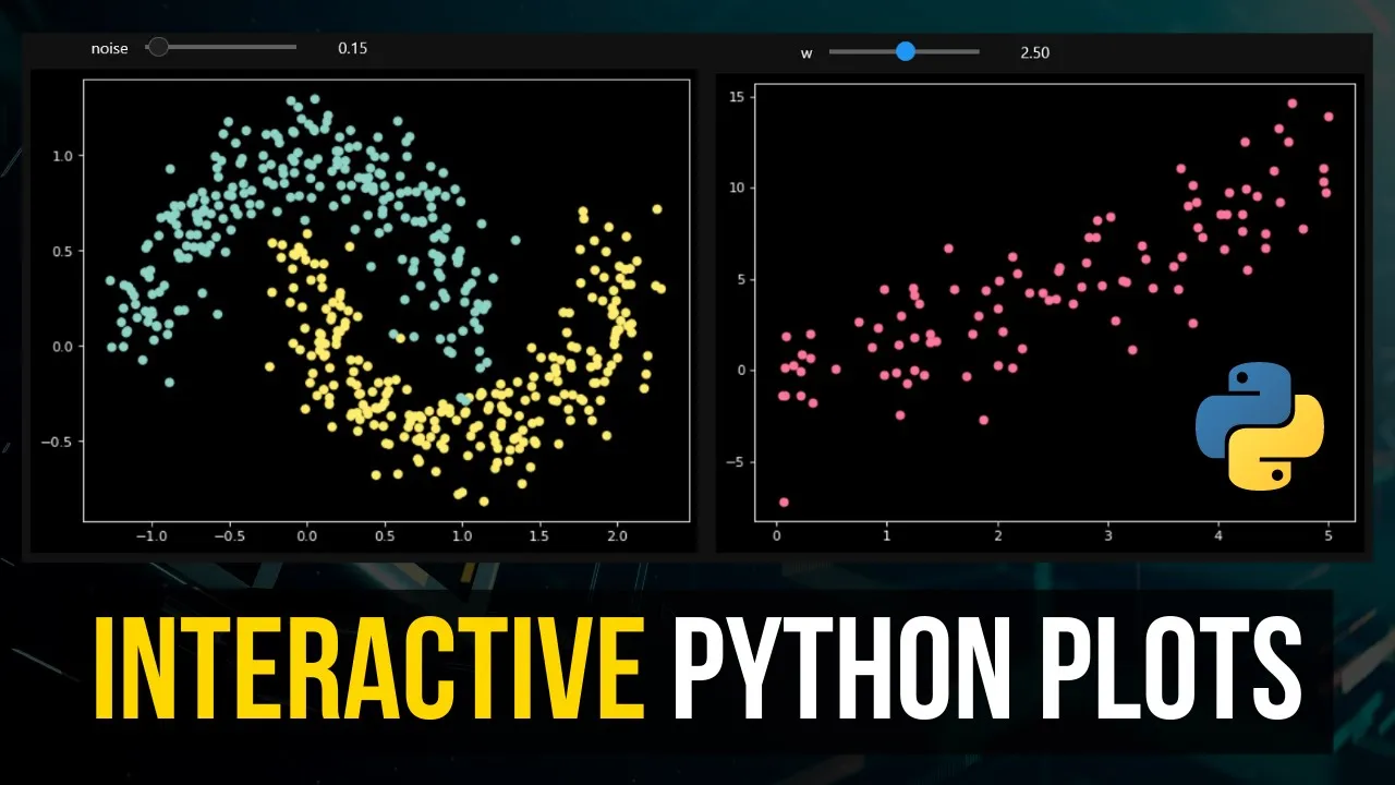
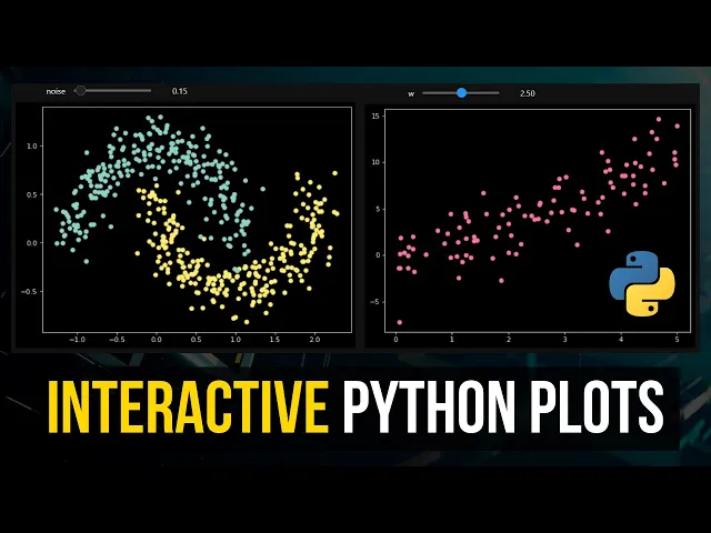
what is going on guys welcome back in this video today we're going to learn how to create interactive python plots inside of jupyter notebooks and this is what it's going to look like in the end we're going to have some sliders and we're going to have some drop down menus and we can adjust certain values and they're going to be the plot is going to be plotted interactively as you can see here we can change the samples 500 for example a thousand we can reduce the noise we can increase the noise and we're going to look at different graphs right we're not going to look at only this particular example here we're going to learn how to create interactive plots in general in python so let's get right into it [Music] all right so creating interactive python plots inside of jupyter notebooks is actually quite simple all we need to do is we need to have a function that does some plotting some visualization and this function takes some parameters those are the values that we can then tweak manually or interactively and then we take that function and make it interactive by um using the ipy widgets module and for that we're going to start by importing the ipi widgets module so we're going to say import ipi widgets stands for interactive python widgets and we're also going to import numpy as np and oh numpy smp and matplotlib dot pi plot splt and of course if you don't have those two installed on your system you just type pip install numpy pip install matlab in the command line and the first example is going to be quite trivial we're going to have some function so basic two times x function and then we're gonna yeah add some noise and remove some noise interactively so what we're going to do here is we're going to say x equals np random uniform 0 5 and uh size is going to be 100 and the y value is going to be essentially just 2 times x plus some noise and this noise is going to be np random normal distribution size 100 so standard normal distribution and we can now add a weight here so we can say w equals one and this determines how much randomness we have so those are the values for example and we can now say plt scatter x y and you can see that this is right now the function now if i change the weight to four you can see that we have a lot more randomness if i change this to 0. 1 we almost have no randomness so this is now something we want to pack into a function and make interactive so we can just say plot underscore fct for plot function weight is going to be one by default and then this is what happens with that weight so now instead of saying plt scatter and of course i need to do the plt scatter x y inside of here so the visualization needs to happen inside of the plot function and now if i say plot function and then 1 i get that if i say 0 i get that if i say 10 i get this okay so that's the basic idea and now we can take that and make this interactive by saying ipi widgets dot interact and we pass the plot function here as a first class entity so without calling it and then we specify w equals and we use a tuple to create a slider so to say from two with a step size off so from zero with the step size off and then i don't know 0. 5 for example and this now creates an interactive plot where we can just go ahead and slide and you can see that the data changes now one thing that you're going to notice is that the data doesn't only change in the weights it changes also because the randomness is inside of the function what we can also do is we can take that x outside of the function because it's just a random generation and we can also say noise equals np random normal size 100 and then we can replace this here with noise uh the reason is that here now the randomness happens once and every time the function is executed we just adjust the weight so the randomness is not executed every time when we plot so that would lead to something like this the same function but the weight changes you can see now this is the same those are the same points but the weights of the noise changes right uh and of course we can also take this and make this more granular so now we have 0.
1 you can see how this works um now it's going to be laggy it's not because of the hardware because i actually have quite a good computer this is just a software lagging this is just python lagging so if you move this too fast it just uh yeah lacks a little bit but you can see now how this works if we put the randomness inside of the function it's gonna generate randomly every time and of course you can adjust these values you can also have this to go to 100 so then you know sooner or later you basically have just nothing um or no structure in here anymore but yeah that is how you do an interactive simple plot now let's go to the example that i showed you in the preview we can save from sklearn dot data sets and of course for that you would need sklearn um we're going to import make moons which is a function that creates sample data based on a certain structure so make moons and we can say moons equals make moons and this function takes some parameters for example how many moons do we want to have let's say 100 uh how much noise do we want to have let's say 0. 1 and yeah basically that's it and then we can now say x and y equals moons 0 and moons 1 and then we can say plt scatter and then we need to take from the x actually the coordinates so zero is the x coordinate and one is the y coordinate so y is actually just the label so actually the color that we're going to use so we're going to say c equals y and then we get this moon structure so that's the structure this is the example that i showed you in the beginning so moon 0 has all the coordinates but they again are split into x and y coordinates and the y so moons one has just a label so whether it's this class or this class essentially uh and we can also change this here now to 500 and we can see a little bit more we can change the noise to 0. 4 then it's quite noisy we can change it to 0.
01 and so on so you can see it's almost perfect now and this also can be made interactive so we can say def plot moons and then we want to have uh samples going to be 200 by default and the noise is going to be zero by default and then instead of setting the values here um constantly or like in a constant way we're gonna pass the parameters so samples and noise and then the rest stays the same actually and then we say again ipi widgets interact plot moons and now what we can do here is we can say okay for the samples we want to have a list so not a tuple this will give us a drop down menu now if we choose a list [Music] and here we can just pass now 200 500 1000 and for the noise we want to have a slider we want to have a slider that goes from 0 to 2 with a step size of 0. 025 for example and then you can see now i can adjust the noise i can also change the samples now one thing that that is important is again we have the randomness of the moon generation in here if you want to have the same set of moon generation every time you have to pass a random state being equal to something 50 for example then you're going to always get the same moons right so you can see that there's no random generation happening it's only the noise that is added so the moons generated are always the same if the random state is not set we're going to get always different moons right so this is how you can play around with that um then another thing i want to show you here is you can also animate the sine function so you can go ahead and say def plot underscore sign start is equal to zero um and is equal to 30. now i'm going to just directly write a function here so that you can see how this works factor is going to be one i can also set the grid being equal to false and plot cosine is going to be um also an additional thing that we can do here and the basic idea is we say np lin space generate values from start to end with a step size of n minus start uh not not step size uh amount of elements generated n minus star times 10 and then we're going to say y is just np dot sine of x times the factor given in the function and then we can say plt grid is going to be grid so true or false depending on the parameter and plt plot is going to plot x and y and if plot cosine is active we're also going to say y equals np cosine and we're going to also plot plt plot x and y again with the cosine values and now again plt dot not plt sorry i pi widgets interact plot sign and here we now have a bunch of parameters to pass so for start we're going to say again from 0 to 10 we're going to have a slider with step size 1 for end we're going to have from 20 to 50 with step size one for the factor we're going to have from 0 to 5 with a step size 0.
1 and the grid is going to be false by default um yeah that's that so let's see here you go and you can see now i can adjust the range of this thing i can also just factor now this is only going to be visible if we also plot the cosine so if i increase the factor you can see it only increases the sine factor not the cosine factor i can plot the grid here so this is interactive you can see how this works kind of cool and um yeah so then also i want to show you something that's kind of cool we can also plot a sigmoid function the sigmoid activation function for that we're going to import math and we're going to say here now def plot underscore sigmoid and we're going to say x in equals zero and the basic idea is we have the sigmoid function we pass an x and then it's gonna highlight that point at the sigmoid function so we're gonna say x equals np lin space negative five to five a thousand values y is going to be one over one plus n p exponent so e to the power of negative x that's just a sigmoid function and y in is going to be for that particular value so 1 over 1 plus math dot x so e to the power of negative x in again just a sigmoid function and then we're going to plot x and y we're going to scatter x in y in and we're going to do that in red and then we're gonna plot the light so basically if we do it just like that let me show you what that looks like um i pi widgets dot interact plots plot sigmoid and um i'm going to say x in is going to be equal to negative 5 5 0. 1 what's the problem here x is not defined what x oh this x there you go so that is the basic idea of this but we want to also have a line so we want to have a line going from here to here and from here to here to to see that and for that we're going to just say uh plt. plot x in x in to zero y in so basically we have x 1 here x 2 here and then y 1 y 2 here and here we're going to say negative 5 x in and y in y in so there you go but of course we want to have color being equal to red there you go and maybe actually want to have r dash dash not just a color like that there you go so that's also an animation we can do and last but not least let me show you here how to plot an interactive histogram that we're going to say plot underscore hist the mu is going to be 0 by default sigma is going to be a 1 by default and it's going to be 100 so 100 instances we're going to have 10 bins by default and the color is going to be blue by default and we're just going to say plt x limit is going to be minus 20 20 so that the plot doesn't adjust automatically we're going to say x equals np random normal distribution given a mu and a sigma so mean and the standard deviation with n instances and then just plot a histogram x with bins equal to bins and color equal to color and then finally we can just go ahead and say ipi widgets dot interact plot histogram and mu can be chosen from negative 10 to 10 with a step size 0.
5 sigma can be chosen from 0 to 10 with the 0.


![Animating Plots In Python Using MatplotLib [Python Tutorial]](https://img.youtube.com/vi/bNbN9yoEOdU/maxresdefault.jpg)