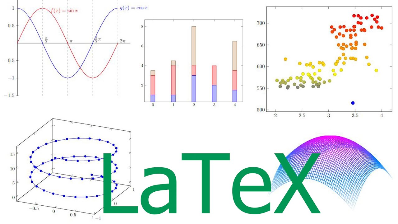
We can visualise the frequency information with two ways depending upon the levels of measurement a bar graph can be used as a graphical representation of frequency for categorical variable meaning nominal or ordinal level of data as an example let's say in the previous visual acuity data 10 of them were male and remaining 12 were female. As gender is a nominal variable the bar graph is a proper visualisation to show the frequency of each category so to draw a bar graph you need to draw the axis first so um with the draw axes i add and categories of the nominal variable goes to one axis so it doesn't it doesn't really matter uh if it goes to horizontal axis or the vertical axis but in this case we're going to use a vertical axis so we have male and female on the vertical axis as a categorical values and then frequency information for each category goes on the other axis so we're going to use horizontal axis to show comparisons among discrete categories so here so that those are tick marks and you just draw the bar uh obviously height is the same as the frequency of each category so bar graph can be useful to point out the order and the relative importance between different categories when there are many categories under a variable. In addition, bar graph can be used for more complex representation of data by grouping or stacking when the variable is nested with subcategories.
Another way to visualise the frequency information for continuous data such as interval or ratio level of measurement is to use histogram so what we see here is a histogram of 80 observations of intraocular pressure so it is typical that measurement values go to the x-axis which is horizontal and frequency of the measurement values go to the y-axis so with a large enough data a histogram can show the overall shape of the frequency distribution of the data please note that the bars are drawn to touch each other in histogram whereas bars in bar graph are not so I invite you to think about the reason why that may be the case. It is a bit complicated to draw a histogram manually and it is not necessary to do so when you have a program to automatically generate one for you but to understand how it is drawn will help us understand how to read the graph better so as a first step, you need to determine how many intervals or groups you want to divide the data by so it is not easy to decide as there is really no right or wrong answer on this however if you have too many or too few of them then you won't be able to see the underlying distribution of the data appropriately and in turn, it will make the interpretation of the data a bit more difficult so there's an equation to actually help you decide what's going to be the optimal number of intervals or groups but you know this equation is not really a holy grail to decide the number of bins so that is really there to give you some sort of guiding number to start with so let's use the second equation because it looks simpler and to see what we get so the end here is basically the number of data we have and if you still remember we had 22 n equals 22. The square root of 22 so basically the number of bins so, by the way, the binning so this first step is called binning where you want to determine how many bins how many intervals, how many groups, classes you want to divide the data range by using one of these equations so we are using is the number of intervals is the square root of 22 so that is if you use your calculator it should be 4.
69 up to two decimal points and now you want to round this to the nearest integer will become five. Using this equation and the suggested the recommended number of bins we're going to use is 5. So now you need to decide the size or width of each bin so to calculate the width of a bin we first need to calculate the range of the data to do so we need to find out minimum and maximum values from the data set and to do that it'll be easier if we sort the data and which we already did so here is our sorted data previously and from this it is easy to identify minimum and maximum value so the minimum is 0.
2 and that is so that is min max so to calculate the range so the range becomes range so the range of the data is max minus min and our mix was 0. 44 minimum 2 so the range is 0. 42 so this is our range 0.
42 now to determine the width of a bin then we can use the equation here so the width is round so that's round range we just calculated which is . 42 and we also determined our number of bins which was five so that is around and . 084 so if you round it to the nearest decimal point that becomes 0.
1 so the size of our bin will be 0. 1. Now we need to determine the range of the first interval as our mean was 0.
02 right the minimum data was 0. 02 so the lower limit of the first interval should be less than the minimum of 0. 02 so that the minimum can be included in the first interval so our first interval will start from logMAR of zero by inclusive of 0.
0 and then up to 0. 1 so that was our size of the bin or the width of a bin point one. Because this width of the bin was point one the upper limit of the um this first interval should be 0.
1 exclusive of and likewise the upper limit of the last interval should be also larger than the maximum value in the data set so that the interval can encompass the value which was 0. 44. So once you have the interval determined then you can just count literally count how many observations you have in that interval and it was 2 before and you can just keep doing this until the last interval so now you add the next move to the next interval so now the next interval starts from where we were left off .
1 and then you again add the width of uh a bin which is . 1 and then the second interval ranges from 0. 1 to 0.
2 and then you count the number of or the occurrences, frequency of observations included in that interval and then just keep going going, going until you hit the last interval. Because the number of bins we needed was 5 so we can stop here. Likewise the upper limit of the last interval should be also larger than the maximum value in the data set as I said.
that the interval can encompass the value the maximum value and our max was 0. 44 so the upper limit of the last interval 0. 5 is fitting.
Now we can draw a bar with the height proportional to the count for each interval and the width equal to the bin size so on the left here, we have a visual acuity in logMAR on the x-axis and we have frequency on the vertical axis so for the first interval we can draw a bars and look at the colour of the numbers that'll match the colour of each bar. So the first one is this black bar right and the height of this bar is actually the same as the absolute frequency of the first interval and then you add another bar that is abutting the previous bar until the last bin. The next one is a red one.
The height of the second one is the same as the absolute frequency of the second interval and you do this until the last bin then we have just completed the histogram right for the visual acuity data we had before now we can draw a cumulative frequency distribution histogram, but it is basically the same thing because we all know the bin size bin width so all we have to do is to draw a bar so we have a blank axes and we have basically the same x-axis which is a visual acuity in logMAR because of the space it is not shown here but when you draw a graph you have to include uh the proper label axis a proper axis label and we have cumulative frequency on the y-axis so the first one is same as the in the first interval's cumulative frequency which is two black right and then we can just put the the bars on top of each other so adding the previous bin to the current bin so the second interval we add six on top of two right and then the next one is 17 20 and 22. So this is how we construct a histogram, the regular histogram on the left and the cumulative frequency histogram on the right.