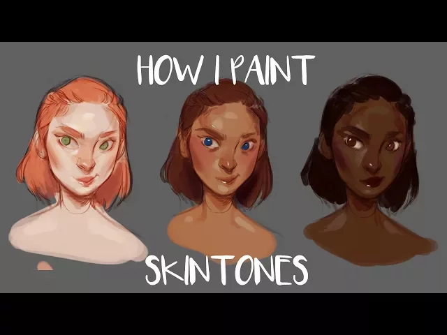
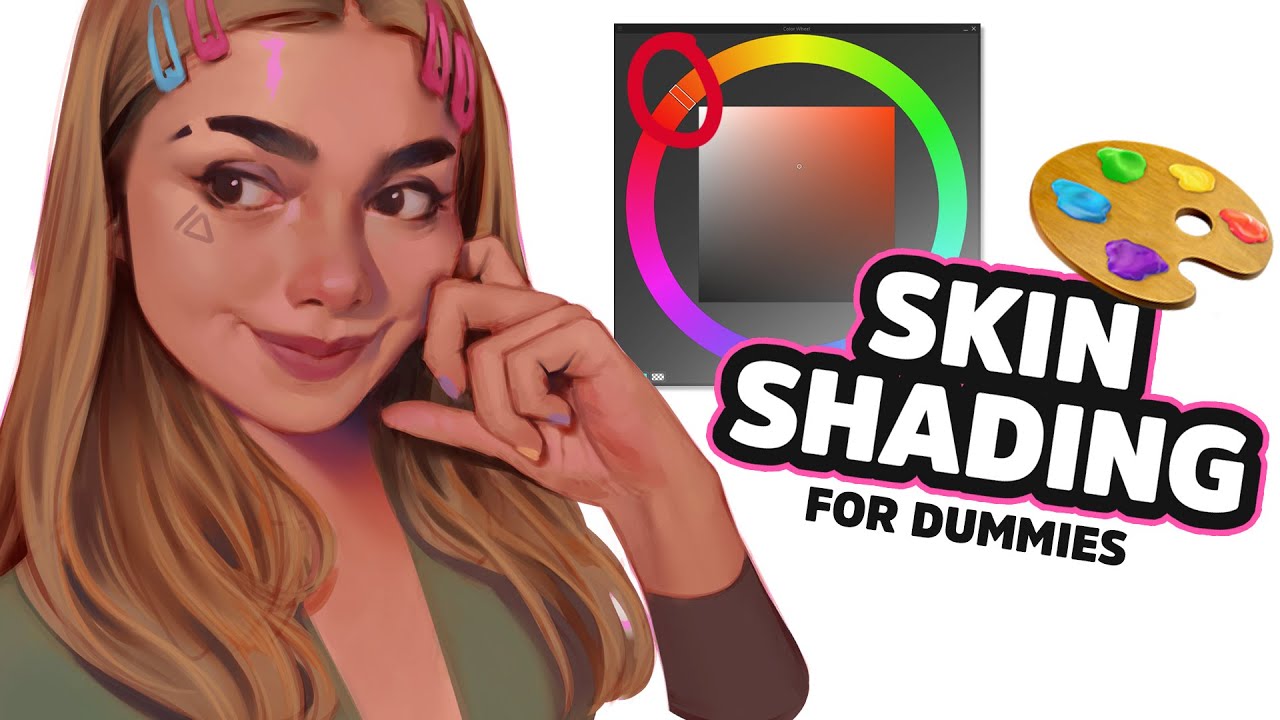
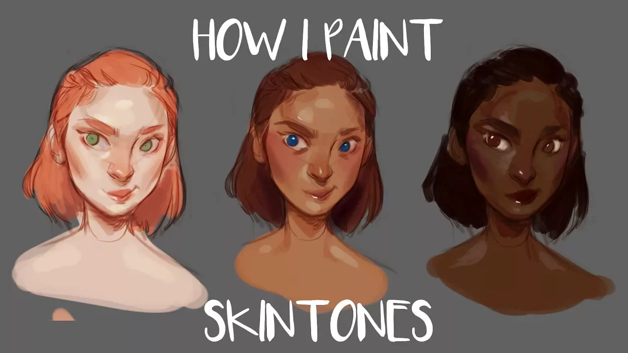
hey guys so in today's video I'm going to be talking about how I paint and choose skin tones for my digital paintings but before I begin talking about that I wanted to say two things first off I'm super sorry that I didn't upload a video last week my painting programs were not working and also my screen recorder was not working so I had very little time to record anything and when I actually did find a bit of time to work the files were corrupted it didn't really work properly and so I'm super sorry that I
didn't upload last week a minute I promise I'm trying to but yeah it's just I just figured out the painting program and I got a new screen recorder software so hopefully everything will work out well in the future also I might upload a speed painting in the middle of this next week because I kind of feel bad that I didn't upload last week so we'll see but the second things I wanted to talk about was that this video was sponsored by Cisco share so thank you so much for sponsoring me so I can put it
a little bit more time into a detailed video explaining my process and if you don't know what skill tree is which is pretty unlikely but if you don't know what they are it is an online learning community with a good bunch of videos over 15,000 videos from professionals who work in certain fields that cover things like art writing business marketing culinary stuff all that goodness and they just gonna teach you how to do things it's kind of like a college class but not as complex and it does not cost as much obviously and it only
call it costs a subscription you know monthly for the whole website you don't have to pay for individual classes so if you want to try the website out I will have a discount link down in the description for a free two month trial to the website for the first 100 people who sign up so if you would like to try that out please just click on the description in the link and you will be directed to sculture so yeah I have a couple of tips for drawing skin tones so the first thing that I would
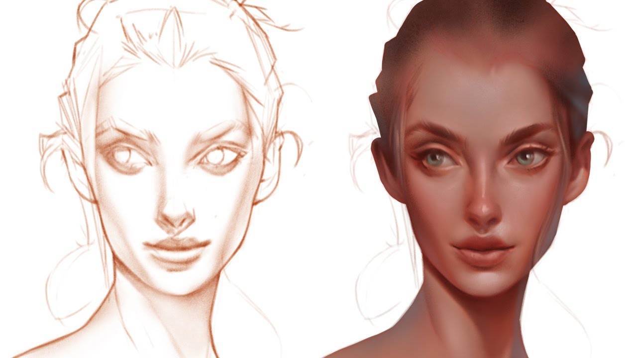
say is once you have your sketch laid out do not draw on a white background always have kind of a mid-tone color in the background if you want the colors to be neutral and sort of what skin colors do look like I would suggest painting on a like a mid gray background or maybe a little bit of a tan colored background that way you know you'll have kind of a neutral background so you start working on if you have a white background then any skin color that is supposed to look normal place we'll look super
super dark and gross so you always have a tendency to go lighter and that's not realistic so first off paint on a neutral in tone background to begin with the second thing that I would say is if you're painting skin tones lock the transparency for the sketch that you made and fill it in with like a brownish color like a pink or purple or something that's kind of a warm toned so that it will blend easier into painting as you're painting it if you use black then if you're gonna mix the line art with your
painting it's going to make the painting look kind of gray and washed out in discussing so I would definitely suggest changing the colors of your lines to something pretty warm also setting them to multiply is a good idea because if you have like a lighter tan colored for the lines and then you just set the lights to multiply its I don't know it kind of blends in very very well the next thing that I would say is choose colors that are slightly darker than you would anticipate them to be so if you like somebody pale
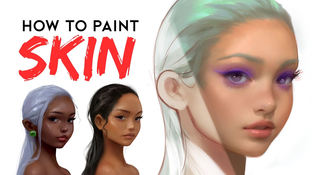
don't go almost to white try to still stick in the mid-tone area for the skin because first off it's always better to draw something a little bit darker and then add highlights to it if you begin with the highlights it's really hard to add shadows to the drawing I just it's always easier to go from darker to lighter than lighter to darker and so I would always recommend trying a little bit darker than you would anticipate it to be for example if you drop pale skin you would expect it to be all the way almost
to white but it really isn't I found that a big part of skin tones is actually her hues if you wanted somebody to have very pale skin you would go to the red end of the spectrum rather than if you wanted somebody with chanoor skin you'd go more to the yellow end of the spectrum and you know tans make you little bit more Brown slash being very pale you're kind of pink so if you want somebody to look a little bit lighter just go with a more of a reddish color of course it doesn't have
to be intense like pink straight up or straight up yellow but switch the hue that you're using a little bit to the pink side if you wanted to be more pale and a little bit to the yellow side if you wanted to person to look a little more go of course if you were to choose a darker like a Pinker skin tone that's darker you would make the person look sunburned or they had like a bad rash and so the darker you want to go you know it's the more chance somebody gets little more like
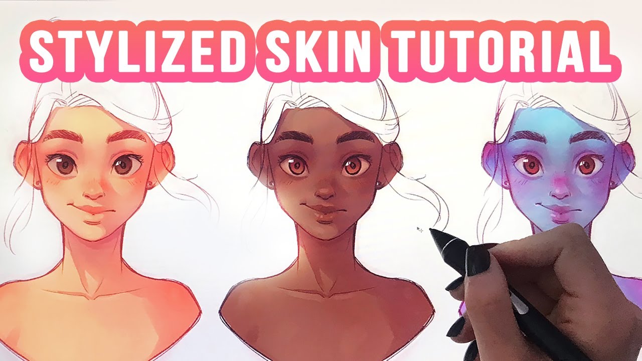
yellow and brown you should incorporate it into that this is of course four completely like neutral skin tones not including colorful lighting or like unnatural skin tones or it's just kind of like the basics of it you know so I have a couple of tips that are also good for unconventional skin tones like if you wanted somebody with blue skin or green skin this would work um I found that usually the lighter tones on the face so like the highlights seem to be a bit warmer and that darker shadows are cooler I don't know that's
just kind of my style I like to make the shadows a little bit cooler and the highlighted areas of the face a little bit warmer just because I guess I'm used to like daylight and usually lights seem to be warmer of course you can have cooler lights but that would be kind of a deliberate choice you'd make you know it's not like old lights are cool most lights like sunlight is warm colors so the highlighted areas of the face would be a little bit warmer and the shadows will be a little bit colder it doesn't
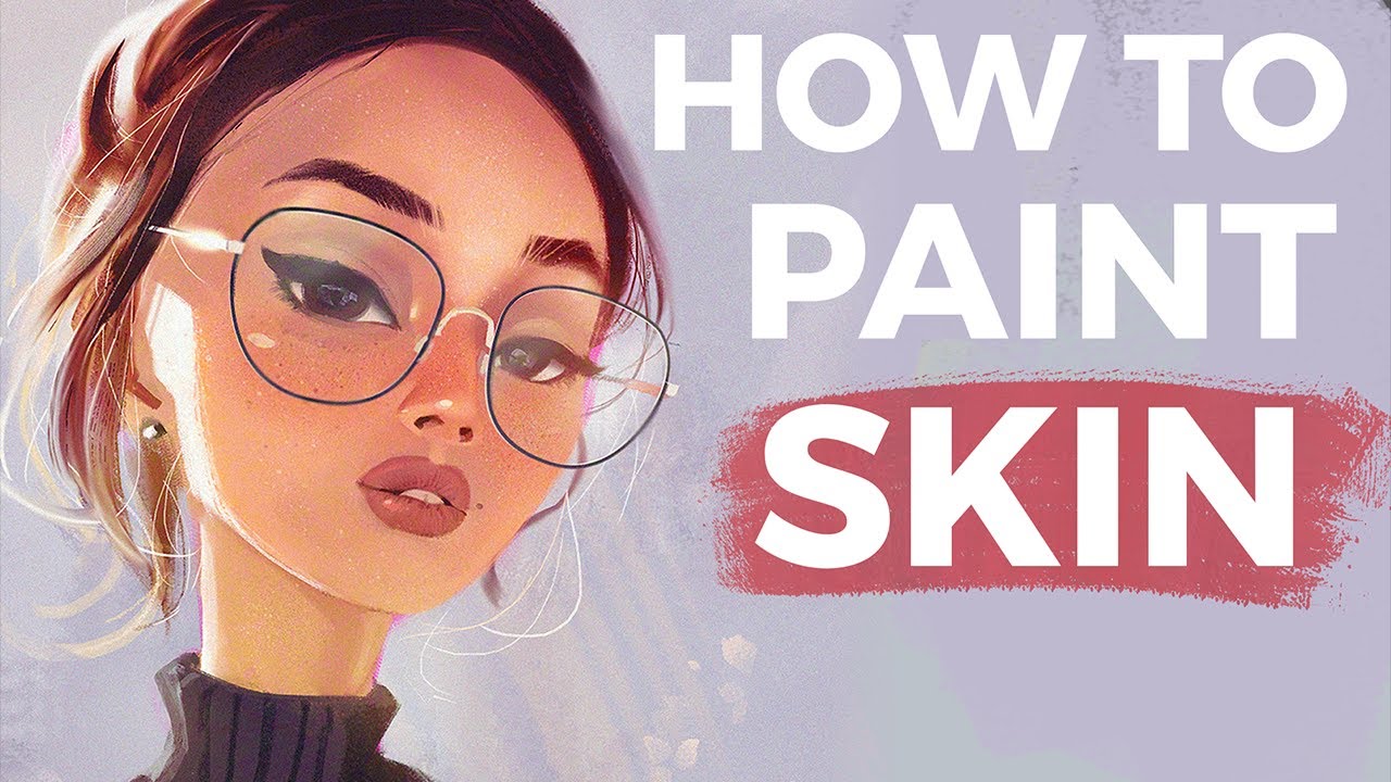
have to be a huge dramatic difference just changing the hue a tiny bed whenever you're selecting a new color for the face will make a difference in making that image not look flat so of course if you want to draw any redness you shift your colors a little bit towards the pink and pretend you're coloring somebody and that's blue and you want them to have pink cheeks and you don't really know where to go with that I would always recommend choosing the color that you want the cheeks to be for example as I said if
you have somebody has blue skin and you want the cheeks to be pink she was like a darkish pink color and then use a very very light opacity to put that pink like on the cheeks if you want it to be there and then just go in and blend everything together so don't put the color like full opacity on the cheek because it's not gonna blend in properly but if you use kind of a lower opacity with whatever color you want to incorporate it into your painting that's going to work SuperDuper well if you want
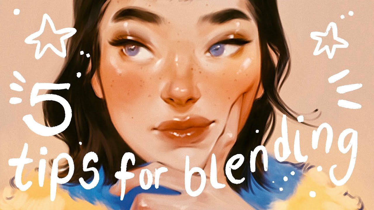
to incorporate any particular color into your painting and you don't want the skin to look unnatural you know just choose whatever color you want to include and don't apply it very saturated like very opaque keep it pretty transparent link your touch on your tablet pretty light and so it will therefore like kind of incorporate butter into this skin the next thing that I want to talk about is highlights so like you know when I draw highlights on the eyes or the lips or than Alice and they're really really bright I usually don't use completely white
for those highlights it's just since the skin tones I choose are kind of darker than as I said I choose colors are darker than I would anticipate the whites or the lighter colors show up much brighter on that skin so I tip I have is for you to select highlights and either a complimentary color for the skin so if you warm ish tones skin color that you choose a cooler highlight or you have a cooler skin tone to choose a warmer highlight now this is completely stylized and it is not like your dries will automatically
look better if you do this it's just something that I do so I like to have my highlights be a little bit on the science side or camp greenish I just think it looks kind of interesting of course still keep it kind of just a bright color but if you add a little bit of a tint to that color it somehow makes it pop a little bit more just because they're complementary colors of course as I said this is just a completely stylistic choice so if you don't want to do that that's totally fine I
just keep highlights for the end don't put in highlights as you're drawing the base colors and all that fun stuff because even though it's super tempting it's my favorite part of the painting to add a highlights it's just gonna somehow mess you up I don't know I've noticed that whenever I add very like contrasting highlights right at the beginning I am very tempted to make the drawing lighter and lighter and lighter to kind of balance everything out and so I would definitely recommend that you don't add a highlight until the end for the painting so
it looks a little bit dull as you're painting it which is really boring but then you will add the highlight right at the end which will be SuperDuper glorious so I recommend that now this doesn't really pertain to the color theory but it just pertains to my techniques on how I paint skin a lot of times it is beneficial to use kind of like a softer airbrush to fill in the skin and because it's going to blend a little bit better and it's gonna make your job of blending the skin a little bit easier since
that is a big problem when you're drawing skin I know is to have it look blended and you know good that way and so if you use a brush with a softer edge and you kind of apply that color gently not with a lot of pressure to your mark it will just kind of incorporate better into the skin tone make it look a little better also another thing that is super useful to do when you really just don't have any idea of where certain tones or colors go on the face it's always useful to watch
makeup tutorials that sounds really weird since punic channel is basically have to you know start with a blank canvas and then put in all the contours and highlights by themselves they're going to talk about what colors they use and where they apply those things you know you can see where girls place their contours or the highlighter and it kind of just will help you understand you know what is highlighted and what is in the shadows on the face as I was really stupid but it does help and you know just kind of staring at faces
and where they're lighter or darker will help you sokeep pinks and Red's for places that you want to look like they're blushing or you know fleshy such as ears nose cheeks maybe eyes if you want somebody to look like they've been crying her they're drug addict which I do a lot lips that kind of thing the places where the skin meets bone more so like the forehead in the chin and maybe even the cheekbones try to use a cooler or green or tone for those areas so yeah those are a couple of my tips I
hope some of those were helpful if you would you like me to do a part two like if you have any questions and I hope to get to them either in the comments or maybe I can make another video talking about skin tones um but yeah I hope this was kind of helpful for you if it was please give me a thumbs up and maybe subscribe if you want to see my videos because I tried to put them out every single Sunday apparently don't I try to so yeah I will talk to you guys in
my next video bye