I'm going to show you six common and horrendous Luger type mistakes why they are so bad and why you need to avoid them in your logo designs so for this example we're going to be mainly looking at the first title of the Allegra itself and not the strap line or what other people would say the tagline so what do you think is wrong with this example of the logo type but the thing is here it might look trendy or it might look relevant to the design but notice how thin the typeface is on Kingstown if
you look at a revised version this is using the same font but just a different thickness in terms of the font family now you might ask what is wrong with having a thinner font or typeface for your logo we'll take a look here when things are down scaled and smaller in size it becomes quite difficult to read the logo type itself and this is gonna be a big problem for a brand because you can imagine if this leg was on a business card for example he would be very very difficult to read the thin font
compared to the thicker one even though the thin one might be a more representative of the brand and the message itself so we're moving on to the second of six different ways that you can destroy your Legos in terms of the logo type used and here is a really simple and kind of geometric logo design but yeah take a look at the logo type here granted this is a bit of an exaggeration but this is something I see so often in beginner or novice designers and it really frustrates me and that is where people use
one letter larger than the actual rest of the logo type to represent the word itself this not only looks really amateurish and annoying to me it's just confusing and it just looks really tacky and ugly I don't know why many beginner Lego designers just jump to this option but you need to stop doing it because it looks unprofessional and it has no place a logo design if you ask me so yeah try and avoid using a single letter to represent the start of a word or words for your Lego designs at the third lugar design
and the third example of why you can really mess up your Lego designs with the typography used I've made this symbol here as you can see here is some pretty ugly logos higher so what do you think my point here is for this design now this is one of the most important points to take home today from this video and that is the font or logo type that you use for your logos should be absolutely relevant to the message of the brand or does the message of the logo in general say for example here the
logo is very straight edged and very sophisticated in appearance and so a playful kind of funny weird font isn't going to do that justice so in the second revision I went for something more contemporary something more simple and something that does reflect the overall style of the symbol itself so just remember what you want to say about the brand or the message from the logo and represent that with the style of the typeface in combination with the symbol moving on to the fourth example in today's video we've got a pretty playful M within an occluder
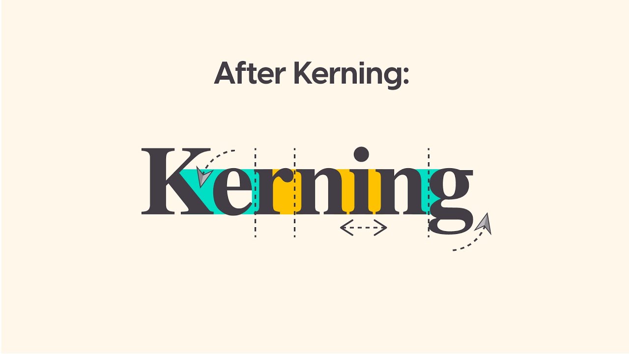
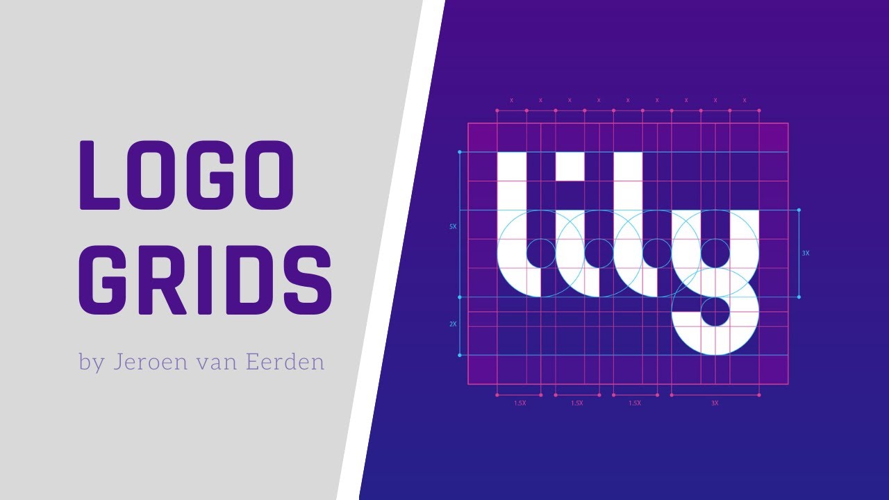
logo I went through a lowercase logo type here to keep it more personal but I didn't gave her something handwritten to make sure it still wasn't too playful but what do you think is wrong with this design well if you take a look at the second revision we can see the tracking has been increased over the entire design and this is really important to get right as well and that is because when you scale them down only one remains legible and I actually do advise that you might want to send the two different versions of
your logos to the client so we can use them on large scale designs or smaller scale designs like we said early on a business card so you remember to have your coning and you're tracking in order so the logo is legible at any distance or any size pretty much the penultimate designed today is something I made myself unless look at the first example today of this design now this doesn't really look like a logo designed to me but what do you think is wrong with this design well firstly there's a lot going on you know
it's kind of cluttered if there's even a dot-com in the title of the logo and this is something I suggest you don't do if possible I don't think it looks very professional to be honest but that's just my opinion but the point here is to keep things simple and to not clutter a logo the logo design should be as simple as possible to drive home the message and the communication for the brand itself there's no reason to over complicate things especially with the Lego type so just keep things simple and lastly today we actually have
some color in this video and my point here is when you're using color for the logo type you should be very careful on what you actually choose is that you can see here granted the logo type color reflects the bottom of the logo design itself but it doesn't look good on this background so keep in mind where the logo is going to be used and if the logo type color is going to work in many many different situations one way around this is to actually have an enclosure a silico rectangle a black rectangle so the
color always works on that background but this logo doesn't have an enclosure and it's just a symbol and the logo type but you should be very careful on what colors you choose for your logo design and especially when it traverses down into the logo type again less is more so you don't need to be flamboyant and able to top with too many colors being used keep things simple guys that's one of the main rules for logo designing do you want to become the best graphic designer that you can possibly be hi I'm Tom Satori and
I've got over a decade of hands-on experience in the graphic design industry as well as owning a youtube channel with a hundred and seventy-five thousand plus obscure Ivor's totally dedicated to graphic design now if you want to boost your skills and your awareness as a graphic designer head over to my subscription-based website for exclusive content one-on-one help vector and PST downloads and so much more design your future today Alisa Tori so there were six different and logo type mistakes that you need to avoid in your graphic design workflow let me know if you found today's
video useful and if you want to keep boosting your skills as a graphic designer subscribe to my channel for weekly graphic design content have a great day and until next time design your future today peace