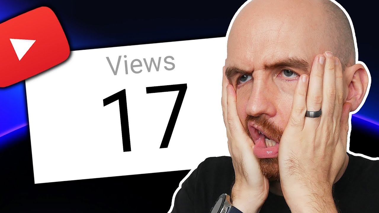
we've talked about this topic several times in the past but I've seen your comments when it comes to YouTube thumbnails a lot of the stuff we kind of give you is very surface level so today I wanted to dive in a little bit deeper because I believe that a good thumbnail can be the difference between 100 views and 100,000 views and yeah there's like a thousand things you can do to make a YouTube video go from 100 views to 100,000 but today's focus is thumbnails and it's because of channels like this one this video sat
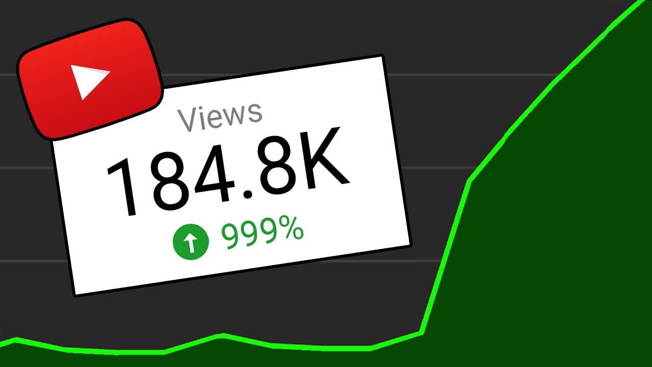
at 200 views for months and then this Creator applied some of the stuff we're going to talk about today and that video in one week shut up to 500,000 views so today yes we are going to get a little more technical than usual but I still think this is going to be pretty easy to tackle regardless of where your thumbnail making skill level currently is or what kind of Channel you have we'll start at the super Basics the foundation of any thumbnail which is the layout to visualize this we're going to look at Ali abdal
who these days has kind of mastered the art of making a nice clear simple thumbnail but it wasn't always like that for example here's one of his early thumbnails and just take a sec to look at this it's a bit confusing right like where should you look there's a meme on the left he's kind of in there as well there's some text for some reason it says Cambridge University I'm not really sure why that's there basically what you're seeing here for a lot of people is just going to be visual overload and it's just going
to end up looking like noise when it hits the YouTube homepage so the way to remedy this and the thing that Ali abdal and so many other people are doing on YouTube is using a very old trick the rule of thirds you've probably seen this before but essentially it's when you take your image and put a 3X3 grid over it all the key elements on this grid should align with the lines or the intersections themselves we can generalize this even further for our own purposes and say that the rule of thirds also includes having up
to only three elements in a thumbnail if possible I like two elements unless you count the background as one but why three well basically our brains love an easy tood digest pattern and three is a nice easy number when it comes to the size of a YouTube thumbnail and getting a clear message across and when it comes to layout we should also talk about wasted space and this was actually from a Twitter thread between Colin and Samir and Mr Beast essentially what he's telling them here is to take his face and move it way over
to the edge and what this is going to do is create even more space for the text and other elements to really grab people's attention and if you think about it this makes sense because on YouTube you have a 4X 2in pixel space to tell the story of your video so every pixel counts just be sure you're not using the extra space to add a whole bunch of visual chaos remember just a few elements keep it simple Mr Beast had another conversation at one point with yes Theory to talk about thumbnails as well here he's
emphasizing the importance of making the main subjects stand out and by now you've seen a Mr Beast thumbnail he practices what he preaches and it's taken years of experience to get here but anytime you look at one you kind of know already what the video is about whether it has text or not basically just remember this on YouTube it's a very competitive landscape on all corners of this website so the better layout you have for your thumbnail even if you're not the best designer in the world that simple layout that clear message is going to
help you stand out amongst the crowd next we need to talk about color and if you've been to a school before you've probably seen a color wheel and you probably know that with the color wheel the colors on the opposite ends contrast the best with one another now that's very basic but I want to go a step further and talk about how Pro YouTubers are using color theory to grab attention the first thing is that you can use color to evoke an emotional response in the person seeing your thumbnail take our own channel for example
the colors we use in our thumbnails all kind of serve a different purpose we'll use red when we're talking about mistakes to try and get people to feel that sense of urgency green kind of does the opposite it's usually more of a positive thing and you'll see us use things like green up arrows for growth or the Big Green monetization logo which everybody loves to see we'll use purples and blues because those invoke a feeling of trust jumping back to Ali abdal his thumbnails are bathed in light he uses a lot of calming colors and
his channel is about productivity and personal growth meanwhile Mr Beast likes to use bright clashing colors and this can invoke a feeling of excitement the other thing I want to mention about color is a little more of a hack and I learned this from the spiffing Brit imagine you're running a football SL Soccer Channel right what is the big thing you're probably going to see when you search for videos and thumbnails in this category it's probably green right because they're playing on a Green Field they always are like I said earlier YouTube is incredibly competitive
so how are you supposed to stand out with your football channel if everyone's using what looks like at a glance the same exact thumbnail well if the entire landscape is a sea of green maybe you can do blue when you're scrolling through YouTube a thumbnail like this in this category is going to stand out a lot more considering the competition so that's color but before we move on to the next design element real quick bonus tip here if you're not sure exactly where to to start with a thumbnail you can always try our thumbnail generator
this can generate a thumbnail simply by just typing in some text and it gives you maybe a jumping off point some inspiration or a thumbnail that you can actually take and edit a little bit to use in your next video you can get more info on that by clicking the link below but let's jump to the next design element I want to talk about text not all videos on YouTube need text in the thumbnail but if you're going to use it it can really be make or break to keep this simple let's stick to the
three C's and the first C is curiosity text can be the ultimate teaser to a video like this thumbnail here Ali abdal is known for giving advice to be successful and so when he's coming up and saying I failed that tends to drive a little bit of curiosity or maybe your text could say the opposite of advice that you hear all the time or your text could tell people something they really do not want to hear the point is text can be a great way to add a bit of a kick to your thumbnail a
bit more curiosity the next C is for clarity and I get it one video can be about many many things but it's important not to use things like text to try and explain the entire video before someone clicks on it you want to take the most interesting thing the most important thing or the biggest overarching thing that your video is about and make that the focus of the thumbnail and when it comes to Clarity I would say if you're going to use text in any case three words is probably more than enough that's not advice
that applies to everyone sometimes people do use more than that but yeah I'd say if you can explain what you're trying to explain in three words that's going to keep things nice and easy to edit in a thumbnail canvas the final C is compliment your text should work with the thumbnail and not against it don't put text in places where it's going to obscure important parts of the image you can let it be playful and intriguing and in the case of Marquez brownley you can even use the text to kind of work alongside the title
or in this example you can put an effect on the text and suddenly people are starting to ask some questions it's one word but it's fading away what does that mean the good news is if you have like a lot of ideas YouTube did just give us the ABC testing tool and basically what that lets you do is have up to three different thumbnails for one video and you don't need to make three in incredbly different thumbnails either you can just do one tweak do a version of your thumbnail with text a version without and
maybe a version that has less text or more text you can try all kinds of things now and YouTube is just going to make sure it takes the best one that got the most clicks and it's going to apply that as the main thumbnail to the video eventually Okay so we've talked about text and now I want to go into the fourth design element and here what I'm going to do is I'm going to show you screen grabs from four different YouTube channels I just want you to take a quick look at these and ask
yourself what is standing out the most on all of these channels for me it was the big face and we've all seen the YouTuber face before with that exaggerated expression faces in a thumbnail are really interesting and I'm not going to say they are always required or not required but the way we've been using that ABC testing tool I was just talking about is in the case of like Rob Wilson's thumbnails here on our Channel we've tested so many thumbnails that have his face and don't have his face and I can't even tell you the
amount of videos in those tests that have won out because his face is on them it helps that he's been doing this for a very long time and he's built up some notoriety but I also think that faces can be a way to start to build trust with a viewer especially a new viewer who may not know Rob's face but they see him there kind of backing up what he's saying in the title or the thumbnail so if you want to try faces how can it work for you well number one go big or go
home when it comes to emotion and really like exaggerate your face more than you think when you're taking that thumbnail photo number two is to be sure to make eye contact if you look straight at the lens you look right into the eyes of the viewer alternatively you could look off to the side a little bit and put an element in the thumbnail that your eyes are kind of drawn to which means what's going to happen the viewer is going to see your eyes and they're going to follow them to whatever it is you're looking
at the third thing is to make sure the shots of your face are really top-notch you want to have good lighting you want to have good Clarity on your camera so really take time with these I'm saying basically don't just grab a still from your video after the fact and try and make that the face on the thumbnail that never turns out super great for the last tip About Faces I know you're thinking we've shown you a lot of examples with really well-known faces and that's not fair right they kind of have a leg up
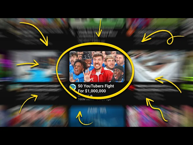
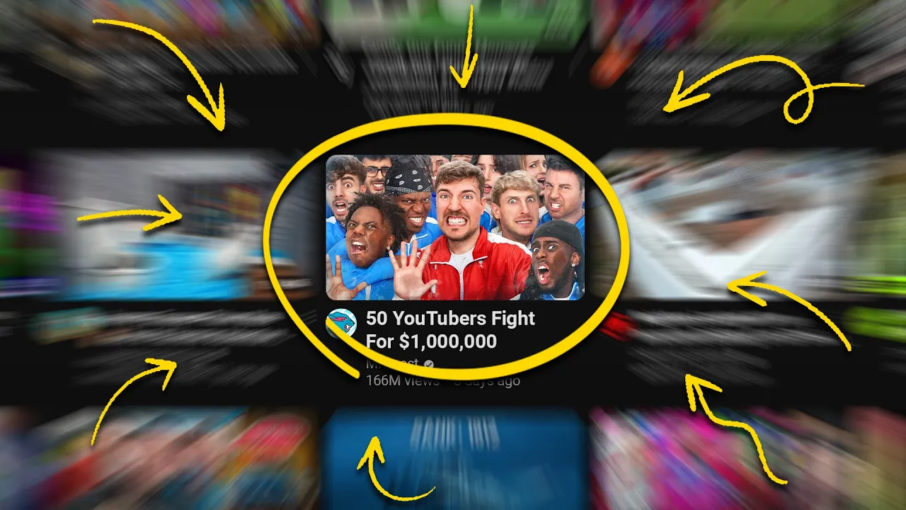
well remember this thumbnail April Lynn actually made a video about Mr Beast and decided to put him front and center she ended up getting a hundred times more views than usual when she did this and I'm not saying you should put Mr BEAST's face on all of your thumbnails but it did help that she was making a video about him oh and the reason we know the video got 100 times more views is because of this new tool we have it's called the outlier tool and it's actually free and underneath videos that you see on
YouTube it will tell you when one stands out on that channel way more than other stuff they've done if you want to check it out the link is still down below and it's going to offer you a lot of when you're doing research with thumbnail sorted we've now improved your CTR which is a metric you've probably heard us talk about before this metric is a bit more of a secret we don't talk about this one as much but it can also be very very helpful so please go check this one out next and we'll see
you next time