okay then my friends so now I want to move on to another layout widget which you're going to find yourself using a fair amount and that is the column widget and the column basically lets us create a column of other child widgets so where is the container widget which we've already seen has a child field which can just be a single child Widget the column widget has a children field plural which can be a list of widgets and then those widgets get displayed as a column on the screen one after another and not only can
we display the widgets in the column we can also dictate how those children widgets are displayed in the column using a couple of extra arguments that we can pass into the column WID itself now if you've ever used CSS flexbox before and you're familiar with terms like cross axis and Main axis then you're going to feel right at home with column layouts because we use the similar kind of terminology with these if not don't worry I'm going to explain everything as we go along first of all let's make a column and add some children to
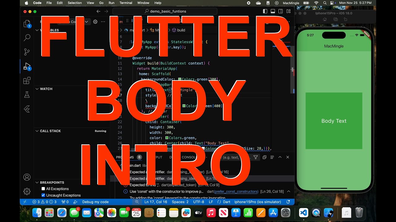
it now to begin with just to practice I'm going to make a new Sandbox widget and put all of our can of practice code in there and we can use this sandbox widget then whenever we want to explore a new feature without butchering our actual home screen widget that we created before so then inside this sandbox widget um or rather inside this sandbox build function I'm going to return a scaffold widget just like we did in the home widget and the reason I'm doing this is so we can have the app bar at the top
of the page with a title inside it and so that everything inside the scaffold like text gets started the right way using material design so let me just finish off this scaffold widget then and then we can start work on the column itself all right then so you can see I've now added this scaffold we have the app bar right here with the title sandbox also given a background color of gray and textt in the body that says hello now up here we actually need to switch this because currently inside material app we're saying the
Home Route should be the home widget which is coming from over here but we want to use the sandbox widget just while we learn how to use this column widget so I'm going to change that to sandbox save it you will need to do a refresh over here because we're not with inside a build method but once you refresh you should see the sandbox page over here awesome okay then so now what I'd like to do is get rid of this text inside the body because now we're going to do a column widget so like
I said a column widget can have several children and for that reason we have a children property or a children arguments now this is going to be a list of widgets and if we click on children and hover over it we're going to see that that list must be widgets inside it so we can't just put random items inside this list like strings or anything like this they all must be widgets all right so we can see this blue squiggly line so I'm going to apply a const right here so we get rid of that
for now and then inside these square brackets we can now just comma separate different widgets so what I'm going to do is just a bunch of containers which we've already seen so container like so and then inside this we'll apply a width property with the first one to be 100 and now we're getting this red squiggly line meaning this can't be a constant anymore so again you're going to see lots of this as go forward adding const removing it Etc but then after that we're going to apply a color argument as well this time it's
going to be colors. red and then we'll do a child widget which will be a text widget and the text will just say one now what I'm going to do is copy this several times so let me just grab that copy it then do a comma paste it in comma paste it in so what I'm going to do now is change the color of each one so this one can be green and this one down here can be blue just so we can see them differently on the screen I'll also change the width of each
one so this is 200 pixels and then this is going to be 300 pixels change the text so this is two and this is three all right so what we have now is a column widget with a children property now the children is a list of different widgets we have three widgets inside it comma separated and they're just three containers with different widths different colors and different children or different text in the children so if I save this now hopefully we should see those three containers the red one the green one and the blue one
and they all have those different widths awesome and you can see they're all in a column one after another going down now if you look at this you can see the default behavior of these different widgets inside the column is to stack one on top of the other in the center so they're kind of centrally aligned right they're not all shifted to the left now I said that we can change the layout of these different column items with a couple of different properties we can use and those properties are the cross AIS alignment and the
main axis alignment now just to explain the difference of those I've got a little diagram prepped over here so the main axis is the direction of the content now in a column the direction of the content is going from top to bottom so downwards this is the main axis right so we have the content going down a column like that so we would control the layout of the items in that direction using the main axis alignment property now if you want to control the layout of the items in the opposite direction going across so for
example if you wanted all of these shifted to the left or all of them shifted to the right then we would use the cross axis alignment because the cross axis is the axis perpendicular to the main axis right so in a column the main axis is up and down and the cross axis is left and right so let's try using these two different properties inside the column widget to try and control this so what I'm going to do is use the cross axis alignment first of all and that is left to right don't forget the
cross axis and to give this a value if we hover over that you can see it requires this thing right here cross axis alignment Now the default value is cross axis alignment do Center which is why we can see they're all kind of centrally aligned but we can change that we'll say cross axis alignment and then press dots and we get the different values available to us so for example if I say start then we're going to see them go to the start on the left if I say end and save it then we'll see
them go to the end and by the way they don't go right to the end because the column's width is dictated by the largest width item inside the column now that is this blue one all right so the total column width at most is this thing right here and so when we say cross axis alignment end it goes to the end of the current column width now if we say dots and then go to stretch and press save then it's going to stretch to the whole width available to the column so that's the one case
where kind of the default width of the column is overridden if you like to stretch to to take up the entirety of the space available to it all right so when we use stretch they go all the way across and I think we'll keep it at that next we'll try the main axis alignment like so and for this we can say main axis alignment and if we hover over this one you can see that the default value is start but I can say dots and then we'll say Center for example press save and now we
can see they go to the center of the screen in the available room to them if I change this and say dots end press save they go right to the bottom I can spread them out by using these other properties like space around and space between so space between put space between each one like this space around just something slightly different it puts space around each one so the top and bottom ones have space around them on both sides not just between them now we're going to keep this as Center I think for now like
so all right so that's how columns work basically we have a column widget inside that we have a children field which is a list of widgets that we can display in that column and they're going to stack one on top of the other and then we can use these two properties to change the display or the layout of those different column widgets so we are going to be using columns quite a lot as we go for forward um I think for now that's enough practice so what we'll do now is try using a column inside
our home widget all right then so what I'll do is get rid of this text for the body and instead we're going to have a column widget like so all right so we know inside a column we have a children field which is a list of widgets inside here I'm going to do a couple of different containers so the first container like so is have a color and that color is going to be colors brown and then the strength is going to be 200 so quite a light brown we're going to give this some padding
we know we can give containers padding by using const and then Edge insets and I'm going to do all the way around so I'll say dot all and it's going to be 20 like so we're also going to have a child property and that child will be a text widget so we can apply cons to that as well text next and then inside here we'll just say how I like my quae like so dot dot dot so that's the first container I'm just going to copy that add a comma right here and then paste it
back in we'll change this brown color to 100 so there's you know a little bit of contrast between them this right here is going to be the same for the padding and then here I will just put coffee prefs so later on we're going to Output the coffee preferences right here instead of this text but for now that we'll do okay so we have this column now and I also want to change the alignment of the items inside that column but before we do that let's get this on the screen so let's go back to
the main do doart and I'm going to change this from sandbox back to home I'm going to save that and then I'm going to do a full refresh over here so we can see the home screen all right so we can see those two containers now in the column I want them to go all the way across the screen I want them to stretch so now I can come to the column itself and I will use the cross axis alignment field to do that because remember the main axis is Up and Down the Cross axis
is perpendicular to that going across so cross axis alignment and the value of this is cross axis alignments do stretch and then if I save that that looks a lot better awesome now there's one more thing I want to do in this lesson nothing to do with columns just to make this look a little bit nicer and that is just to make this text at the top white and bold so that's this text inside the app bar so remember to do that we can apply a style field to the text itself the text widget which
is a text style inside that we can give the different fields so the color is going to be colors. white and then then after that we'll do a font weight which is going to be bold so font weight do bold like so I'm going to save that hopefully we'll see that update which we do awesome so my friends that is columns in the next lesson we're going to look at the opposite columns which is rows