there's a lot of good charts out there from The Wall Street Journal Charter even the consulting firms themselves make really good charts but there's something about charts from The Economist that's just so appealing why is that to answer that question I went through every Economist chart I could find took detailed notes and compared them with some of the best chart makers in the business and it turns out the answer is a little more complicated than it looks so in this video I'm going to show you exactly what I found I'll show you the four main
reasons why their charts are so effective and how you can use the exact same techniques in your own chart making [Music] hey everybody Paul here from analyst Academy where we teach people how to make better presentations based on best practices from the Consulting industry if that sounds like something you're interested in make sure you check out our Advanced courses at theanalystacademy.com one more thing before we get started you can find direct links to all the charts used in this video down in the description below the first thing I notice about charts being The Economist is
that they're all very simple almost without exception you can understand all of them within just a few seconds take this chart about covid-19 in China for example it shows how 1.3 million people are under medical observation in China currently and everything about this chart is pretty simple there's a very basic title and descriptive title right here the chart itself is just a basic line chart which is probably the easiest chart there is to understand font is a nice sans-serif font that's really easy to read and even the colors are just a basic black red and
gray everything about this chart gets straight to the point notice even how these months down at the bottom instead of writing out the full names of the months they just write out the first letter keeping the chart simple and focusing on the actual data here's another chart about the World Cup that's really simple and easy to understand basic title basic subtitle basic bar chart there's minimal distractions and they just focus on the actual message of the chart but aside from the Simplicity of their design is their choice of charts if you scroll through their website
or on on their Instagram page a lot of them are line or bar charts which by far are the simplest charts to understand the number one goal with your charts is readability not trying to impress your audience and this is something that the economist does really well especially compared with some of the consulting firms here's another simple bar chart that shows share price changes for SNAP Netflix and Uber and you can probably understand it in just a couple seconds likewise this one about homicides in the US is a basic line chart that you can understand
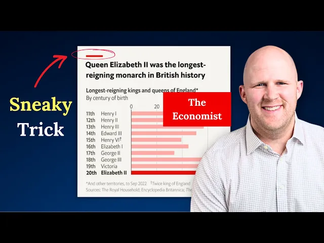
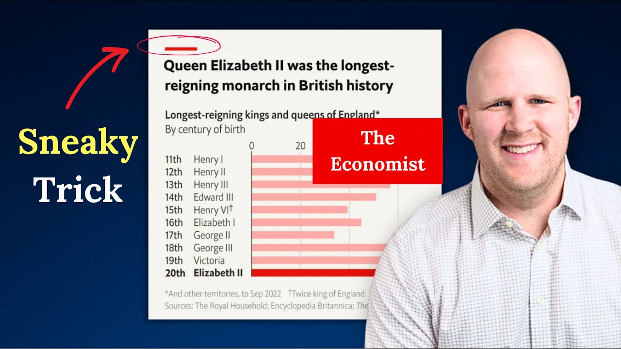
really quickly or even this one about Russia climbing out of a recession again this is because of a simple title and font simple colors but most of all because of a simple chart of course they do have complicated charts from time to time but by and large they keep it simple reason number two and this is a big one they match the chart to the message it's a chart that shows how Queen Elizabeth II was the longest reigning monarch in British history it's a bar chart which is the perfect chart for comparing values because it's
clear which is the longest in this case the comparing the years of each Monarch's Reign and it's very clear where Elizabeth falls on this list and how she Compares with all of the other monarchs and if you're trying to tell stories with your data this is an absolutely critical component it helps your audience understand your message quickly and easily here we have a line chart about the price of Thanksgiving turkeys in the U.S it's showing how the price of a turkey has gone up expressed as a year-over-year percentage and a line chart is great for
this because it shows change over time if this were in a column chart you wouldn't be able to see these nice sloping lines which emphasize the change plus you can see these other comparisons really well with the all items comparison and the food comparison or this stacked area chart that shows spending by International tourists it's a stacked area chart which is good for showing the combined total while also giving a breakdown for each category you could think of it like a line chart and a column chart combined together the focus is on this Top Line
right here but being able to see the breakdown is also helpful reason number three is that they guide you to the insight and usually they do it very subtly this is a chart about Taiwanese identity and they've given a very simple but clear title that tells you exactly what they want you to know but then they've used color to actually highlight that message so this dark red line tells you exactly what they want you to know and then to a lesser extent this red line right here while this Gray Line kind of Fades into the
background what this does is it helps the audience understand your message you don't just want the audience to understand what your chart is saying you want them to understand the message you're trying to communicate and how the chart supports that message and you can do this with things like a strong title the use of color or even adding shapes to your chart this bar chart about nuclear power is another really good example the title is strong and it's clear nuclear power is one of the least deadly sources of energy but then notice how they've bolded
it down here in other words they're connecting the message with the information actually shown on the chart which sounds like a pretty simple thing to do but you'd be surprised how many people forget to do this then there's this one about food price inflation says food price inflation is nearly three times higher than pre-pandemic forecasts again strong title and then of course Bolding and a nice dark red line that supports that title but one thing that's interesting about this chart and about all of their charts is this red line right here yes it's part of
their logo and it's part of their branding but the other thing that it does is it draws attention to this title right here which is going to help your audience understand your message because the title says it very directly so this is yet another thing that the economist does to help Their audience understand their message and they do it on pretty much every one of their charts which brings me to reason number four consistency something that the economist does really well is that they're consistent with all of their charts on their website on their Instagram
page and in their print versions yes there's a little bit of variation from chart to chart but by and large they follow the same colors the same design and they use the same principles that we've discussed today Simplicity matching the chart to the message and helping the audience focus on your message looking back at each of the charts from this video notice how similar they all are they're simple the chart matches the message and they guide you to the audience then on top of that the colors themselves are very consistent from chart to chart and
yet this is just another way The Economist reduces distractions and helps you get to understanding quicker most of the charts we use today came from Instagram but even the charts on their website although structured slightly differently share many of the same features of Simplicity guidance and proper chart selection The Economist doesn't create perfect charts all the time they do make mistakes but what they are able to do is pretty amazing they're able to take a mess of data and numbers and turn it into a compelling story that anyone can understand in just a few seconds
which if you ask me is pretty remarkable so if you're looking for some good examples of how to build good effective charts the economists might just be a good place to start