hi guys this is anik jain and today i'm going to be showing you my entire logo design process from start to finish from breaking down a brief to sketching and finally the finished product so stay tuned till the end to see my entire design process get started with the brief as you can see here we have the website good brief open and the ui is very easy and pretty simple to understand here you have to choose the type of brief you are looking for for example illustration packaging for now i would take logo design and
also the type of industry you want to go for let's say we go for food then we click on generate and as you can see uh instantly a brief judge got generated with the company name description job description and a deadline and if you're not happy with the brief you can click on generate again you can keep clicking on it until you're satisfied with the brief you get i would say don't waste so much time here but yes once we are happy with the brief we will click on export and download it after downloading the
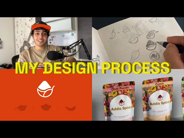
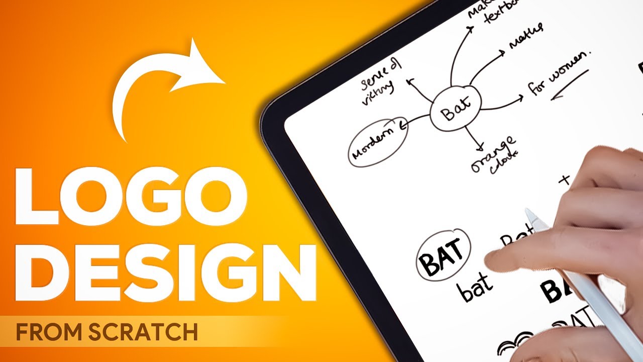
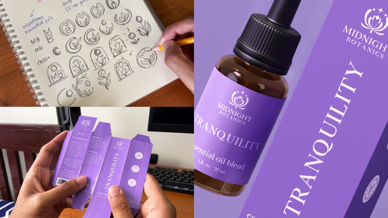
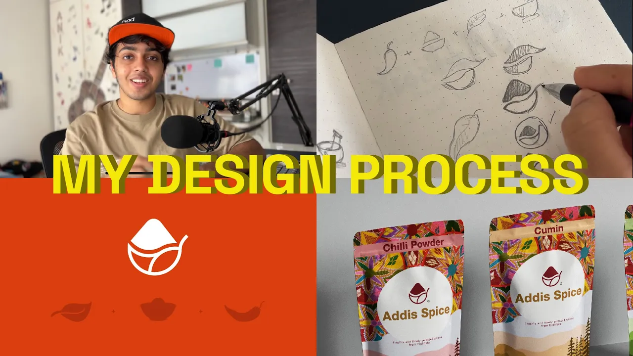
brief break down it in your sketchbook by highlighting the important keywords to keep in mind while description these keywords are going to help you in the sketching process and speed up your workflow as somewhere in between these words is hidden your logo design concept so this is a very small mind map i have created for this brand the name is adi spice as the name says it's a spice brand it's a utopian spice brand spices are really famous in the utopian side of africa for the logo design i have to keep certain things in mind
like keeping it simple minimal and creating a unique icon for the brand so now that we are done with our mood board let's get on to some research then next is probably the most boring part but also one of the most important parts in logo designing research research gives you a deeper understanding of the company you are designing for which means you can create a logo that means something special to the company remember people like stories how can you tell a good story for the company if you don't know anything about it or why it's
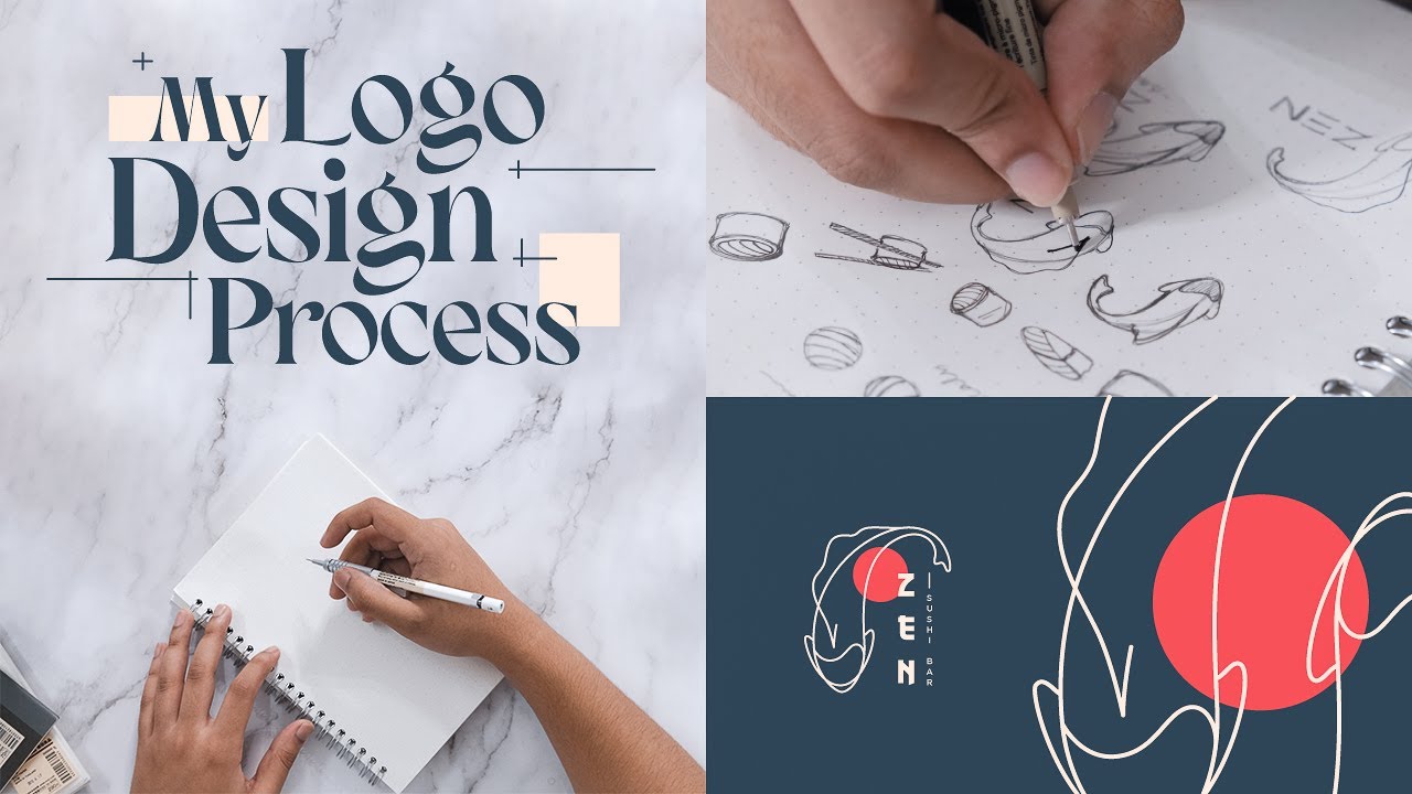
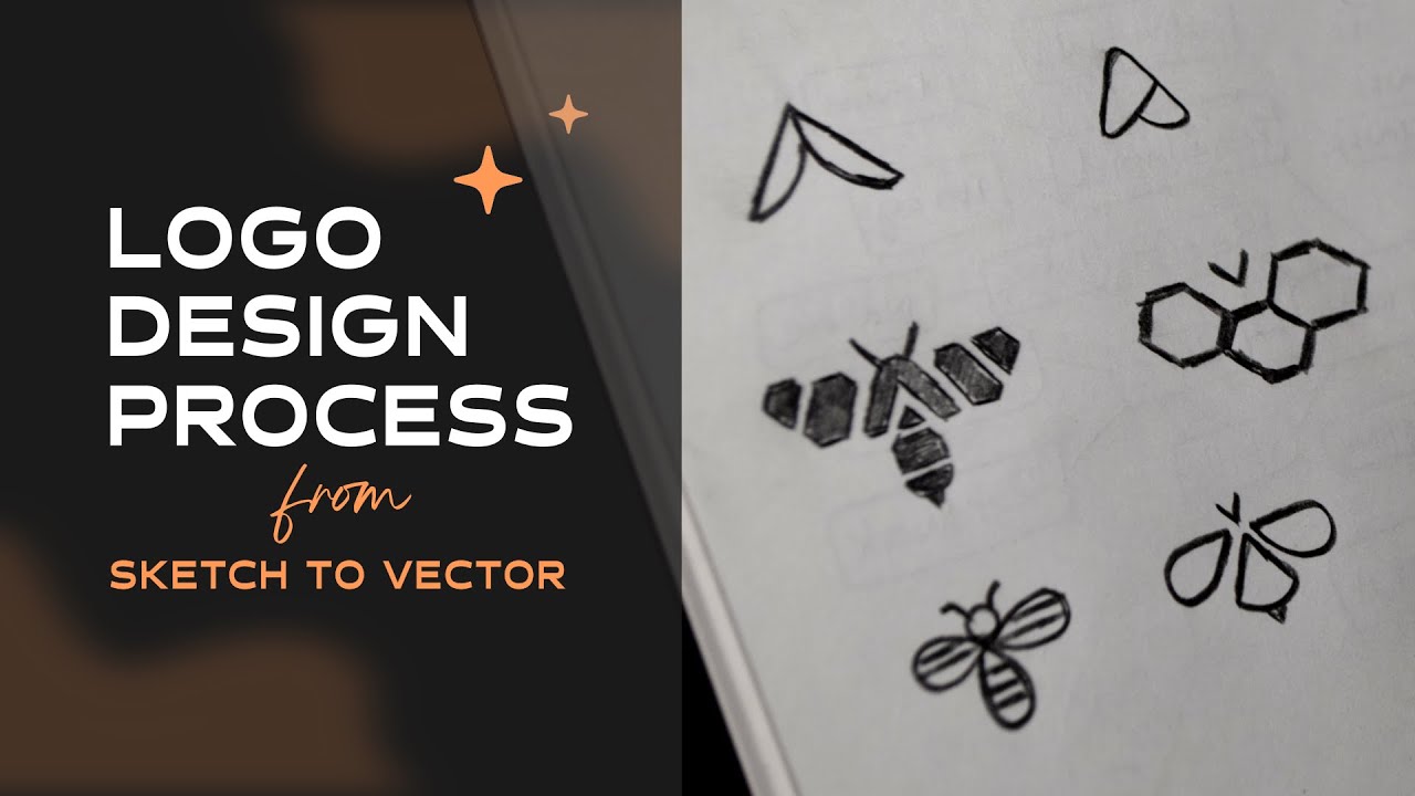
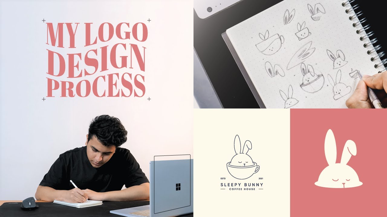
significant sketching is a favorite way for graphic designers to come up with some quick and unique design ideas this way the designers know what is in their mind regarding a particular subject these instance sketches are different design concepts which can be developed into a complete logo design even though i have an ipad sometimes i still prefer to use a simple dotted sketchbook and a pencil for my sketching process there is one rule of sketching i religiously follow and that's designing at least 20 different concepts of any idea or for any brand you're working for this
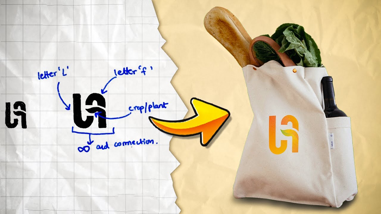
really pushes you beyond your limit and helps you come up with creative solutions different ideas which you wouldn't have if you didn't try out and push yourself harder to do it so after doing my 20 sketches i'm finally really happy with this concept this one right here basically this concept is the spice the milky shape with how a spice is served in a bowl and the leaf aspect all that included in this simple form so here is the spice on top here is the leaf element and this is also like a bowl i'm pretty happy
with this and let's see how this is gonna look when we digitize it once you're quite happy what you've come up with and you see a potential in the sketch take a picture of it on your phone import that picture in illustrator you can send it through mail or to whatsapp everything set in place let's lower the opacity of the image and press ctrl 2 to lock it in place now i cannot select it this makes it very easy to trace this logo we have created right here and let's start with tracing there we go
we created the logo finely and we can check by pressing ctrl y the lines and everything is perfect the way i created these curves is not with pen tool but actually used circles to create it i can show that in another video how to create logos with golden circle but yeah for now this is the logo we have created let's add more character let's add some colors and let's put a font which suits well to the brand yep let's go further with it now that we have chosen the colors we can go with let's try
to put each of them and let's see which one works before making the duplicate i will select the logo and expand it so all the strokes are now expanded now i'll make a duplicate yeah let's put in each color and see which one works the best so again we need to remember this is a ethnic utopian spice brand we need to keep the target audience in mind i would say i really like how the yellow is looking here i think the red and green it's too much and yellow it's like in the middle ground it
feels subtle so let's get rid of these two and um let's focus on this yeah i really like this what do you guys think let me know in the comments below um so this is the font type we are going with should i show it should i try a different color with this maybe like a maroon-ish red i guess that's a little distracting let's let's keep it the same color i feel like this is a really good option i'm really happy with how we came up with this wait wait wait we are not done yet
if you are sending the client this logo which we just created please stop right there if you are not sending your logo design with having mock-ups in your presentation to the client then you are doing a huge mistake as a designer and a creative person we ourselves know how the logo which we created is gonna look outside in shops on t-shirts but the clients do not always have that vision so it's very important to put those logos in mock-ups and to present them in such a way that it looks like it's a real brand so
guys that was my entire logo design project from start to finish hope you had fun and learned something new and do let me know in the comments of how you would have done something differently as always thanks for watching and do subscribe