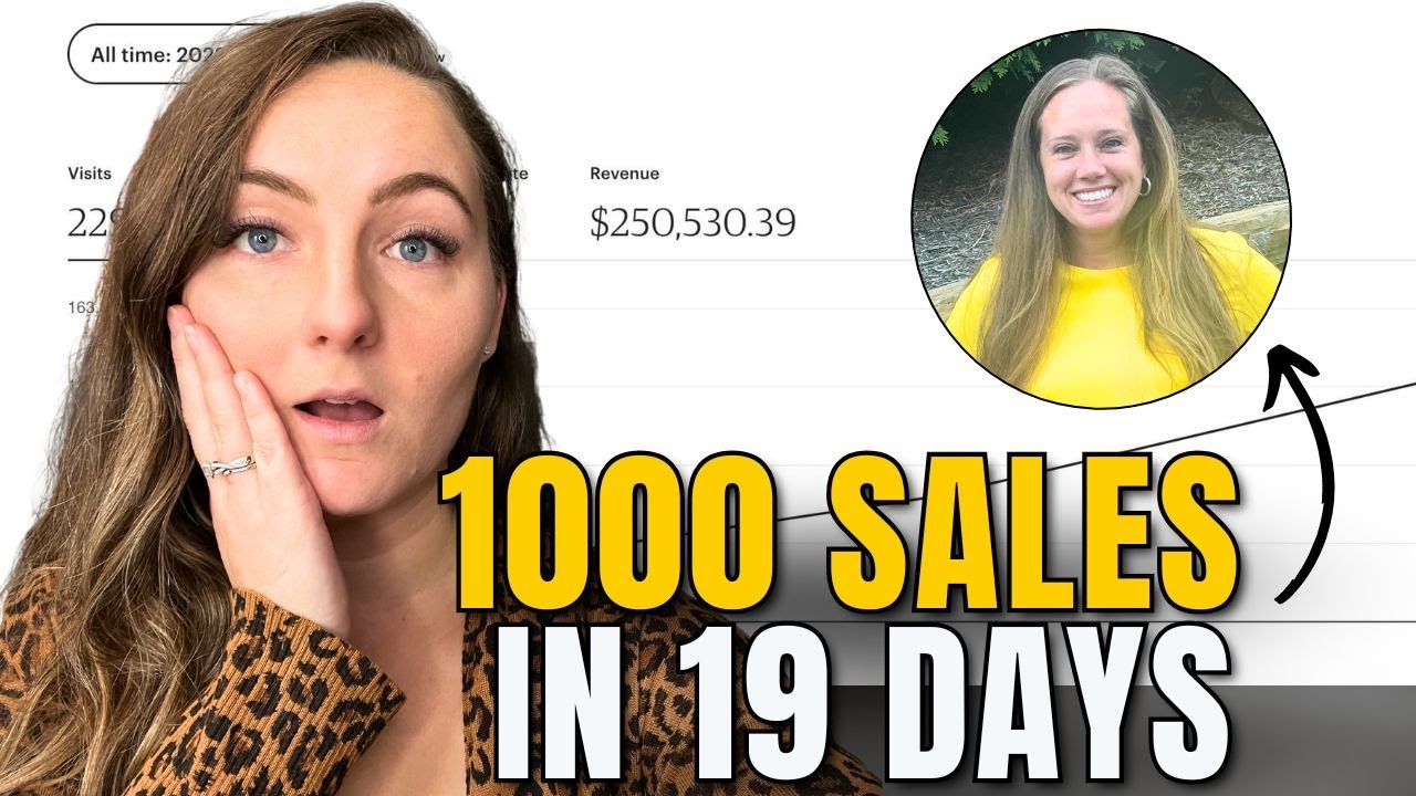
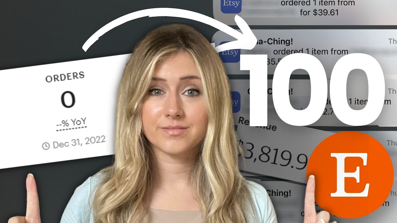
what's up guys in today's episode we're really excited cuz we have Jay from Jay's way here critiquing print on demand designs live on camera so if you are somebody that's personally struggling with trying to understand designing or you feel like designing is holding you back in your print on demand business we are going to be like I said critiquing listings live on camera and showing you how to turn C and maybe even bgrade listings and really turn them into the A++ listings that make you a lot of sales without further Ado let's get into the
live training all right guys and without further Ado we have Jay from Jay's way here the master of print on demand designs he's going to be here live helping us Master the art of Designing for print on demand so Jay what are some of your top tips some of your top design tips to just put you on the spot right off the bat yeah no pressure right um you know starting at the beginning it's going to be Clarity and readability right like you talk a lot sometimes about you know legibility and that is like being
able to actually decipher letters and to read what the words mean the definitions of the words and how they work in a sentence but readability is the kind of like the digestability of a design uh and you want that to be done at a glance so that people are not um you know clicking into your listing to maybe have a a zoomed in view uh and then potentially tanking your conversion rate if it's not something they like and I'll throw back to something I've said before right if you're going to suck suck in big bold
so that people won't go click on it worst case if you have ad spend on it right because now they're you're paying for that click um otherwise I'd say uh contrast and hierarchy for sure so get well versed with text because text based designs will have and will always sell like there's no way around that um you can have some with just imagery too but most of the sellers out there are either going to be text based or you know something text with an image or just text alone so learning how to structure the hierarchy
like directing somebody's eye from naturally we read from left to right so being able to kind of like bring them in in like a Zoro formation or have it kind of scale down or have certain parts of the text Bas design for example bolded or in a different font that would draw your eye or draw attention to in an order to lead them around right where you want to go intentionally um think of it like U you know putting as nerdy as it sounds it was uh one of my dad's saying he was an English
teacher and it was like saying putting the wrong emphasis on the wrong cabable right if that makes sense so it's like you want to at least put the right emphasis in a visual way on the right visual syllable or element right um otherwise like balance and Alignment another big one um you know stick to Simplicity I think um Simplicity and focus are are probably two of the biggest ones because everybody tries to jam too much so everyone's watching all these YouTube videos all the things right we got CET bows we got the um teacher Niche
stuff with a pencil in the shape of a bow uh and then words all around it and like everybody and their sisters Aunts Uncles and brothers are telling you to do all this stuff and now we're seeing like designs that are incorporating all of it if you're the first to Market with that you could have a potential you know really a KCK a kind of design and and just see sales to the moon but if you're the 10th thou 10th 10,000th uh viewer of those videos like your iterations what what are you going to have
to do to bring something different to that table for people to want to choose yours over the other you know 99,999 that have already been out there and potentially have sales velocity now you're stuck competing on in areas that I hate which are price and things like that right you're going to be spending a ton on ad Spin and you're going to be sacrificing your bottom line because the race to the bottom a lot of the time feels like the only way to compete when you're one of 10,000 plus right um color uh intentionality so
with your fonts and your color palettes um branding is a big one for me so you want to be able to limit your so it's it's research first right you want to create designs that you've proven demand for and then you want to present them properly because you can absolutely tank a design by not showcasing it properly like we talk about zoom in but then it's like also you know packaging it all and having brand cohesion ultimately so you want to be able to limit your limit your mockups for example to maybe you know pick
a store and buy their whole shop mockup kind of package make sure they're you know human-based so that way you can actually just stick with like three or four of the same one and you'll probably know that you know you Rec recogniz that when they add more to their shop they're going to add more in the same vein it's going to kind of have the same kind of cohesion right you know you look at these mockup shops and they're super branded out right that's the idea you want to take something like that it keeps you
kind of on this you know keeps the blinders on it keeps you kind of in a in a path where you're not going to stray left and right off these these arteries you're going to stay on the main on the main artery and you're not going to you know go on tangents um that said I would also say stick to three to five fonts that you can carry through the bulk of your design so it doesn't look like a mish mash of you know just random scrapbook designs um and it it'll and then the color
palettes the same way like keeping it kind of streamlined will just make your shop feel branded out and I cringe when I hear people say you know like people only go to your shop based on a listing level they see you in in search results and that's it they're not clicking on your shop well I and many in my membership of multiple repeat customers one of our you know mutual friends right Carla she'll tell you like she she has conversations with her customers Stacy and my wife same thing they come back and they buy more
they become your brand ambassadors and I'm not saying you know these are paid influencers they just truly resonate with your brand your story your brand values and they are genuine in their want to promote your stuff so like if you're making designs where people say holy crap where'd you get that shirt and they're around obviously people that are like-minded in their you know circles if it's in my wife's case it's big dogs in caros it's a you know a religious community people are going to laugh they're gon you know it's going to evoke some emotion
where'd you get it well they're going to share and then they're going to go and they're going to buy more so ultimately being able to have more than one option for a specific ideal customer I think is just going to lend itself well if you're streamlined and you everything's branded properly you're going to speak to them in a way that they're going to be able to two or three items from your shop maybe at the same time best case scenario they come back again as you know with you know the ad spend and stuff it's
way cheaper to have a repeat buyer than it is to acquire that customer the first time around right so I'd say those are the probably you know the biggest ones right the clarity the hierarchy and balance when it comes to design and then the being intentional build everything you do with your shop and this is one of the trainings we're doing in my membership coming up uh next week too is about designing with intention right so have that ideal you know that ideal customer in mind as part of the niche in that Niche you can
have several ideal customers but then make sure that the target audience you know there's something for all of those elements within that kind of umbrella I guess if you want so loaded question but long answer no I love it the big thing the biggest things that I think just stood out to me and what I love about that method one is that well one just down to the very thing about you said about fonts like choose a handful of fonts like you know what I mean especially I think on our last call you even pointed
that out it's like even doing like if you're brand new and trying to do multiple fonts on one single shirt is like that's like a very Advanced to get that right like really just limit yourself same thing with your color scheme right if you have the same thing if you are going to design the interior design of your house like a true interior designer is going to go to Home Depot they're going to go pick out colors from the color palette wall of paint and they're going to make the textures and the furniture and all
the Accents in that home follow this one pallet so then when you walk from from the bathroom to the kitchen to the living room right it feels like a cohesive house and it's like the same thing that you want to feel when you walk in your house or if you walk in a physical store like Victoria's Secret or Nike like it's an identifiable brand Vibe s that really stood out to me and then I really liked what you mentioned about so you are can you explain a little bit more you said that you were helping
your students basically tackle down a uh like your customer Avatar and then what would feed into that like I really I I never even heard someone teach like that so I think that's really really cool because even myself I get really confused about when I talk to print on demand sellers because I'm usually I'm handmade so it's like I have it's very clear for me it's like I have one product that attracts One customer Avatar if I want to attract another customer Avatar I just launch a different product in a different category but print on
demand's a little bit strange because it's still technically the same product type but it could be for many different customer avatars so I guess what you're saying is like you are giving people a road mapap to basically say you're predetermining before you go to market and stress yourself out okay here's our brand um here is the potential different customers right like you're kind of building like a tree of all the different people that you can you can um potentially go after and you're determining that before you go to market because that is something I feel
like people don't plan and then they get really overwhelmed because they're like they could pick up so many different uh stones at one time so I think that's really really cool really valuable you have one of the best communities in terms of print on demand teaching design which is the number one thing that every seller has struggles with before anything else right it's your designs that make you money and that's like the the the bulk of the reason I would say 80% of the reason obviously you're getting that click so really helpful stuff all right
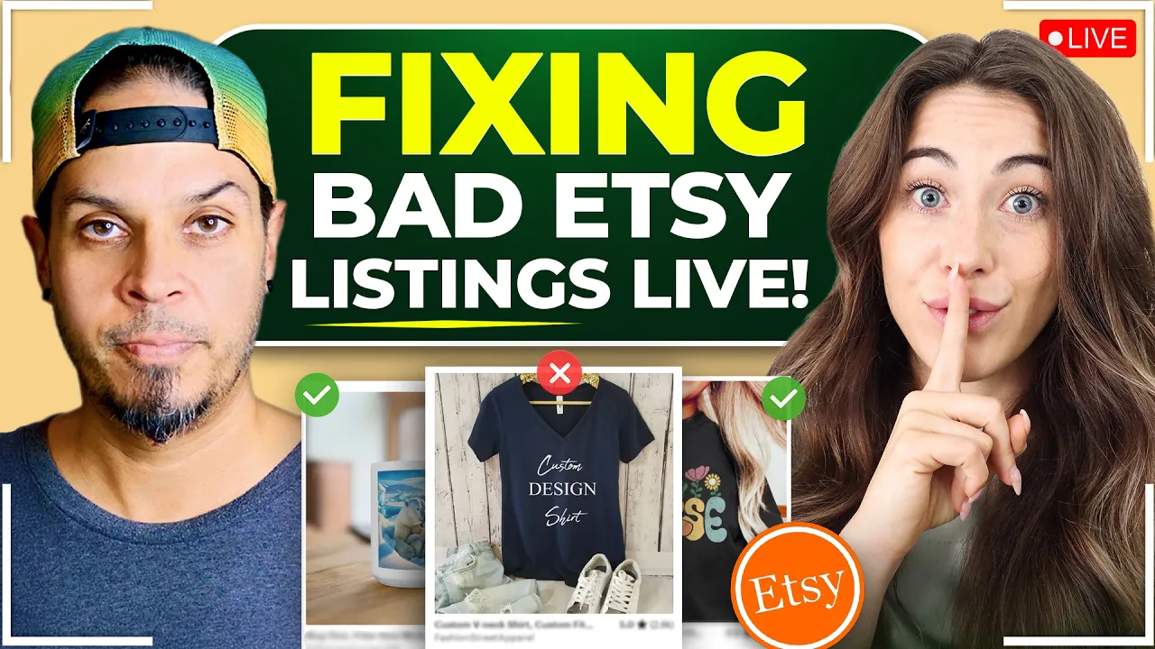
now we're going to move into doing actually some live listing critiques and some of these critiques we just found and then some of them we're going to put you on the spot again some of them are actually submissions from my community so I'm going to share my screen here and I just want you to go to town I want you to analyze some of these listings and tell me what you would change what what what's start with this one what um you know down to anything SEO pricing strategy menu images all that stuff this one
I think um looking at this like with zero um previous inclination here men's graphic te's Mountain collage uh nature t-shirt men unisex Mountain theme so these keywords are super General there's nothing that you know speaks to uh hiking um you know we can probably look at their tags if you're using you know um everb or E rank or something to that effect um and using that they I don't even see hiking in there they have nature shirt nature teas cycling shirt Cloud shirt these are not words that I think as somebody who would be into
the outdoors or mountains uh would be typing into a search bar right so starting there it's like who is it you're targeting who who is a cloud shirt wearer right and I don't even see clouds in the design right so ultimately like speaking to the design um otherwise you know there's a couple of things here like I don't feel the contrast is enough on this type of shirt it's kind of minimalist but you've got the grit of the mountain and then you've got a distress element on this golden frame that is showing through the mountain
on the right side but not on the left so if you yeah you can kind of zoom in on that you'll see uh on the right side you can see the mountain showing through but it's not on the left side so it's you know you've deleted too much of the background you're probably using a um an AI background remover these are kinds of things that you know i' be able to teach you and walk you through how to do this properly uh and then you've got these like minimalist geometric shapes these circles there that are
they supposed to be the clouds but they're very you know they're clean they're not distressed it doesn't look like it's kind of hard to tell but I feel like they conflict with the design in its entirety right so for me I mean to make this better I would probably get rid of the big the box and the circles and maybe um yeah I would probably just get rid of all that together you could leave a moon and actually maybe throw some on there if that's the intended person uh the other key word is in there
was cycling I mean does this look like anywhere you could plausibly cycle right probably not right so wow I didn't even so this is how you know you're a real designer I would never even catch that but that's that's what happens when you're like talking to a real designer like that's the St that's the difference between you and me um and the level of detail that you notice versus me but yeah I 100% agree I think it like taking out the random I mean I guess geometric geometric but yeah back to your point it's like
who are you really targeting right like are these actual mountains like maybe this there's a mountain range that hike hikers or cyclists actually cycle and it's like an identifiable mountain and maybe that's that mountain and that's the value proposition but like exactly what they said it's like I don't it's just kind of random and like who are you actually speaking to um you know um like if this is a a famous mountain range put it in there right like people are for those landmark things those touristy elements they visited somewhere and they forgot to get
the shirt or they were all out of their size you're giving them an option to kind of like capture this this momento this moment right in their life from previous and they maybe they wouldn't have thought that they'd have a second chance at cop in the shirt but here you are offering it to them but no one's gonna you know if they're searching Grand Canyon like I don't know too many of the big mountain you know ranges in the States but you know Mount Everest or wherever you are uh himalayans whatever like that's what people
are going to be searching for right like a specific mountain range um and if you're just alluding to the cycling kind of thing there's a lot of things here right to unpack like if you're if you're cycling down a mountain you're probably if you do your own laundry you're probably not wearing a light colored shirt right if this is something you're going to be wearing because it's going to get filthy uh lots of little things right you know like that I just consciously when I'm looking at a design and how how I would think of
somebody wearing this doing the thing that they love and why they're buying it so i' probably go with a darker shirt I'd probably go with a lighter design um but yeah that lots to unpacked there and then the um looks like we have in terms of pricing on top of everything uh not outrageous I would absolutely be running a sale though um at least partway what are we charging so free shipping so they're rolling their pricing in I would you know charge the five bucks or or 5.95 for shipping and then drop your initial price
point the customer facing price point you're not actually competing on pricing that in but if people are filtering by a certain amount then at least you're going to show there you can even the goal with the the sales is not just to you know entice the buyers but it's also to entice by way of showing up in search results because if they filter by on sale even if you don't have a specific entire shop sale you can still have like if you have a buy two save $25 like a a sale based on the quantity
then you will still show up in search results if they've got that you know on sale box ticked right so lot leverage leverage all the free marketing that Etsy gives you right and I mean yeah like maybe another color option here might help one or two I wouldn't you know emplore you to list anything above and beyond five colors because decision fatigue or analysis paralysis is real but um you know give them give them an option here I think um yeah anyway I could go on for days on one thing I just caught here as
your uh explaining that is I think they're trying to use this moment as a value proposition so high cont mountain range locked up with some geometric elements with some overlapping and laying to create an eye-catching design of colors in mountain peaks printed front and center with soft so you're trying to sell this uniqueness as the value proposition whereas I would say like to uh Jay's point right like a more a stronger play or a stronger value proposition is likely no one's going to understand the value of this design like oh it's a unique design more
so than going the direction of actually using an identifiable location or something like that um because as as much as like maybe you as a designer think this is cool but like for the masses or what is the actual like this doesn't actually to me scream like value right versus an identifiable place or you have the mountain range and then you know they could put their data visited visited on XYZ date right like that's a true value proposition um versus like a like a random kind of you know we're highlight like you're highlighting this as
if this brings that person value if that makes sense absolutely and the way it's composed on the shirt it's more like an afterthought right yeah yeah ex feel like what do you think of the main image um boring um I would have you know it's two there's not enough contrast like we talk about contrast to right it's I would have a darker background if you're going to Showcase a lighter shirt so at least it pops off the page and it doesn't kind of you know you run the risk of in this case there's enough a
little bit of contrast there but it's not enough in my opinion to stand out on a page of search results right uh make it pop so have it a dark background so that that shirt just jumps off the page um yeah but I would also probably have zoomed in a little bit on this design in that initial because it is so detailed uh yeah I mean especially if you're going to showcase the features or speak to them but even that like I'm you know again the son of the English teacher you got after that first
line in the description which gets indexed by Google the first two lines you want to make sure that your keyword heavy on those so that people see it in search results on Google but the next sentence of that paragraph is like what six lines long you know it's it's you can't read it with running out of breath visually in a way right so break it up you know it's a run-on sentence ultimately got it got it oh you're talking about this one here no no the the description oh in the description here oh I see
I see the first Line's a sentence the second from this outdoor second line is it's it's a whole paragraph of one sentence the other thing is like give them a size chart at least in the second image so that they know what they're looking at second or third image tops right okay you saw a in there I didn't see one oh there it is yep and then also uh do you have any recks um it looks like they have pretty straightforward um options here so no like you already said color options you know if this
is a print on man you can obviously offer different colors um but also different um like I don't know if that's something that you you teach or agree with but like having like different options so like a shirt a hoodie um I would I wouldn't do with this design but if you edited this design then yes um like absolutely I'd offer crew neex for sure and hoodies probably right speaking specifically to crew neck are a no-brainer but speaking to the you know the specificity of this design the mountains the hiking all that camping potentially the
outdoors Z you know you're going to want a probably a hoodie at some point right it just would make sense I think yeah and I absolutely do um and encourage like offering multiple products with the same design it's better than having three different products in your shop all with the same design right it just it's confusing to the customer especially if they're detailed and you zoomed in they don't know what they're looking at if it's a t-shirt or whatever make it obvious right nice okay cool yeah really good stuff all right let's go to the
next one let's do this one so this one actually is doing a lot of really good things I don't know I couldn't really find too much this is the easily distracted by weeners I thought that was pretty funny um I don't know it's funny this is fun I feel like this is really good I don't really I feel like theing is right the daily sale their drop- down menu has hoodie crew neck and shirts all in here I know I like I like what I'm seeing um you know you got a several color options here
I might tone it back but you you know whoever shop this is that you know whatever colors they're selling are the ones that you know you obviously want to keep um what I found typically though is the ones that you present the design on so the first image is typically what you'll sell more of than anything else because it's you know it's resonated already for them to click on it and they've already kind of almost fell in love with that that color what they're seeing right so very seldom will you see I can't say very
seldom but uh more often than not they're going to choose that main image that you have first um design-wise I think it looks cool it's cute it makes sense it's simple the only thing that scares me with DTG here is the solid blocks of inks so I might introduce a little bit of distressing or something not overly but just to mitigate the potential you know disgruntled from a customer because on a crew neck sweater you're going to have a little bit more of imperfections from the print process right you'll have fiber showing through uh especially
with white um it you know it's a thicker it's opaque you need the pre-treat there it's going to potentially if they hadn't pressed the Garment and dried the pre-treat or cured the pre-treat enough the white ink won't stick as beautifully as it should and it'll you'll see fibers popping up through right so just to kind of like intentionally distress it a little bit will make it look like it's you know it'll it'll hide the imperfections ultimately and I think that would be a a pretty quick win um looking at the uh I really like the
uh yeah see this it's great the second um the second or third image here I'm looking at with it's got hug me you you know you're speaking to the Valentine's um seasonality of the element but it's not you know you haven't changed your initial image but it's just when you come across that it just kind of hits um The Promise slide is great I like seeing that nice big icons right you got the shopping and you got the shipping it's you know it speaks to the order even if you didn't read it you kind of
have an idea of what's going on there um you know you got the uh social proof with the with the review in there um I might darken the top Banner into all that same color and make that review a top across the top all white if you go the uh yeah it's the one right before the um the pink and yeah that one I'd make that Banner right there uh dark and make that text white so it just jumps off the page uh but I like what you did too about keeping from the nose up
because as humans we're drawn to people's eyes and it's distracting so if you're going to Showcase somebody's face always make sure that they're at least looking away but not straight ahead right away or up there's a psychology there too and uh but you know it's always safe if you cut from the nose up you still kind of get the the aesthetic the vibe um and it looks good so I do like it I would just you know I wouldn't change the design necessarily other than to potentially intentionally distress it a little bit it looks good
one thing that I caught but uh first of all that I just that I just learned a whole bunch of stuff just that so thank you all that I didn't know any that um one thing I caught in the menu that is so if there's any potential for confusion uh you're just like more at high risk of like losing the sale not that this is that much confusion but just something to keep in mind like you have military so first you have green so exactly like what you just said like that main color is the
reason they click so that's probably going to make a lot of the sales right but you have two green options without linking what that actually is so like what is the difference between military green and force green oh okay well you do say it here but I had to like look for that like I I just spent the last like two minutes trying trying to find do you have a color palette thing here like a color palette image that explains so I see that you have it here now but it was a little bit hard
for me to find so military green is that do we have something that says what the other one is the I'm sorry that's forest green do we have something that tells us what military green is um just because it was a little bit uh confusing for me and just any confusion can cause drop off because you really only have every single second that they're there it's like you want to try to convert them as fast as possible and if they get confused you're just increasing that risk um so having some sort of color palette would
be good and then the other thing is this is obviously a really cool design um and if you haven't we don't know if you have or haven't but split testing this same thing but with just different colors to validate that this is the winning color maybe it's actually you know this one right which I don't know we didn't go into your shop and investigate that but if you haven't done that like I would split test this I don't know Jay if you agree with that but I would even split test it you know maybe with
the the tan and then also again with the white and then maybe even the black is that something that you would say maybe uh yeah I'd probably go with like a higher contrast between the visual right so stick with your green or your Navy and then or the maroon whichever the like the first three that you saw there and then the other one I would probably do on maybe like an ash or something because the reason is I wouldn't go with the sand is because you got a dog you got a doxy or you know
Dash and or wiener whatever you want to call it um dog shed and if you're wearing white or any light color you're going to be covered in the darker prur right so the only way you can kind of limit how bad that fur shows up and you guys all know what I'm talking about you know as as owners right is to use an ash or Spork gray that has the flecking in it which may hide some of you know the fur that's on the shirt otherwise you're going to be you know you won't wear a
white one it's probably the the least popular one that you're selling unless they're walking their dog out in public somewhere right um but yeah I would contrast you know show the dark one and then show one on a lighter color awes for sure and yeah you know link link to your colors right if you can help it if you're only going to show on crew neck but you're offering everything else uh at least link your photos to the color choices so that when they pick them they can you know decipher through right oh it's working
for you it's not working for me huh this one it was doing it it's doing it on some of them but some of them oh in the T-shirt one it is oh maybe that's what it is let's see so yeah so for t-shirts it's working but not for yep or the other ones oh some of them some but not all okay yeah figure that out and and one thing I'll suggest here is like to uh Hannah's Point have the color palette there and anyone that you don't have a mockup for you can just link that
to that color choice right so at least they'll see the whole color palette and they can read for themselves yes cool all right let's go into the next one so this one we're switching it up a little bit this is a blanket um Scandinavian style this looks like really I feel like this is a super trending pattern um but let's see what do you have to say about this one right off the bat not not nearly enough contrast it doesn't jump off like that initial image right is what you're going to you know get people
to click on um I'd probably maybe zoom in a little tighter but best case scenario like or at absolute least darken the background so that it pops off um maybe even light in the image but dark in the background so that you can kind of see at a glance it sort of gets lost you know what I mean do you think the same kind of like not enough contrast there right and definitely like just like if you were like here it's like you know it looks like a good image but it's like in comparison to
like your competition in the search Pages it definitely is like a little bit dark here um and just yeah blending in back here but you know always subject to test I almost kind of would like to test it with this but like zoomed in more I don't know or what other one or even this one I feel like that looks awesome I was just looking at that too and I also think the um on your video so if you go to the video it'll show like the the weaving which is great but you could even
take a still you'll see of the woman holding her arms up uh with the blanket in two seconds coming up I think yeah right there you could take a still of that and then darken that right because that looks awesome and it gives you a good you know sense of the size as well without just looking at a couch or a bed you could try a couple of things right but um I even like it on the wall as a tapestry sort of thing I almost Bak this the beginning of the video too instead of
the other one I agree I still like the weaving but I would make this almost the start of the video because that's like really big value and that looks really good I agree the design itself though looks great I wouldn't probably change too much there you don't want to like you know to what you had said before is something that I've kind of said to everybody is you know limit the color palette limit the font choices because the more you try to jam in there right less is always more but you need to be more
artistically educated to make sure that you can do it all in a way that looks tasteful and looks good right um so yeah I think the design looks good and it probably would uh make like a really good end result as as a woven blanket too like I think the colors look great I think this looks great that looks really great cohesive yeah it all feels definitely branded and cohesive so the massive plus there but just that main image I might revisit and then give it a little more give it a little more punch test
it and test with the still of the the lady holding it up to another keyword for something like this I feel like I don't know maybe I mean you're proba they're probably better but I feel like Cottage would this fall into Cottage Cottage she cottage decor Cottage core I don't know if that keyword is in here but I don't know I guess it's more Scandinavia maybe not more Cottage but Whimsical it wouldn't wouldn't hurt to have Cottage core in there I mean you're out in the especially if you darken up the imagery potentially um there's
a you know she's got woodland animal in there um the rustic scandy decor I think is a big one so that's good you have that uh dala I've never heard of so I don't know what that is but there's not a lot out there um she got dalah horse is a kind of horse do you know what that is I have no idea dalah horse I don't know dalah horse Fox Birds I would put punctuation in there at least break it up visually with a comma like where it makes sense um because you're not going
to exact match if there's no commas there anyway yes you will broad match kind of thing but um it's kind of like it's you know still a bit of a run on there right visually the readability I think Whimsical yeah all of that I might Valentine might be something I'd throw in my tag but I wouldn't put it in the title unless it's literally a Valentine's design yes there's a heart on it but does that constitute Valentine's right I wouldn't just because then you're gonna you're at risk of ruining something if it's working right um
if you change that now to Christmas or to you know whatever seasonal Trend you never want to screw around as you know with the SEO right if it's working don't break it so gift for more is something gift for more maybe it's Scandinavian I'm not sure I don't know um yeah I feels like it might have been a little rushed one other idea which I don't know how it would get pulled off because I'm not the designer but I feel like this borderline could fall into baby blanket or I don't know I could be wrong
on that one but cute enough yeah cute enough but it would be like and then if you did a personalization thing where there was like a I don't know a badge where like you could put in a clear personalization request with a name I I don't know how that would manifest but I feel like maybe if it was done right with the right font it could kind of manifest into a baby blanket uh but that would you would have to pull it off with the font and the design um and you got a ton of
blankets in here yeah and looking at the banner I just zoomed out to the shop there I would probably put some of your most recent woven blankets at least one image up there in a banner um and then looking at the front page of the shop I feel like the contrast element is a is a a thing there too okay more things yeah if you click on Timeless boho like on our shop name there you'll see like there's just a little bit of a lack of uh contrast it feels like you can you can lighten
the product itself and then darken the backgrounds a little bit just to make them kind of stand out a little more yeah but just a little bit with light lighten it a little bit Yeah overall looks really good really good but yeah definitely on the right track here I like I like the uh the design the whole the whole I think you got the Scandinavian thing on on lock here it's kind of cool I haven't seen like somebody do as much of it yet so yeah and do it well so Co all right let's go
to this last one here we have something that says literally me and a wolf I like this font I feel like this is very uh what is that y TK T I don't know what is that new thing with like all the young I don't know anyway Y2K is that a yeah Y2K yeah Vibes um so kind of interesting it got six views in the last 24 hours so it actually has a badge let's see what happens if we add it to cart if it uh it's in nope it's not in it's not anyone's cards
but it is etsy's giving an Abus badge it's got load of favorites it looks like it's sold a fair amount but I feel like they're driving out external traffic because I'm not seeing like it's got like a 1% conversion rate so it's got a ton of views right so the views are coming from somewhere okay yeah might be external traffic this could probably be coming from I don't know if that wolf is actually this could be maybe trademark if this is coming from a video game or something maybe I don't know I don't want to
what does it Sayo oh it's a from a meme so maybe there's a meme going around or something on social and that could do it yep mentally where I'm at dissonant shop like otherwise you know it's almost like if I'm looking at the entire shop so the it's um they're they're just going with this entire minimalist Vibe so it might work um yeah yeah so this like an example where like you know white background photography normally isn't what does it but because it's like that is their Vibe it's like a meme shirt you know supposed
to be satirical and dark and whatever it's kind of like working you're saying I think it kind of works just because they're at least being consistent with it right um but that particular design um needs to be bigger larger on the shirt for sure and again zoomed in right like you can't really see it you can't really make out the details of the wolf right away if you know the meme then maybe you know you know what you're looking at but even like the one below it um me and who for you it's the third
one in I think you know there's just not enough contrast with the design on the shirt without looking at it and right these are all memes and maybe they make sense but it's you know they're not what because imagine everybody every time looking at this on their phone right ultimately right right it's just hard to see what you're looking at but yeah this is definitely interesting case where it kind of makes sense but definitely room for improvement I mean they've had 1,300 sales on only 39 listings and their shop is pretty two years or so
yeah yeah if you're G to do the meme thing you're going to be chasing them if you could if you list more you'll sell more especially if you're chasing memes and trends that way right but you're going to want to stay on top of it all and I just I feel bad about going down the um you know the trend path only because it's a recipe for Burnout because you're never going to be able to stay on top of something unless you're perpetually you know online wherever you know all the funniest memes are going to
be uh shared or displayed right it's a lot of work um but I'm looking at some of these I'm not afraid of work but I like to work a little smarter than harder right nobody needs 3,000 listings in their shop funny but yeah I think even just like the lowest hanging fruit like we said I feel like it would be just like lightening the like making it bigger and like lightening it a little bit I guess like lighting it so you can see yeah so it shows off on the on the shirt right because it's
kind of you know it's hard to digest what's out there that readability element and then obviously we could add a video we could go a little bit crazier same thing with the drop- down menu have different variation options so crew neck hoodie um I feel like there's probably not that many different colors you would do with this like black is kind of your thing you're going for but yeah the black the pepper um it looks like it's a comfort colors even though there's no tag there oh and it says Bell and& canas 3001 this looks
like a comfort color shirt so just you know you're setting yourself up for potentially some disgruntled um customers that are looking at your description it says Bella and canvas 3001 so if you're not actually selling the Bella then you know make sure that that you uh and your size chart shows a Bella as well but that's yeah definitely not a Bella in your mockup that's also uh one of ets's terms of service that you're going to want to get on board with is accurately depicting what the End customer is going to have when they get
that package okay so you're saying this is a comfort colors mockup but then he's saying it's a Bella 100% yep okay it's misrepresented for sure all right we don't want to do that okay all right cool well this has been super valuable I mean I just learned a whole bunch of stuff as well um this has been really fun and I just want to say thank you so much and hopefully we can get you back on here soon um and yeah guys maybe even below this video If you want to get one of your listings
reviewed comment the link down below and we will put that in our pool for maybe the next time we do this or the next live we do if Jay would like to come back that'd be fun we should do a live and then we can just you know kind of go through I just did this in my in my membership too was we did had uh you know 10 or 12 shops and we spent four minutes like quick First Impressions bang bang bang right and it was like in a group environment so it was kind
of a cool fun thing where we had the community kind of comment on it and they held off they held off all their comments and didn't hit enter until I was done the four minutes and then they hit enter so that chat is still saved right um but it doesn't it's just way way more fun to get the community involved so live would be a lot of fun actually cool yeah all right well let's get on the calendar all right thank you so much we will see you next time thank you Jay bye bye adios
take care