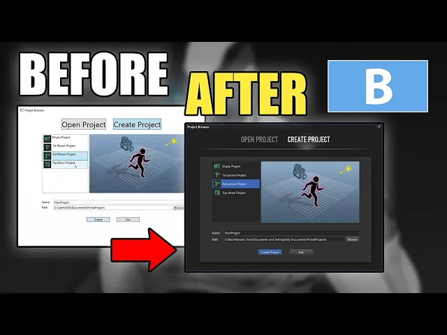
hello everyone and welcome to the game engine programming series where i write a game engine from scratch in the last video which was a blue episode we started working on the look of the level editor and right now we have this dark theme that we can use with the editor and we made also some nice animations that go with it however the list boxes and the buttons have still their original look that doesn't really fit with the rest of the design of course so i'd like to continue today and change the look of these elements
as well and then we can step ahead and go to the main window when we do the list boxes and the buttons then this part will automatically be changed to the new design as well and don't worry about the dark background right now because all we see is the background of the window itself we will put user controls in there anyway with their own background lighter background color so for example this history tab and lock tab will have their own background colors of course and i'll be changing these buttons [Music] all right i'd like to
start by defining a new look for the buttons and therefore just go back to visual studio in the control templates the xaml file and here will be earlier we did this simple button that we are using in the windows style the three buttons on the top right of the window and i'm going to make another style that will be applied to all the buttons in the application so if i would write a style right here then i can't really see what the button looks like right away i'd like to see what i am designing and
then i can just go here in world editor and make a style for a button in this document and i see what happens and when i'm finished i can just move that to the control template resource dictionary so now i can just zoom in on one of these buttons like this and extract its template and edit it locally so here i'll use apply to all and then in the same document i can just edit the template or style actually for this button now it created two styles for us one of them is the focus visual
style and that's just a dotted line that appears on top of the button when it has the keyboard focus so we can press enter and it's the same as clicking on the button and the only thing i have to change here is because it's using the default system colors which is well black in this case on default unless you have changed it in windows settings yourself but normally it's black i want to use the whiter color the font color for the editor so i'll use this one and i'm going to give the buttons a darker
background as well so that goes better with the lighter font color that we have and well all these colors we are not going to use because we have our own so first i'm going to change the background and border brush for the button the default background is just one color and i want my buttons to have a subtle gradient towards a darker gray so therefore i'm going to define a linear gradient brush like so so what i did here is tell the linear gradient brush that it should lay out the gradient vertically by going from
zero on the y-axis to one on the y-axis so it tells it to go vertically and not from left to right or horizontally and remember we have these gray colors which go from darker values to lighter values so this 5 is as you can see here is a bit lighter so it goes from the offset 0 which is the top part of the button and goes to offset 1 which is the bottom of the button and then it will go to gray color 4 which is just a bit darker now i'm going to do the
same for the border as well and then here i'll use a different shade of gray of course for it not to be the same as the background and the foreground is just a font color okay and then i'm going to set other properties that i want to be the default for all the buttons in the application next i'm going to define what kind of shapes should be used in the button right now it's just a border and a content presenter in it so this text for example is displayed by this content presenter and what i
want to do is to have another border on top that will change the color of the button whenever we select it so i need just another additional border and that's it basically i have a background border that is this gray background with the border and on top of everything else i have the content presenter and in between i have a border for when the button is selected and right now it has a transparent background and i'll change the color of these borders in the control template triggers so here i can define what happens when the
button is defaulted or i go over the button with a mouse or whenever i press the button or the button is disabled so i'll just remove all of these first when the button is defaulted r is pressed i would like it to have the selected background color which is this blue color so now for example i can set this property temporarily to see what happens when the button is defaulted and i can say okay when it is defaulted then i want this border selected to have that selected background color now you can see that all
buttons in the user interface are defaulted and have this blue background color for some reason it's not showing me here already and whenever it's defaulted i also want this blue color not to be just a blue color but also have this gradient so i'll let it be transparent towards the bottom of the button so here in the control template i'll just define a couple of more colors in the resources so i can reference those so here i've got this gradient brush that i can use as a kind of masking for opacity of this selected border
okay now you can see that it's a bit darker towards the bottom so that's good and i want to have the same actually whenever the mouse is over the button or the button is pressed but whenever the button is pressed i want this foreground color the font color to be fully white so it will be even brighter and as the last trigger i would like to have a darker even darker color whenever this button is disabled so if this enable property is false then i'll have a darker background color and the darker text color for
that i need a couple of more linear gradient brushes here and i'll just remove these colors just to avoid clashing my names my key names with them we don't need them anyway yeah of course i didn't put anything in the trigger for disabled buttons yet so i'll just do that now so for the foreground the text color i'll just use a disabled text disabled font brush whenever the button is pressed i want the gradient to be reversed normally when it's defaulted or i'm hovering with a mouse pointer over the button then the blue color goes
from lighter blue to a darker blue and whenever i press the button i want it to go from a darker blue to the lighter one so we have this kind of subtle click effect and therefore i'm going to reverse this opacity brush for whenever the button is selected so it's just basically the a copy of this one but the with the offsets reversed and then i'll use that one here so instead of selected opacity brush i'll just use the pressed and of course i need to change its name here as well and then we are
done with the button style let's see what it does i should also put these away okay so we have here a disabled button you can see that it's darker and whenever i go over a button with a mouse it will become blue and if i press it then you can see it has this subtle click effect all right now one thing i notice is that our buttons now especially on a darker background they appear to be not really square or rectangly they appear to be skew and that's like a visual illusion because we are using
a darker border color at the bottom and a lighter one on top and that gives the illusion of the button being wider on top and a bit smaller at the bottom you see it changes when i have the blue background to fix this visual illusion which is of course our buttons are still rectangular right so there's nothing wrong with it and to fix that i'll just change the border thickness of our buttons that should fix the problem so here in border thickness i can say okay i want to have on top i want to have
a border thickness of one and on the left and right of the button i want no border basically right so now if we look at our buttons they appear to be rectangular again which is good i'll put this new style for a button in the resource dictionary for control templates now you can see that it's applied even to the project browser window we have these new buttons and this one is defaulted and this one is disabled we can't press it and you can clearly see that it's darker so that's clear from the appearance of the
buttons okay now let's move on to the list box and listbox items now i can do the same thing with the listbox i can just extract its template like so but the thing with this box is that we also have to make a style for listbox items because the listbox style only applies to the appearance of basically its background for the items of the list box we need to have a listbox item style but i really can't extract the style for the listbox item in this way because it's it this selects the list box itself
and i can select the items to extract their template so what i normally do is go to this location where visual studio is installed and here is your flavor which is the kind of visual studio that you have for example if you have the community version or a professional version so if you go to this location there is this file that defines the look of all wpf controls on windows so if you make an application it will use these controls in this resource dictionary on default and if you open it you can see there's a
resource dictionary and there is a style for everything every control in wpf here i have done a style for scroll bar for example and what i can do is just search for a listbox item and find it and you can see there is a style for it i can just copy and paste this to my file here and there is a cell for list box as well so we can even compare this to what we already have i'll just change all the properties that i need to set to have a default look for all the
listbox items in the application i left most of the properties for the listbox item the same as they were but i defined different triggers now so whenever one of these items is selected they all just have another background color or they also have another color when i go over the items with a mouse pointer and when they are disabled or the list box doesn't have the focus then they'll change colors as well i can also already just change the style for the list box itself i'll just get rid of these colors here again i left
most of the properties as they were but added a couple of new triggers to handle whenever i hover over the list box with the mouse pointer or if the list box is active so for example here if the listbox hasn't got the focus and i go over it with a mouse and it will have this blue border i set the border thickness to zero for now because i don't want my list boxes to have a border but whenever we use a border somewhere so we set the border thickness to another value then zero then this
happens whenever we go over the list box with a mouse pointer and i think this is enough to restyle all the list boxes well we only have the listbox in this open project view but we already can see what happens i think yeah it wouldn't pick the listbox item style because i override it within this item container style so what i do is to give the listbox item style and name and then refer that whenever i want to use it now because i overwrite the style for listbox item in this one i can just say
that it's based on my old listbox item style and it's changed while i'm here i want also to put something more in this open project description in the listbox item okay i played a bit with the font sizes and phone types and i think this looks okay the thing is that the project path is cut off here at the end but that's really the part that we want to see right because the start of the path doesn't really matter we want to see what the name of the project is in project directory i'll have to
fix that later on but for now i'll just use this and see how our list boxes look now okay this looks nice and then i have to move this style to the control template resource dictionary so it will be applied to all the list boxes in the application as we can see this listbox style is now applied everywhere which is nice i have to align these titles to be centered as well and here you can see the listbox for game entities has this a new style there is this bug in wpf i think that whenever
i select multiple items in the list box then it will have this disabled color and well if you go back a couple of videos and look at the default style of the list box and you can see that it happens there as well so it's not something i just did it's just like this all the time and yeah i would rather have this blue color for the multiple selections as well but it doesn't really work right now maybe they'll fix it later on all right so next i'll just go ahead and change the background for
the history and look and have new buttons for different kind of look messages as well first i'll use this font type for project templates as well that might be a bit too large actually so i'll just make it smaller yeah that's better okay let's go to the world editor and then i can set the background for different parts of the world editor here here i set different gray colors for the backgrounds of different parts of the world editor and i gave this grid splitters a transparent background color so they appear darker so if we look
at the level editor right now and you can see these grid splitters like so and here is one as well but because we don't have anything here where the renderer the graphics will be we can't really see the grid splitter but it's there and unfortunately restyling the tab control for wpf is a bit of work actually so i'll do that sometime when i'm making a docking manager for the interface then i'll restart the tabs as well because then i'll have to have new tab behavior anyway for now i'm just going to make new toggle buttons
to use for these three and then we'll be done with the initial design of the user interface so i'm going to open the logger view here and then i can define the look of these toggle buttons here locally i'm not going to use them anywhere else so i don't have to put them in this control templates resource dictionary in this case i don't need a focus visual style so i just remove this and also all the colors i'll set the focus visual stall to no so for these buttons i just need a border within a
border there is no text or any other content i just have colored borders this is the initial style for our toggle buttons right now you can't really see anything but then i'll finish the style in the body of the control itself i can move the event handlers for these toggle buttons to its style as well so i can just use an event setter here and then attach it to that event handler so i'm using the click event and the handler therefore is because i'm using the same handler for all three buttons i can just move
it to uh to this style and then i can just delete these here and then i can set the background color of the buttons it's not quite working i see i think there's something wrong with the triggers because the way i was intending it to work is the buttons should become darker when they are not checked or they are not selected because they are toggle buttons right so if you toggle them they should become a bit darker because i'm changing the opacity here to half the opacity okay let's check why it is not working so
i'm using the background here in the outer border as well and that will fill the whole button with that background color to fix that problem i just need to get rid of the background and then it probably will work yeah so now i unchecked the warning button and it became darker i can uncheck all of them okay so that looks nice and one more thing i'd like to do is to have a border here on top so i can have a separation between the log messages and these buttons now i can just use a grid
instead of a dock panel and i move this part to the end of the file so it ends up on top of everything else so i put these buttons on a border and gave it a nice little drop shadow and also now in our messages we have this background whenever we go over the messages with a mouse then we have a blue background okay i changed the text block style in the locker view so we have this font color now now i'm just going to fix these the font color for the scene names and then
we'll call it a day for now okay so today we finished restyling the user interface now we have everything in the colors that we like at least i like these colors if you don't like them then feel free to just change the colors i think for me this works for now so i hoped you enjoyed this video and i'll see you next time thanks for watching if you like this video please feel free to like and subscribe if you join me on patreon you'll get access to the code on github so you don't have to
type everything over from the video plus there are also other nice goodies and rewards exclusive to my patreon supporters please use the link in the video description to check them out i hope to see you next time until then take care and happy game engineering [Music] you


![C++ DirectX 12 Game Engine - [S01E03] - Creating A Game Engine](https://img.youtube.com/vi/YgZSSE3qZqA/maxresdefault.jpg)
![C++ DirectX 12 Game Engine - [S01E02] - Refining Our Window](https://img.youtube.com/vi/rWylZKi8QbM/maxresdefault.jpg)