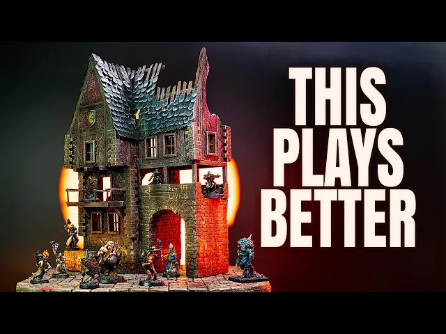
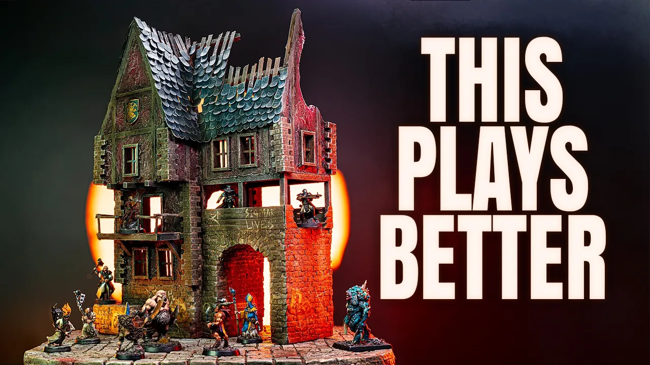
Most Mordheim wargaming terrain looks amazing, but plays terribly. It's built for display, not for gameplay. Players go around it instead of through it.
And when that happens, the terrain stops mattering. This build is about my process and how I fix that very problem. >> [music] >> Hey good folks.
My name [music] is Layth and I want to welcome you to my YouTube channel called Debs and Dice. Today, I'm going [music] to walk you through the process I had to make this awesome building for Mordheim. Perhaps even more importantly, I will talk about my thought process to make better Mordheim terrain at the tabletop.
Before we get into it, I want to ask you a small favor. If you like this channel and the content I make, then please do what you can by liking, sharing, [music] and subscribing. Thank you.
Now, let's get cracking, shall we? So, this is where everything starts. Just the basic shape.
And this part is more important than it might look because this is where most terrain either works or doesn't. It's really easy to just start stacking walls and before you know it, you've built something that looks great. But once you try to use it, it just doesn't hold up.
So, here I'm trying to slow that down a bit. Just focusing on the shape and what that actually means for the game. Now, the first thing I'm thinking about is movement.
Like, can you actually move through this space? Are there clear paths or are you going to get stuck somewhere? Because that's something I see all the time.
You build a nice-looking structure, but no one actually goes inside it. It just becomes something you move around instead of through. So, here I'm trying to keep everything open, making sure that there's always a way through the building.
At the same time, I'm also thinking about line of sight. What can you actually see from different positions? Where are you exposed?
Where do you have cover? And this is something that's really driven by the shape. Even small changes here, like a corner, an opening, an angle, can completely change how space plays.
And then there's the overall feel of it. Because I don't want this to be just another square building. If everything is straight and predictable, it works, but it's not that interesting.
So, I'm trying to break things up a bit. Different angles, slightly uneven, just enough to give it some character, and that eventually helps both visually and in terms of gameplay. Because now we get more interesting positions and more interesting situations during a game.
So, once the basic shape is in place, this is where it starts to become something you can actually use. Because up until now, it's just volume. It looks like a beginning of a building, but it's not really playable yet.
So, the next step is defining the inside. Where are the walls? Where are the floors?
How do you actually move through this thing? And one thing I'm thinking about here a lot is accessibility. Not just for the models, but for the players.
Because it doesn't really matter how good something looks if you can't actually get your hands in there. So I'm trying to keep everything open enough that you can reach in from different angles. Front, sides, even from above.
Because during a game, you're constantly moving models, adjusting positions. And if that becomes awkward, people just stop using the space. At the same time, I want the interior to feel connected, not just separate rooms, but something you can actually move through.
So I'm adding these walkways and openings so you can go from one part of the building to another, and potentially connect [music] into other terrain pieces as well. And this is where I stick to a bit of a system. All the floor heights are set to about 2 in or roughly 5 cm.
And that might sound like a small thing, but it makes a big difference. Because now everything lines up. You can connect buildings, you can stack things, and it all just works without having to think about it.
So even though this looks like a lot of small decisions, it's really all about one thing. Making the space easy to use. Because if it's easy to use, players will use it.
And that's when the terrain actually starts to matter. At this point, I start bringing in some of my own custom parts. Things like door frames, windows, and corner stones.
Just to help define the structure a bit more. I've modeled and printed these myself. Mostly just to speed things up and to keep things consistent across builds.
It also helps tie everything together visually without having to overthink every small detail. So, at this point, I start defining the actual floors. Just adding in some basic supports so the building starts to feel a bit more structured.
Because up until now, it's still pretty open. But now we're turning it into something you can actually use during a game. I usually work from the bottom up, starting with the ground floor and then building up from there.
And for a flooring, I'm just going to use some coffee stir sticks. They're simple, they're cheap, and they really work well for [music] this kind of thing. But again, the important part here isn't really the material.
It's how the space is used. So, I'm constantly thinking about accessibility. Can you actually get your hands in there?
Can you place models without knocking everything over? Because if that doesn't work, the whole thing kind of falls apart during play. So, even when I'm adding floors, I'm trying to keep things open enough, making sure you can still reach in from different angles and actually use the space.
Then for the upper levels, I build things out a bit, adding these overhanging sections, which is pretty typical for this kind of architecture, but it also helps break up the shape. So, instead of just stacking floors, you get something that feels a bit more dynamic. And this is also where I start to think about connections, how this building might interact with other terrain pieces.
So, I added this platform here on the second level, which actually came from a suggestion from one of my patrons, Tiny Legion Craft on Instagram. Definitely go and check him out. But it is a great idea because now you can start linking buildings together, adding walkways, and suddenly the table becomes a lot more connected.
And finally, I started working on the roof. Just using some balsa wood to define the shape. And this is really where the silhouette starts to come together.
Because from a distance, that's what you actually read first. So again, just try to avoid making it too flat or too predictable. Breaking up the shape a bit, adding some variation, so it feels a bit more alive.
As a final touch on the walkway, I add some railings because this needed to be safe at some point, but I make very much sure that there is enough space for a walkway. At this point, the construction is pretty much done, so the focus starts to shift a bit. Less about structure and more about how the building actually feels.
So I start working on the roof, adding shingles to give it a bit more texture, and then just going back over some of the details, breaking things up a bit so it doesn't feel too clean or repetitive. I'm also going to use some texture gel here for the wattle and daub sections. It adds a bit of variation, but also makes the whole thing a lot more durable.
And then I start adding some small storytelling elements, like these coat of arms shields. I rough them up a bit just to suggest that this place has been through something. Maybe they belong to a family with a wolf as their sigil.
And that's really the shift at this stage. From building something functional to making it feel like it actually belongs in the world. So, up until now, it's been all about structure and layout, but the paint job is what makes it readable, and that's really the goal here.
Not just to make it look good, but to make it easy to understand at a glance. So, I'm thinking a lot about contrast, making sure that different materials stand out, so you can quickly read what's wood, what's stone, and how the building is actually put together. I'm also trying to break things up a bit, adding some variation in the color, so it doesn't feel like one flat surface.
Even small shifts in tone can make a big difference visually. And then, there's the wear and tear. This is where you can start hinting at a bit of history.
Edges get [music] worn down, surfaces get dirty, things don't feel new anymore. And that's especially important for something like Mordheim. You want it to feel rough, a bit broken, like it's been through something.
So, even small details, like the shields, the posters, or how the materials are weathered, starts to suggest a story. And at the same time, I'm trying my best not to overdo it, because it's really easy to just keep adding more and more, but a lot of the time, less actually works better. So, the goal isn't to paint every detail perfect.
It's to support everything that's already there. So, when you put your models on it, you can read the space quickly, you understand how it works, and it feels just right on the table. Before we look at the final result, I want to take this opportunity to thank my patrons for their support and a special shout-out goes to my champion and legend level patrons: Aggressomnia, Andreas Winberg, Fredrik Kjærskov Lund, Gem Capox, Gunnar Byström, Henrik Mannerstråle, Hunter's Cave, Mad Nurse, Magnus Solberg, Teddy, Anton Hund, Arjen Angenent, Gun Panda, Oliver Granlund, RD, and The Elder Kein.
Let's have a look at the final results. So, yeah, this is the finished result. And for me, this build really comes down to that balance.
Something that looks good on the table, but more importantly, actually works when you play on it. Because at the end of the day, it's not really about how detailed something is or how many hours you put into it. It's about whether players actually use it, whether they move through it, take positions, make decisions because of it.
And when that happens, the terrain stops being background and starts becoming part of the game. So, if you enjoyed this one, consider liking the video and subscribing to the channel. There is definitely more builds like this coming.