[Music] Simon Says subscribe and click on the Bell icon to receive notifications let me introduce myself first of all for those of you who haven't maybe attended one of our webinars before so my name is Deborah Ashby and I'm an I.T trainer specializing in Microsoft products so I basically design facilitate and deliver training both online and in the classroom as you can probably hear from my accent I am based in London in the United Kingdom so let's get on to the subject that we're going to be looking at today what are pivot tables why are
they useful you may have come across pivot tables before you might even have been asked to put a pivot table together and if you've never done one before then it isn't particularly obvious how you would put one together or even why they can be useful and I will say that with pivot tables as I mentioned they are brilliant if you need to analyze a large data set and if you've already opened that file that I've sent you you can see that that is quite a large data set of just very generic sales data it's not
real data they're not real companies I literally made all of it up myself so we're not using any live data but that is a good example of a large sample data set so we use pivot tables when we want to extract meaning from our numbers so by looking at just the data in the spreadsheet it's very hard for us to maybe say how many sales per company we've got without maybe doing a formula or using a pivot table and by far pivot tables are my preferred method as opposed to using formulas they're just a lot
more flexible and dynamic and we use pivot tables to really organize our data and present data so that it's easy for other people to interpret so people can see exactly what it is that they're interested in and leading on from that once we've created our pivot table to analyze our data we can then make it even easier for people and we can make it really visual by displaying that pivot table data in a pivot chart and we're going to look at that as well again today and then if you want to really take it on
a stage further we can start doing things like creating interactive dashboards to display key metrics and if you've never sort of put together a dashboard before we're definitely not going to have time to cover all of it in this session today because that is like a topic in its own right but a dashboard is basically just a series of different charts and different ways to represent data that makes it really easy for stakeholders CEOs to kind of zero in on the information that's of interest to them so that's sort of why we use pivot tables
so let's open up the data set oh sorry before we get onto that let's go through the agenda for today so you know what you're in for so we've basically just discussed what pivot tables are and why they're useful the next thing we're going to do is we're just going to open that data set that I've sent through because I just want you to understand what you're looking at before we actually get into analyzing it I find people often miss out that step and they just present data and if it's the first time that you're
seeing it it can be a bit sort of confusing and all over the place so we'll go through each of the columns so we understand we're then going to talk a little bit about the importance of excel tables now Excel tables are different to Pivot tables the main reason being that Excel tables are more static than a pivot table a pivot table is something we can move around and analyze in different ways whereas an Excel table is basically a table but they are one of the most useful things in Excel and I always use them
if I'm going to create a pivot table so we'll talk a bit about tables we'll then create our first pivot table very exciting and then I'll show you the most important part which how you can pivot the fields around move things around so you can just analyze your data in lots of different ways in about two seconds so it's very very simple we're going to talk a little bit about grouping while we're going through pivoting the fields I'm just going to show you some other things that you can do with pivot tables basically so some
of the most important things that you might want to do how we can aggregate our data or change the way that we're aggregating data whether we're summing or counting or working out the average things like that I'm going to show you how you can show values as something else so maybe a percentage of the total things like that we're going to take a look at how we can apply number formatting in pivot tables because it does differ a little bit than when you're just applying number formatting to regular cells in Excel so I'll show you
that I'm going to show you how you can toggle on subtotals and Grand totals change the report layout how we can Jazz up our pivot table add a bit of color and apply a pivot table style and then we'll move on to the section about creating pivot charts we're going to take our pivot table data and we're going to put it into a really nice visual chart I'll show you a little bit about some of the things you can do to format your pivot charts and just make them a little bit easier to read and
just look a bit nicer I guess and then we're going to add some interactivity by adding something called slicers if you've never come across slices before they're a really wonderful way of making it super easy for anybody who's looking at your data to interact with that data without messing up what you've already done and then finally at the end a really important part I'm going to show you how you can very quickly update all of your pivot tables and all of your pivot charts with the click of one button because the data if you take
the sales data that I've just sent you data in general doesn't stay static I might add more sales figures to that data the next month so I want to be able to have a quick way of updating all of the pivot tables that I've created with that new data with the click of one button so I'm going to show you how to do that as well now hopefully that will take us all the way through to an hour I will try not to overrun as I normally do um so let's get going so I'm going
to minimize down you should be able to see my desktop by now and I am just going to open up the store sales data all right so this is the spreadsheet that I sent you guys so this should look exactly the same as what you have notice at the bottom I have two tabs I have one called store data that I'm currently on I have another one called July data now don't worry about the July data tab too much at the moment we're going to use this at the end when we update our data and
main focus at the moment is going to be on this tab the store data tab so let's just take a moment just to look at our data and understand exactly what we're looking at here so basic generic sales data we have the date in column A and I've basically taken or this is this data is set to take a reading on the first of every month and the data is about six months worth of data we then have the store in column B so this is data for two different stores computech and microworld we then
have the town that that store is located in these are towns in the UK we have a store code we have the country we have the manager of the store we have the category that that's item belongs to or so you can see here these are electrical stores they're selling electrical goods and then the amount of sales so this is the data we're going to be analyzing now if you want to quickly see how many lines of data if we press the shortcut key control down arrow on our keyboard that's going to jump us all
the way down to the last row of our data so we can see here that this is a reasonably large data set we have 21 576 rows of data and you can see there with the date it goes to June 2019 so I have six months worth of data here control up Arrow to jump me back up to the first row in the table now my data has column headings this is everything that we have here in row one and I would advise you if you're going to use pivot tables you need to have column
headings in your data very important otherwise things just get extremely confusing now the data set that we're using here is what we call a clean data set and what I mean by that is that I've already tidied it up I've applied formatting when necessary I've removed duplicates I've removed blank rows anything that looks slightly strange I've removed out this data already and I was going to leave all of these things in and show you how to clean the data set and then I realized that we have a webinar in a couple of months that's all
about cleaning data so I thought I'm not going to do that now we'll leave it for that webinar if that's something that you're interested in so maybe you're somebody who receives data from other people or maybe you download it from external systems and that data comes into Excel and it's not perfect you have to do a lot of tidying up to get it to look right that cleaning data session is going to be one for you because you're going to see loads and loads of shortcuts on how to do that quickly so we're starting with
a clean data set now the first thing I always do is I mentioned at the beginning is I always before I put my data into a pivot table I always make sure that I format my raw data set as an Excel table which is different to a pivot table the reason being that Excel tables have the ability to Auto expand so if I was to add any more data onto the bottom of this data set it's going to essentially become part of the Excel table which makes updating all of the pivot tables a lot easier
later on so you'll see exactly what I mean by that when we get to that section but for the time being just remember put your data in a table you won't regret it so to quickly put our data in a table all we need to do here is Click anywhere within our data and press the keyboard shortcut Ctrl T that's the shortcut for creating a table alternatively if you don't particularly like keyboard shortcuts you could go to the Home tab and click the format as table button over here in the Styles drop down so I've
just taken this out of the table in case you didn't see that process control T to put our data into an Excel table yes my table has headers let's click on OK so now we have our table design contextual ribbon at the top and I always recommend that you give your table a name it just makes it a lot more meaningful so in the first group here where we have properties I'm going to call this sales data and it's worth noting that with these table names you either have to have if you if you've got
two words like I have just here you need to make them all one word or you need to separate the words with an underscore you can't have any spaces in your table names so we have our table named we're now ready to create our pivot table and there are a couple of different ways that we can do this we can do it from the insert ribbon we have a pivot table button just here but I generally tend to find that I'm normally already on the table design ribbon and because I'm already on this ribbon I
might as well use one of the options that we have which is this one summarize with pivot table so let's click on this you can see here it says select the table or range so it's picked up the data that I want to use basically all of the data around where I'm clicked and I can see my table name in here I can then choose where I need to place this pivot table so do I want to place it on a new worksheet an existing worksheet or do I want to add it to the data
model now this bottom option just here if you want to know more about that that's actually what next month's webinar is about so if you want to learn how to consolidate multiple tables of data and create a big pivot table that is the one you want to attend now in this lesson we're going to put our pivot table on a new worksheet and I highly recommend you put pivot tables on new worksheets separate to your raw data so let's click on OK now notice at the bottom here we have a new worksheet it's called sheet2
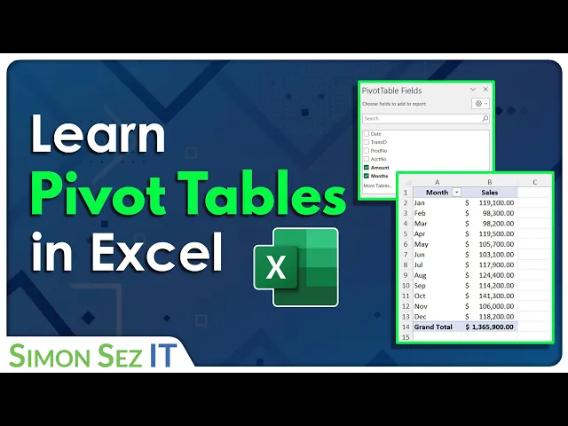
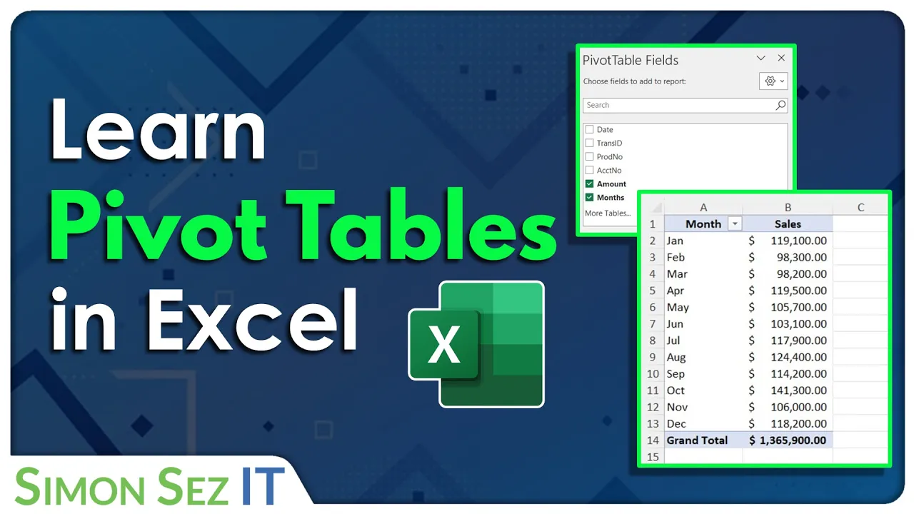
at the moment we are going to rename it and we're currently looking at a blank pivot table report and then over on the right hand side now I'm just going to rearrange this because this isn't how it will look when you go to it it will look like this okay this is our pivot table Fields pane now notice what we have in here if we take a look in this top area we have all of the column headings from our raw data sets we have dates Store Town store code so on and so forth so
that is why it's so important to let the pivot table know that your data contains column headings because it's going to pull those in and use them as pivot table fields and that's the terminology when we're working with pivot tables these are referred to as fields underneath we have four currently blank areas filters columns rows and values and basically all we do to create our pivot table is we drag and drop different fields into different areas underneath to build our pivot table report and it's really worth knowing or it's really worth looking at your data
and thinking about what exactly it is that you want to extract from your data what are you interested in so maybe your manager has come to you and he wants you to pull out from this data how many sales have been generated for computech or how many sales have been generated by a specific manager so working out exactly what you're interested in is really going to help you when it comes to how you organize your fields now as I mentioned this is sort of the standard way that your pivot table fields and your little filter
areas down here are displayed but I know that some people prefer to display them side by side so you can see we have a little Cog icon just here if I click the drop down we can change it to Fields sections and areas sections side by side so let's click this and it just displays them in a slightly different way some people find this easier but it is entirely up to you I just want to check in that you can all still hear me let me switch back and make sure can you all hear me
I'm gonna check back in the panel yes okay I'm now paranoid that people can't hear me wonderful okay guys thank you very much we shall carry on all right so now we have our Fields let's start to construct our pivot table now the first thing I'm going to do here we'll start off with something really basic so we are going to analyze this data and what we want to pull out of it is just the total amount of sales per store so remember we only have two stores computech and microworld so let's start arranging our
fields so I'm going to grab the store field and I'm just going to drag and drop it into this Rose area now when I let go check out the pivot table report it now puts both of those stores into the rows and because I want to see the amount of sales I'm going to grab the sales field and we're going to drag that down into the values area would you take a look at that within two seconds I can basically tell my manager exactly how many sales we've generated for computech if I wanted to go
a stage further and maybe wanted to remove microworld from this I could use a little filter drop down and just select computech to see just that information that's of interest to me so really nice and straightforward that is a basic pivot table okay really easy we're just dragging and dropping fields now what about if we take this store field that we currently have in rows and drag and drop it into columns instead what does that do to our report but it just organizes it in a slightly different way we now have the stores running down
in the columns so we have some sales and we can still see the information and then we have the grand total at the end so this is what we call pivoting the fields it's basically just moving fields around to different areas to perform different types of analysis let's do another type of analysis maybe I now want to see which manager is performing the best and generating the most sales so this time I don't really need the store information so I can get rid of this field and to remove a field from any of these areas
you simply drag it outside until you see that Red Cross and let go I can now add the manager field instead and I'm going to drop that into rows so now take a look at my report I have all of the managers listed here and I have how many sales in monetary value not the counts how many sales they've generated if I was to drag a manager into columns again it just displays that in a different way and for this type of information that's not particularly useful I would definitely have that in rows as opposed
to columns let's do another type of analysis let's drag manager outside again let's drag this time I'm going to drag store no sorry I'm not going to do that I'm going to drag Town into the rows area so now I can see the amount of sales generated by each town in the UK so this is doing a very basic analysis but this is a pivot table okay that is pretty much all there is to it obviously we're going to get a little bit more complex but it is very basic level you've created yourself a pivot
table to extract data okay let's take it up a notch because so far we've just been adding one field into each of these let me show you what happens when you start adding multiple fields so I'm going to remove the town from the rows and this time I'm going to drag let's drag the category into rows I'm also going to grab the manager and drag that into rows as well but I'm going to place it underneath category when I let go take a look at the analysis we can now see our data broken down by
category and manager so I have the category at the top then the manager and I can see how many sales they've generated we then have the next category then all the managers and the sales for that category all right so it's a different type of analysis and when we have it in this layout we can actually see the subtotals at the top here so the subtotal for the cameras category is this number just here now I'm somebody who doesn't like to read subtotals at the top I very much like to have subtotals at the bottom
and I'm going to show you in a moment how you can simply move this subtote move this subtotal down if you prefer it to look that way we'll do that in a moment now what about if I go back to this rows area and I rearrange these so that manager is above category let's just drag it above let go I now have it organized by manager then the category underneath so just different ways that we can look at this data simply by pivoting these fields and moving them all around now what about this filters area
at the top here we haven't put anything into there so far well what we can do is maybe if I wanted to grab the store field I can grab it drop it into filters and if we take a look at the pivot table report I now have this filter error at the top so if I'm only interested in this analysis for computech I can select it and it's going to apply a filter so now I'm just seeing the sum of sales broken down by manager and category for the store computech all right and click the
filter again I can put it back to all whatever I want to do okay so really nice and straightforward you can have a lot of fun with this and move things around and get all types of analysis out of your data let's do something slightly different now I'm going to remove the filter so let's take that out and I'm going to remove the manager let's just leave category and the sum of sales now what about if I want to break this information down by date instead so I'm going to grab the date and I'm going
to drag it into rows and I'm going to place it above category you can now see it's breaking it down in a slightly different way now this looks a little bit weird because all of my data in my raw data set I took a reading of our sales figures on the first of every month so you can see here it says January and then it says one Jan and then one Feb One MA because that's when I took the reading so those are all of the dates in my raw data set also notice that even
though I move the date field to rows notice that it's actually split it out into months and date for me so it's basically looked at my raw data it's looked at the date column and it's broken it down in a way that it thinks I might be interested in now in this actual example this isn't particularly helpful I'm not I know that all of my readings were taken on the 1st of January I'm not really interested in having first of Jan first of Feb in here I just wanted to say Jan Feb March so what
I could do then is I could remove the I think I need to remove the months one out of here no as the wrong one hang on one second let me put that back the date field out of here and then it's going to break it down by January February March okay so just be aware of that sometimes when you are dragging dates into rows or columns it will look at the date and it will try and break it down for you sometimes it'll break it down into quarters sometimes into months sometimes that's helpful sometimes
it's not so just remove accordingly okay so lots of different ways that you can analyze your data now because we have this ordered by our months and then we have our categories notice next to the months we have these little collapsible menus so I can collapse up January collapse up February and I can also expand these out so those kind of helped me really zero in on maybe one particular month that I'm interested in okay so don't forget about those now while we're on the subject when we're clicked inside a pivot table as we are
now notice up on the ribbons we have two new contextual ribbons pivot table analyze and also the design ribbon so everything that we need to format our pivot table do different things with our pivot table we're going to find on one of these two ribbons now if we take a look over on the pivot table analyze ribbon all the way over in the show group notice that the middle one there the plus minus buttons is toggled on and that's why I can see these collapsible and expandable buttons next to the months but if I just
didn't need those and I wanted to remove them I could toggle those off and it's going to get rid of them just there also a really important thing to note because I get this question all the time is if your field list disappears or if you accidentally close it down so if I click on the cross and that goes away people are like oh how do I get my field list back click in the pivot table pivot table analyze in the show group field list click this it's going to pop that pane back open okay
so lots of little tips and tricks just there now I'm going to rearrange my pivot table very slightly let's remove the months and I'm going to leave it on just the category and also the sum of sales because we're going to start to talk about value field settings how we can aggregate our data in different ways now currently this pivot table is just showing me the sum of all sales so it's aggregating the data for all of the cameras that have been sold all of the memory cards regardless of where they were sold or anything
so I can see the actual total sales for each of these categories now it might be that I want to see the count or the average or something completely different so this is where I can go in and change how I'm summarizing or aggregating this data so by default it's done it's done a sum but maybe I want to see a count the actual number of cameras that have been sold as opposed to the monetary value so what we can do here is we can right click in sum of sales and we can go down
to Value field settings and we can then choose how we want to aggregate this data so maybe instead of sum I want to count I'm going to change it to count of sales and now I can see the count as opposed to the sum another way that we could do this instead of right clicking over here is if we're working in our pivot table Fields where we have the values area we can click the drop down and we can access value field settings from there and I could maybe do an average of all of the
sales instead okay so we can aggregate our data in different ways now what if I want to see the sum of all of these sales but I also want to see the count how would we do that well I'm going to change this one back to sum so that we have our sum of sales but what if I want to have another column that shows me the count well this is really simple all we need to do is grab the sales field again exactly the same field and drag and drop it to the values area
it's going to give us another column and of course by default it's going to do a sum so we're getting exactly the same data as the previous column but you might have already worked this out we can very quickly right click in this column and we can choose to sorry summarize the values by the count instead so now I have the sum of sales but I also have the count in the same pivot table I can then change these headings to make them a little bit more meaningful so some of sales is okay I don't
really want this to say count of sales two whoops I'm going to click in the cell double click and we're going to take the 2 off the end just to change the title of that field now notice as soon as I did that the pivot table kind of jumped and rearranged itself it collapsed up its columns and you'll notice that if you start doing things like widening widening columns so that you can see the data a bit better when you change the fields around or even if you do a refresh of your pivot table these
are going to jump back to how they were originally so let me show you a quick example of that if I go up to refresh I'm just going to say refresh all it's going to jump back to Auto width basically so the width of the longest item in the cell so if you have specific widths that you want to keep your pivot table at you need to make sure that you change that in your pivot table options and then when you start moving fields around or refreshing pivot tables the column widths aren't going to change
sometimes that can be a real pain if you've spent ages making a pivot table look really nice and getting those column widths exactly as you want them as soon as you change something in the pivot table it just collapses back up to how it was originally so to retain these column widths we need to go to the pivot table analyze ribbon we're going to go across to options and in here right towards the bottom we have an option here autofit column widths on update so I want to deselect this because I want to keep it
as the common width that I've set so let's click on OK and now if I was to refresh this pivot table those column widths aren't going to change okay so just a little tip there which I see very few people point out and it can be really valuable now another thing that we can do once we've sort of done this summary just here is that we can show our values as something else so maybe I want to show the sum of sales for each of the categories as a percentage of the grand total so what
I'm going to do is I want this to be in another column so I'm going to grab another sales field drag it down to values of course by default it's going to do a sum of sales too but straight away I'm going to right click and we're going to say sorry show values as and then I have various different options in here so I want to show my values as a percentage of the grand total and I'm going to rename this field at the top here to say percentage of grand capital like so so now
I can actually see the actual percentage of total sales that the camera sales make up okay so this is another really nice way that we can analyze it and we have lots of other things within this show values ad that we can do so we can show running totals we can show percentages of the column total lots of different calculations that we can perform okay so just keep adding sales fields and changing them to show exactly what you're interested in all right so really nice and straightforward now I'm going to undo some of that work
that we've just done I'm going to remove some of these fields so I'm just going to take it back to just having the sum of sales so let's remove percentage of grand total and also the count of the sales because we're going to move on to talking about number formatting so so far we haven't spoken about number formatting and if you take a look at the sums sum of sales column in our pivot table currently our values don't have any formatting we don't have any Commons Commons we don't have any decimal places we don't have
any currency symbols now the way that you apply number formatting in a pivot table is slightly different to if you're just plot applying number formatting in an Excel spreadsheet what we don't do is we don't select our data just here and then go to home and select our number format we don't do it that way what we do instead is we click within our data we right click we go down to Value field settings and we choose number format from here and then we can go in and choose the formatting that we want so I'm
just going to choose let's go for currency formatting I'm going to take the decimal places down to zero and as we've got so many people on the call today from the US I'm going to leave it on the dollar symbol let's click on okay and okay again and it's going to apply that number formatting okay so remember to apply it that way as opposed to selecting the cells the reason why we don't select the cells and apply the number formatting is if those pivot table Fields then move if we rearrange our pivot table Fields the
formatting doesn't carry with it it's applied to the cell so you're going to get sort of some numbers with formatting and some numbers without okay so that's why we do it in a slightly different way let's move on to taking a look at some of the ways that we can change the way that our pivot table report looks now for this I'm going to add in another field let's go for manager again I'm going to drop that into rows I think I'm going to put manager above category actually let's organize it like that all right
because I want to talk to you about subtotals and Grand totals I briefly touched on this at the beginning of the session when you have your data organized like this so multiple Fields within rows you're going to see subtotals at the top by default if you don't like this if you're someone who prefers to read your subtotals at the bottom I am one of those people then we can change that and we do this on the I think it's on the design ribbon yes the design ribbon at the top here now the first group here
is the layout group and we have a subtotals drop down so we can choose to turn our subtotals off entirely or we can show them at the bottom or at the top of the group so I'm going to switch mine to show at the bottom of the group and I can now see the subtotal for Felicity Chambers okay so this is entirely personal preference you might prefer them to be at the top or you might just want to turn them off all together entirely up to you now the same thing applies for your grand totals
you're always going to have and I have quite a lot of data here a grand total right at the bottom so this is just a total of everything in that column of the pivot table if you like that you can keep it on if you want to turn it off you have various different options here so you could turn it off for rows and columns which will turn it off entirely and I will say that if you do plan on putting your pivot table or putting it into a pivot chart it's always good to turn
off the grand total because you don't really want to include most of the time a grand total in your visual analysis so I'm going to turn this off for rows and columns like so so very very simple what else can we do in this little group well we can change the report layout so by default I'm showing my pivot table in compact form but I could choose to show it in outline form which gives me a slightly different way of viewing it it puts the manager name into its own separate column as to kind of
putting it in the same column as the category I can change it to tabular form again something very slightly different you might find this easier to read or I can go back to compact form now if I have this in tabular form I might want to repeat the manager labels all the way down through all of these rows sometimes that can be quite helpful we can choose to repeat all item labels which is going to put this into each row now for me that looks a little bit overwhelming I'm going to remove those item labels
and put it back to compact view but just remember you've got different layouts for your report choose one that's most appropriate for your data we can even add in blank rows so if I want to insert a blank line I can do that it just gives a little bit of separation between each item in your pivot table again just makes it a bit easier to read so think about all of those things when you're putting together your pivot table now just a couple of things related to pivot table Styles there's nothing too complex here again
if we work up on the design ribbon we have a big old group here which opens up a gallery of different types of formatting different styles that we can apply to our pivot tables and we can hover over and get a nice live preview as to what each of these look like so go through these choose one that appeals to you I'm just going to choose this one because I really like the color rose why not that will quickly apply to your pivot table once you've applied a style you can then customize that style further
by turning on these different pivot table style options so if I click on banded rows that's just going to put some lines running across again which makes this a bit easier to read I can do various different things you can see as I toggle this off and on it removes the formatting from the column header I can do the same with the row headers or I could choose to have banded columns things like that and these pivot table style options work slightly differently depending on which style you've selected so it's always worth selecting a style
having a play around with these until you get your pivot table into a really nice easy to read format so that's kind of how pivot tables work you know you can get more complex you can delve in and get a bit more advanced with different things but that is basically the concept behind them now one thing I would say is that if you are going to be creating lots of different types of analysis so maybe you want to do um you want to do what we've done here so we're summarizing by manager and category but
maybe then you want to just see a breakdown of the sales by the store you might want to create multiple different pivot tables now the easiest way to do that for me is to Simply copy the current pivot table and when I say copy I just mean copy the entire worksheet now before we do that I'm going to rename this worksheet so that it accurately represents what's on this worksheet so let's right click let's rename it and I always name my worksheets if they contain a pivot table pvt that's my standard naming convention and then
what is this showing well this is a summary by manager and category so I'm just going to say man oops I can't type today underscore cat I have an idea as to what this pivot table represents now if I wanted to do another pivot table all I would do is copy the entire worksheet and you can do that very quickly by holding down control and then just dragging and dropping the tab it's going to create a copy we're going to have the pivot table on here and we can then rearrange this pivot table to show
what we want in the second analysis so maybe I just want to analyze by store on this particular pivot table and maybe I want to turn on Grand totals for this particular one like so maybe I want to change the style of this pivot table I can do that so now very quickly I've managed to create two different types of analysis using the same pivot table I haven't had to go back to the raw data and start all over again I then simply right click and rename this tab this one might be called pivot underscore
score underscore sales something like that and I would carry on duplicating for as many analysis as I need to do so that's a nice little quick trick for creating multiple pivot tables now we've got about nine minutes left so we're going to finish up by taking a look at pivot charts and also slices and believe it or not despite that delay we've managed to cover pretty much everything which is great so let's take a quick look at how we can analyze uh using charts so when we use a chart we're just basically visually interpreting the
data that we have in the pivot table and a lot of people find a chart a lot easier to read than maybe just simply looking at data chances are particularly good if you're trying to compare different items it's a lot easier to see if it's in a chart now I will say that when it comes to creating a pivot chart you really need to take a good look at the data that you have in your pivot table and think about what type of chart is going to suit your data best because not all charts are
created equally and I'm going to show you an example of this I'm just going to rearrange these fields a little bit just to demonstrate this so what I'm going to do here is I'm going to remove category so that we just have a list of the managers and their sum of sales so if I wanted to put this data into a pivot chart what I could do is go up to pivot table analyze and over in the tools group I have a pivot chart button now if I click on pivot chart it's going to allow
me to select all different kinds of charts and they're organized down into different categories now maybe I decide that I really like pie charts I don't for the record but maybe I decide today I want to put this data in a pie chart I'm going to select the pie chart click on OK and the date I've got a bit too much data for this pie chart it's not particularly easy to see and because all of these sales are reasonably close together it's very hard for me to see just by looking at the pie chart exactly
sort of who's generated the most sales it's not a particularly good analysis using a chart and because I have quite a few different managers I have to make this chart quite big in order to be able to see them all in this Legend So This is a particularly good chart for the type of data that I want to analyze so think about that in general the general rule that I tend to live by is things like column charts and bar charts are pretty much Universal they're pretty good at representing any type of data whereas if
you have maybe time-based data so maybe we had sales over January to December those are always nicely represented using things like line charts I would only ever use a pie chart and I very rarely use pie charts for very very small amounts of data so maybe if I just wanted to show the amount of sales by store because I only have two stores a pie chart would be quite a nice chart to use to represent that data so really think about the chart type that you're using before you put together your chart so what we're
going to do here is I'm going to create a very basic bar chart I'm going to select bar we're just going to use the basic bar chart just here and click on OK and that's going to give me my pivot chart let's drag this down now again I have quite a bit of information on here and what I would say is that when you're trying to visually represent data don't try to cram as much information into your chart as possible for example if I wanted to show this to maybe my CEO or maybe some key
stakeholders maybe they're not interested in seeing all of the managers and how many sales they've generated maybe they only really want to see the top five managers so that would be a much better data set to represent in a chart because it's a lot smaller and it's a lot easier to compare and we're really honing in on what we want to see so what I would do here is I would go to my pivot table click where we have row labels and I'm going to apply a filter and I'm going to apply a top 10
filter and I'm going to say only show me the top five items by sum of sales and items in this case is going to be the managers so when I click on this I now see who the top managers were if I want to sort these I can do that from here as well if I click the drop down I can sort A to Z or Z to A I actually don't want to do that I want to right click and I want to sort smallest to largest or largest to smallest so if I want
to see the top selling manager at the top I can do largest to smallest and I can see that Spencer Lee has generated the most sales and this is a much nicer data set to show in a pivot chart another thing when it comes to Pivot charts is you want to make them as clean looking as possible you don't want loads of things on your pivot chart that aren't necessary okay the simpler the better when it comes to Pivot charts so the first thing I always do when I've created a pivot chart is I come
in and I remove any unwanted items so these little gray buttons here these are little filters we can filter our pivot chart but I actually prefer to do my filtering in the pivot table which will in turn update the pivot chart so I'm going to remove these gray buttons simply by right clicking and saying hide all field buttons on charts I'm then going to click up in the chart title and I'm going to give my chart a name so everybody knows what this represents so this is showing the top five managers oops advantages by uh
uh sales okay so very very simple other things that we can do here we have a little Legend now sometimes the legend is really useful it shows you you know what each thing what each bar represents on the chart in this case it just says total not particularly useful at all so we can get rid of the legend in a few different ways it is just a text box I can select it and just press the delete key alternatively if I click the plus icon just here I can turn off and on different elements of
my chart so I could deselect Legend and that's going to remove it okay a couple of other little tricks because we are running out of time things that I do when I'm tidying up charts is sometimes I like to add data labels as opposed to having this horizontal axis at the bottom so again if we click on the plus next to the Chart I can add data labels and if I click the arrow I'm going to display them on the inside end of the bar I can then select those data labels and apply formatting so
if I want to change the color maybe I want to make them white I can simply go to the home ribbon and make those changes I'm just going to make these bold so they stand out a bit so if I have data labels on each bar like that it really means that I don't need this horizontal axis I can then just simply select it and delete it out making my chart look a lot cleaner maybe I want to make these bars a little bit wider or a little bit narrower how do we do that well
this time we need to right click and we can say format data series and this allows us to change the Gap width so I can make the bars wider or thinner and there's loads and loads of different formatting options that we have in this right-click menu and you'll find that with your charts wherever you're clicked for example if I click on this axis just here if I right click I can go in and I have loads of different options in this pane for formatting this axes in different ways so don't forget when it comes to
adding items to your charts you've got the little plus icon just here you can click on the element and you've got some right-click menus and you also have some contextual ribbons pivot chart analyze at the top design and format so many different options I could select my bars go up to the format Tab and I could do things like maybe say I don't want to fill but maybe I just want a nice outline around the outside and I'm going to change the weight of that outline to something like that now in this case that doesn't
look particularly great but hopefully you get the idea I can remove the grid lines select them press delete makes it look even cleaner now this looks too hideous for me I need to fill that with something just to feel okay with myself there we go that's a bit better now one thing you might also have noticed is that when you create a bar chart because we've sorted this notice that the chart shows the actual managers in a different order to what we have in the pivot table it kind of reverses them in the pivot chart
now I'm not sure why it does that if somebody knows please tell me I'm not sure why it does but it seems to put the one with the lowest value at the top going down to the one with the highest value even though we've sorted them the other way around but what we can do is click on the axes right click and say format axes and in here right at the bottom we can choose to show the categories in reverse order and that just makes them match up with what we have in the pivot table
okay now there is loads and loads of formatting that you can apply to tables I am not going to have time to go through any more about that with you today because there are a couple of other things I want to show you before we finish up I'm going to run about five minutes over if you need to leave I fully understand if you can hold on for five more minutes then please do the next thing I want to show you is just how you can very simply add interaction into your pivot tables and pivot
charts using slicers and a slicer is basically just a visual filter so what we can do is we can click on the pivot chart or the pivot table go up to the analyze ribbon and in the filter group here we can choose to insert a slicer and we can insert slices for any column heading that we have in our data so maybe I want to insert a slicer for let's say the store and the town click on OK and it's going to give me these little visual panes that I can put somewhere on my worksheet
and I will say that if you're doing this you'll probably want to leave a bit of room maybe in the column A to place these slices I'm just going to put mine over here I'm going to resize this one I'm going to put this one underneath and I've got loads of town so I'm not going to be able to fit them all into this Slicer in a nice fashion but we can scroll through and see them all now these are linked to our pivot charts now pivot tables so if I want to filter all of
this data and just see the information for computech I can simply click on the slicer and it's going to update I've got a little clear filter button at the top here I can click on something else so maybe I want to see the analysis for the storm microworld for um let's say the town bath and I can hold down control and select more than one three different towns like that so this is a really nice interactive way so if you send this to uh other people who aren't particularly familiar with Excel this makes it really
nice and easy for them to filter the data and extract out of it what they're interested in in a really nice and visual way let's click on the cross and click on the cross again okay again we could go a lot more into slices but I'm going to leave it there for the time being the final thing to show you is simply how we can update all of our pivot table data with the click of one button so if we go back to our store data as I mentioned this store data runs to June 2019.
now this is sales data so it means that in the month of July on July the 1st I'm going to have another bunch of data to add into my data set and what I've done is I've just put that data on the July data tab now because we put our original data in a table this is going to be so simple all we need to do is take our new data and select it all a quick way to do that is to click inside control a to select everything and we're going to do a copy
and a paste Ctrl C to copy let's go back to our store data click in the last row Ctrl V to paste that in now you might find that you've got your column headings in there we can simply delete out that row but effectively this data has become part of the current Excel table and what that means is that because it is part of the sales data table and all of the pivot tables and pivot charts that we've built are based off of the table name sales data all we need to do is refresh the
pivot table and it will pull through that new data and update the pivot table and the pivot chart so how do we refresh when we click in the pivot table we go up to pivot table analyze and we have a refresh button just here if I click on refresh all hopefully you saw those numbers changed and the pivot chart updated to reflect that new data as well now if we hadn't put our data into an Excel table it wouldn't do that we wouldn't be able to click refresh we would have to go in and reselect
the entire data range which is a bit of a pain and that is why it's so important to put your data set inside an Excel table prior to creating your pivot tables if you're not a subscriber click down below to subscribe so you get notified about similar videos we upload to see the full course that this video came from click over there and click over there to see more videos from Simon says it