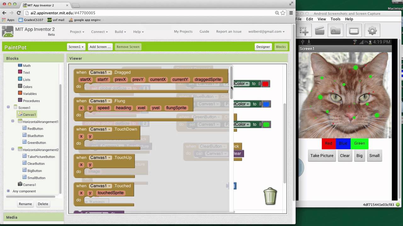
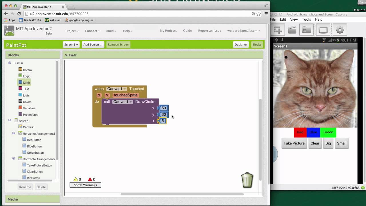
I'm going to show you how to use the slider component in App Inventor 2 so we've got this kind of funky UI where we've got a big button small button that lets us change kind of the size of the circles drawn on on this cat okay and I'm just going to get rid of those guys instead we're going to use the nice uh slider widget which is kind of a new component in in App Inventor so I'm going to delete the big and small buttons we don't we don't need them all right and then I'm
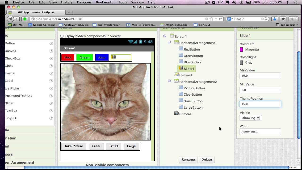
going to go grab a slider component and bring it in and try to get into my whoops missed it there but I think I can get into the horizontal Arrangement all right then I'll just grab a label because this will kind of tell the user what that slider is for and the the label I'll just put some text in there it says this is you know this is how you change the dot size okay and then let's just you know I don't know why the Orange is the default here but let's change that to Black
and that'll look a little bit better okay so the properties on the slider component one is width and I'm I'm going to change this to 100 the the the widget's a little bit glitchy and I find if I give it a fixed width that that helps helps it we'll see how it looks yeah it looks looks okay here in our UI all right key things are these these properties so Min value let's make the smallest Circle someone can draw two and let's make the biggest circle someone can draw 20 all right and we'll start it
off as 10 right in the middle someplace so that'll be the default okay so that's kind of setting up our slider component in the designer and you know now let's go to the blocks and actually make make it work right if you'll recall we've got this variable called dot size and when the canvas gets touched let's take a look at this guy when canvas is touched we use the variable dot size whatever's in this variable we use it to draw a circle that that that size okay so let's let's kind of make us some room
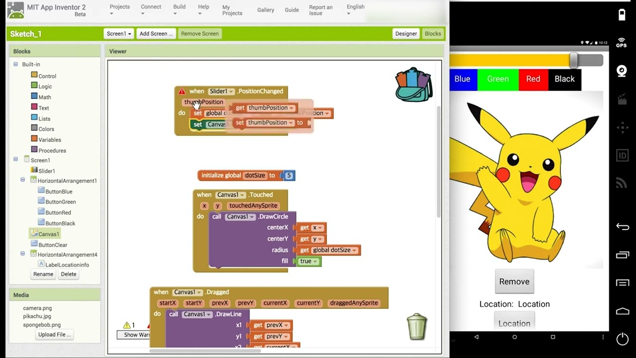
let's get rid of this uh camera stuff and what we want to do with the slider is when the user changes it we want to change the variable dot size so slider has just one event it's called position Chang and it tells you the thumb position as and as you know we said it's range from two to to 20 okay now when the position changes we want to change the dot size Vari able so I'm going to set Global dot size two and I'm going to Mouse over thumb position and get the thumb position okay
and that's it okay user changes the slider change that variable and then the next time they touch the picture it'll draw a picture of a different of a different size let's see if it works so right now my picture should be of size 10 I'll touch blue and let's see how big my pictures are no they're they're size two okay I guess it's cuz I have't changed my slider yet let's see if I change it okay now the pictures are are bigger okay now if I change it to real small they should be back down
to two yeah they are and real big they should be the biggest yet 20 Okay cool so our slider is working as far as changing it but our default value for the um the circle size is not what what what the thumb position which which which makes sense so really if we wanted to start off as 10 we would just set this variable to 10 to start off with and that way you know because our our thumb position starting off at 10 they'll be they'll be in sync