Hi there! In this video we’ll learn to create a trifold restaurant menu card in InDesign, so let’s get started. Before we create a document, let me explain the setup, so that you understand it well.
So this is the layout of the outside panel. On the extreme left is the first page, which is the flap of the brochure, and that’s why it’s going to be slightly narrower than the rest of the pages, because it will fold inside, and the front cover will rest on top of it. Page 2 will be the back of the menu card, and page 3 is going to be the front cover, hence will have information like the name of the restaurant, address, etc.
You can also find that the folds are coded with letters BAA, which is nothing but the masters that will be applied to them. Now let’s move on to the inside panel. Here, the page on the extreme left is page 4, which will have A master applied to it, and so will page 5, which is the center page, and the one on the extreme right is page 6, which is the back of page 1, hence it is also narrower than the other two pages, and has B master applied to it.
Now keeping these settings in mind, let’s create our document. I’m going to change the units to millimeters. I have already selected ‘Letter’ as the document size.
Let’s select the landscape orientation, and then click the width tab, and enter the forward slash which is considered the division sign, and then the number 3, as we need to divide the page into three individual pages, which will eventually be 6 pages back to back. The moment you move the cursor somewhere else, you shall find how brilliantly InDesign does the calculation for you of the width. Now remember I told you that one panel is going to be narrower than the rest, which means the rest two panels will be broader than that one panel, so let’s add another millimeter to this to make it broader, so instead of 93.
133, it shall become 94. 133 millimeters. Let’s also uncheck the facing pages option, and enter 6 pages.
Update the margins to 10 millimeters, and bleed to 3 millimeters, and hit create. Once in the document, drag the pages panel out, and expand it. Now you can see all 6 pages have A master applied to them, and the width of the A master is 94.
133 millimeters. So we’ll need another master with a reduced width, as one panel of the trifold will be narrower, and when I say one panel, I mean two pages, back to back. Let’s take the cursor to the master zone, and right-click, and select ‘new master,’ from the options.
In the popup window, you can base your B master on A master, or even if you don’t do that, it shouldn’t really matter for now, but let’s still select the based on master option to ‘A master. ’ Now since our B master is going to be narrower, and we’ve added a millimeter to the other two pages, we’ll have to reduce those two millimeters from this narrower panel, so 93. 133 was the original size, and minus 2 millimeters from it will bring it down to 91.
133 millimeters, so let’s enter that here, and hit okay. Let me take you to our setup, and you could see that our page 6 was narrower, and obviously had B master applied to it. Similarly, page 1, which is the back of page 6 is also narrower, hence has B master applied to it as well, so now we’re going to replicate this setting to create the spread.
So let’s get back to InDesign, and select page 1, and hold Command on a Mac, or Ctrl on a PC, and click page 6 to select them both. Now take your cursor to page 1, and right-click, and from the options, select ‘apply master to pages’ option, and in the popup window, update the apply master to ‘B master. ’ You can find that the two pages are already selected here, so just hit okay.
When you get this conflict popup, just hit ‘use master page size. ’ You can find that the selected pages have B master applied to them now. And our setup is now falling into place, so you can see the BAA, and then AAB format, so let’s place the pages together to create the spread.
If you click page 2, and drag it to place it next to page 1, you’ll find that it refuses to sit next to it. So what we need to do is click the burger menu at the top right corner of the pages panel, and uncheck the ‘allow document pages to shuffle’ option. Now when we try to drag page 2 to make it sit next to page 1, it will comfortably sit there.
Drg page 3 next to page 2, the same way. So that’s the spread for the outside panel ready. Similarly, drag page 5, and then page 6 next to page 4.
And there you go, we’ve got our BAA setup for the outside panel, and AAB for the inside panel. Let’s start working on the inside panel first, so double-click page 4 to select it, and before creating any elements, let’s first go to the layers panel, and rename ‘layer 1,’ ‘background. ’ Create another layer, and rename it ‘text & images.
’ Now lock the background layer, as we’ll need it at the end of the session. Select the ‘text & images’ layer, as all our work, for now, will be on this layer. Let’s begin by establishing the center of the page in the middle of the spread, so let’s grab the rectangle tool, and make a rectangle stretching from the left of this page to the right, and then drop a guide at the center, and let’s delete the rectangle.
Let’s drag the ruler from the corner, and reset it at the top left corner of the spread. Now drop a guide from the ruler above at 40 millimeters from the top of the center page. Let’s grab the pen tool, and let me zoom in, and click the top left corner of this page, and then the center point where both the guides meet, and then the top right corner of the page, and let’s also take the two points of the bleed space on the right, and then on the left, before closing the shape.
Double-click the color picker, and let’s pick a golden color for this. With the shape still selected, right-click, and go to effects, and then drop shadow. Let the mode be multiply, and color black.
Change the angle to 90 degrees. Update the X offset to 0. Increase the size to 3 millimeters.
I think we’ll have to reduce the Y offset a bit, so let’s reduce it to 2 millimeters, and hit okay. Now pick the type tool, and make a text box, and type in ‘menu. ’ Select the text, and change the font to ‘Roboto Black.
’ Increase the font size to 30 points, and center-align it. Now place the text on top of the golden shape we’ve created. Let’s check the preview.
I think we need to lighten the golden shade a bit. Let’s double-click the color picker, and lighten the shade a bit, and hit okay. Now we need a table on the left to add the menu items, so let’s go to table, and select ‘create table.
’ On the popup window, update the body rows to 10, columns to 2, and hit okay. Once your cursor is loaded with the table, take it to the top left corner of the page on the left, and then click and drag it to cover the entire page. Since we won’t need such a wide column for price, bring the cursor to the dividing line between the two columns, and drag it to the right, as illustrated.
Now take your cursor to the line on the extreme right of the table, and drag it in, as illustrated. Let’s go to window, and then type and tables, and select ‘table. ’ Set the table panel aside, and then type in ‘starters’ in the first row in capital letters.
Now select the text, and from the table panel, center-align it vertically. With the text still selected, update the font to ‘Silom,’ and font size to 18 points. Select the text once again, and grab the eyedropper tool, and steal the golden color from the shape we created earlier.
With the text still selected, go to window, and then styles, and select paragraph styles. Create a new paragraph style, and rename it ‘menu_heading. ’ Let’s pick the type tool, and make a text box on the right, and then right-click, and fill it with placeholder text, so that we could steal some text from here.
Now copy a line from here, and paste it into the second row. Select this text, and change it to capital letters, and then update the font to ‘Roboto Medium. ’ With the text still selected, create another paragraph style, and rename it ‘item_heading.
’ Now copy some more text from the text box on the right, and paste it under the item heading. Select this text, and change the font to ‘Roboto Regular. ’ While the text is selected, using the eyedropper tool, steal the golden color from the shape created earlier.
Let’s select the entire text of the row and copy it, and paste it a few times. Leave just one row for another heading, and then paste it to fill the rest of the rows as well. Let’s select the first heading, and copy it, and then paste it in the vacant row, and then center-align it vertically.
Now change the heading to ‘barbecue. ’ Let’s now type in the price, and then right-align it, and with the price still selected, update the font to ‘Roboto Medium. ’ Let’s type in the prices for other items as well.
Select the first price that we’ve already styled, and then create a new paragraph style, and rename it ‘price. ’ Now select the rest of the prices, and click the ‘price’ paragraph style. Select the prices, and copy them, and then paste them for the barbecue items.
Since our table is ready, let’s get rid of these black lines, cuz they make the table look ugly, so select the entire table. Now you see this small grid with blue and black lines. Click the black lines, to turn them blue.
Now go to the stroke color option, and select ‘none. ’ Check the preview, and you can find the lines gone. It’s time to delete this text box in the middle, cuz we won’t need it anymore.
Now select the table on the left, hold Shift and Option on a Mac, or Shift and Alt on a PC, and click and drag the table to the right. Since this panel is slightly narrower, the table doesn’t fit well, so make necessary adjustments to shorten the width of the columns, and this page is sorted. We’ll update the headings in a bit, so don’t worry about that.
Let’s grab the rectangle frame tool, and make a rectangle covering the entire center page, including the bleed. Now go to file, and then place, and locate the image on the computer, and hit open. Once the image is up, let’s right-click, and go to arrange, and select ‘send to back.
’ Our inside panel is ready now, so let’s select the table on the left and copy it, and then paste it on the outside panel, and let’s align it to the center page. Time to update the headings, so let’s change this to ‘dessert,’ and change the other one to ‘salads. ’ That reminds me that we’re yet to update the headings on the inside panel, so let’s quickly do that.
Let’s update this to ‘main course,’ and this should be changed to ‘beverages. ’ Let’s get back to the outside panel, and grab the rectangle frame tool, and make a large rectangle covering the entire page on the left, including the bleed. Let’s go to file, and then place, and locate the image on the computer, and hit open.
Now let’s grab the rectangle frame tool once again, and make a rectangle on the right page covering a little more than the half page. Then go to file, and then place and locate the image on the computer, and hit open. Let’s grab the type tool, and make a text box, and this small panel will have the name of the restaurant, any contact details, address etc.
, so let’s just type in ‘restaurant name,’ and a sub-heading of ‘breakfast, lunch, and dinner. ’ We can style it using the paragraph styles we’ve created, and then center-align both the text. Let’s now type in an imaginary address, email, and a phone number.
Since these days home delivery has become a big thing, let’s type in the home delivery contact number, and highlight it with the heading paragraph style. As a divider, type in ‘l’, and then change the font to ‘Wingdings,’ and it will turn it into a black circle, so let’s increase the size of it, and we’re done. Just one last thing to add, so let’s go to the layers panel, and hide the text & images layer, and unlock the background layer, and select it.
Now pick the rectangle frame tool, and make a large rectangle covering the entire page. Then go to file, and then place, and locate the image on the computer, and hit open. Let’s lower the opacity of the image to about 60%.
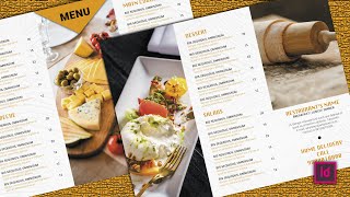
Similarly, add the same image to the inside panel as well, and lower the opacity of the image to 60%, much like we did earlier. Lastly, unhide the text and images layer, and there you go guys. The trifold restaurant menu card is ready.
To export it, go to file, and then export. Type in any name for the file, and ensure that the format is set to ‘Adobe PDF Print,’ and hit save. In the general section, ensure that the pages option is set to spreads, and not pages, else individual pages will print, which we don’t want.
Move to ‘marks and bleeds’ tab, and ensure that the ‘crop marks’ option is checked, and hit export. Now locate the file, and double-click to open it, and that’s how your file is going to look electronically, along with the crop marks. Alright guys!
That concludes our session, and I’m going to see you in the next one in just a bit. Good bye!