- What do you think about my sunglasses? How about my silver jewelry, and this white tee layered underneath my dress? Well, I think this outfit is pretty trendy, and I think others would agree with me too.
These pieces were originally popular in the nineties, but they've made a comeback and are also very popular now, 30 years later. These trend cycles that we see in fashion can also be seen in the design world. Like fashion, design trends come, go, and then come back again.
In this video, we'll go over what design cycles are, why they matter, and how understanding them can help us address users' evolving needs. When I think about trends, I like to picture a pendulum. Each trend reacts to the previous ones, sometimes pushing back with a radically different approach or subtly tweaking elements to better suit the current landscape.
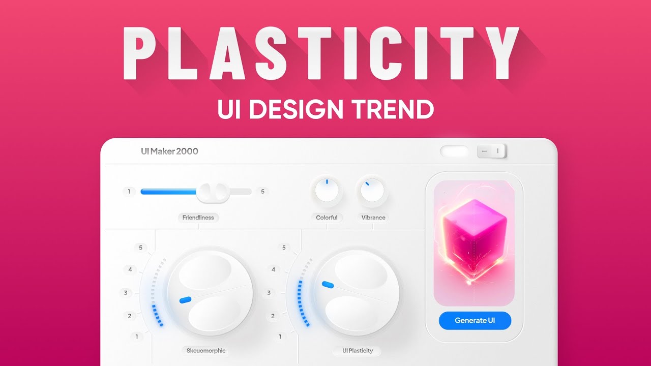
An example of digital design trends coming back in different forms, is the evolution from skeuomorphism, to flat design, and then having elements of skeuomorphism come back in a more modern way, called neumorphism. Skeuomorphism was popular in the early 2000s, and incorporated real world textures, and created depth with shadows. These things made technology feel familiar when many people were new to using digital products.
But as users became more tech savvy, designers began a new flat design trend that stripped away these real world elements for a more clean aesthetic. Now recently, a new trend called neumorphism emerged, which skeuomorphism with flat design. This trend reintroduces skeuomorphic elements, like shadows and textures in a more subtle way.
It creates a sense of depth, without reverting back to traditional skeuomorphic elements. Now, let's consider another cycle. When computers first started becoming popular, many software and operating systems used dark backgrounds.
They did this to reduce glare, and because it was easier for old style CRT monitors, that were less efficient than today's computers. Then as computers became more advanced, we saw this widespread adoption of bright white interfaces. Recently though, dark interfaces have been making a comeback.
Back in the day, dark screens were a necessity. Now people enjoyed dark mode for its aesthetic appeal, along with practical benefits, like conserving battery life on OLED screens and improved accessibility for people with cataracts. A third example is the use of gradients.
Gradients were a staple in early digital interfaces. They were used to add depth and dimension to flat digital space. In the example, you can see that Microsoft's website from 1994, used this gradient to add dimension.
Then when flat design became popular, users understood the digital space better. They didn't need or want much dimension, and as a result, gradients were out. But after years of flat design dominance, gradients are back again, just in a different way.
Now they're used in more strategic ways to add depth and help certain elements stand out on a page. In this example, you can see how Pepsi used gradients to emphasize the Pepsi can. To summarize, understanding past trends and the user needs they addressed, not only provides insight into current user needs, but also helps us to anticipate future needs.
- Thanks for watching. If you wanna see more of our UX videos, take a look at these over here. And consider subscribing to our channel.
On our website nngroup. com, you can access our free library of over 2000 articles. You can also register for one of our virtual UX conferences, that offer Live hands-on UX training.







![I Replaced ALL my ADOBE APPS with these [free or cheaper] Alternatives!](https://img.youtube.com/vi/5EfqHg49kMk/maxresdefault.jpg)