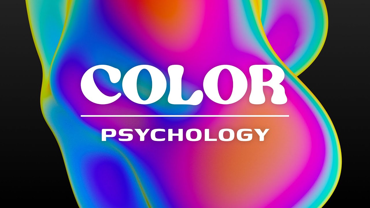
do you ever find it difficult to apply color to your logo designs maybe you feel lost when it comes to choosing the correct color for your finished and polished designs well today I have several different methods that are make sure that you pick the right colors for your logo designs each and every time let's start off with a really sobering fact that is quite shocking research provided by color comm show that it takes only 90 seconds for people to make a subconscious judgment about a product and between 62% and 90% of those people base that
assessment on color alone now if you consider what that actually means it's pretty huge essentially a vast majority of people will make up their minds on a design based on color alone and in branding and logo designing this couldn't be more crucial the first thing I would do when considering color for a logo is to take a look at the industry your client works in so prime example here would be the financial sector a very common color for financial companies is blue and that stems from blue being a color of trust and security this is
something positive that a financial business would want their clients to feel so by looking at the industry your client operates in you can get a good feel for the norm of the industry now you don't need to necessarily follow that trend but it should give you a good idea of what the competition are doing and what the industry as a standard is doing to the next method is one I personally always consider when designing a logo and it's really quite smart it's based around five keywords gender tone value time and energy now if you apply
these words to the logo and the brand you will build a picture of the kind of color that's required so gender is quite self-explanatory if the brand is typically aimed at females you're going to want to choose colors that play into that market again there is no need to be cliche but it's good to keep in mind the tone relates to if the brand is playful or serious playful Legos might require more vibrant colors as an example value would relate to whether the brand is cheap or luxurious and luxury can be communicated by purple golden
or black now time alludes to the logo in a modern or a classic way both of these will have typical color choices related to them and finally energy is the brand loud or is it kind of subdued and muted so asking yourself these five questions can help build an image of the kind of colors that you want to be working with we want to try and create a personality around the leg on the brand and then the color choices will stem from our personality now another way to look at this is to relate back to
the brief of your project and bring up those key words that link back to the brand that you should have in the brief so things like strong stable healthy natural and so forth you then see where these key words fit into the color psychology terms so things like red being confident or dangerous or passionate orange being friendly warm energetic also orange suggests change and as you run down the list you can see things like green represents natural and healthy huge it's pretty obvious to most people and like I said blue does evoke trust and security
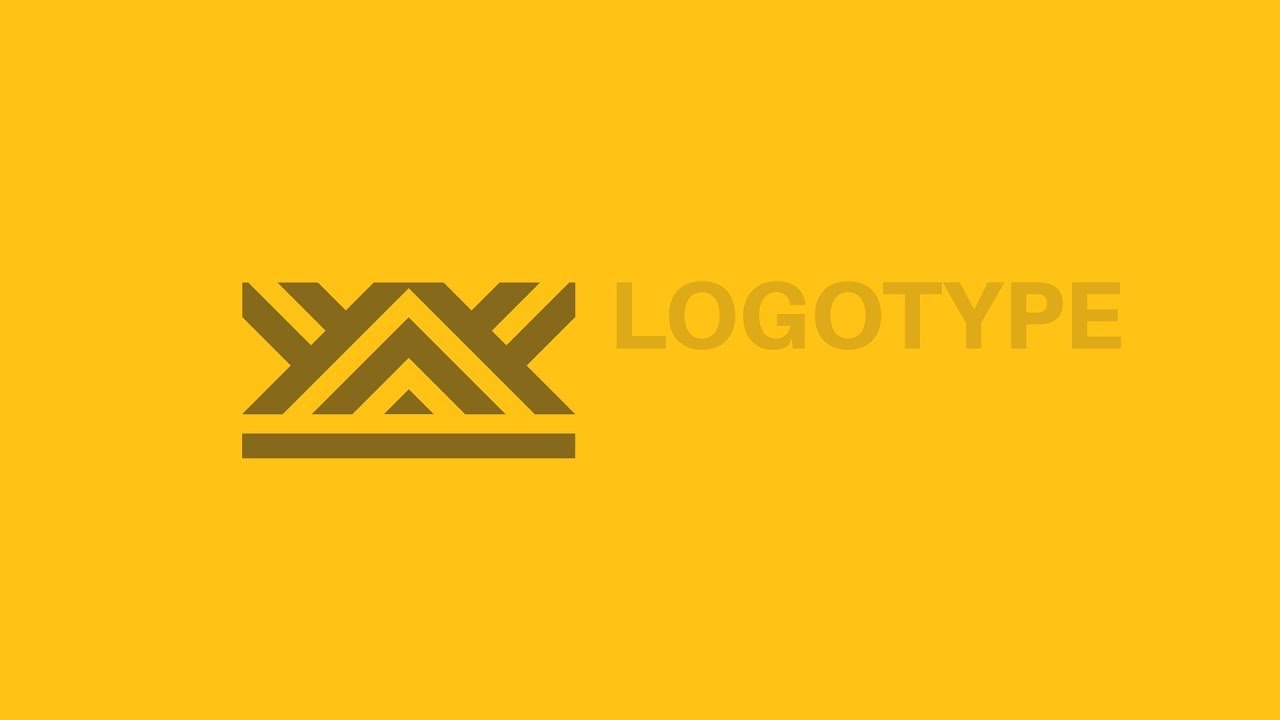
so you refer back to this color psychology and see how that fits into the keywords for the logo design in summary you need to really consider the personality and the background of the brand and raluca design this is before applying any color and so let's reveal the winner of the most recent logo design competition where I asked you guys to design a logo based around a retreat or a kind of hotel that was aimed at upper-class middle to upper-class citizens there are loads and loads of entries with a whole wide range of skill sets of
presentation and styles but I kind of narrowed it down to five people and it was quite a hard choice to choose between those five designs but I finally landed on I designed by Philippe because it did hit all of those markers that I was looking for in the brief it's a simple memorable logo that appeals to the upper-middle class kind of clientele the color scheme that logotype the layout everything about it was pretty much what I was looking for I really can imagine this logo being used for this kind of retreat or this kind of
holiday location but don't worry if you didn't win or you missed this competition I am going to lose to another one in a few days check out my community tab on my channel homepage because that is where I'm gonna post the competition entries but yeah until next time guys the sunny future today peace [Music]