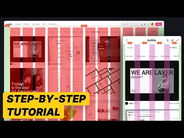
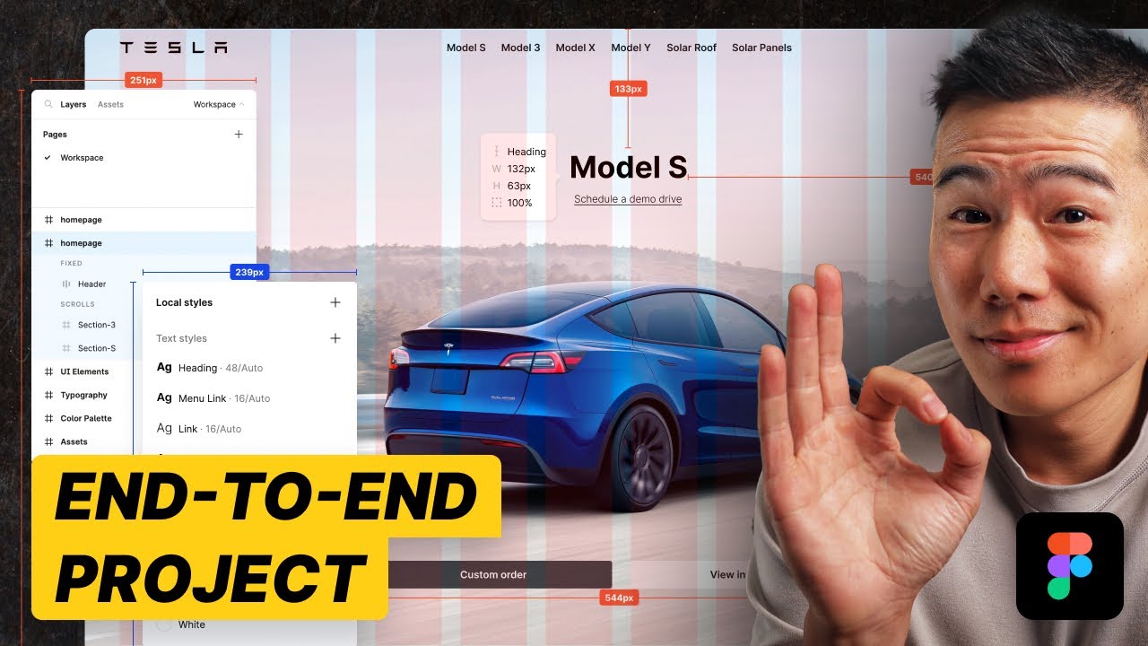
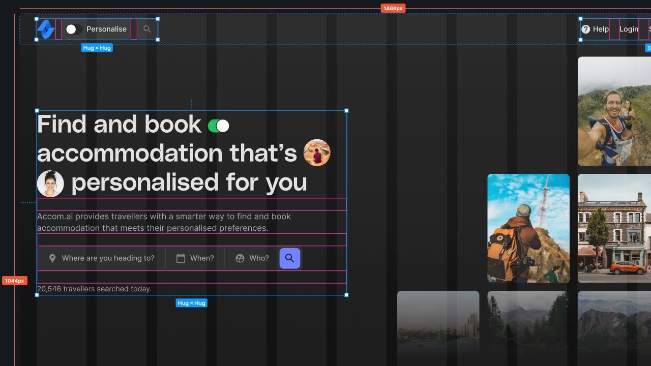
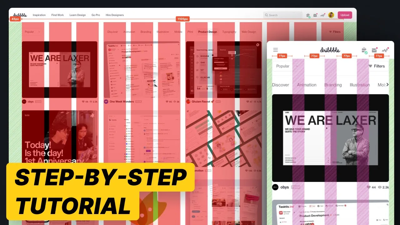
now when it comes to UI design grid systems you probably have so many questions how many columns what are the margins What A Gutters what if I'm designing for mobile devices what if I'm designing for desktop devices there are so many questions and it's endless so in this all-in-one masterclass we will cover everything to do with UI design grids and the best part is we're going to do it together with a real world project so let's Dive In foreign over here you can see I have the website dribble. com opened I do like the fact that it's got a pretty simple layout to help you understand how to utilize grid layouts or grid systems in your DUI designs let me right click on this website hit inspect we're going to go ahead I'm gonna walk you through all the things that you should look out for when you are creating a grid system and then we're going to actually go ahead and recreate this in figma so you know how to do every single little step so by the end of this video you will feel confident you'll know everything that has to do with grid systems and you'll probably like it so much that you'll gently smash the like button let's go ahead and take a look now what I want to do is I want to resize my viewport all the way down to mobile size okay so as you can see as I'm scaling this our viewport up and down you can see that the layout will adapt but at a very specific viewport size it stops reacting so if I go all all the way down to 320 as you can see right after 320 the layout stops adapting so we know right away from 0 to 320 there is a break point and you'll know what I mean if you follow along now as I continue to expand you'll see that once it hits around 6 30 it starts to split so let's take a look at 6 30. right there oh you got me right there the layout splits into two columns right let's take note when does it change once again we can go further further and we can see around there there is a major change So at around 960 which is a very common breakpoint bang oh you got me right there three columns and then we go further uh increasing the viewport size and we'll go to four columns eventually right there so that was around one three four oh one three sorry four six okay four six and then eventually it goes up to five columns as you can see right there 9 30 or 9 let's see nine well where did it change around 980 983 okay whoops nine eight three bang right there night four as we start to scale the viewport up and down there were some key break points where the layout will start to change with this understanding let's jump into figma and start recreating this grid system or grid layout so you understand how to do this step by step so I'm gonna go over into figma I'm going to f on my keyboard I'm going to phone and for the iPhone SE that is the 320 by 568 viewport size right so that's the standard viewport size for the iPhone SE that's generally the smallest break point that you'll deal with so that's zero to 320 pixels now if I go back into our dribble let's go ahead and take a look at one one of the main break points so that was around 6 30 okay if you remember around 6 30 right there bang you can see the number changes up at the top so 6 30 right there oh got me right there so we're gonna go ahead very quickly I'm gonna go command D duplicate that frame and I'm gonna change the width to 6 30.
pretty simple right where we're gonna now we're gonna Master UI grids fairly quickly let's go ahead and increase the viewport size a little bit more you can see that there are some slight changes in the layout over here at around 768 but I'm going to skip that mainly because there is a major change and we're going to create breakpoints for every single part this video might go for too long so I'm focusing on more on the larger changes so around 960 right there you can see 960 two columns three columns so I'm gonna go ahead and duplicate this change it to 960. and I might just go ahead and do one more so we might just go ahead and stretch this all the way out to nine to five columns um just to exaggerate the changes so you can see the key differences so I think around 984 right there in the top right corner of the screen you can see that changes to five columns okay one nine eight three so I'm going to duplicate this to 1983. Okay cool so now that we've got our key break points I'm gonna go ahead and start to design the grid layout so selecting the frame under layout grid I'm gonna hit the plus I'm going to click the grid icon change grid to columns count to four keep it at stretch the margins now the margins let's just quickly refer back to dribble and see what sort of spacing that we're working with now we won't be utilizing the exact measurements I'm just going to quickly eyeball this for you so we don't waste too much time but we can see that it's around 16 to 20 pixels on the left and right and because it's just a one column grid we can use four columns we can use one columns it doesn't really matter but what we're going to be doing is we're going to keep the margins to 16 and we're want to keep the gutter to eight here inside I'm going to go ahead and draw down a frame for the content right so I'm just going to use this Frame as the content and inside this Frame I'm going to go ahead and set the constraints to left and right just to make sure as we extend our viewport that the content as you can see sticks to the left and right and then inside this content I'll hit r on my keyboard I'm just going to draw down a rectangle okay perfect now what I want to do is I want to make sure that the frame I'm now going to go and hit shift a and this will turn this into an auto layout now if you want to learn more about Auto layouts more Advanced Techniques learn my end-to-end process for how to manage an entire project all within figma with industry leading tips and tricks then make sure to check out my figma master class course I can't cover everything in YouTube videos so make sure to check out the link there's a 10 off coupon code but with that said let's continue with this tutorial quickly stretch this content out much rename this to content as you can see right there and I'm going to keep that centered on the top I'm going to change that to fixed then for the rectangle I'm going to change this to fill container okay now because we've got the auto layout and once again I'm not going to explain how to utilize Auto layouts hopefully you already understand how to use them if not check out my figma masterclass we're going to change this to 16 to keep our content within the grid layout so as you can see if I now stretch this out whoops let me just quickly change the rectangle to fill and make sure the content is left and right just like that we can see that the content inside stretches just like dribble right so if we go back to dribble you can see that if I go ahead and change this voila you can see that it's exactly the same behaves the same so we've got a 630 right if we go all the way to 6 30.
oh you got me right there two columns one to two one to two boom boom boom boom so we're gonna go back to figma I'm going to select the content copy this go to the 768 oh sorry 630 paste this down I'm gonna stretch this all the way out to the left and right okay so we've got the content I'm then going to go back to my previous design select the layout grid by selecting the side command c pop it down command V so I'm going to bring the same layout grid over to the 630 break point now the thing that we need to notice here is in the 630 breakpoint the sides the left and right maintains still looks like it's 16 pixels or 20 pixels but then on the inside it seems like it's doubled so if we want to maintain the same or appropriate grid layout for dribble we then need to go to layout columns keep the margins at 16 and we might increase the gutter to 32 just so it's double 16 okay so now if I go ahead and just change my order layout selected my order layout making sure the direction is horizontal making sure the space between is 32 because we've got 32 space in between each item I can then duplicate this rectangle and you can see immediately based on our Auto layout constraints I can now let me just move this down over here expand this right and it's going to maintain the dribble layout wow magic right so if I go back as you can see it's exactly what we need okay so I'm going to move this back up and then let's take a look at the third one so the third one is 960 pixels so we're talking about anything beyond 6 30 right this is 6 30. anything beyond 6 30 all the way to 960 we want to make sure that so let's go right there so 6 30 to 960 is also going to maintain two column grid right so actually let's go 960. that's actually the same so let's just go ahead and take a look at 962.
let's just take a look at this one so that's 1983 so for this one let's do four or three columns for this one so three columns over here I'm going to go ahead I'm going to go select copy the grid paste the grid down and I'm going to change this to 12 because anything beyond 768 I generally will use 12 columns because we've got a lot more elements on the page and I want to make sure that we have enough columns to sort of structure our content if you don't have enough columns you might not be able to really get a nice layout or balance layout so over here we can take a look at this layout over here you can see that the spacing on the sides are increasing so I would say maybe that's 32 pixels and I would say the spacing in between is also a little bit larger so we might actually go with 24 and 32 over here so let's go 24 for the margins and 32 for the gutters so as you can see if we extend that and we can go ahead and double click on our content paste our content down stretch this all the way out and then go ahead and duplicate the rectangles and make sure that our Auto layout settings 32 on the sides and 24 on the left and right perfect there we go so now if I go ahead and whoops let me just delete one of the rectangles if we go ahead and resize this this is pretty much exactly what we need right if we take a look at this over here it's looking pretty similar right pretty similar so now let's go all the way to what's this one this one is nine eight three so let's go all the way to Knight 1983 so all the way out to 1983 as you can see right over here right there so that's five columns so remember this is 1983 in total so it's anything between this one and 1983 so let's just say it's going to be four columns okay so it's going to be four columns and as you can see the spacing on the left and right between anything below 183 is around 80 pixels on the left and right and we've got around maybe 32 or 40 pixels on the inside between each element so if we want to do that we can go ahead select the flout grid paste it down we change the count to 12 make sure it's 12. margin is going to be 80 and maybe we use the gutters of 40 to make sure that the spacing in between is a little bit larger and then what we can do is we can go ahead and double click and select our content command C command V paste that down stretch all the way out to the left and right and we can just duplicate the rectangle so we've got four just like that and then we just need to go to our Auto layout and make sure the spacing in between is 40 the left and right margin is 80 and you'll see magically everything will snap in between so if you can see if I stretch it it's going to look just like dribble okay so if we go ahead and resize this as well it's exactly what we need so hopefully you're following along now it doesn't end there okay so if you remember there are no strict guidelines in terms of how your grid layouts should work you can use any sort of numbers as long as it achieves what you want to achieve if you take a look at any web app or any website every platform will use some sort of different grid layout as long as your measurements are divisible by four which if you didn't realize we are using measurements of divisible by four everything is between 4 8 12 16 20 24 32 Etc that is all you need to know then if you want to take this even further to be able to visually see how this actually works in the real world you can go ahead and go to plugins go to break points I've got a free trial hit continue I can go ahead and create a new adaptive layout move this blue box beneath it and as you can see we have a grid layout for anything between zero to 320 okay so I'm going to go ahead and make sure we have zero at the end then the next breakpoint is 320 as we know right so anything between 0 to 320 then we have anything between 320 to 6 30 so if I go back it's going to be 6 30 just like that then we have anything between 6 30 to 814 right is that right should be 960 right or was it 814 I don't remember let's just use 960. I think 960 is a more common viewport size let's just use 960 for now so the next one is going to be 960 just like that and then the next one following that is going to be 1983 so selecting this I hit plus one nine eight whoops eight three all I need to do now is hit the plus icon go to and select the first frame anything between 320 and 630 we'll use this grid layout anything between 630 and 960 will use this grid layout anything between 960 and 1983 we'll use this grid layout so if I hit Ctrl G on my keyboard to hide the grid layouts I zoom into my canvas over here we can see that this will make you a designer for dribble as you can see once you pass through that breakpoint of 960 bang we go to a three column go all the way down go to two column all the way down to one column and really that's exactly how grid layouts actually work you just have to think about what are the layouts what are the breakpoints that you need to really cater for the information that you have just remember every single website is going to be different dribble is different to Facebook Facebook is different to Instagram and you need to think about what is the best layout that works perfectly with the content that you want to display you can't just repurpose a grid layout and it's really important for you to utilize measurements that are all divisible by four so if you want to learn more if you really do want to advance in figma or really advance that end-to-end process of knowing exactly how you start in figma all the way to handing designs over to developers and everything in between make sure to check out my figma master class course if you're wondering what are some great tools to also use to manage your grid systems your topography scales Your Design Systems your style guides and all this great stuff for your UI projects I would recommend three key tools if you are actually looking to manage a design system specifically with your developing team I would definitely recommend xerohype.
com or storybook. js.


