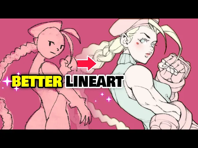
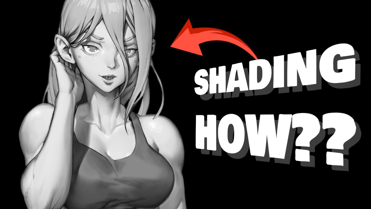
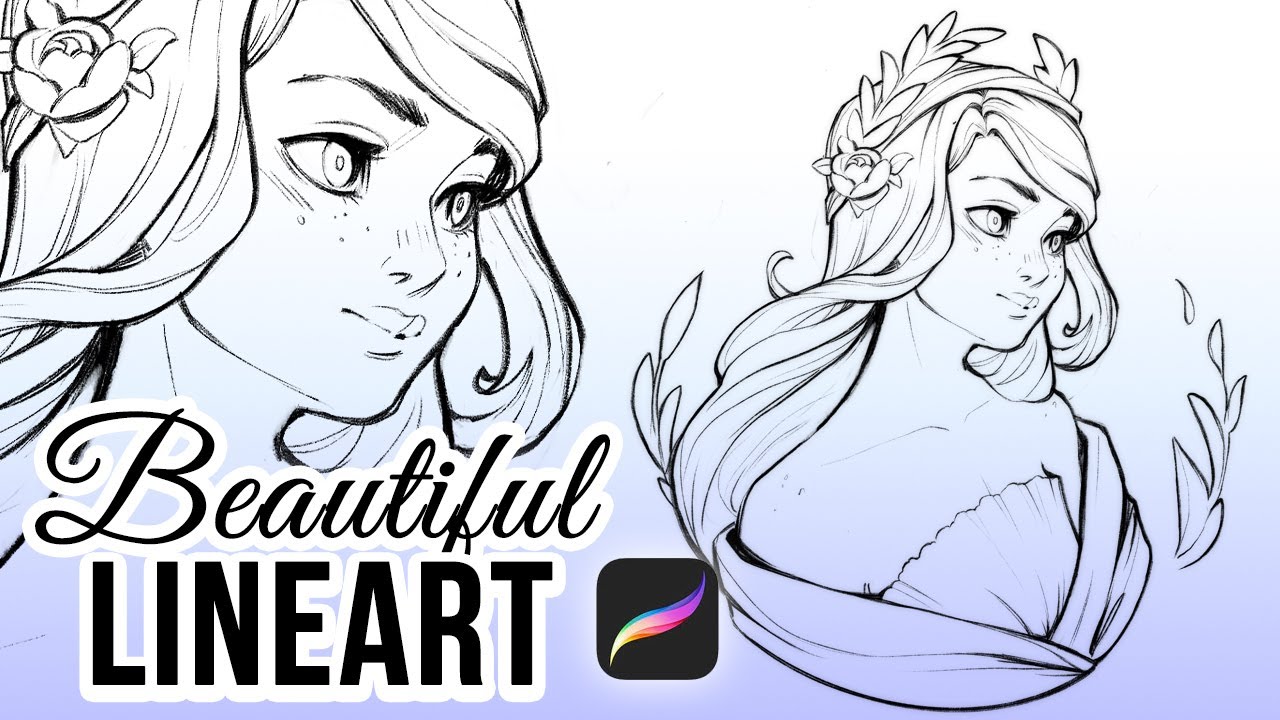
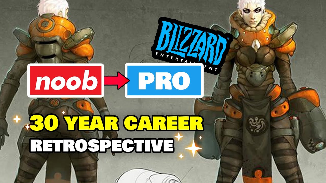
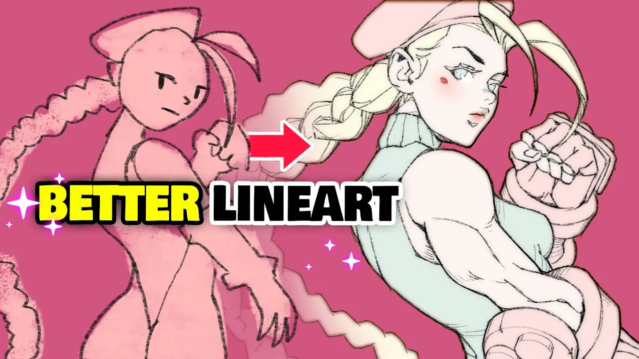
it's you again welcome back oh no it's happening again oh hi i'm mark i used to be a senior artist at blizzard entertainment and now i teach art for a living in this bald episode of my weekly series that i've been calling youtube art school we're going to have to talk about the quality of your drawings my spies taught me that you've been struggling drawing clean line art and that's unacceptable so let me show you a bunch of professional tips to increase the quality of your line art by at least 420 percent that's great value
oh quickly let's get this class started [Music] all right class is in session pay attention you're about to level up the quality of your line art significantly and all it will take is for you to first pay the class fee of either one like or one sub but also to start applying the six line art tips that we'll go over today it's actually pretty easy i believe that you'll be quite surprised at just how well it works and just how much better your lines will look after the class how much cleaner and more aesthetic your
drawings will be these are tips that i find myself repeating to my students quite often and it always makes a huge difference so give it a shot if you like how i teach by the way you can also become one of my students go ahead and use the coupon in the description for a big discount on my art program extend it until the end of the month alright let's get right into it the first two tips will be pretty quick the first one here is just about the tool that you use your line art brush
i'm sure everybody's got a favorite brush to use for line art but tastes change and you should try the one that i use here it's literally the best even better you can get it for free in the top right corner of the screen and down in the description below now that's one out of the way the next thing that you'll want to do is disable line smoothing or whatever this cursed setting is called in your painting software line smoothing kind of stabilizes your brush stroke so that you can magically draw cleaner lines but i find
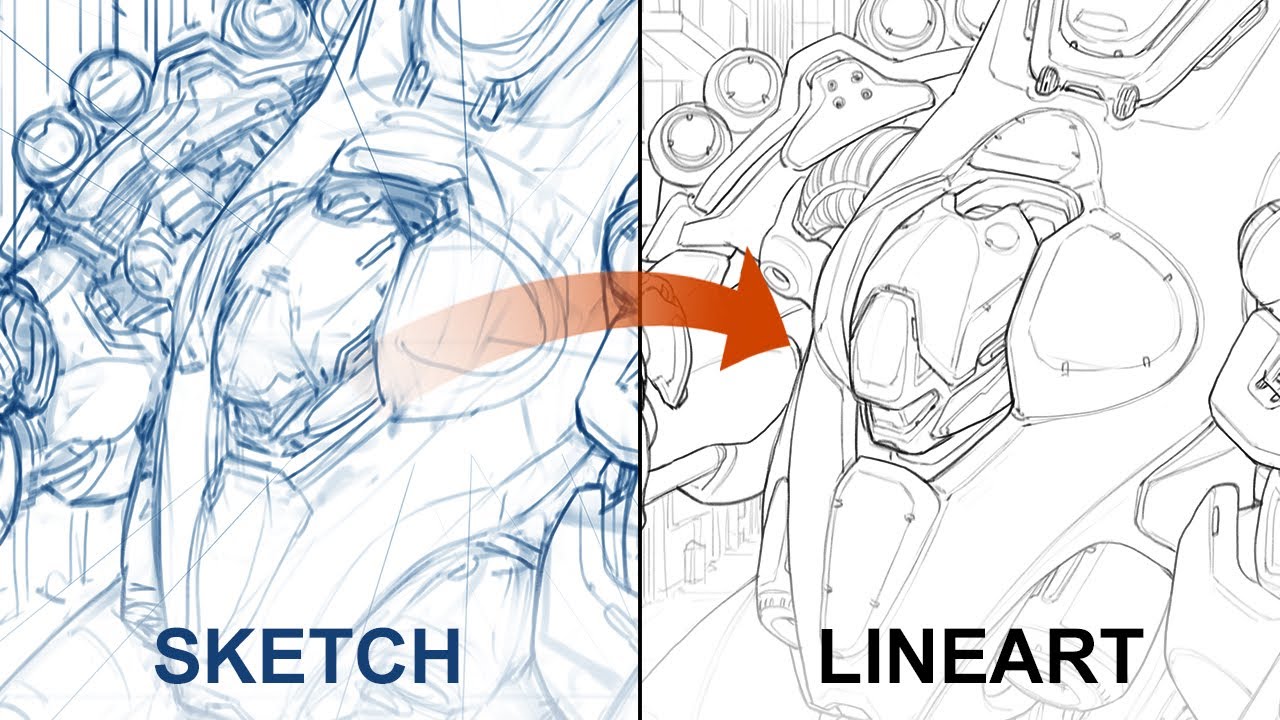
it's a horrible idea to get used to this practice your actual dexterity instead this way you won't be locked into digital art only there's no line smoothing with traditional pencils go back to zero be gone that's better next line confidence now we're getting serious a confident line is always more aesthetic what we're trying to avoid here are what i call hairy lines basically using multiple small strokes instead of one continuous one to make sure that you can focus on that part i highly recommend that you always draw your drawings twice say what let me explain
the first version will be the sketchier version what i have here essentially and from here you'll want to just drop the opacity and pop a new layer on top of your final line art the second time around though we don't have to focus on the artistic part the drawing is done we can relax the second version is all about confidence and the technical qualities of the lines to get the best lines and it might be a little bit counter-intuitive but i recommend that you do quick strokes not slow using the entire arm in your motion
not just the wrist and don't hesitate to undo if the brush stroke isn't quite on point as you see me work i do a lot of that too at this stage it's very tempting to turn on smoothing but resist get used to having full control over your lines and as you get better you'll start to notice that your use of control z happens less and less now drawing the same thing twice might seem like a lot but some people like a lot of the more old-school manga artists actually draw things three times they have an
even sketchier version at the beginning i personally think that's a little bit overkill but all of this to say if you only draw your drawings once you're likely leaving a lot of quality on the table do what the pros are doing instead right that's done line confidence check next up we'll look at line shading or how to shade and suggest volume with lines alone what there are two types of scenarios in most drawings for which you should be able to use line shading and you can see them both in action here on kami's boots i
think you'll agree that this shape is pretty clear kind of like a cylinder with softer edges but what makes it work i could have drawn a line here to give volume to the cylinder but that doesn't nearly look as good as suggesting the volume with a few lines instead using lines this way is particularly useful when the corner is not a hard corner i often do something similar to kind of fade my line away when the detail of a surface becomes a little bit more subtle when a full line would be too much okay but
why not add those lines all around right remember that we're talking about line shading here just like your typical shading the sides of the volumes are often darker to give the impression of 3d since we're dealing with lines here all i'm doing is adding a few more lines where you would typically have shading and fewer or none where you would have highlights we can't draw a smooth gradient with lines but we can suggest one by reducing the frequency of the lines gradually this way i'm not only suggesting a soft corner here for the boots but
also giving it a little hint of 3d with a few carefully placed lines and you can see this in a number of places on my drawing moving on to line weight now line weight is really just how bold the line is it's one of the most important tips today though because it applies in a number of different ways line weight is kind of like paragraphs in a book it helps us digest the content better it organizes the author's thoughts except in this case in a similar way it allows us artists to organize various elements in
the drawing in relation to one another there are three things to consider with line weight three situations in a drawing where it makes sense to adjust the thickness of your line for better results the most significant one is when you'll want to visually place an object closer or further away from another when you want to add depth the logic here is that you'll want to use a thinner line for things that are behind other things or far into the distance aka in the background and you'll use bolder lines for elements in the foreground in this
example we have a bunch of circles in front of one another but it doesn't really read all that well when the line weight doesn't change when we adjust the weight so that it's increasingly finer with distance though that works a lot better another way to use line weight is to convey importance for example which one of these stand out to you the most the one that has a bolder line right i rest my case usually we'll save the bolder lines for the outlines of our drawings or for the outlines of certain volumes just like we
saw a minute ago so for small details within the silhouette use finer lines instead one more way that i like to use line weight is to emphasize cavities i have a lot of examples on my drawing here some examples would be like these cylindrical shapes here around the around the arms and the hands of the character now while this thing is perfectly cylindrical the arm itself isn't and so right in the middle here where you have kind of the muscle indent the line thickens to kind of simulate a little bit of shadow same thing here
on the inside of the hand you can also see this effect in the back right there the garment that she's wearing is nice and tight but her skin itself at the surface of her skin is not as flat and so we get this kind of a triangular shape here once again suggesting a little bit of shadow that you would normally find in that kind of cavity same thing around the armpit here slightly thicker slightly bolder in here in between her outfit and the shoulder in between the legs a little darker and while we're at it
let's take a look at how the line weight can indicate the depth and the importance of different elements here on the actual drawing probably the most obvious here is going to be the outline of her body compared to the outline of her braids obviously very fine this line here because i want it to be pretty subdued i don't want it to take too much attention we can also look at her right arm here on top of the body essentially laying in front of it so it's going to be very important here that i add enough
of a of an outline around the arm to make sure that it doesn't blend with the rest of the torso this character is full of overlapping here we have the chest volume here in front of the left arm we have the right leg in front of the left leg pretty subtle the way that i did it but you can still tell that the right leg has a slightly bolder outline because it's in front and then when it comes to the importance of details i think this area here represents it quite well we have a bunch
of details on the inside of the volume these three tiny cylinders but really the most important part is the bigger piece so this one here is going to have a thicker outline and all the details within the shape will be a lot more subdued with a finer line all right moving on check check check and quadruple check and finally line style i think the easiest way to explain this one would be to show you the difference between a line with no style and one width can you spot the differences how about now i think it's
maybe a little bit easier to spot the differences but the one that is done is the one on the left here the one on the right still hasn't had the pass and you know you can look at the lines here all we see are nice clean lines but on here there's a little bit of an extra there's a little bit of a like a little bit of a gradient here on the side of the outline but only on the inside not on the outside and really what makes this possible is just this one layer here
first so this is going to be the line art itself but slightly blurred so all you would need to do is duplicate your layer and then do a little bit of a gaussian blur pass on it by just a couple pixels usually that does the trick until you get kind of a halo like this around your actual line art what i do from there is i set this to multiply multiply blend mode and about like 30 usually that's pretty good then when you overlap it on top you get a slight amount of fuzziness around the
lines and i'm a big fan of this look now i don't know if you noticed but the edges here on the outside is nice and sharp it's only blurred on the inside of the silhouette and that's very simple to do really you just mouse click or just select your flat colors you know this layer right here and then ctrl shift i to invert your selection then from here let's say i had like some some fuzziness left over from the gaussian blur just go ahead and delete and all that goes away and you're left with a
nice crisp silhouette while the lines on the insides are nice and soft but that's not all there's one final step it's a layer effect on the flats layer but if you don't have that in your software you could also do another pass where you just blur your linearts but maybe a little bit more and give it a tint which is basically what this does here so in photoshop i like to select inner glow set to hard light and then give it kind of a warm dark color not too much of a spread otherwise it looks
kind of silly just a couple pixels and now we end up with something that's identical to what i had here on the left and then when you don't have any colors or don't plan to have any like these dynamic poses that i did for last week's video i think you'll be able to appreciate the effect a little bit more now that you know and what went into it but you can see it again slight fuzziness here of the line art and also a little bit of a reddish tint here around the fuzziness of the lines
and that is what i meant with line style here check and that is going to wrap it up for this week's class i hope that was helpful if it was let your art buddies know let them know they should never skip a class but please don't laugh at their drawings with bad line art just because yours is now way better after watching the class that's not nice also don't hesitate to tag me on social media if you follow this class and end up creating a cool drawing as a result or any of my classes for
that matter i always love to see what you create and even though i can reply to everything i do see it all and i often try to retweet or post in my instagram stories the art that impresses me the most sending some extra traffic your way i also read all the youtube comments so if you have any suggestions for future videos or if this helped and you want to let me know comment away also before the video ends don't forget to check out my complete art education program [Music] it's happening again