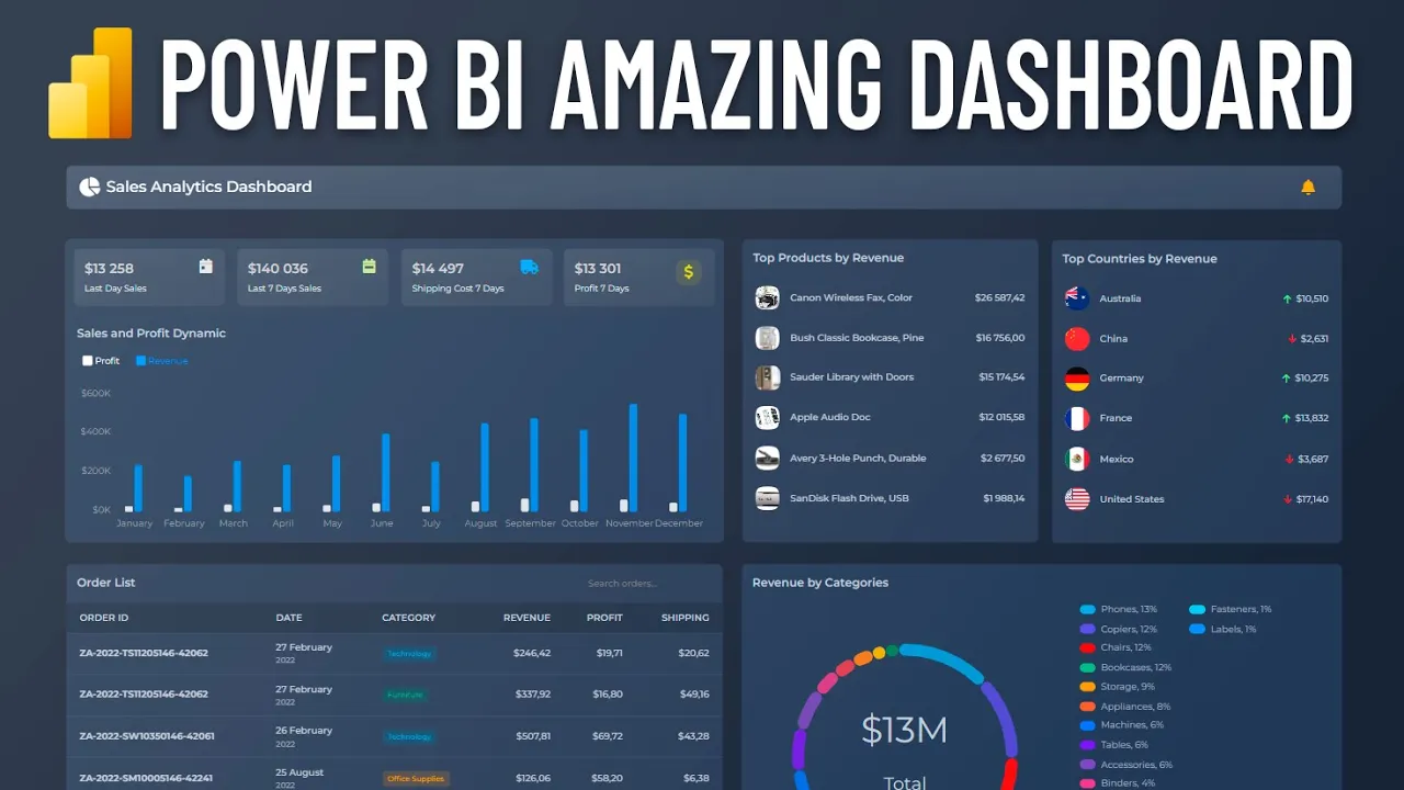
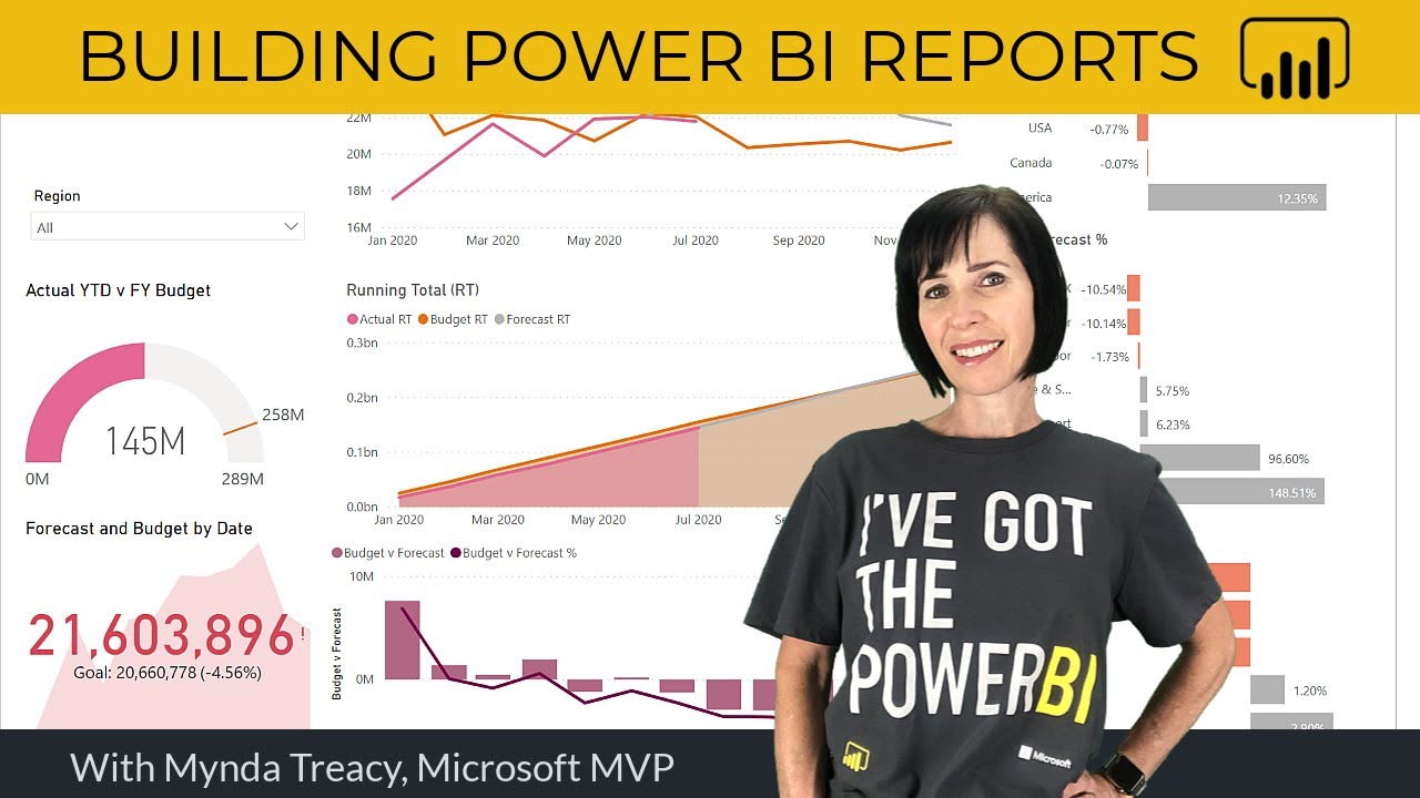
[Music] hi guys and welcome to this video today we are going to create such an amazing dashboard that is absolutely incredible for the powerbi dashboards we are used to first let's take a look at it the first is the visual of the header which in addition to the title contains a notification with a link to your personal account next we see stunning cards with key indicators one card representing one visual below them is a column chart with sales Dynamics the legend allows you to highlight series as well as turn them on and off by clicking
of course there are tool tips and much more then on the right there are two lists these are visuals of the table created using power Styles in one list there are top products in the other there are top countries visuals support highlighting on Hover as well as cross selection of data by clicking on rows below is a list of recent orders this also represents a table with power Styles order IDs are clickable links that can be followed for example to the CRM system the table has pagination mode enabled for convenience you can change the pagination
alignment as well as its size a search visual has been added to the table it allows you to quickly find the desired order in the table using the specified Fields just type a few symbols and press enter or activate the instant search mode this is very convenient especially for the mobile version the dashboard ends with a dut chart displaying sales by product category the chart allows you to cross- select report data as well as highlight the desired categories when [Music] hovering okay let's get started first let's import the following visuals into the report Big Card
simple card column chart table visual donut chart search box you can download all these visuals in your personal account on the custom- visuals. in the download section there you can download ready-made dashboards including the one we will be creating today next go to transform data the power query window opens let's select new source and web we will add a link to Google Sheets which will contain an Excel file it is important we do this for informational purposes never do this with sensitive data use safe and protected data sources in your work to get the link
go to Google Sheets select file share and publish to web next select link link Microsoft Excel and entire document copy the link and paste it into the field select the order sheet great great let's look at the data I noticed that dates were not recognized correctly so let's assign them the date data type manually Okay click close And apply good now I want to resize the canvas because the width of 1,280 pixels makes the visuals too large in full screen mode let's set the width to 1,600 pixels and height to 1,000 we will make a
dashboard in dark mode okay let's start with the column chart I'll add the order date to the bottom axis field and I'll leave only the month there since we will limit this chart to one year in the series we will put profit and sales oh by the way I also want to remove from the visual the built-in standard formatting elements that are unnecessary for us these are the title background and header icons good now let's set a specific visual size for example 800x 300 pixels so then move on to formatting the visual itself and add
a header you can choose it outside or inside we need it inside let's go to colors in general there is a very good automatic palette here you can also specify one color for all series but I want to set them manually great make the appearance of the columns so that they are rounded not only at the top but also at the bottom let's rename the series and show the legend the series are highlighted when you hover over the legend super now I want to filter the data in this visual so that there is only one
year left here we're using a hierarchy so I'll have to add a year field to the axis then select 2022 in the basic filter of course in your tasks you can use Advanced filtering or even top end for dates and I'll move down one level in the hierarchy okay let's move on oh I'll adjust the scaling to fit width okay now let's get down to numbers firstly we don't need Precision to two digits after the dot and secondly we will set the currency format for the profit and sales fields of the data set that's better
it's time to change the background since we are creating a dark mode dashboard the background of the canvas needs to be dark for example 19233 and without transparency great let's add a dashboard title based on the big card visual to do this I want to add a sample table with report meta information which will contain information about data refreshes or notifications from the CRM system for the current user and more of course when working on a real project you will be able to obtain this information from direct query or power query our visual supports power
Styles this is our team's own development you can get the documentation from the link in the video description for first I want to add a measure that displays the dashboard title with an icon we write the style icon pie chart then size s through the pipeline and also text through the pipe okay let's see how it works just put the measure in the top measures field and we will remove unnecessary formatting elements increase the text size a little and add a gradient background to the card super now I will create a notification for the user
let's create a measure if there are notifications in the data set then display an icon with a link this will be the Bell icon icon color is orange size X's no text okay I'm adding it to the top measures they're next to each other on the left so I'm going to use the cool horizontal alignment option and tell them to leave all the white space in between now we need to add a link to our Bell I just add the link parameter through the pipe great then we can send the user to read the notifications
this is especially convenient when using direct query okay let's move on now it's time to add simple cards with key indicators I'm creating a measure to display sales for the last day okay let's add it to a simple card we will also set the data format to currency great let's reduce the size of the card and disable the built-in formatting options looks good already change the color scheme to a gradient one with the same Shades as the header this visual allows you to display an icon in the upper right corner this will add emphasis to
the information I'll select the light gray calendar Day icon the icon codes correspond to the regular font awesome icons make three copies of this card to display other indicators I'll play around with the size and position a bit similarly I add a measure for sales over 7 days there's a mistake here I forgot to change the equal to symbol to greater than or equal to Max date I'll fix that later in this video I Chang the icon and color I do the same with the shipping cost measure the title is too long I'll short it
I'll correct it a little and add one last measure for profit get looks great we're done with the cards and we'll move on it would be great to see a list of orders as well for this we will add a table visual I'll put the fields in it order ID product category order date and sales amount I will sort the table by order date we will also need profit and shipping cost fields and rename these fields as usual let's remove the built-in format adding options great now I want to make our order ID with a
link the table accepts power Styles and we use them by creating a new column the code will be as follows that is we created a link to the order with order ID as text and in bold I'll place this column in the table now by clicking on an order we can get into the CRM system to work with the order by the way I will disable the option to select rows in the table this is convenient since we do not need it this table supports pagination which in many cases is much more comfortable than scrolling
endless data in my opinion the order date is inconvenient to read so I use power styles to transform the appearance of the date I'll add a column order date formatted with the following code the result is a text and subtext style which gives us a more convenient Compact and modern look at the date I would also like to transform the product category view to add more emphasis to do this create a column with a power style badge with the following code here we assign a different badge style for each category and then display it with
a soft format let's put it in the table this is what we need a stylish and modern category attribute okay don't forget about the header inside the table I will also slightly reduce the number of items per page and increase the height we need a visual to search for an order in the table by the way most likely in future versions of the table we will probably add a built-in search for the table without the need to use a special visual although of course this special search visual will be very useful in other use cases
let's add it and place the order ID and Order date field in it it will search for text in all added Fields so let's remove the unnecessary also move the search to the top of the table pointing it to bring to front since we are making the search visual as part of the table I want to make it transparent to do this I select transparent in the box styles the search settings have a lot of interesting options for example a minimum number of characters for a search case sensitivity instant search without having to press enter
and more I'll reduce the text size and try searching by the way if you are searching within one visual you can disable the search interaction for other visuals to improve performance so type in part of the the order number and press enter cool we found this order if the visual cannot find any records then the search string will be tinted red let's check out the instant search it searches immediately while we are typing in the settings you can select a delay in milliseconds this is the time between the end of typing and the start of
searching the smaller it is the faster the search will be performed for the mobile version we recommend making this value larger than for the desktop version I'll adjust the placeholder and move on next we will have sales by product category for this we will show them in the doughnut chart let's put the category and sales in the visual okay I'll turn on the legend when you hover over it the sections are highlighted I also want to see category names in the center of the chart and adjust the total member there is also an option only
on Hover but for us it is not relevant in this use case in the legend I'll add a percentage display and also Center The Legend at the bottom we remove unne necessary things and add a header by the way you can display a footer to give for example instructions or show some important note there is not enough detail by category therefore I will use sub categories and expand the hierarchy using drill down it would be better for the legend to move to the right basically we don't need to display the top categories in the view
so I'll go up the hierarchy and go straight down to the subcategories level or you can simply remove the category field that's better by clicking on sections of the dut chart we can cross select data in other visuals let's continue to complete the picture it would be great to see top sales by product as well as by country I'll do this using tables let's start with the products I put the product names and sales in the table let's fix it a little as usual I'll turn on the header I want this top to look like
a list so I'll turn off the column titles you can also turn off the borders this top list will be short a maximum of five or six items so we need to disable pagination it's very useful to see the thumbnails of products so I'll connect a sample table with photos to the data model as an example it will simply contain the product ID name and link to the photo okay I'll connect it to the orders table let's place a column with the name of the products from the products table we have empty values due to
an incomplete Dimension field we will simply turn them off I would like to remind you once again that I'm doing this to show the capabilities of visuals of course when working on a real project you need to use other more correct approaches to modeling by the way we will try to do this with the country's table for now let's add a power style column to the products table with the following code here we just have an image link and the name of the product through the pipe okay not bad let's add a rounded image style
after the pipe or even a circled one super the table has selections enabled but I'll probably turn them off and I'll still turn off the bord so it looks like a list and sort them in descending order of sales great now let's add a list of countries similar to the top products now let's consider a more correct approach to selecting top countries for this we use the top end filter adding sales in the by value field I also want to add an interesting indicator of changes in sales over the past two weeks to see the
Dynamics I'll do this using the power Styles icon element adding a measure with the following code here we will first display an arrowup icon in light green color with the text sales for the last week oops it's time to correct the mistakes I made at the beginning of the video I need to correct the equal to symbol to greater than or equal to okay back to the list I will format the sales values in currency format and rewrite the code using variables good now let's add the sales values for the previous 7 days so we
will compare the last s days with the second last 7 days also calculate the change using the divide function although it is better to use subtracting one value from another it will be more correct depending on the change we will select the icon and the color of the icon it turned out great I want to see country flags so I'll add countries with a dimension table and connect it to orders add a custom column to power query it will generate a link to the flag image based on the country code okay let's connect the table
this apparently happened automatically and create a power Styles column with the following code you yep we've got an error most likely the problem is in the filter which comes from the orders table I'll delete it and then redefine it to the reference from the new table great I'll do one more design trick to make the left side of the dashboard more consistent with the right in terms of the height of the visuals to do this I'll just insert a rectangle with rounded corners and place it under the chart and simple cards and so we have
a topend dashboard that combines ease of reading modern design cool features and high performance due to a limited number of visuals thank you for watching in the next video we will create a mobile version of the dashboard as well as a light theme so subscribe so you don't miss anything


![Visual Calculations in Power BI - DAX Made Easy! [Full Course]](https://img.youtube.com/vi/JITM2iW2uLQ/maxresdefault.jpg)