I thought I would take inspiration from the time of year we recently started a new year which is a time when a lot of people set goals and clean things out in other words we prioritize and declutter so today I thought it'd be interesting to talk for a bit about the importance of decluttering our data visualizations let me pause here and tell you a quick anecdote so when I was growing up I used to get in trouble for cleaning my room this sounds strange right but I'd get in trouble for cleaning my room because I
was cleaning my room when I was supposed to be doing my homework now as I reflect back on this now I realize the room cleaning was not simply a homework delaying tactic as my mother assumed but rather that I found it hard to concentrate when the environment around me was cluttered but by bringing order to the space around me I found I was better able to concentrate better able to focus my attention and be productive and creative so those got me thinking if this is one potential impact of environmental clutter on our ability to concentrate
what's the impact of clutter in our data visualization when it comes to our ability to get our audience to concentrate their attention and get our message across to them but then I started thinking well yeah but maybe I'm the only one who feels this way or at least I should question that assumption so through a highly scientific study uh via a Twitter poll I asked a couple of questions first off I find it easiest to focus my attention when my environment is either clutter free cluttered or it doesn't matter now one person pointed out which
totally fair feedback that the word clutter itself has negative connotation and what different people will consider clutter will vary from person to person so this is totally true but I think we can still make some broad points from this first off a decent portion 20 percent one in five say clutter actually they don't take it into account at all it doesn't matter when it comes to their ability to focus their attention note though that the majority do say they prefer an environment that is clutter free check out what happens though when we change this statement
slightly replacing environment with data visualization now here we see a shift where the proportion saying it doesn't matter goes down the proportions saying they can focus their attention better when things are clutter free goes up in fact nearly nine out of ten say they prefer a data visualization that is clutter free there's good reason for this if we picture a blank page or a blank screen every single item every element we allow to go on that page or screen takes up cognitive load on the part of our audience takes some brain power to process this
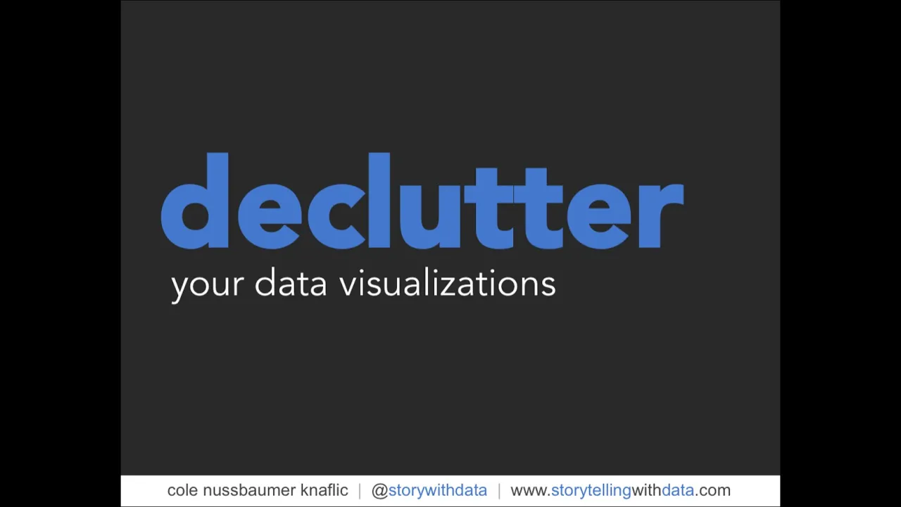
means we want to take a Discerning look to the elements that we allow onto our page or screen and in general try to identify anything that isn't adding information and strip those unnecessary elements away so today I'm going to talk you through five tips tricks lessons on how we can declutter and the importance of decluttering our data visualizations we'll start off by talking for a bit about how people see how we tend to visually organize information and how we can take that into account when we are designing our data visualizations in the second section we'll
talk about the importance of employing visual order in our designs the third section we'll talk about the importance of creating clear contrast making it clear to our audience where we want them to look the fourth section we'll discuss some risks in over complicating things and then finally we'll look at a strategy where we strip down some of the Clutter that our tools tend to add in and then build up to tell a story to our audience in the way we want them to be taken through it so let's Jump Right In and start off with
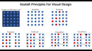
a lesson on how people see so here I want to introduce the geshot principles of visual perception the Gestalt School of Psychology set out in the early 1900s to understand how individuals perceive order in the world around them what they came away with are the principles of visual perception still regarded today as how individuals interact with visual stimuli we'll talk about them here because of some of the direct applications on our data visualizations first principle is proximity we tend to think of objects that are physically close together as belonging to part of the group one
way we can leverage this principle is in tables so here in the example at the right simply by virtue of differentiating the spacing between the dots your eyes are drawn either down the columns in the first case or across the rows in the second case the next principle is similarity we tend to think of objects that are similar color similar shape similar size similar orientation as belonging to part of a group so again we can leverage this in tables use it to draw our audience's attention in the direction we want them to pay it and
eliminating the need for additional elements like borders to do so next principle is enclosure we tend to think of objects that are physically enclosed together as belonging to part of a group note it doesn't take a very strong enclosure to do this light background shading is often enough one way we can leverage this principle is to draw a distinction between different parts of our data the closure principle is interesting to me says that people like things to be simple and fit in the constructs that are already in our head so most people when faced with
this shape will see a circle first and only after that see it as its individual component parts so some of what the principles allow us to do or just question some of the things that are graphing applications have historically done for us heavy borders dark background shading we can strip those elements away and when we do so our graph still appears as part of a whole and our data stands out more next principle is continuity this one similar to closure it says if I take the objects in panel one and I pull them apart most
people will expect to see what's shown in panel two whereas it could also be what's shown in panel three so our eyes like to draw continuous lines even where they may not explicitly exist so again we can use this to start playing around stripping things out of our data visualizations here for example on the right I've taken out the y-axis line all together now your eyes actually still see it because of the continuity of space between the text and the data as we saw in the previous example the more we strip away the more our
data stands out let's talk about one more principle the connective property the connective property has a stronger associative value than similar color similar size similar shape it's not typically stronger than enclosure but that relationship depends on thickness and darkness of lines so you can play with it to get the right sense of visual hierarchy that you're after one way we use the connective property frequently is in line graphs to help our eyes make sense of what is sometimes a whole lot of data so we get a little theoretical there let's look at some practical application
of the gashap principles through an example so this is an example from the IT world where we're looking here at ticket volume so issues coming in with the blue line and ticket volume being processed with the red line now if we take a look at this graph with an eye towards clutter what can we get rid of how many elements can you identify for me there are six main changes that we can make in reducing the Clutter of this graph first off let's get rid of the graph order next the grid lines it's always amazing
to me how much those two steps alone do in terms of making our data stand out more next I want to tackle all those data markers remember every single element adds cognitive burden so here we're adding a whole lot of cognitive burden for no additional information rather this data is already encoded with the lines now that's not to say never use data markers but to say use them for a purpose and with a purpose not just because they happen to be there with in your graph so let's take those away and the next step I'm
going to clean up my access labels so I'm going to drop the trailing zeros from the y-axis one of my pet peeves by the way they carry absolutely no information and yet make the numbers look more complicated than they are so we'll take those out also going to abbreviate the months on the x-axis so that they'll fit horizontally Studies have shown that diagonal text is about 50 percent slower to read than horizontal text vertical text by the way even slower so we should opt for horizontal text whenever possible I'm also going to get rid of
some tick marks on the x-axis just because they sort of get under my skin that gets us here and now that we've alleviated a lot of things that we're adding cognitive load we can maybe more easily see that there's a bit of work we're asking our audience to do here with the current placement of the Legend at the bottom of the graph your eyes do a bit of darting back and forth between the legend and the data to figure out what we're looking at we want to try to identify work like that so that as
the designers of the information we can take that work upon ourselves our audience doesn't have to do work to get at the information so in this case we can Leverage The Gestalt principle of proximity put the data labels right next to the data they describe while we're leveraging proximity let's also leverage similarity make the data labels the same color as the data they describe it's just another visual cue for our audience that says these pieces of information are related so we haven't taken this one the whole way yet but check out how far we were
able to go just in pausing and thinking about what's in our graph that really doesn't need to be there and stripping out some of those unnecessary elements now while we strip things away we also want to think about what remains and how we can employ visual order when it comes to the contents of our data visualization or the pages that contain them so let's take a look at an example here I'm actually going to have you pause me for a moment and spend a couple minutes reading through this and thinking specifically about the design of
the overarching page and how you feel about it so go ahead and hit pause read through this and then tune back in with me so this is an example from the philanthropic sector they'd recently surveyed a number of non-profits and we're wanting to understand what considerations were most important in selecting vendors for the various non-profits now there are some things that I actually really like about this slide one thing I should mention is this is certainly too much information uh in a live presentation to or meeting to put up on the big screen and it's
too dense for that there are too many words but if this is a written report or something that's being sent out for people to consume on their own then the level of text may be appropriate and that's one of the things I actually really like about this slide is the use of text we have a clear call out at the top demonstrating Effectiveness is the most important consideration our graph is titled our axes are titled we have some information on this survey there's some call outs on the right hand side of context right for context
there were a couple Dimensions that going into the survey they thought were going to be very important affordability of services and previous work together that turned out to actually be less important and really it was demonstration of results that was the top driver in choosing vendors but there are also some things that I don't like about the design of this slide and mainly those come to two areas that have to do with employing visual order first off alignment and secondly white space so let's talk about each of those when it comes to alignment nearly every
bit of text on the page is Center aligned and this has the effect of not creating clean lines on either the left or the right which ends up looking messy so I tend to stay away from Center aligned text and opt instead for either left aligned or right aligned in which you choose depends on the layout of the rest of your page and the elements on the rest of the page with you always have the goal of creating clean vertical and horizontal lines speaking of which we also have some diagonal components on the page diagonal
text we already talked about reasons for avoiding that diagonal elements like the diagonal lines here also should be avoided they just tend to look messy so you want to think about other ways of connecting the text to the data when it comes to White space we aren't using our white space here well rather we've taken up pretty much all of it with either text or graphics uh White space is interesting it's one of those things that people tend to fear and I've never really understood that because white space used strategically can be really useful for
helping to emphasize the stuff on the page that isn't white space so minimally we need to preserve borders uh around the edges not let all our texts creep into those we need to not stretch Graphics to take up the whole space that's available but rather right size those and in general resist the urge to fill up white space just because it's there check out the impact we can have on how this slide feels simply by being more considerate when it comes to our alignment and use of white space for me suddenly it feels like something
that was kind of messy before things were haphazardly thrown onto the page now suddenly has order now one question I get sometimes is whether it's worth it to spend time making our data visualizations look pretty and I think for me pretty for the sake of pretty the answer is no however there are some important things that we get some sort of side benefits through aesthetic design so by paying attention to the Aesthetics of our data visualizations and the pages that contain them in fact there have been studies done in the area of product design that
show that aesthetic designs people actually are more patient and tolerant of issues when a design is aesthetic one good example of this the method brand of dishwash soap for a while they had a bottle that was it was sort of orb at the top and then narrow in the middle and had a broad base and it sold like crazy people loved how it looked and sold repeatedly even though it had crazy leakage issues so people were willing to overlook this functionality flaw because they liked the Aesthetics uh so I want to think about how can
we use Aesthetics to get our audience to feel good about our design so that they want to use it and they want to spend time uh getting the information out of it so here specifically we've looked again at alignment and white space something else that we're doing here is leveraging our contrast so remember we have those diagonal lines in the original here we've gotten rid of them and instead emphasized the particular pieces of data and some pithy parts of the text on the right to tie those words together with our data so continue to explore
this idea of creating contrast it's easy to spot a hawk in A Sky Full of pigeons this is an analogy that Colin Ware uses you wrote a book called information visualization perception for design the analogy is it's easy to spot a hawk and A Sky Full of pigeons but as the variety of birds increases that Hawk becomes harder and harder to pick out so the more things we make different the lesser degree to which any of them stand out or said another way if there's one thing that's really important let's think about making that the
one thing that's different leverage our contrast strategically look at an example here so in a moment I'm going to put a graph up in front of you and what I'd like you to do is think about how you feel in reaction to this graph if you had to sum it up in one word right your gut reaction how do you feel about this so when I do this in front of a live audience I'll sometimes get this sort of negative guttural sound coming from the audience or people shout out words like overwhelmed and Confused these
are all negative reactions that we want to avoid in our audiences let's back up and take a look at what we're looking at here so this is an example from a prominent U.S retailer they had recently surveyed their customers along with customers of a number of their competitors across some different dimensions seen across the bottom selection convenience service relationship price so in each of those categories or various survey items that roll up into the category and those were combined to create this weighted performance index we don't need to worry about how that's calculated but rather
just know that that's an aggregate measure of performance in the given category with higher being better we have that information for our business depicted by The Blue Diamond as well as another of a number of our competitors depicted by the other colored shapes now this is a tough one to take in and in fact even if we have a lot of patience and really want to get the data out of it some cases it's nearly impossible because our business the blue diamond is obscured by other data points this is a case where we're not using
our contrast strategically let's check out a potential redesign of this data so here the main thing that we focus on is creating that clear contrast the dimensions that were originally along the bottom have now been put on the y-axis our business in first position and in blue is the one thing that stands out as very distinct from the rest so now with this design we can make two comparisons very easily we can let our eyes scan across the blue get a relative sense of how our business is doing across different categories or within a given
category we can get a quick understanding of how our business is doing relative to the competitors by comparing the length of the blue line to the lengths of the gray lines now if it were really important to compare our business to competitor C for example this design doesn't allow for that so well because for that we have to go over to the legend on the left either count down or count up to get the positioning of competitor C then go back to the right either count down or count up in our data to figure out
which bar to be comparing if that's our main point this is not the right design for this but if our goal is to get a quick understanding of how our business is doing relative to the competition this can allow for that well and again here the big point is how strategic use of contrast can really help direct our audience how to pay their attention shift gears now and talk for a bit about some of the risks of over complicating and some tactics to avoid over complicating if it's hard to read it's hard to do this
was the one of the findings of a study done by song and Schwartz at the University of Michigan they did a couple iterations of this one was with workout regimens another was with sushi recipes where they had sushi recipes written in two different fonts one of them which we see on the right hand side here was a straightforward easy to read aerial font the other depicted on the left here was this sort of cursive font called brush stroke and they handed different versions of the recipe to different people and ask the students to estimate both
how much time they thought it would take them to make the sushi recipe as well as How likely they were to attempt it and what they found was those who received the recipe written in the hard to read font were they both estimated that it would take longer and they were less likely to make the sushi so taking that and applying it to our data visualizations says we don't want to over complicate things because in doing so we run the risk of our audience either thinking it's going to take too long to get at the
information or deciding they don't care to spend that time to get at the information at all so here are some tips to avoid over complicating first off make it legible you want to think both about typeface and size when it comes to legibility if you're going to be projecting on the big screen try to get into the meeting room and do that ahead of time so you can make sure your font is big enough for everybody in the room to be able to read secondly keep it clean leverage visual affordances which said in another way
means pushing some stuff to the background and pulling other things forward so again leveraging that idea of contrast that we talked about in the prior section use straightforward language make sure you spell out any acronyms at least the first time that they're used define specialized language or avoid specialized language this can be a great space to just get feedback from somebody who's Less close to your work than you are and see what kind of questions they ask often that can help us from over complicating or help us to identify spaces where we might be over
complicating either our message or our data and finally remove a necessary complexity and this is not about oversimplifying but rather not making things more complicated than they need to be that brings me to our final tip of the day here now I want to look at a strategy for stripping things down from some of the default settings that our tools tend to add in and then building up to tell a story to our audience so we'll look at one final example this was from a startup who was they'd recently created a product and they were
getting ready to launch that product in the marketplace trying to figure out how they should price it and one of the inputs that they wanted to bring into that pricing decision was how competitors had priced their respective products in the marketplace over time so this was the graph that they started off with it was actually quite difficult to look at we're not using our contrast well right we have so many different colors going on that it's hard to pay attention to anything and we're over complicating things uh so one easy step to move from more
elements to fewer in this case is to Simply take all those bars and turn them into lines so in that step we've gone from 25 distinct bars to five lines so again on this idea of not over complicating we've also aligned everything to a common x-axis of time which will just make the data easier to interpret now from here we can do a lot of the same decluttering that we did with the ticket example get rid of the chart border eliminate grid lines data markers clean up our axis labels use the gesture principle of proximity
put the data labels right next to the data they describe also leverage similarity and now I want to think more about how I can use my contrast strategically so oftentimes I'll start by making everything gray push everything to the background which forces me to be really thoughtful and strict about where and how I draw my audience's attention so here there are a number of places we could focus our audience you know maybe there's something interesting that happened with the launch of product C in 2010 and the decrease we saw in existing product prices since then
or it might be interesting to note that actually in general in this space with the launch of a new product we see an initial price increase post launch followed by an eventual decline or perhaps the most recent point of data in 2014 is of Interest any of these could be the right points of focus the right way to use our contrast depending on the story we want to tell so let's look now at a strategy for building this up and telling the story to our audience this might start with some context my goal today is
twofold first I want to create a common understanding of how prices have changed over time in the competitive landscape secondly I want us to use this understanding as one of the inputs to our product pricing and I'll end with a specific recommendation so before I even put data up got here so on our y-axis we have average retail price ranging from zero at the bottom to 500 at the top we have time on our x-axis ranging from 2008 at the left to our latest data points in 2014 at the right Now Products A and B
were both introduced in 2008. price points of 360 plus a piece now over time they've followed a similar trajectory with B always slightly undercutting a as of our latest point of data they're priced pretty tightly 260 and 250 respectively but something interesting happened over time new products were introduced and they were introduced at much lower price points but all have increased in price since their respective launches and in fact what we tend to see in this Marketplace after the launch of a product is an initial price increase followed by an eventual decrease over time when
we look at our most recent data point prices are pretty tightly converged when we consider the broad range that they've had historically an average of 223 with a low of 180 and a high of 260. therefore when it comes to the pricing of our product we're recommend starting with something slightly lower than that in the 150 to 200 range so check out how far we've taken this example again that's by starting and stripping down some of the default settings that our tools add in and then thinking how can we build this up in a way
that tells a story to our audience in the way that we want them to experience it so just a quick recap those when it comes to the importance of decluttering our data visualizations we talked about the geshot principles and how people visually order what they see and how we can use that in our data visualizations talked about the importance of employing visual order and the sort of implicit contract that that creates between the designer and the audience in the third section we talked about the importance of creating clear contrast and really thinking about how we
can direct our audience's attention to the important parts of what we're showing talked for a bit about some risks in over complicating and some tips to avoid over complication then finally we looked at an example where we strip down all the Clutter and build up to tell a story to our audience so we've looked at today are tips and tricks taken from chapter three of my book which is all about clutter I just want to give you a sense of the other content that is there goes much more into detail into the entire storytelling with
data process uh all the examples we looked at today are from the book and there are also many more and much more by way of content and tips and tricks for really doing an effective job when it comes to telling a story with your data so with that I say a very big thank you for tuning in be sure to check out my website at storytellingwithdata.com and you can learn much more in the book story