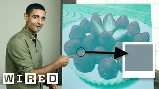
so the next thing I'm going to talk to you about is color constancy so what is color constancy first does anyone know is it when the color stays the same even though the light is changing yes yet exactly right so it is a feature of human vision that ensures that the perceived color of an object remains constant or relatively constant under varying elimination and so I'm going to explain color constancy in relation to the internet phenomenon that was the blue and black or white gold dress so by show of hands who perceives this dress as
blue and black okay so slightly over half who perceives it as white gold pretty much the rest okay that's fairly reflective of the population as well does anyone perceive it as anything other than those two options maybe a sort of blue and brown maybe yeah so another option is that blue is kind of bluish in a brownish color which tends to get categorized into the blue and black okay so hopefully by the end of this talk you'll be able to understand why is perception perceptual paradigm occurs across the population to begin with though I'll talk
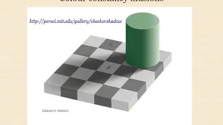
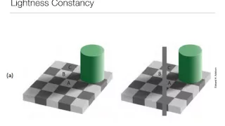
about how color is perceived under shade this is the simplest variation of color constancy and so to highlight this I'm going to use this diagram here that shows a simple checkerboard with two yellow dots however one of the dots is casting shadow by this green cylinder and so what can you tell me about the perceived color of this year yellow dot in the shade versus the yellow dye in the light the one in that shade is brighter yeah so that's generally heat the way that it is perceived by the population is that the the yellow
duck that's in the shade appears to be brighter than the yellow dot that's in your mind but if I was to remove everything else from this image apart from those yellow dots you can see that they're actually exactly the same color furthermore what can you tell me about the the square in which this yellow duck is is viewed does the square that the other got sitting on a Pew brighter or the same or darker than that yeah the square of the other yellow dot brighter or lighter yeah so that's another another point is that the
the surround of the dot there also appears brighter but again if I remove everything from the image apart from that we can see that the squares in which they see there are also exactly the same so why is this happening so what's happening here is that we are we are aware that this cylinder is casting a shadow across the board and so our brain is telling us that anything that we view in this shadow should actually be brighter than it appears it appears dark because of the shade and so our brain is artificially lightening it
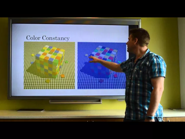
to the color that we that we that the yellow dot actually is because these yellow dots are the same we perceive this as brighter it's being artificially inflated in luminance so moving on now to how light colored light affects our perception and to do this I will show you a simple Rubik's Cube viewed under yellow light on the Left do we light on the right and we can see that the color the colored squares on the Rubik's Cube are the same in both cases for instance across this front line we can see we have blue
yellow red blue green and under the blue light it still remains blue yellow red blue green so the colors we're perceiving the colors of the Rubik's Cube to be the same under both conditions but I want to draw your attention to two squares particular and they are the blue square viewed under yellow light and the yellow square viewed under blue light and so to me to most people this still remains a blue square and a yellow square however if we were to remove the colored light context from each situation we can see that the blue
and yellow squares are actually both the same color and noticeably they're neither blue nor yellow so our brain is is viewing these and subtracting the blue and yellow light from each case and inferring a color onto that so how does this relate to the dress well so there are several lighting cues in this image what is the first and potentially most obvious lighting cube may be the background it looks really bright yes so the most obvious thing to me is that the background is clearly overexposed so if we were to remove that overexposure then now
the background looks a little bit more correctly exposed and the dress looks darker as this changed perception for anyone does the dress now appear a different color to what you did before it certainly looks a more blue and black then it was game yeah so this is potentially enough challenging lighting cues to change people's perception so now that the dress is less overexposed potentially you now see it as a blue and black dress and whereas you used to see it as a white with gold but what else can you tell me about the lighting cues
in this photo does anyone know the context under which is was taken know so okay there the photo was taken in a shop front window looking into the store and that we know is displayed in the window and in the background we can see the store so the background is illuminated under indoor lighting and the outdoor or the shop window is potentially illuminated under daylight and so what what can you tell me about indoor lighting a quality of indoor lighting even in the room that we're in right now it's yellowish yes exactly so the indoor
lighting tiers have a yellowish tinge and daylight tends to have a bluish tinge and this is related to the spectrum of life that that each of you don't know so daylight tends to be made up of a greater proportion and intensity of bluish light whereas indoor lighting tends to be much more yellowish orange quality and so how does that relate to viewing this dress so here's a little cartoon to try to explain it so focus on the right-hand side of each image and so the left image is showing potentially what a someone who views the
dress under yellow light so this this panel is illuminated in yellow light and we can see that it looks different to the white lighting of the dress the blue and black dress similarly this white gold is viewed under blue light and we can see how the perception of the colors changes but what's important here is that the right-hand panel of each dress is exactly the same color so we move that across you can see that we're perceiving these that what we actually view is the same color but potentially our cues are different so those who
the whose brain is telling them that the dress is illuminated under blue light subtracting the blue light from the image and viewing the dress as white and gold whereas those who are potentially brightens are telling them that their dresses illuminate another yellow light are perceiving they're correcting for that and receiving the dress as blue and black so hopefully this is kind of explained to you how these two two different perception paradigms occur is there any questions