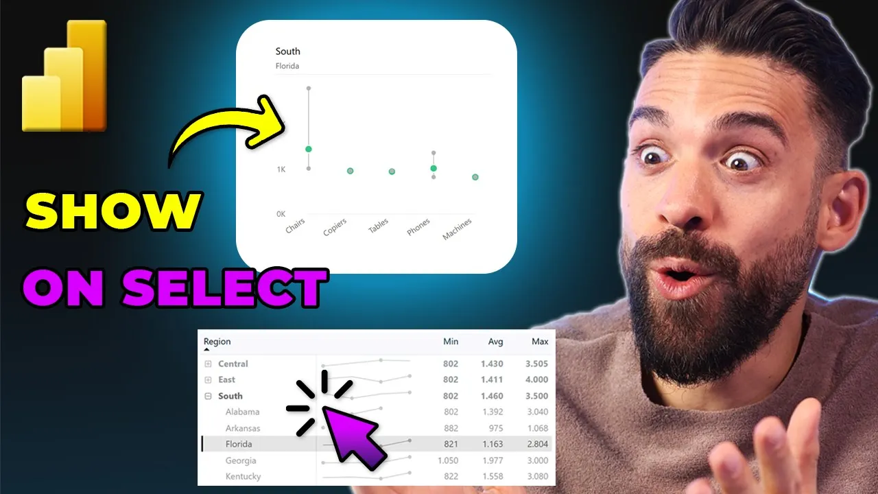
Is it possible in PowerBI to only show a chart when a certain item is selected in a different chart like this over here? This can be super helpful because sometimes a chart only makes sense when a certain employee, project or region is selected. Now, in this video, I'm going to show you step by step how to set this up.
I know what most of you are thinking. Ah, he's just going to do this trick where he uses a card visual, overlays that on top of the main chart, and then makes it transparent when a certain item is selected in a different visual. Now, that was indeed also the first idea that came to my mind.
However, there's a big downside to that approach, and that is that you lose the tool tip, and for most charts, you want to keep that tool tip. So, therefore, I've thought about a different way, and I got it to work. However, before we explore that one, let me also show you that first method with the overlay and guard trick in case you didn't know that one just yet.
All right. Now, how it works is as follows. You see here on the left hand side, I have the table visual.
And when I select one of the states, then only the main visual right next to it becomes visible. However, you see there's no tool tip because there's an invisible guard over it. Okay?
So, when I clear my selection, that guard is visible again. Now, how it works is as follows. Let me just delete this one.
I'm going to insert a new card visual. And let's put it on top of the main one. Just like this.
Okay. Now, the text that I want to show, I put in a measure. So, here on the right hand side in the data pane there, you see I have a measure called placeholder text.
And this is the text I want to show when the user didn't make a selection yet in the other visual. So, select the region. Okay.
So if I take that one and drag it on top of that card visual, then we see the text here. Okay, perfect. Now then we can go to formatting options, call out values.
Now the label I don't need. So get rid of it. I want to have it in the middle.
And maybe let's also make it a little bit smaller. For example, 28. And I'm going to make it dark gray.
Now the border around that guard we don't need. So here on the cards I turn off the background and I turn off the border. Okay, now that's nice.
However, when I select a region or state, nothing changes. It's still overlapping that main visual. So now we have to apply conditional coloring to the background as well as the text to make both the background and the text transparent.
And for that we have another measure. So over here you see there's a transparency measure that I use which just returns a transparent color using the RGBA color model and the fourth argument there we can set the opacity or the transparency. All right and that only gets applied if the field region is filtered.
That's it. Okay. So that measure we can then use here in the formatting for the colored value color.
So you see over here we have conditional formatting. Then we can go for field value. And here I want to use that transparency measure.
There it is. Let's click on okay. And now we do the same for the background.
All right. So here in the size and style there we have the background. And here we also have an FX button.
So that means we can use that same measure to apply transparency. And now the chart already should appear. So you see Arkin says selected.
But if I deselect Arkansas, ah, now the value as well as the background become non-transparent again. And when I select the state like Florida and Georgia, then the main chart is visible again. But that guard is still there.
It's just well transparent. So you don't see it. And that's also why there's no tool tip because well, we have an overlapping card.
And that brings me to the second method where you don't need an overlapping guard visual. Now let me show you how that one works. Now first of all I need to make sure that there's no selection in players anymore.
And then here that overlapping card visual I can delete or let me just hide it for the time being. And for this approach we need to adjust the measures that we use for this visualization. Now in this visual you will see in the builds panel I have the min value, the average value and the max value as well as some measures that dynamically set the title, subtitle and the maximum of the y-axis.
Now for those measures we want to return the value dynamically. So we have to update these measures over here in the data pane. So let me start with sales min.
We need to wrap these measures inside of an if function because we want to check if and then if there's a filter on the region. Okay only then I want to return the minimum sales order value. All right.
and otherwise blank. Okay, so the default value of false is blank. And then I can copy this and do exactly the same for these other measures that I'm using in this visual.
Now for the max variation, I need to of course use the max function. And now I need to repeat this for all of the other measures as well. And now that I've updated the measures, you see my chart disappeared.
But when I make a selection, for example, Florida, tada, there it is again. And the best part, I still have my tool tip. Nice.
However, when there's nothing selected, I just see a white box, which is a little bit weird. So, probably you want to show some text. Now, how can we make that possible?
Now, also here, we could add another shape with the text and then underlay it and make the background of the chart transparent. However, this is not really what I want. What I want is just one chart.
So therefore I'm going to show you a different approach where you can actually also show an image placeholder image if you wanted to. So what I did is the following. I went to PowerPoint and then here created a placeholder.
Now again can be text can be an image whatever you like. Now then I exported this as an SVG and then back to our chart and then formatting options. Here we have plot area background.
Now that image we can select here. Now there it is. And now I set the image fit to fit or fill whatever looks best.
There you go. All right. So this is what shows when there's no region or states selected.
And now if I make our selection, taa, it disappears and we have our visual showing. So let me select some other states as well. There you go.
And now you see the tool tip still working. There's no overlaying or underlaying shape whatsoever. And when I deselect the states or the regions, then we have our placeholder text or image.
And all of this is possible without needing any extra overlaying shapes or underlaying text boxes or whatsoever. And what do you think? Do you like this idea?
Maybe you have some other ideas of how to achieve the same thing. Put it in the comment section below. Now, if you want to see more PowerBI tips and tricks like this one, check these videos over here.
And if you want to build reports together with me from beginning to end and learn all of my PowerBI tips and tricks and how to build really good PowerBI reports, then check out my PowerBI design transformation program. Thank you for watching and see you in the next video.