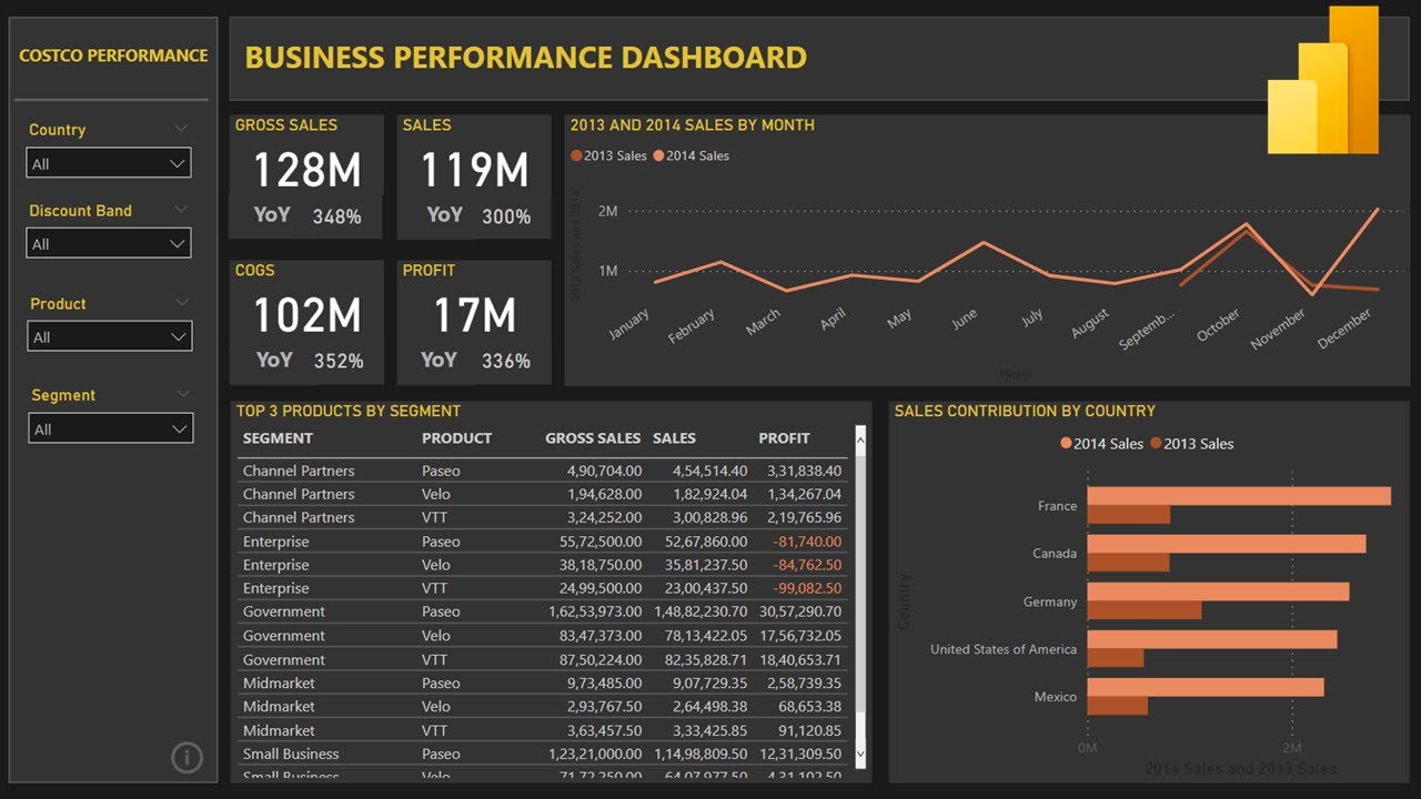
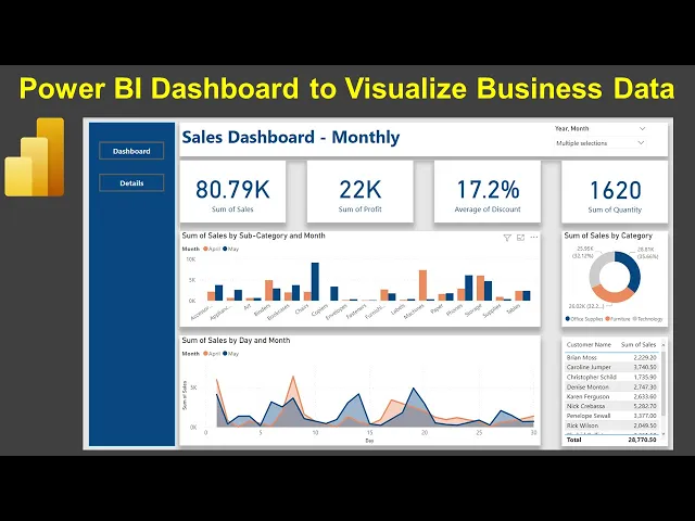
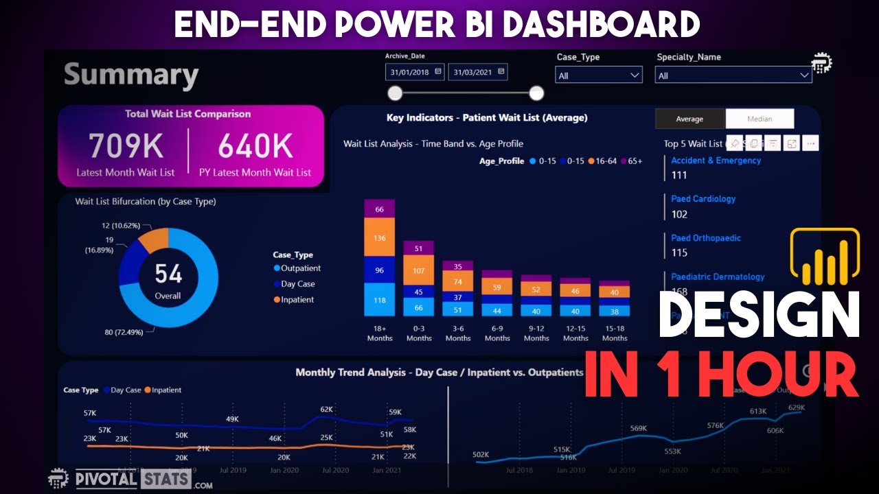
hello and welcome to the new Power bi dashboard tutorial and in this dashboard I want to show you how you can create a design like this which is a sales dashboard the monthly sales dashboard and the reason I'm saying this is a monthly dashboard is because you have this monthly selection over here where I have currently selected the April and May right and based on that I am showing some of the kpis like the sum of sales The Profit the sum of quality average discount and then down below the sum of sales by subcategory and one and this will this is basically showing you the April and May based on my selection right and then some of sales category the top 10 customer also the sum of sales by day and months it's like the month we have selected April what is the trend and then what is the trend for me so clearly May is exceeding in the case in this case so whole idea is this how you can do some this type of a comparative analysis so if you want if you want to let's say compare the entire one quarter April May June which is a financial quarter hold on let me select April May and June so you can do three months comparison over here in this chart in this chart and then some of the aggregated charts and then in these three months what are your top customers all of this information is available now the another thing is that you have the dashboard view but also you have the details view which if I click on it it basically gives us the table for these customer in these months that we have selected which is helpful in scenarios like you want to give them to ex users to extract it and then if you want to go back to the dashboard you click on the dashboard and you get the dashboard information similarly you can create as many tabs as it is as you want like dashboard or maybe this is like a summary dashboard then you have maybe by product dashboard customer analytics and stuff like that so this becomes your One-Stop shop the whole thing is it will become bulky once you will keep on adding more and more visualization plus more and more calculation as per the need of the visualization but the whole idea is how you can create this and that is what I was going to show you in this video but before that just a quick information about my power bi tutorial sheet which is this Sheen where I keep all of my power bi related videos in this live Google sheet this sheet link is present in the description and then you can access all of my 200 plus videos and the current video I have with this sales dashboard monthly which I am adding you the entry right in front of you so sales dashboard monthly is something I will pop when I will publish it the link will be present here so whole idea is that you can come to the sheet and search any of my videos very easily also so you can keep it as a bookmark so whenever you need it you will have this sheet always up to date since it is a live sheet so the link sheet is present in the description you can search or filter and then search my videos jump to the video using the link which is present here and also I have some exercises related videos that you can access very easily so with that information let me go back to the power bi and here I am into the power bi so the first thing is about the layout so layout is something you have to decide about the kpis the charts and how will the layout looks like and in this case you will see that the layout is quite clean clearly you have some separations between the kpis you have the separations clearly called out between the charts and then these charts over here right and the whole idea is I show you not just the kpi but everything about the formatting and all because that plays an important role when you roll out the dashboard it becomes easily consumable so all the background the color and stuff like that is something we will going to view it in this video all right so what I'll do is I will going to create another page the page number three and in this we were going to build the visualization step by step so if you are a complete beginner I will completely hold your hand for everything that I will do from designing the visualization to any calculation to any setting you will see it right in front of you over here so if you are a beginner watch with a normal speed I suggest but if you are an experienced user then watch it with the you know at least 1. 25 x speed because that will give you the good Pace but where is the data for this dashboard well the data is this super store dashboard and um this this is present on my Google Drve Link is which is also present in the description and let me show you the data location so here I am in this data set folder of which I have given the link and the file is the power bi Super Store uh sales so this one is a missing uh with the missing data for one of the previous examples but still you can go ahead and use it I have multiple versions of it so you can you can actually look into it based on when it was released and all but for power bi mostly I'm using the this one as a data set I think there is another one not wrong but maybe the case that I may have renamed it so this is the file you know go ahead and use this no issues you will going to find very similar absolutely similar values and with that let me go back to the power bi so here I am in the power bi so first thing is the background of this dashboard right so for that before creating any visualization we need to the canvas background and over here we you can change the background and make sure the transparency is zero so this is the one of those reasons where even if you change the color where transparency is hundred percent and that's why the color does not appear I still don't understand why they do do this ideally it should be zero percent and then we can change it to 50 or whatever we want but hundred percent basically indicates no change in color which becomes quite confusing for beginners even it was for me when I initially first started it but that's what it is well with that uh what we need is uh basically a banner on the right or sorry on the left so what we can do is from the insert we can go to the shape and select this shape right we can do this drag this down and from this angle we can change it maybe up till here right this should be good enough and then little bit down below so it becomes like a part of this dashboard and not like covering it entirely then it's about uh changing the changing the color so within the shape the style and the fill what I am choosing is this color right this is the color what I am choosing if you can see it over here this is what I have right so this is the detail section so this is the first section what I am doing and then what do what do we have on this Banner is basically these two buttons so the buttons is also present over here and I will going to do a blank button right and in this blank button I will just keep it like this so that it is centrally placed Ctrl C Ctrl V one more right up until here I will select this dashboard come to the style enable the text and within that I will going to write the dashboard I'll make it bold also I will have to change the color to something so that it is visible right and also I will increase the size to 12 which is good enough and then over here for this button which I have selected just now I am going to enter details and change the color again to this and make it what 12. uh and make it what bold so what is this um this is 12 volt I will also make it 12 just to so that I am consistent and it is clearly visible so this is the first thing that we have over here about the dashboard if you will see this is the first section then we have this Banner right and this particular value so over here in page um what we were going to add is the text box and we'll drag this up till here and little bit on the left side so that it will start appearing more like a proper Banner so I'll keep it till this yeah this should be good I guess so we will say sales dashboard monthly I will select that and make it what 28 make it what bold right sales dashboard monthly looks good and then obviously the color color you need to keep it consistent so that you know it's it's basically reflecting a theme of a dashboard so if I do that here is my same information then once I have built it what I need is basically a slicer so if I go to this super store sheet what I have is the uh we have basically this order date and this order date is not coming like a proper hierarchy what so what I did is I created another date like a date hierarchy proper so for that if you are not viewing this like a proper date hierarchy go to the Super Store Right select the order date and we have this state as the proper date which is this date and then what I did is I created one more order date that's actually nothing but I created the order month or you can say another order date or order date copy or any field and then equal to the order date as soon as I do that I think I change the format to a short date which is this and that is just to bring this particular order month over here so it basically gives me the hierarchy for some strange reasons that it does not give this the order hierarchy so I started picking up this field so what I'll do is I have this order right and I bring if I bring this and so this is what it gives me not a good thing right so big so I will drag it up and yeah drag till here and then what I can do is bring it here also from this drop down if you see I will click on the drop down field this gives me more space to for the selection correct so so if I bring this up over here it's not picking up this entire size so I will have to little bit increase the size of the banner and then bring it bring this in line with the panel that I have it here okay so now I can keep this as part of this so it will feel like this is a part of this dashboard uh the banner sorry so we have the order month right so if I select this this is what you get once if you bring the entire field over here uh just completely like order month so what you need to do is you need to basically first bring the ear right and then bring the month information so what it does is it basically uh create that proper hierarchy that for 2020 you are not getting that for each transaction you are not getting the date because that that will be very lengthy but all those transactional dates are now grouped into the month okay and that is what it is going on over here as well if you see uh the same thing over here so just so that you have everything at your disposal uh if you need to create a dashboard like this so we have this dashboard now or we have this view right uh the next thing is creating the kpi so kpi creation is using this card again so huge so I will bring it till here and I will keep it like this increase little bit yeah and we will call it what sales right so 2.
3 million is sum of sales uh that's a total when we have selected everything right so this is what the sum of sales is still you can change it by going into the formatting you have the category value 2. 3 million right so I'm keeping it like as it is category label is something which is present here which is this label right that is uh formatting which you can change so this is a call out value the main value and the um and the 2. 3 million is what each actual value is and then down below you have the effects within the effects you can change the background transparency you but what I have enabled is the shadow right within the shadow I am so if I enable this the shadow that I am choosing is the bottom right so if you see over here this is the shadow that I am choosing so this looks like little bit big right compared to what I have it so I will just give it little bit more uh size so this is some of sales and uh only thing is the font color call out value I will change it to this right and sum of sales let's change this as well to the same color so you have it like this okay so Ctrl C Ctrl V uh maybe a couple of times Ctrl C Ctrl V Ctrl C Ctrl V yep four so we have the four right but we need to align it properly this is like there is space here in so these are not equal spaces so what you do select this hold down the control key select this keep holding down the control and keep selecting the values right so we go to the format then we go to the Align and distribute horizontally and that way now the spacing is equal in between of that even if you want you can change the size um if if you think there is a more space because I believe over here the sizes space is little bit less right so if you increase the size let's say to this much and you select everyone there is an option in which this is for the size now there is nothing about the size distribute this is only the alignment so what you can do is rather than than making sure that this is the exact size my preference is I just choose it at the start and then you know place it um at their respective location and then distribute it horizontally right so this much is fine select everything again format align distribute horizontally and this is I think good enough okay so we have this we have this only thing is now we need to change it from sum of sales to the profit over here profit this one is your I believe discount so if I go up I have the discount so this count will come but the only thing is for Discount we take average and the 15.
6 if it is coming not like formatting this one then make sure that you click on discount and hit the percentage and make it one decimal position that's the setting since I already done that's why it is giving me but in your case it can give you the raw information like 0.


![Hands-On Power BI Tutorial 📊 Beginner to Pro [Full Course] 2023 Edition⚡](https://img.youtube.com/vi/77jIzgvCIYY/maxresdefault.jpg)