i don't want to be that guy that just repeats the same thing as everyone else so i'm going to hit you with an opinion to start many massive channels have crappy looking thumbnails what's going on but they perform well because of the bidet minom phenomenon what that means is people are more likely to click on topic or creators they are interested in and sometimes there's so much interest in an established creator that they can play by different thumbnail rules to smaller channels that don't have a recognizable brand so here's what i mean i love pewdiepie
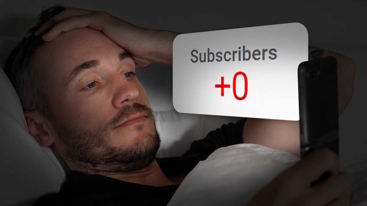
and i bet this video did great but if you put that on your video as a small channel probably not gonna do that well now felix might say this is one of his best performing thumbnails he's ever made does that mean we should copy it well in most cases no because it's his face that triggers the interest and ours probably won't i actually made my own version of this and that video caused three subscribers to leave thanks felix big channels also have tons of data in which they can react to which will help them refine
the thumbnails to get better results and that could be a reason they don't look great sometimes because actually that is what works for them but in the early days when you don't have time data or recognizable brand or face or even fancy pants photo editing software it's worth focusing on getting the basics right that do work across the board for everyone so here's some of the things i think will help you out a lot with your thumbnail design no matter who you are or what stage in your youtube journey you're at the first thing is
to simply take a photo these are videos i pulled stills from and these are thumbnails where i took a photo for the thumbnail can you see the difference the photo is just better quality can also take a long time to find a still from a video that isn't pulling a weird face and when you take a photo you'll put more thought into the image rather than just hoping something comes along that might work i mean if you leave it up to a still you're really limiting your creative options the same applies if you do not
appear in your thumbnail and you use an image photos are just better in so many cases number two left to right in the west we read from left to right so if you're using text in your image it makes sense to put the text in the left now it's by no means wrong to put it anywhere else but our eyes naturally seep outwards from that side if you can't decide where to put your text on your image just eliminate your time consuming choice by going with the safest option number three contrasting colors so what you
can see now is the adobe color wheel if you click here and then drag this around to the color that takes up most of your background it will show you the exact opposite color which means if you're using text and you want it to stick out from a background a lot that opposite color is a great choice to go for it's not wrong to use anything else you can just trust in the decision that this will help you make number four text if you do use text in your images then simplify your message down to
around four words basically your thumbnail needs to work when it's displayed very small to get the right message across and to stick out which means small text in a sentence is too hard to read and even bigger letters and lots of them gives our eyeballs more work to do my video on rethinking thumbnails explains how important it is to get noticed instantly and lots of text can slow this down that also means using a bold font number five fonts serif fonts are things like this a little more old school and sophisticated these were designed for
print back in the day sans fonts like this were designed to be easier to read on screen so unless you're printing out your videos into a flipbook to stay safe with highly readable thumbnails use a sans font google sans fonts options and there's loads of free ones you can use some popular ones are roboto monster app and we use one on our thumbnails called poppins i actually rebranded our entire business based on our youtube thumbnails because sometimes businesses want to keep their thumbnails branded and their branding just doesn't work for grabbing attention like a thumbnail
needs to number six faces versus no faces youtube is shell shelf youtube itself reports that thumbnails and faces pulling emotional expressions perform better now i like to run with my face because it's way harder to design a thumbnail that is just unique as a face and i'm trying to build up interest in this face that i spoke about last time the thing is if you don't appear in your content and you want to be on camera it might not work for you but don't panic if that's the case then think about what you can do
to make your thumbnails instantly recognizable in the same way a face might be able to do that and that would mean to build up a thumbnail style that over time has this recognition so you could use the same colors or fonts or it could just simply come down to the way you color correct photos like peter mckinnon doesn't always appear on his and you can tell a marloff it's one of his videos from his image because of the way it's shot and edited number seven keep it simple design is hard the first thing we all
tend to do when trying to design something is to add lots to an image because it feels like design is about adding things but really in most cases especially in thumbnails design is about making sure the most important thing the thing that your potential viewers brain will recognize in an instant stands out fast and simplicity can really help with that eight draw the eye what's important about your image when it comes to appealing to your viewers interest is it the text is it the item in the photo with thumbnails there should be a hierarchy something
in the image will be the thing that potential viewers will want to see to establish what that is and then make that stick out more common ways to make something stick out by adding a stroke which is a line around the image like this or a drop shadow which creates layers or a glow which just makes things play the thing is larger channels with a recognizable creator can use these as a weapon to make photos of themselves stick out if you're new that may be sticking out of a photo more than anything else isn't going
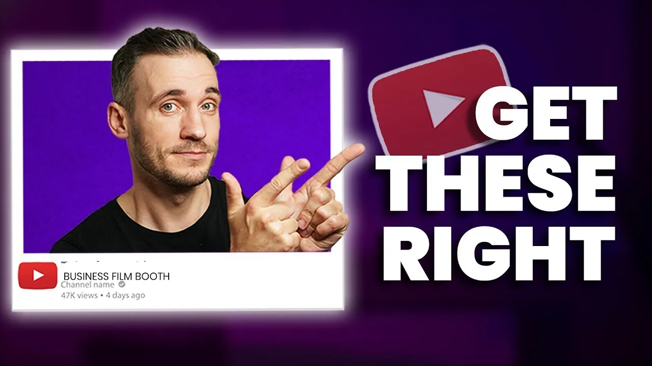
to be as powerful in the early days unless you are smoking hot then forget everything i said and just pout [Music] i'm not saying don't feature just that new viewers might not seek your face and i see a lot of people using strokes and it might not be the best solution but if you don't feature in it check out this example simply by putting the item of importance in the middle and then putting some text behind it draws your eye in this is one of james kelly's thumbnails go check out his channel i recently got
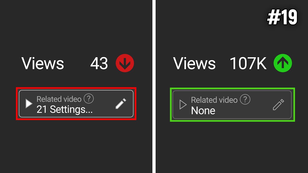
to see his data and the click-through rate on the homepage for this video was epic there's a link in the description number nine keep things out of the bottom right corner simply because it gets blocked by this little number sometimes if you don't that was that was a fast point i wish they were all that fast number 10 tell a story a before versus after an action shot from the set even just an expression can tell a story that works with your title if you don't use text story is going to play a big part
in your images and number 11. never ever use the default thumbnail i have nothing other to say on that please never use one of these three options means you too pewdiepie stop telling me i look like him in the comments because i'm probably older than him so he looks like me so if you're unsure about your thumbnails go for the things that make it easiest for you to make but stick to these rules and make sure you watch this video here which might transform the way you make your thumbnails it might not bye