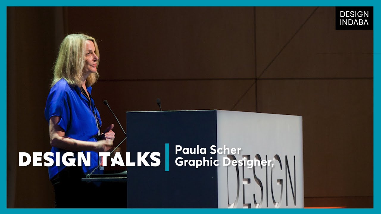
[Music] I'm so honored and scared to be speaking here today uh I saw all the speakers today Pepe andos inisa and Hela and Ross Tomaso Stanley nahem Larry and those amazing Patrick cooa kids I've also seen all the speakers for the last five years head in daba and um it's an active follow it's quite an active follow it's daunting but I'm honored to be here not as MC as I was earlier in the day but um here to just show you some recent work and to um for the first time ever make a little announcement
uh that um of of just something new that I've done um I'm uh I'm from Ohio that's my twin brothers they're twins to each other Ronald and Donald rhyming names thanks Mom uh this is the uh logo that changed my life about 50 years a ago I was 7 years old so I'm a graphic designer and I became a graphic designer around now 50 years ago and what happened was I was going to get a haircut with my dad uh I was in the passenger side of the car he was driving and um we stopped
at a light there was a construction site over to our right and he said oh look at that isn't that interesting and I said what he says well the way look at you see where it says Clark on the side of the truck and there was a like one of those forklift trucks those trucks that do this I don't know if you call them something different here you know what you know what I'm talking about okay like a forlift truck and he said um you see where it says Clark and I said yeah and he
said look at how the L is lifting up the a just like the truck does and I thought oh my god oh I like how how long has this been happening is this is this like everywhere what's going on and the idea the idea that someone had sort of had to stick the name on the side of a truck at a construction and had taken the pains to put in that little moment of pleasure and surprise and Delight just for someone like me to enjoy I was like I don't know what that is or what
it's called but that's what I want to do and I and that's what I ended up doing so I've been doing it now for uh uh about 40 years or so um and I think the thing that interests me most when I come to a place like design and daava of course you come to Be Inspired but the real moments of pleasure that I have are when you sort of get to see how someone did something I knew that that was what I wanted to do and I knew I wanted to why I wanted to
do I want to make people happy but how did you do it how did you get from here to there so this whole presentation I've sort of organized an idea of how to how to do different things and I've got a long list of different things that I've learned how to do over the past uh four decades or so but I'll just show you a few of them that I thought would be fun uh today so first of all um this is something you might want to know how to do so you can avoid doing
it and uh people say graphic design is harmless people say it's ephemeral people say it's cosmetic people say it doesn't really mean all that much but you can ruin the world with graphic design I haven't quite done it yet but this poor lady here his name is Teresa leor and 15 years ago she worked for the government and one of her tasks as a government worker in the United States was the tedious Act of laying out government forms uh one of the forms she had to lay out was a ballot for a presidential election and
she was in fact she worked for the board of elections in Palm Beach County Florida so if you remember what happened there in Florida if you know your history books uh that was the year that George Bush ran against Al Gore and um election night bizarrely enough the entire country was tied it was a tie vote and it was all going to depend on how the boat came out in Florida and Florida was nearly tied and it was all coming down to the votes in Palm Beach County this is what Teresa did okay you were
picking between George W bush in position number one right your second choice is Al Gore in position number two right so but she had too many things to lay out so she laid him down the that side then L on that side and the way you voted was you took a thing and you punched a hole in the middle right so if you wanted George Bush Bingo hole number one you want Al Gore hole number two right wrong if you if you did hole number two you were voting for this guy on the other side
Pat Buchanan and so about a thousand people later claimed they voted accidentally for papuana they meant to vote for Al Gore and guess what um by some counts and people dispute this but by some counts Al Gore lost the election in Florida by 700 or so votes so because of graphic design that kind of crappy job that every graphic designer in this room has been forced to do too much type not enough space one color government form do it fast just it has to be out there bad printing this is what happened and what happened
after that the invasion of Iraq the invasion of Afghanistan you know so if anyone asks you design counts right so um let's let's put away world destruction for a moment and kind just think about how to have fun with the brown cardboard box so I'll talk about some projects I did to demonstrate a couple of simp simple principles um there's this guy named Jeff Braverman his company has been selling nuts peanuts in uh uh New Jersey for Generations three generations his great his father his uncles his great-grandfather his grandfather the new York New Jersey Nut
Company Jeff uh is a college educated MBA he worked on Wall Street then he decided he was going to take this business online and you can tell he did that because the nuts now say nuts online right so but that wasn't Jeff's big idea what he really wanted was the website nuts.com now nuts.com may have been a like a like a porn site I don't really know what it was but Jeff managed finally to get the the URL nut.com then he decided to redesign these packages this is a fun job because Jeff said said I
only want to do one thing the packages aren't stole sold in stores they're not on shelves you order them online you say I want this many nuts this many uh raisins this many pretzels this many snacks then it just comes in a box to your house right and so he just wanted people to be happy when they got that box and so see those little characters dancing on top of where it says nuts online that's his whole family there's like him and his uh sister and his brother and they're like these cartoon characters are all
part of the lore right so we decided to make it feel personal and fun instead of doing corporate identity do an anti-identity do it all by hand so I painted the word nuts over and over and over again started to look funny after a while uh did a whole alphabet that we call nutcase um and then kind of commissioned Des andaba uh hero and alumnus uh Kristoff nean to personify all these guys that's my client Jeff wearing an N for nuts hat and so we just did this whole series of very simple packages and the
idea was that like the tight face let you kind of graffiti all over the packages create a whole family like that and then this brown cardo box doesn't look like any delivery you'll get that week it doesn't look like Amazon it doesn't look like something from the post office it looks like it only comes from one place and their sales went way up just because people were so happy about getting nuts in these boxes they didn't cost a single bit more to manufacture and they were uh uh more recyclable actually than what they were doing
before so it just goes to show you that this again this is as crummy a job if you ask me well not crummy but it's sort of as limited and modest a job and it seemingly is designing a ballot but you can have some more fun with it too and then they're just like fun to eat and play with and these nuts um and so forth so um a bigger issue I think in graphic design which is so ephemeral is how to be timeless while you are being fashionable and we had a client saaks Fifth
Avenue who wanted to do both at once the challenge with doing both at once is you want to look like an authority like you really know about fashion like you're a trusted source for fashion information yet you want to have the capacity to surprise people by changing looking new every time you're looked at right and um hard to achieve that kind of overreaching brand identity while also uh uh communicating change their old logo looked like this or the logo they had when they came to look like this it's just a sort of piona square they
like the square part the square they like the ti face they didn't like so much and so we tried all these different things but we found it was really difficult to Signal newness unless you actually had something older to manipulate so we look back at their history and found for years decades they had these uh cursive logos like handwritten or handlettered spencerian typography logos uh with the favorite one being that one at the bottom in 1973 uh which uh very looks very 70s looks very bellbottoms and sideburns and stuff but um it was commissioned in
fact by my mentor masimo velli uh who um who was their consultant at the time from a guy named Tom carnesi and we decided that would be our starting point so we gave it a makeover lipo suction trimmed it up a little bit and then because they like squares we put it back in a square and because they really like squares we divided that square into 64 smaller squares and what we discovered was that the newness existed in those 64 smaller squares you look at this logo it looks very classic it looks very timeless it
looks traditional even but you zoom in and you're looking at Modern Art these could be France Klein paintings or Barnett Newman paintings you know and each little square has lovely little moments you know and sort of the DNA of the brand is embedded somehow in these moments right so these things became the building block of how we remade the brand without changing their logo and so they um you know it was really satisfying no one no secretly no one wants a new logo they all want they want someone else's logo or they want their old
logo back so in this in this case they got their old logo back but looking sharp and looking cap capable of surprising people they have 60 different packages no two are alike only at design is up do people clap for pictures of shopping bags well done Boxes Etc Etc and then it's a little Herring bone pattern we had we had we had we wrote some funny computer programs to kind of generate these random patterns blown up on things like cards and notes used in a grand way on their Fifth Avenue flagship store as an awning
and then even run as a little filigree on the windows and I remember the the management there was sort of like concerned that well no one will understand that you've chopped up the logo so we we we we designed this sort of like science display that said here's the logo and then these squares are where you know so but people didn't know it they got it right away okay so um one of my clients is a bigger church this is the Cathedral of St John the Divine it's the largest Gothic cathedral in North America this
vast interior space it's located on the far Upper West Side in a real in a diverse neighborhood and they have a really interesting charge their charge is within this Grand Gothic space to to do Contemporary Art installations to do community outreach including helping the homeless helping the community to do um uh musical programs that could be Sacred Music on the pipe Oregan or contemporary music programs to do local education for children and adults all happening within this church which is also an Episcopalian Church and so they asked us to do a graphic program for it
and again sort of realizing that you needed the new against the old we did a logo for them that's very simple just uh zooming another a rose window and pairing with a nice contemporary sander of tiace but the thing we did that I was really proud of is we found a TI face that was almost from the very year it started designed by Frederick gouty we cleaned it up and repointed it then we persuaded them against their will to use this typ face which they thought oh that makes us look too oldfashioned but I said
not if you use it to say things like refresh thy homepage and and so um the the sanser of tiace works with the gothic tiace and it sort of says the old and the new are coexisting and it can be fun right and so this is really what they do they have liturgy that's the church discourse that's the kind of conversations that have their advocacy that's what they do on behalf of art on behalf of artists on behalf of music and behalf of the community but then you know so they um you know it's only
um when people walk in the uh Church they they did a restoration of and people just say oh my God it's not sh it's not swearing if you actually say that in church um this is a Harley-Davidson slogan loud pipe save lives so we hijack to promote uh their pipe organ series same thing different uh device not a motorcycle but a pipe organ um every uh lent they have a marathon reading of Dante's Inferno so this poster promotes that um their artist in Residence is a tight rope Walker the famous Philipe petite who walked in
fact across the transcept of the uh Cathedral years ago and is still their artist and residence he had a showing of his film man on wire there so we found a bit of ecclesiastical language there there's phelip contemplating the message and looking upwards towards whatever higher being he relies on to keep him balanced then they have dogs that walk around in their Garden at the end of leashes that are held by their masters or Mistresses and they were having this problem with the dogs either running free or running free and and defecating on the LA
can9 Theses was the issue and so um this says please keep your dog and at least hold close thy loved this is collect what you receive that's uh if your dog makes please tidy it up and if that's not clear enough just simply for the dogs themselves I shall not poop this is the most photographed poop sign in New York City I promise you okay you may not have this problem but I had it once and only once uh how to put how to put a big sign on a glass building without blocking the view
the building was the headquarters of the New York Times the New York Times is located has been located for its entire history around Time Square in fact that's the original building and it gave Time Square in New York its name um they later moved and were and spent much of the 20th century in this big Stone massive building down the block from Times Square the basement of which is where they printed the paper every day the ground floor of which was where they parked all the trucks that delivered the paper and then the reporters and
staff all worked above the printing presses above the trucks they don't print it in New Jersey they printed in New Jersey now many people read it digitally but still the uh the ongoing work of Journalism still goes on so they were leaving this building and moving to a brand new beautiful glass and steel Tower designed by the brilliant um uh Parisian architect um uh um um Renzo Piano Italian architect with offices in Paris and Genoa uh Renzo Piano he had designed this beautiful glass building the theme of which was transparency the idea being that journalism
is what creates transparency right so it's still near Time Square and Time Square is a funny rule that if you build a building in Time Square in order to to keep the time squaring of it all you have to put a big sign on it at least one big sign ideally multiple big signs ideally flashing multiple big signs and um The New York Times sort of said we we'd rather not have a flashing sign but okay we'll put a block long sign of our logo and stick it on the building right the building happens to
have up its uh up its full height these horizontal rods made out of ceramic about as big as my thumb long and each of them is uh together they sort of shade the sun in the summertime and retain the heat in the winter time it's sort of like a breeze solay right and so they said stick the sign on that thing right but the problem is a big sign that it's that big and it blocks off a whole floor's worth of views and so we had to figure out how to get around that so what
we did was when particularly they liked more signs we said what if we didn't stick one big sign what we stuck like 900 really teeny signs on the uh facade so each of the 900 things say a little thing shaped like a teardrop like that and it points out towards the outside of the building so that when you line them all up just right sort of just the way a newspaper is actually all those lines of type right and then you sort of look at it straight you can sort of see through it but when
you look at it from underneath it looks like it's Opa because of the parts that stick out um from inside you can barely see it at all and your view from this floor of the Port Authority bus terminal one of the ugliest buildings in New York by the way um is completely unimpeded I'm told that's the obituary Department by the way so bad luck's the only kind of luck they have the poor obituary writers um there it is at night so it also fell upon us to do the signs on the inside of the building
and they had this cool idea they asked us they just gave us this General request would you be able to figure out a way to kind of restore a little a little bit of like the old character of The New York Times to this beautiful clean glass and steel environment where it's all the conference rooms were glass all everything is like completely modern they they they s were missing the the kind of stone Heap that they came from that they were there for you 50 years or so so we said we came up with a
way to do it where we took signs like these and we said what if we made every single one of them different by going in the photo archive and finding a photo that kind of works so no two men's room signs are alike uh they have men that are like building skyscrapers or men that are just cheerfully running across the grass as men used to do in the good old days wearing their jackets ties and suspenders the ladies actually uh campaigning for the vote or just looking pretty walking down the street so every bathroom has
a different sign indicating men or women or unisex uh the page one room has a meeting of people being excited about what's on page one the video edit room equipment room just pictures of equipment lots of Team rooms so we have groups of people doing team activities even groups of boats doing team activities teams winning things dancing that's Bob FY I think Conference Centers conference rooms all with an exagger ated kind of dot pattern the way that the newspaper used to have in the old days right Pantry copy room we start had fun with these
things I don't stat room I think that's statistics it might be something else we were kind of imprecise because there were these opaque rooms with uh uh with solid walls called privacy rooms and those rooms like you go into to cry I guess or things you don't want other people to see you doing or to like break up with your lover on the phone or to get the test results from the doctor you sort of just go in there so privacy rooms those pretty fun to do rise or closet I've never I don't know what
happens in that room and then finally the balcony no speeches by the pope as of yet from the balcony but um so I have a you can tell I love to talk right so people like me have trouble shutting up and listening and particularly if you're a designer and you think you have great instincts you you sort of think the first idea you have is like the best idea so now I'll show you the first idea I had for a client the client was the uh Museum of Arts and Design and M A Great ACT
ACM right great uh three-letter acronym as as Emily OB calls it a tlaa three-letter acronym m a d mad right so I had this great idea for a logo for them but had you'll see the problem so that was the building they commissioned from Brad kville on Columbus Circle in Manhattan and Brad took this building that was from the early 60s did this really clever thing he cut a continuous glass strip all the way through the building up the front of the building across the floor of the building up the wall through the ceiling back
on the outside all the way around this continuous trip and I said I want the logo for this Museum to be a continuous line that just kind of like does itself just like that it turns out that's there's like math involved or something I don't really there's something involved with it where like not everything continuous line so you couldn't make it out of mad but I'm like okay we'll simply change the name of the museum to A+ D A plus d that works and like art and arts and design that's what they're all about museum
museum who cares about that a plus d and so I showed this to CLI I said here's the idea look it's a continuous line just like the glass strip and they're like uh-huh but what isn't it mad mad I said no well yes but now now it's going to be a plus d and then they said how is that why is that a d and I said well you know how D's are rounded on rounded and so that Notch is sort of how the D is rounded they said well aren't they rounded on the bottom
too but it doesn't work if you do that on the bottom it doesn't it's like it's not a continuous line so I said well this one is special it sort of does this so I said look I'll prove it to you I'll prove Pro this is good because what you can do is you can change this all the time put exciting things inside it you can kind of like have different patterns and different materials just like the museum itself has all these different things inside it right and they're like uhhuh right and I said oh
wait and you guys will appreciate this actually so we um put it on stationary and then wait for it we made some shopping bags I swear to God I must have had like seven meetings where I try to shove this square peg into whatever size hole they were offering me and it just wouldn't work and finally I I remember I remember the day I said you know they keep telling me they don't like this thing and I keep not listening to them what if I just listened to them and just accepted the fact that they
didn't like this thing I went back and I said okay we're starting over and this was well into the process it was a scary decision to make we said okay let's review this is on Columbus Circle it's the only complete traffic circle in New York it's a square building that sits in the circle hence all the square pegs round holes things I was thinking and I thought what if we just started with squares and circles right and so you start with a square in a circle you kind of can do this little thing where you
move them around and then bang m a d it's that simple it was that simple you don't have to clap with that you guys would have done that before I would it's staring you in the face right and you can do all that stuff that I was selling them with you know all the you put it in things like that even better right and then what's really cool is it makes this whole crazy type face that we call mad face make your mad face that you can't really you can sort of read it it's like
you wouldn't use it for a firus you know fire exit sign I suppose but then then anything you wrote in that tight face became part of the brand right so put it on the side of buses put it on banners put it on anything even long passages dare people to read it and then in the museum itself it's a motif that goes all the way through in the gift shop they've used it on things to deploy hey a shopping bag I'm going past that quickly um boxes little bags stuff like that so we did a
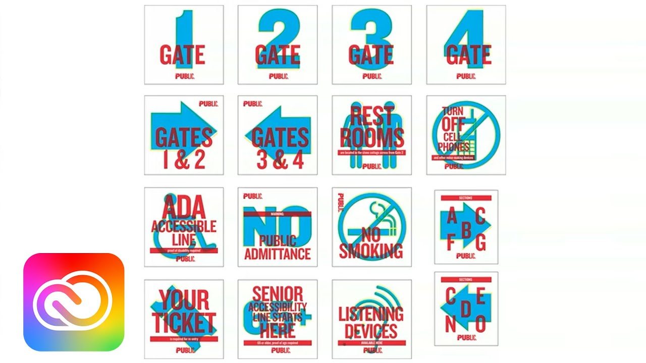
bunch of Publications a necktie I'm not sure but if you're a real fan why not and then this very popular t-shirt that says if you can read this you are mad it sort of what separates the real fan boys and fan girls from just the Casual visitors if they really are committed to this type face um this is a complicated issue how you get to where you need to be um we were asked by the Department of Transportation of the city of New York to do a city-wide pedestrian wayfinding program for them and uh that
meant that we had to provide instructions for anyone in the city to get to where they needed to be and then to figure out where these signs would go figure out how what would be on the signs and obviously this involves mapping right so to make a master map and to come up with the graphic style for that map that would then become perhaps one day the default map for all of New York City um so here's New York City's confusing there's a good Old Time Square a little bit closer to the modern day this
program was called by the Department of Transportation walk NYC because it was supposed to encourage people to walk encourage them to walk because it's healthy because there's less cars on the road because then it even promotes economic development they might walk in a store discover something new Walking is good right um they were doing uh five little test areas um in New York City uh one in man two in Manhattan one in Queens and one in Brooklyn and then they were doing a bike share program it would go with too and so we did all
these interviews with people asked them how they got around New York saw a lot of terrifying things like this I don't know if anyone here knows New York at all but this person was asked to draw a map of New York and its surroundings Manhattan is a giant Island Brooklyn is a much smaller Island to the east of New York you know that's not true and then New Jersey is some landmass located to the east of Brooklyn and if you like in in like New Jersey is actually uh on the other side of Manhattan so
it's a little bit confusing so um we did all this kind of like stuff you do as designers and we're just doing one part of a much longer kind of series of steps you go through to find your way around a lot of those things depend on the graphic kind of information you're getting and there's like different kinds of graphic information you get telling your way in New York and we didn't want to invent a brand new one we wanted to build on something it was already there luckily my old Mentor M melli did the
signage for uh the New York City subway system Back in 1970 that system is the authoritative way of getting around New York helvetica a Swiss typ face unfortunately is the default typ face for New York city so we decided to use helvetica except change it to do one cute thing with it we renamed it helvetica dot and we changed all the dots over the eyes that are technically called titles by the way we change the dots over the eyes so they're round they're dots right get it do dot I don't know so I thought it
was funny uh so there's a version of helvetica that exists only for DOT a color scheme that's very muted except for some bright colors um and then we had to work out a whole icon system get ready nerds this is for you this moment so some of the icons are all good but we thought they all have to coexist in this tight space with this new tyght Bas so what we did was we went in and kind of fiddled with all the icons so for instance the skirt of the lady matches the leg of the
r the shoulder of the guy matches the part of the r that comes down the lady the the the thing in between is the thickness of the bar they are you know no you think anyone's going to get less lost in New York if we don't do stuff like this probably not but on the other hand it's going to be there a long time and do you really want to like walk up to it and say gee you know the that bus it doesn't look like the curve of the sea why not you know so
fix that for you world so you can see so we did all this stuff partly because it all coexist so closely did new icons like a Milt and Glazer omage I love New York shopping back um you know redrew the bikes so they look more like the bike rentals that we now have in the city then we had to kind of draw all the landmarks in New York too no computer system can do this how complicated do you make them we decided to use these straight on kind of profiles of things like the Empire State
Building against the city grid then we had to take things like this turn them into things like that so when they shrunk down they look more like that many many interns gave their lives in this process but it was good for him uh this me checking it out and so finally the system looked like this in drawings the uh we we the this is all organized by a great firm a wayf finding firm called City ID they worked with us to do the graphics Billings Jackson did the product design and they based it on modernist
New York buildings snaap together in this modular system built off site installed in the dead of night and now if you're in Chinatown if you're in Midtown if you're in Brooklyn or queens or if you're renting City bikes around the city you'll encounter our map in these signs so it's actually quite nice I have a really cheerful little moment of uh sh Shen Freud for you coming up uh they actually work too people can you see people looking at them all the time and getting less lost so right now New York looks like this thank
you Cape Town [Music] yeah I had a challenge to design um two dozen logos at once and um this is how we did it the client was the um MIT media lab we've had many speakers from the MIT media lab on this stage a fantastic Place filled with brilliant scientists the lab actually houses two dozen different research groups each one of which is led by at least one sometimes two sometimes three Geniuses and each one is further kind of attended to by dozens of geniuses is probably the most startling array of brain power in one
place anywhere in America for sure I would say um they have this fantastic graphic Heritage at MIT let by two women actually from the all the way back into the 60s Jacqueline Casey who you see there on the left who like masimo Vell as much as masimo Vell invent introduced helvetic God to the United States I would say and then the Visionary Muriel Cooper who was a co-founder of the media lab really a Visionary in terms of the display of information Graphics overall and she uh this is Jackie's work Jackie Hay's work Muriel Cooper did
this amazing logo back in the early 60s for uh MIT press so you can see it right Mi t then press with the thing down right it's there this logo probably was one of those ones where someone said huh at the beginning now it's been around since 1962 and it's beloved and the MIT media lab people say we want a logo that'll last this long it needs to be simple it needs to be clear but it's somehow needs to be surprising too because we're the media lab we're not conventional publishing like MIT press so we
said okay we're just going to take ML and put it next to the words figure out some way to do that so we came up with this modular system based on I like modular Square systems I apologize for that this is based not on 64 squares but on 49 I think 7 by S and so you take take those 49 squares you trace an M that way and you do an L that way then you put media lab next to it and that becomes This Modern acronym monogram for media lab right now remember I told
you though that this isn't really the problem everyone there works for the media lab but what they really are really passionately connected to is this world of these smaller research groups that are really small tight SWAT teams of people exploring all these different things things that range from Effective computing to viral Communications object-based media mediated man so we use that same 49 Square system to generate almost an infinite number of letter combinations that any of these uh people any of the scientists there can pick their own or even make their own if they want to
use the system so it all goes together something like this [Music] hey hey hey hey [Music] [Music] [Applause] [Music] heyy so this was an assignment I got that I thought was just to do a logo and ended up kind of accidentally teaching me something bigger um it was a project that I've uh I've actually worked on and off with this group now for 15 years called the Robin Hood Foundation they had come up with this great idea they were going to really badly resource poor New York schools public schools in bad neighborhoods in New York
and poor underresourced neighborhoods in New York and they were going to sort of try to fix these schools the physical housing of the schools however even though um a school is expensive to kind of remodel but a library in the school and every one of these schools had a library occupies 5% of the space but affects 100% of the students because all all the students one time or another come to the library so they called in a bunch of young Architects a dozen young Architects they got donations from every publisher donations from corporations and started
this big effort they asked us whether we would be the Graphic Design Consultants so I thought you want me to do a logo for this I know how to do that I sort of demonstrated my ability to do logos earlier right even if I don't get them right the first time so I said okay big breakthrough idea Library too boring a name we're going to call this the reading room and you're allowed to talk because that's an old idea shushing libraries I gave him three ideas or you could call it owl owl and Owl we
had owls at the very beginning of the day right owls but I didn't then I had to make up something that it stood for a three-letter ACC so I said it's like one world library or our wonderful I didn't really care what it stood for I just like that I and then I said um or or I said you could just call it the Red Zone get it because it's like red I read this book Red Zone I read this book so first they said you know librarians don't like it when you spell red that
way you know then they said um um also um the you're trying to blow these kids away that the the their idea of a library you know is going to be blown away this isn't like the library they used to these kids have don't know what a library is this is what libraries are to them they sort of like just these rooms with stuff laying all over the place books you know just a handful of book shoveled on in a barely broken shelf and so why not just kind of call it a library and I
was like so the logo is just simply that word with that thing after it except we moved it inside and made it red dada okay then the Architects had a good time with it and they put it on things look um Henry meberg made that a a window in the door see up and down the exclamation mark and the big bold Library over it so I think the kids actually knew this this was a library at least maybe with the surprise inside then one of the archists we were working with said look I got a
problem I'm not being sure this is your scope of work we do this off for free so in theory nothing everything was in our scope of work nothing our scope of work so but he said my library has really high ceilings and most of them did by the way but the kids can only reach so high see how tall that kid is so there's this big space between the top shelf and the ceiling can can can you like do like something to go there and I said like a mural I'm not like a muralist I'm
I'm you know I'm I'm here to do logos you know but uh he said well I mean think about it so I came up with an idea my lovely wife Dorothy um was uh studying photography then in as she was doing in between her many careers and I said could you do what if we did some portrait photography what if we just took pictures of the kids in the school and kind of made them like a heroic freeze like the like the like the Ure on the Parthenon along the top of these shelves so that
these big kids would look down at the slightly smaller kids and they'd have this give and take between them so we did this in that one library and then all the Librarians is all they wanted they didn't understand what a logo was but they understood what a mural was so I want a Library like the one in East New York that's what they all said so then we went on this great program of commissioning murals to go in all these libraries and so um uh Lynn Paulie a great illustrator did painted portraits of the kids
uh Dorothy went back and did these high contrast pictures we did sort of an Andy Warhol is op art pop art kind of thing um Peter arle the Great uh illustrator interviewed the kids about books and reading and then put their words up on the thing all the way around um this is a uh a raphaela Square did a whole series of tiny Silhouettes that kind of burst all over the place based on things that are in the books labeled with their card catalog numbers uh Charles wilin uh did this great collage that starts on
the outside and kind of envelops the whole school again the subject matter of the books and we got fantastic people involved Kristoff Neiman a designed ala favorite did this amazing mural that kind of baked books into Moby Dick's mouth and the sale of a ship and Abraham Lincoln's beard there are there and look how beautiful these libraries are too they're just fantastic you know and filled with books and uh just amazing places uh Myra colan did this great installation of kind of strange objects all the way around kind of Daring people to figure out what
they were who am I leaving out um oh uh uh so there's Myra and uh Stephan sagmeister who's here last year at Inaba he did a mural with yuku yuku Yuko shimo that it was like a a um a manga style cartoon that says everyone who is um everyone who is boring is interesting or the other way around or something like that but it goes all the way around the library and it's again it's this heroic thing that just is there to excite kids so there it is this is us uh stepan and yukos and
so this is what I didn't know what happened I started doing these things and I somehow got on their mailing list and I get these little invitations in the mail and they'd say come to the opening of our library so I would I showed up to as many as I could and you'd be greeted by one of the students wearing a sash welcome and then there'd be a ceremony and the kids would write poems and they would talk about you know what the library meant to them and then um you know you'd see kids actually
enjoying the libraries and so I think sometimes you think you're doing it for yourself or you're doing it for your client you're doing it for your teacher or your boss but you really well I then I thought oh we're really doing it for the kids but I learned one last thing and this is how the world actually gets changed a little bit at a time if you ask me um we did a tour of the libraries and people and like at parties like this people say whatat did you do I'm like I'm the graphic I'm
the Consulting graphic designer of the entire program and they'd say um and what's that entail I said why you see that logo that says library and they said Library where it said Library you mean over the library door you did that wow uh and I said and and those murals they said oh you did the murals why I you didn't well I I helped I sort of like made a phone call and then you know sent the measurements of the size of the murals to the people doing the mural I did that that's important and
so but really being behind the scenes and orchestrating the whole thing is where the satisfaction came in but the real satisfaction came when we did a tour of all the libraries halfway through the thing I took I took some of the artists I'd work with the illustrators I work with the designers who work with me and we just kind of rented a van and went from one to the other saw as many as we could at the very end of the day we were in the last library of the day and uh we were there
closing time uh it was getting dark outside and the librarian said um well it's time to go I have to shut this off I you know it's time to clothes and so I said I'll show you how I turn out the lights and so okay and so she she goes to the door as with her keys in hand as we're all leaving and says I turn them out like this and she turned out these switches in order then the last one she turned out was the light that is the light that goes up on the
kids and and she said I do that one last because I like to remind myself why I come to work every day and then I realized you know that guy asked me come up with the mural and it just so happens where lights on it we had given that woman a ritual she could do every day that kind of actually made her job better each one of those kids who knows maybe they had an epiphany like me they looked up at one of these pictures and had a little Clark Forklift truck moment good for them
that librarian at this point now has influenced probably 1,500 kids who have passed through her care and if she just has helped a little bit more to think about a little bit more you know somehow one of those kids maybe one day God willing if they hit the jackpot they'll be up on stage here pucha presenting to you in the future and I hope to gosh that's true so thank you [Music]
![CreativeMornings/New York: Michael Bierut on Endurance [Livestream]](https://img.youtube.com/vi/APyckCD5E-M/maxresdefault.jpg)