[Music] thank you greetings everyone and welcome to my channel in this video we will be discussing one of the most popular tools used by bioinformaticians in differential expression analysis d62 d62 is a bioinformatics tool that enables identification of differential expressed genes in rna-seq experiments however not all genes are suppressed equally and some genes are differentially expressed in different experimental conditions dc2 allows researchers to identify these genes and determine if they are up or down regulated it is based on a statistical model that takes into account the variability in sequencing coverage between samples the d62 package is available on R software which is a popular programming language for statistical Computing and graphics firstly we upload the following libraries which are dc2 ggplot2 Peak map and enhanced volcano by using the package version function we can get the version of the dk62 in our case it's 1. 36. 0 and then we upload the account data file with read.
csv function as here we can see in the data frame we have seven columns starting by the gene IDE and then three replicates for the control group and three replicates for the treatment group and then we get the number of Gene IDs inside the data with enroll function in our case we have 27 179 Gene IDs after that we check if we have a duplicated Gene IDs inside the Matrix we use sum to add or to make addition of the number of duplicated genes inside the count file but we got zero also after that we're trying to get the nice positions inside the data by using which is and then we put the name of the count data file we have zero Nas inside the data to perform dc2 analysis A mapping of The Columns of the count data to a corresponding group or condition is needed d62 uses a data frame where there are no names of the data frame need to be the column names of the count data The Columns of the new data frame provide the mapping of the samples to a specific group the first step is to create the data frame of the genoties so in our case in order to extract judging names or the gene IDs we write the name of the our data or the name of the data frame and dollar sign and then the gene IDs or the name of the column that we want to extract and here we have the name of the gene IDs the second step is to create the count data then the First Column that we want to extract which is a second column in the data frame told the seven column or the last column as here we can see that we want to extract the second column which is the first of the control replicate until the last column which is a seven column in our data the third step to convert account data into matrix by using as dot matrix function as here we can see we check the class of the count data file before the conversion into matrix by clause function it was a data frame but after that by using the s dot matrix function we convert it to Matrix array put the diagram the provided R code is used to create a data frame called call data contains the information about the experimental conditions associated with the samples used in differential expression analysis let's break down each part of that code data. frame this function is used to create a new data frame condition equal to as detector C rep control 3 red treatment 3 this part creates a column named condition in the data frame the as dot factorial function is used to convert the function values into a vector variable which is a categorical variable type in or in this case the condition values are generated using the rip function which repeats the strings control and treatment three times each creating a vector of 6 elements row dot names called names count data file this port sets is our own names of the call data data frame to be the same as the column names of the count data file object the call names function retrieves of column names from the count data file object overall this could create a data frame called Data with a single column named condition which repeats the experimental conditions associated with the samples the condition column contains Factor levels control and treatment repeated three times each corresponding to the samples used in the differential expression analysis the raw names also called Data data frame are set to the column names of the count data file object this called Data data frame is typically used as a sample metadata on performance differential expression analysis to associate the samples with their respective conditions after that we go for pre-filtration why prefer traditional count genes prior to running dc2m functions is not required it is additionally beneficial for two reasons by the moving growth with very few reads we reduce the memory size of the DTs datao ship and speed up the transformation and testing functions in dc2 additionally sends features without any data for differential expression are not plotted it can improve visualizations in our analysis genes with a total count more or equal to 10 are kept for the differential expression analysis as here we can see cow data row sums and intercom data more than or equal to 10. there are sums command is a built-in R function used to calculate the sum of rows of a matrix or an array for this line creates a D6 data set object named DTS from the row count data and the sample information called Data the count data argument represents the Matrix of row reads counts or the rows correspond to genes and column correspond to samples the call data argument represents the sample metadata including the experimental conditions design formula conditions specifies the experimental design with condition being the variable representing the experimental conditions foreign this line simply prints the DDS object displaying its content and some of the information as we can see it performs the differential expression analysis using d62 method on the DDS option the d62 function estimates size factors and dispersions based on the provided count data and applies a negative binomial generalized linear model to identify differential expressed genes the updated edds object contains the results of the analysis in order to save the normalized three counts we use the counts function and then we put the DDS data a normalized equal true and then with the right to CSV function and the name of the normalized counts and then the normalized counts dot CSV file foreign then we use results function for the DDS data this line extracts the results of the differential expression analysis from the DDS option the results function is used to calculate the log to fault changes p-values and adjusted P values using the linear Mini Cooper method for each G the contrast argument specifies a comparison of interest in this case comparing the treatment condition to the control condition based on the condition variable the alpha argument sets the significance threshold to 0.
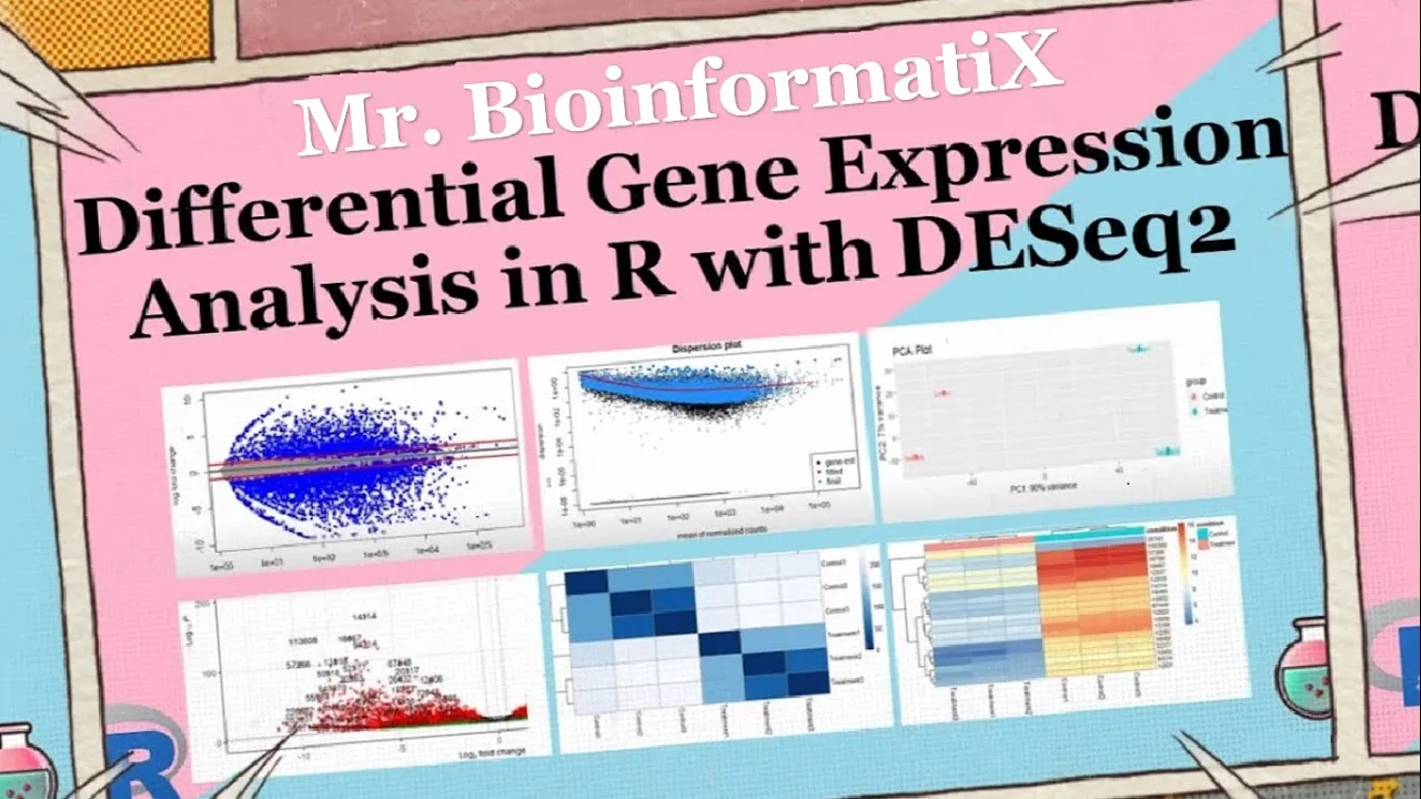
05 controlling for false Discovery rate the resulting object rest contains a differentially expressed genes along with their corresponding statistical measures which can further explode and analyzed then we use a summary function the summary function is to get the number of up and down regulated genes 21 of the gene IDs were upregulated whereas 24 of the g9ts were down regulated blocky May visualizes and identifies gene expression changes from two different conditions in our case it's frequent versus control in terms of log fault change M on y-axis plot in E visualizes and identifies genetic suppression changes from two different conditions treatment versus Concourse in terms of fault change on y-axis and log of the mean of normalized expression counts on x-axis here by using plot m a function we can plot the n a graph generally genes with lower mean expression values will have highly variable log fault change the blue dots are representing the differential expressed genes and they have adjusted p-values of less than 0. 05 the triangles in the edges or the plot are genes with higher fault changes as the direction of the triangle are the direction of the fault change for example this Gene was upregulated whereas these genes were down regulated genes on the right part of the plot here means that these genes have high mean of normalized counts and height all changes which are very interesting to look into shrinkage of effect size is useful for visualization and ranking of genes it's more useful visualizer it may plot for the shrunken lock to fall changes which remove the noise associated with lock to fault changes from low count genes without requiring arbitrary filtering thresholds here by using LFC shrink and then we put DDS condition treatment versus control and then plot m a res LFC plotting me function foreign we perform the dispersion plot this person is a measure of spread or variability inside the data variance a standard deviation interquartile range among other measures can all be used to measure dispersion however dc2 uses a specific measure of dispersion related to the mean and variance of the data when for example we have 0. 01 dispersion in our data it means that there is 10 percent variation around the mean expected across the biological duplicates dc2 dispersion estimates are inversely related to the mean and directly related to the variance based on this relationship this person is higher for a small mean counts and lower for large name counts description estimates for genes with the same mean will differ only based on their variance therefore the expression estimates reflect with the variance in gene expression for a given mean value we have three steps for estimating dispersions the first is f is get this person estimates for each engine by maximum likelihood estimation second step is a fit a curve to a gene wise dispersion estimates this curve represents the expected values of a dispersion gives us expression values of the genes velocity shrink Gene wise dispersion estimates are shrunken towards the curve to get the fireman dispersion estimates some genes will not be shrunken towards the curve because the variability or dispersion is so high so dc2 will assume that these genes will not follow the modeling assumptions to avoid the false positive that may happen because not fit for the model and by using plot this P estimate we can get this person plot which is dispersion on the y-axis and mean of normalized counts on the x-axis okay then principal component analysis plot PCA the PCA describes the variance in the data as it shows if the samples are connected to each other or not pca1 is the most variation in the data the gene expression across the six samples and BCE 2 is the second most variation in the data before performing the PCA plot we have to make the log tool transformation of the normalized three counts in order to improve the clustering for the visualization as from the chart we can see that three samples are on the left side of the graph and the other three samples on the right part of the graph to understand what their clusters mean let's know how big is the variation in the data pca1 represents four when using these unsupervised clustering methods lob2 transformation of the normalized counts improves the distances clustering for visualization e62 uses a regularized log transform of the normalized accounts for sample level quality control as it moderates the variance across the mean improving the clustering blind equal to false should be used for transforming data for Downstream analysis where the full use of the design information should be made blind false words K pre-estimation of this person Trend if this has already been calculated if many of the genes have large differences in counts due to the experimental design it is important to set blindfolds for Downstream analysis when blind faults the experimental design is only used by the r log transformations in calculating that in Wise dispersion estimates in order to fit a trend line through the dispersions over the mean only the trend line is used by the Transformations not the gene wise estimates this could creates a volcano block for visualizing the results of the differential expression analysis press which typically contains information such as locked of all changes B values and The Trusted P values for each gene lab equal ronin's risk or resolves this specifies the role names of the results object should be used as labels for the data points in the volcano plot x equal look to fall change this indicates the lock of all change values from the results object should be plotted on the x-axis whereas y equal P value indicates that the P values from the results object should be plotted on the y-axis of the plot title treatment versus control this is the title of the plot p cut off this specifies the significance cutoff for the p-values FC cutoff equal to 0.
5 this sets the full change cutoff for lock to fold changes and point size equals 3 uses sets the size of the decal points in the plot lap size equal to 6 this sets the size of the labels for the data points in the plot now let's perform the part as here we can see these genes were upregulated while these genes were down liberated after that we go for data quality assessment by sample clustering and visualization on heat maps by the following codes foreign this code performs hierarchical clustering and generated map to visualize the distances between samples based on the routine expression profiles let's break down the code sample tests equal to Desta RND this line calculates the pairwise distances between samples based on the regime expression provides the save function extracts the gene expression values from the rld object which is likely a transformed version of zero gene expression data the T function transposes the gene expression Matrix so that samples are represented in columns the test functions in calculate the distances between the samples Library are color Brewer this line loads the r color Brewer package which provides color palettes for virtualizations sample this Matrix equal to as dot matrix sample this this line converts a sample disk object which represents supervised distances between samples into a matrix format using the S toot Matrix function the resulting Matrix is stored in sample test Matrix variable regarding call names sample disk metrics this line retrieves the column name so the sample list Matrix which respond to the sample labels it simply prints the names of the columns colors equal to color random palette refbrewer dot pal nine blue is 255. this line generates a color palette for the heat map it uses the blues color palette from the r color Brewer package which consists of nine shades of blue in this case it creates a gradient of 255 colors P hitmap simple dist Matrix clustering distance rows equal sample disks clustering distance calls sample test color call equal colors this line generates eight map using the P hit map function from the P hit map package the sample disk Matrix is passed as the input data for the app the clustering distant rows and rusting distance calls arguments specifies the distance is used for chironical clustering of the rows and columns respectively in this case sample distant object representing the pairwise distances between samples is used for both row and column clustering the call argument specifies the colors to be used in the heat map which were previously defined in the colors variable overall this code performs hierarchical clustering based on Sample distances and generates a man visualizing the distances between samples the resulting heat map provide insights into similarity and this similarity of genetic suppression patterns among samples as we can see from the graph the color represents the distance between the samples treatment samples look different from the control samples the dark blue diagonal line here represents the high similarity between samples because it's the intersection of the samples with themselves for example treatment 2 with treatment 2 or treatment 1 here with treatment 1.