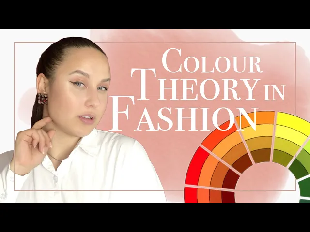
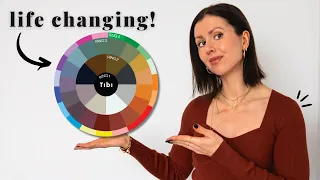
hello and welcome to design my name is Maria and today we're going to be talking about the theory of color in fashion and outfits and yeah let's get started if you don't know which colors go well with your skin tone then I'm gonna go ahead and check out this video on how to figure out if you're a cooler a warmer or a neutral skin toned person and then you can continue watching this video you know so you can pay attention to the things that matter for you and oh let's get started so colors are quite
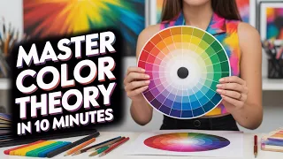
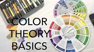
difficult if you don't know anything about them honestly being an artist helps but let's just get into it and we cannot go anywhere without mentioning the circle of color color circle color of colored circles okay know that thing so why is it important it's kind of a cheat sheet for you honestly the colors are not just thrown randomly there is actually a thought behind it and we can figure out the matching of colors through here let's start with the primary colors so the primary colors are you blue red and yellow so these colors are like
they cannot be make like they exist they're the primary colors they cannot be made out of different colors so here they are now if we mix yellow and blue then we'll get green and foamy mix blue and red will get purple and if we mix yellow and red we'll get orange these are the secondary colors tertiary colors are the ones that are kind of fit in between of those everything else now let's talk about the warmer and the cooler side of the circle color circle yes so the warmer colors will be the yellows the oranges
the Reds maybe some of the green and the cooler tones would be at the Purple's the Blues and kind of like the greenish blues so it depending on your color tone then you can figure out which colors work best for your skin tone all right now every color every like really bright color right here it's called a hue if we kind of dilute it with white it is called a tint if we mix it instead of white with black making it darker it's a shade if we kind of diluted with a gray making it more
neutral it would be a tone okay now that we've got all of that out of the way let's talk about what colors like go together with what so an opposite sides of the circle we see complementary colors why are they called complementary colors is because when they're put together the eye they kind of highlight each other so they're really really bright pairing so for instance the idea of green and red are actually complementary colors so that's why we have the Christmas it's green and red and it's super bright yeah yellow and purple are really kind
of toxic mix as well as well as the blue and yellowish orangish color so now that we figure out like what like either we want to follow those just because they're super bright or we want to stay away from them because it is your choice right if you don't want to be super afraid and out there then you know yeah don't do it and of course you don't have to wear like huge amounts of those colors together if they're complementary you can wear like for instance a red pent you can wear a white shirt with
a green necklace the fact that they're not together is going to kind of pull them apart and they're not going to stand as much also you can maybe the shirt would be with little polka dots of green so that's not going to be super intense on the eyes so the the amount of the of the color can also vary stay in like a one-color category so for instance if you choose red just choosing the two colors that's closest to it would suffice it's gonna be a really nice and simple vision and it's not gonna be
like too complicated for the eye sure excuse me [Music] so the next kind of a thing a color combination called the Triad is the three like evenly spaced out colors on the color wheel this is can also be a really bright combination and maybe a you could choose to only you pick where the two and not the third just to tone it down a little bit if you thinking of wearing super bright then go ahead it's you know it's it's not on my business if you guys are enjoying this content so far please consider subscribing
and liking this video thank you [Music] so split complementary colors is when you choose one color on one side of the wheel go to the its complementary color don't choose it but choose the ones that are closest to it so these this is a little bit lesser of a like extreme combination of the complementary colors but it is still quite bright so if you were thinking of dialing it down maybe trying to use the tint or the shade of that of those colors together so if you are not feeling like dressing up super bright and
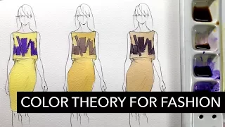
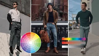
out there then you can always tone the colors down with neutrals like the Browns and nudes complementary colors when they are mixed they create a brown color [Music] there's different ways of dressing with color you can go monochromatic which is basically one color in different it can be a one color throughout or it can be one color in different kind of Oh like a tint of that color a shade of that color or hue of that color so it's one color but a different strength of that color if you know what I mean I'll have
some examples here so you'll totally know what I mean okay so next one would be a kind of matching colors by the one of the thing that I was talking to you about by the circle if you want to wear the complementary colors but you don't want to stand out as much you can always dilute one of the colors or both of the colors and make them either a shade or a tenth of that hue that we're talking about [Music] in the worst case scenario you can always rely on prints on your garments so for
instance if you already have a print and it has different colors then you know for sure that these colors work together so you can just pull one of those out and get more pieces of that color into your outfit that way it's going to be like a one continuous cohesive outfit you could also dilute that color and make it a lighter one or maybe make it more neutral by adding you know grey to it or maybe having it Dart like just darker yeah yeah some of the prints may include of those complementary colors the ones
that I'm just telling you kind of like if that they may be too much but they are used in different proportion which is really important to see and figure out because if there were used together in the same amount then it would be too much but if it's just for instance a blue background and it has some I don't know purple flowers and those purple flowers have little tents of that orange a yellow color that the complementary to blue it's not gonna stick out as much as you know if it were those yellow orange flowers
on the blue background if you guys are really scared about starting to wear a print or maybe you just want some more inspiration about how to do it here is a video about how to start wearing print and how to just continue to doing it [Music] okay another way of wearing colors depending on like your style and how right you like the colors or her said how subtly want them to be so wearing different colors in the same intensity so for instance wearing pastels all together pastels are the tenth of the hues that you're wearing
or maybe wearing just really bright hues altogether or maybe wearing a jewel tone so jewel tones are usually a little bit deeper they have a little bit more black into in it so it's more of a shade of the hue all right you guys I hope this was useful I hope you learned something new today and I hope you have greeting stay classy bye you