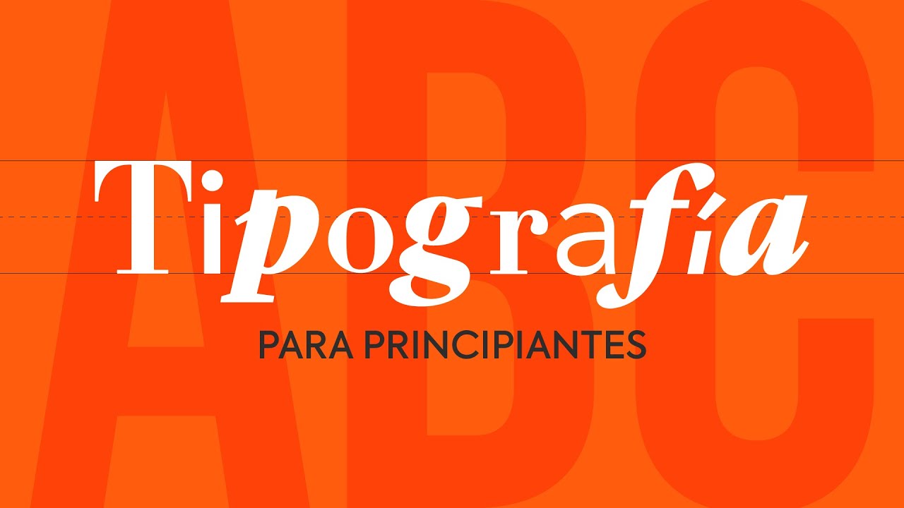
Today I'm going to give you some typographic advice. And I'll share my top 10 fonts you must have if you want to be a good graphic designer. Hello, krakens, and welcome to a new video by Marco Creativo.
Today, as a teacher, I'll give you some advice, those impulsive ones that I can't hold back. Now, you already know this, but if you don't, I'll repeat it. The typographic part of a graphic project is extremely important for its outcome.
Those of us in graphic design don't like to gamble with fonts that might cause problems, that's why we always look for fonts that are well-crafted and give us the assurance that the result will be professional. So, we can't risk using poorly made fonts or weird things downloaded from dubious websites. But I won't name them because then I get criticized, but it starts with D and.
. . ends with T.
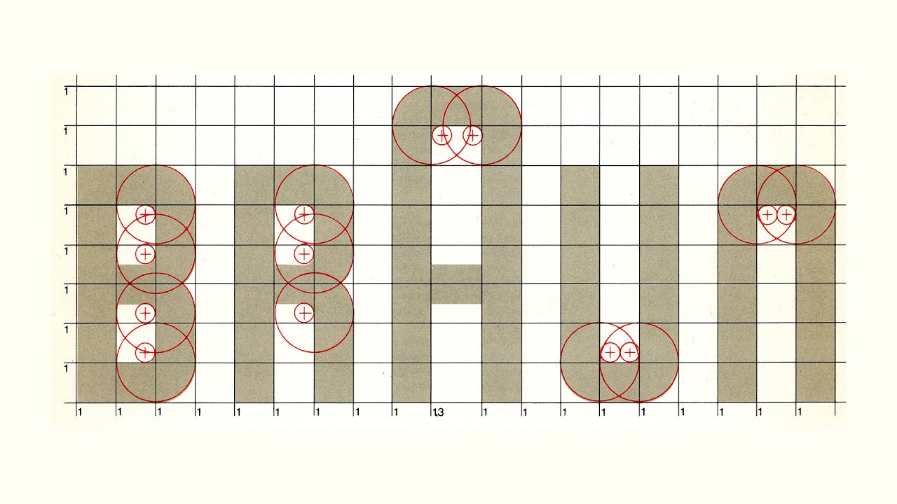
I explained in one of my videos about the creative process for designing brands, which I'll link here, how you can analyze fonts. How you can detect those qualities and values that typographic forms communicate. On the other hand, there's intuition, the one we gain with experience, which ultimately tells you which font fits best for each type of project.
That's something you'll enhance over time. Now, what should we consider when choosing a font for a project? First, each font has a voice tone.
This is something I've discussed in other videos and I'd like you to put into practice. Ask yourselves what the voice tone of a specific font is. Think of each font as a way of speaking, a way of communicating, and we must abstract ourselves from what it says and focus on how it says it.
When you face a font, ask it questions. No joke, seriously, ask questions. Ask it things like.
. . Are you elegant?
Are you youthful? Are you a bold font? If you were a product, would you be expensive or cheap?
Are you feminine? Are you masculine? Are you unisex?
Are you strong or fragile? And so you could go on throughout the video. The goal is to identify the voice tone and personality of the typographic variant we are analyzing.
For example, a helvetica light italic will not convey the same values. . .
as a helvetica extra black. So, when choosing a font to analyze, also choose a variant. Pay attention to this, just like when we analyzed color.
Many values are subjective, based on our culture and personal experience, but don't worry, because you will always extract values and aesthetic and functional aspects of the font itself. Second, make sure the font is legible. If you want to write a headline or a text, that is, if you want to communicate something, the first step is that it must be readable.
If it's not readable, the message is worthless. For it to be readable, you need to consider both the selected font and the composition and generated contrast. But it's true that there are projects where legibility is secondary and design, aesthetics, or attention-grabbing are more important.
But generally, reading, legibility, will be a very important factor to consider. Third, with "Serif" or "Sans Serif"? Well, this is more a stylistic question for each project and will depend a bit on the tone we want to communicate.
Serif fonts tend to be more classic, elegant, or academic, while sans-serif fonts, are usually considered more modern, minimalist, and technological. Be careful, this can change over time. Besides, each project is different and each font is a world, so always analyze each situation and be consistent.
Fourth, consider the context and the audience for which the message is intended. Designing for a young, teenage, adult, student, art collector audience, gym people, top athletes, gamers, kart drivers. .
. Sorry, I'm getting carried away. So, the audience and the context in which the message will be presented, affects how it should be resolved.
So always keep in mind the context and the audience you are communicating to. Five, dare to combine fonts. Typographers tell us that with a single typeface, with various weights and some variants, it is more than enough to layout an entire magazine, and they are absolutely right.
But you can also experiment by combining pairs of typefaces. I advise two typefaces, and they should not be too similar, so that stylistic difference is noticeable, making the result more attractive. I leave you a link in the description where you can discover many typographic pairings, which also work very well.
Now, let's get to the point of this video. What 10 typefaces are essential in your type library if you want to be a graphic designer? And this is a personal selection I had to make because, of course, choosing 10 typefaces from all the ones I have was very difficult.
Plus, I'm sure if you ask me in a month, I'll tell you 10 others and if you ask me again in a year, I'll tell you 10 completely different ones. But anyway, this is my personal selection as of today and I'll be naming them in chronological order, that is, from oldest to most modern. So we start with "Bodoni," one of the most beautiful typefaces ever designed.
"Bodoni" was designed by the Italian Giambattista Bodoni in 1767, and inspired by his French rival Firmin Didot. And the truth is that both typefaces have great similarities and in this list, I could have included either, but I've finally chosen "Bodoni. " "Bodoni" is a typeface of great elegance with modern-cut "Serif" and high contrast, which, along with Didot, have been widely used in fashion environments and trend magazines, with an "italic" that I find gorgeous and with which you could write anything and it would look perfect.
Well, almost anything. The latest version of "Bodoni" we can find is "Bauer Bodoni", currently licensed by Linotype and created in 1926. "Futura.
" Who doesn't know "Futura"? This is one of those typefaces that couldn't be missing from this list. "Futura" was designed by Paul Renner in 1927, inspired by the rationalist foundations of the Bauhaus movement, and despite not belonging to this school, his inspiration made "Futura" the most important typographic development that emerged from this movement.
Inspired by pure geometric shapes like the circle, the triangle, or the square, it has become one of the quintessential geometric typefaces. In fact, the initial concept of "Futura" that Paul Renner wanted to develop was much more disruptive than the current one. But I imagine that after several changes, it reached a solution that allowed this typeface to be commercialized.
"Futura" has been the typeface used by directors like Wes Anderson or Stanley Kubrick for some posters and credits of their movies. It has also been used in logos like Supreme, Volkswagen, Nike, or FedEx, among others. It's a super typeface.
"Rockwell. " I wanted to include "Rockwell" in this list, even though it's not a very popular typeface, it's a "slab-serif" with a lot of personalities. "Rockwell" is an Egyptian-style typeface designed by Monotype and supervised by Frank Hinman Pierpont in 1934.
It's based on an earlier, more condensed version called "Litho Antique. " This typeface is recognized for the curious "Serif" found on top of the capital A. With that American touch, it's a typeface that has been widely used in sports like rugby or baseball.
The most suitable use for this typeface would be for corporate identities or headlines, it also works very well for photo captions or very small texts, but I don't advise using it for standard reading paragraphs. I particularly love those very straight finishes of those "Serifs" and those well-constructed shapes, practically using the same line thickness in all its characters. And that structure is what makes "Rockwell" a "slab-serif," geometric, and very well-balanced typeface.
"Helvetica. " But Marco, "Helvetica"? Yes, we have to acknowledge that "Helvetica" has been one of the most used typefaces of all time, alongside "Comic Sans," but in a good way.
"Helvetica" is useful for designers of all kinds and always looks good. "Helvetica" was designed by Max Miedinger in 1957 and was a commission by Haas Foundry to modernize their "Haas Grotesk" typeface, inspired by the famous "Akzidenz Grotesk," created in Berlin in 1896 by the Berthold type foundry. Originally, this typeface was called "Neue Haas Grotesk," but it was in 1961, when the Haas Foundry was acquired by the Stempel Foundry, that's when they decided to rename it "Helvetica" to honor its Swiss origin, as it was originally referred to as "Helvetia.
" Well, this marketing move, along with the growth of the international typographic style, made "Helvetica" the most used typeface by the late 1960s. In fact, it has been used in many logos we all know today. But it doesn't stop there; in 1983, "Helvetica Neue" appeared, an expansion of the type family to include 51 different weights, a large type family.
Wait, in April last year, the "Helvetica Now" project was launched, a complete redesign of the entire type family with very interesting adjustments and the creation of three categories. The "micro" category for very small texts, the "text" category for normal textured paragraphs and the "display" category for large sizes. It's incredible.
This is the great story of "Helvetica," and that's why I wanted to include it in this top 10. "Frutiger. " Adrian Frutiger is one of the greatest typographers that have ever existed.
He has created typefaces like "Univers" or "Avenir," which are two superb typefaces that could have easily been on this list. But I chose to focus on "Frutiger," as this typeface was created in 1968, specifically for the signage system of the Charles de Gaulle Airport in Paris. "Frutiger" was designed primarily to be legible and recognizable from great distances and different angles, whether walking or driving.
In 1976, "Frutiger" decided to expand the type family and name it after himself for marketing purposes. But, is it a typeface that only works for signage and exhibitions? Well, no, it's a very versatile typeface and can be used for headlines as well as for text paragraphs and footnotes.
"Swift. " "Swift" was designed by Gerard Unger in 1989. A Dutch designer who created this typeface mainly so that newspapers of the time would have a more modern look.
It is a Roman typeface with a modern finish due to the use of those sharp and geometric "serifs," which are so distinctive, along with a large eye, making "Swift" a very versatile typeface, suitable for both headlines and text bodies. In fact, this newspaper example is laid out entirely in "Swift," and look at the interesting appearance it has. Also, "Swift" is currently having a resurgence because there's a trend to use retro typefaces, but with an avant-garde character, both for corporate identities and for magazines.
And "Swift" is ideal for this. "Gotham. " "Gotham" is one of those typefaces that always seem to tell the truth, making whatever is written with it appear sincere or at least fair.
It was designed by Tobias Frere-Jones in 2000 and inspired by thousands of signs photographed in New York City. It's a very symmetrical and sans-serif typeface, which became very popular when Barack Obama used this typeface in the campaign that led him to be President of the United States. And everyone remembers that "Yes, we can.
" "Gotham" has a style very similar to the original "Futura," but with details that make it different, purely American and special for headlines. And as a typeface, due to its consistency, it has also been used in many well-known logos. "FF Din" "FF Din" is a superfamily with 55 styles, of Dutch origin and designed by Albert Jean Paul between 1995 and 2000.
"FF Din" is a redesigned version of a German typeface especially thought for signage and industrial products, but it has some very interesting shapes, like the curve of the L or T, which give it a very special character, it is taller than wide, which gives it an advantage in its use for signs, as it allows us to place text better on vertical supports. Currently, it can be seen applied in many ways in headlines, brands, and of course, in signage. "Geomanist".
"Geomanist" is one of my favorite typefaces. Firstly, because it was developed by a Spanish studio named "ATipo". And secondly, because it has an exquisite finish and structure.
"Geomanist" is a typeface created in 2015 with a "Sans Serif" and contemporary cut, including nine weights. While the uppercase letters adhere to classic structures typical of purely geometric typefaces, it is in the lowercase letters where the warmth of humanist strokes is perceived. Hence its name, "Geomanist".
A feature to note is its slightly condensed construction, which is appreciated in geometric typefaces, as they tend to take up quite a bit of width, making them less practical in medium or long texts. "Geomanist" is very versatile. It works in headlines and text paragraphs, with versions for both paper and screen.
You can purchase it from the "ATipo" studio's website, and their payment system is "Pay What You Want", pay what you wish, and I assure you this typeface is very much worth it. And finally, "IBM Plex". "IBM Plex" is an open-source superfamily of fonts, designed and developed by Mike Abing of IBM in collaboration with Bold Monday, to reflect the spirit and principles of IBM.
IBM, with its new typeface "IBM Plex", saves a million dollars annually on typographic licensing fees, in this case, licenses for "Helvetica Neue", which was the typeface IBM used in all its communications. Until they decided to invest all that money in creating their own typographic system. And here comes the surprise, to liberate it.
"IBM Plex" was launched in 2018 and currently has four typographic variants: "Sans Serif", "Sans Serif Condensed", "Serif", and "Monospaced". Each with eight weights and their respective italics, making a total of 64 styles. Additionally, it is a typeface currently prepared for over 100 languages.
Very versatile and suitable for varied uses such as headlines, texts, signage, products. . .
Always with that technological and modern touch that connects with the brand's spirit. You can download it from both IBM's page and Google Fonts page. And that's my top 10 for today.
If you have a favorite typeface that isn't on this list and you'd like to share, leave in the comments what typeface it is and why it is so special to you. If you liked this video, give it a like, and if you are interested in design, subscribe to this channel. With that, I hope you are very happy.
See you in future videos. Goodbye. Bye.