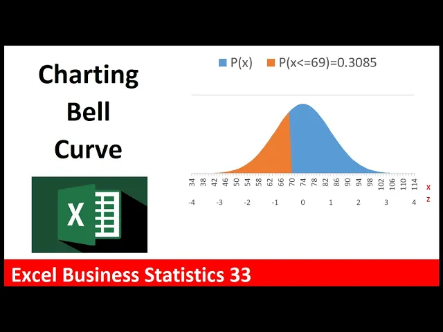
welcome to excel business statistics video number 33 and in this video we want to see how to chart the bell curve we want to be able to change the x value to 75 and instantly our chart updates [Music] now anytime you're creating an excel chart you actually have to create all the data and then make the chart so we're going to have to list a bunch of x's probabilities some z values and some probabilities that represent just this particular value now to get the x value well we're going to start at whatever x value is 4 standard deviations below the mean so down here i already have 4 standard deviation let's figure out that value we're going to take the mean minus there's the standard deviation times 4. when i hit enter so we want our x on our horizontal axis to start at 34. the upper value well there's the mean plus the standard deviation times four so 114 will be the last value on the horizontal axis now to create our x values we'll use the dynamic spilled array function sequence now how many rows do we need well we need 114 minus 34 but we want to include that lower value so we add 1 comma we don't need columns and the start will be 34.
so when i hit enter it spills from 34 control down arrow to 114 control up arrow now we can use our norm dot dist function that's for the x values for x i'm going to click on the top one and then use the spilled range operator pound that'll get everything that spills from that top cell comma there's the mean comma the standard deviation comma and we do not want to use true we're not doing cumulative this is where we use probability mass function as we saw last video we saw the big math formula so we're going to use false or 0 to determine the height of the normal bell curve so zero close parentheses and there are the probabilities very small and you can see as we get to the mean the mean value will be the highest point in the chart so keeps getting bigger that's the tallest and then these keep getting smaller now we'll come back and do these in just a moment but let's plot just the x and the probability highlight the labels ctrl shift down arrow ctrl backspace that jumps back to the active cell we have horizontal axis and we're going to use an area curve so insert over to charts area isn't up here so we click the chart dialog box launcher we want to go to all charts on the left we want to select area and this is very convenient we can hover and see it actually put the x values on the horizontal axis and plotted the area so that's the chart we want click ok now we're going to have to do a lot of different things to this chart right off the bat i'm going to select the chart title type in equal sign that shoots me up to the formula bar i've already created a meaningful chart title that tells us what the mean and standard deviation is for the test come up to the green plus let's add axis title so i'm going to check this i'm just going to type in the vertical axis label something like area equals probability and enter for this one i'm going to link it equal sign and there it is x equals test value i don't want the grid line so i'm going to select and delete i would like a legend so down here i'm going to check now i want to move this so i selected control 1. i'm going to try putting it at the top later we'll have another element in this legend that represents the area from negative infinity up to our x i'm going to move this and now let's create our z the z will be a secondary axis listed below the x equals open parenthesis i need all the x values so i click on the top cell and i'm going to type pound we're going to subtract from each x value the mean close parentheses and divide by the standard deviation and enter so sure enough that one's minus four control down arrow that 114 is four standard deviations above the mean control up arrow now i want a legend that explicitly lists probability less than or equal to 99 and then i want to show the probability which is right there i already did individual norm. dist so we're going to create a text formula equal sign and in double quotes i want p open parentheses x n double quotes so far all we have is text i join it to this comparative operator there's only two things in this formula if i control enter you can see the label so far f2 and i'm going to join it to the particular x value and then join that to some text so double quotes close parentheses equal sign that's all the text we want so n double quote if we look at it that's pretty cool so far but f2 let's join it too and watch what happens when i click on this very messy with lots of decimals number when i hit enter i get lots of messy decimals and i don't want that in the chart so f2 around b6 we'll just round it so we'll use the round function there's the number comma the number of digits we're going to round to is 4.
close parentheses and that is going to be a beautiful label and it will be dynamic if i type 75 that is a beautiful label ctrl z now to get everything less than 69 to show up as a color here in this column we have to show the probability when the x value is less than or equal to 69 otherwise we need to show nothing so we can use the if function now the logical test is we're going to have to look at each x value so i click on the top cell type the spilled range operator and i ask of each x are you less than or equal to 69 then we type a comma the value if true that means it's less than 69 we need to show the probability click in the top cell hashtag pound the spilled range operator that's what's going to go in the cell if it's true comma if it's false we have to show nothing and the syntax in a formula to show nothing is double quote double quote close parentheses and that's our formula when i hit enter and scroll down sure enough the probabilities only show up 69 and less above it's showing nothing now we have to add this column to our chart so right click select data in the select data source dialog box we want to add a series of numbers so i click add the series name that's going to be the beautiful label we just created now series values you have to be careful highlight this and then delete it delete it before you click in the top cell control shift down arrow and control backspace there we have the values click ok now we're going to have to come back and edit to show the z values later but for the time being we're going to click ok and there you go that's absolutely beautiful if we change this to 75 it's just like magic now control z we need to tell this section of the chart so i click on it and we need to tell it to go to the secondary axis now this doesn't open up automatically use control 1 then click secondary axis now it's a little off kilter and we don't need this so i'm going to select it and delete now we need to go back in right click to select data for the first set of probabilities that's the blue area all the probabilities we're going to show the x but to get the z on there we're going to select this one and change the x value edit and these will be z so click on the top cell control shift down arrow control backspace click ok when i click ok they don't show up but now i go up to the green plus axes arrow and there it is secondary horizontal now it shows up let's click escape it shows up in the top but we're going to select it and then access options we're going to go to labels and down to label position we're going to say hey i want to show it low and now we have the z values below the x values now if i click on x the increment of 4 is perfect because i can see the mean but if we click on z control 1 over in labels i want to specify the internal unit now here's the weird thing it's incrementing by 1 but it's based on this axis so it's listing all these z's based on all of these single digit increments what i really want is standard deviation so since the standard deviation is 10 when i type a 10 there we go this is incrementing based on units of 10. there's our x there's our z we can make it a little bit wider the last thing we need to do let's actually resize this is i want to label here to list x and z so insert shapes rectangle i'm going to click and draw and drag double click and let's type x enter z select it all and in the home ribbon tab i'm going to add red font now selecting the outside edge ctrl one no fill no line and that is looking good pointing to the outside edge there's my move cursor i can make sure it's in the right place and there's our beautiful chart i can come up and type 100 and just like that the orange fills it out and the probability is listed above if i change this to 54 i can see the probability of about 2. 28 and there's the orange probability 69 and enter now this chart is showing everything up to the 69 if we want to show everything above well you could create this whole thing over from scratch or we could use this as a template and change three things now i want to copy this sheet so we're going to learn a great trick let's click on the worksheet and drag up that little black downward pointing arrow means i'm going to drop it here but look at that piece of paper if you hold control a plus shows up on that piece of paper that means we're copying now to copy it you have control and the mouse pressed down you actually have to let go of the mouse but continue holding control then let go of control now i want to double click and rename this above chart without a space because i already have a sheet with a space and the first thing we have to change is this if function it's not less than or equal to it's greater than or equal to when we amend this formula and hit enter now everything below that hurdle is showing nothing the hurdle and above is showing the probability we can see in the chart the orange is on the upper end now that label which is this cell right here has the incorrect operator and the incorrect amount will change the operator to greater than or equal to and then we have to because this is showing everything up to the x f2 to get the upper end 100 minus whatever that is and enter same with this although we're not showing this anywhere and there it is there's a label there and there now when i change this hey i want to know what the probability of getting 80 or more when i hit enter there's our visualization actually it looks like our x change when we widen it so i'm going to select this control 1 labels and let's specify this as 4 and tab i think that means over here too click control 1 labels we want to specify 4.