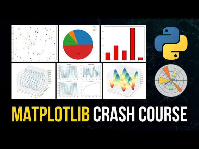
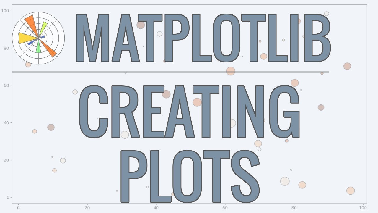
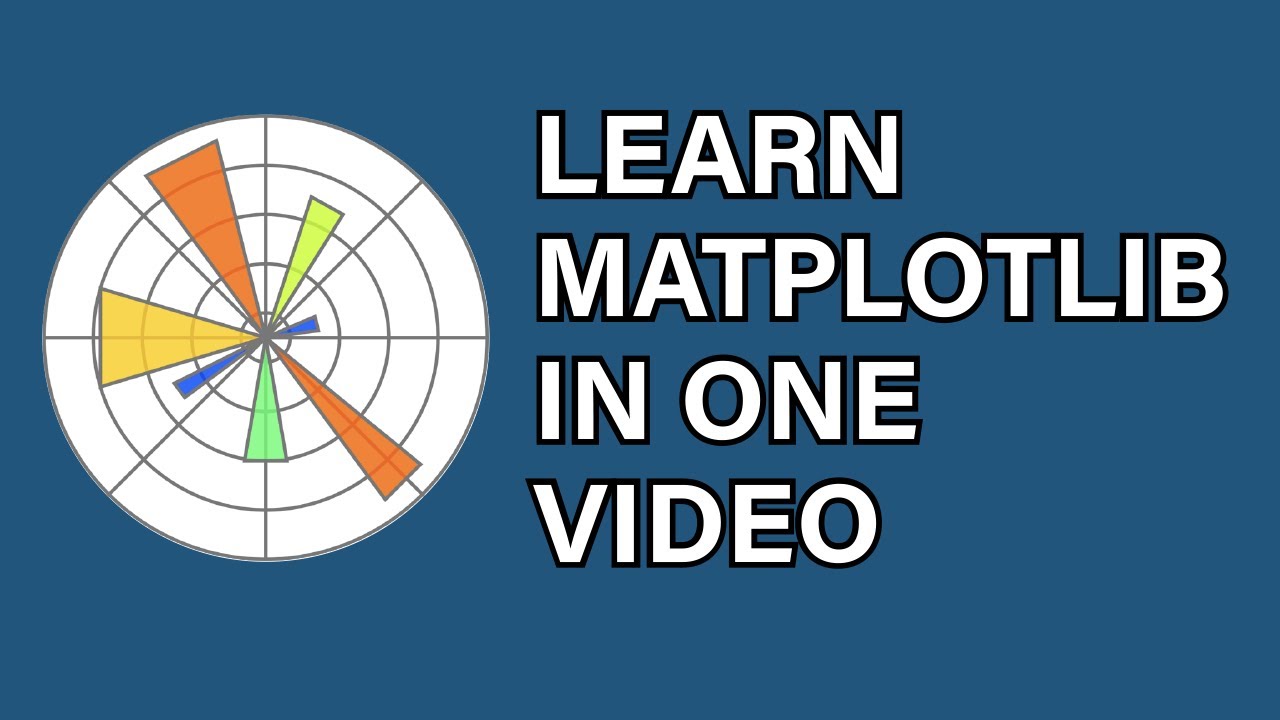
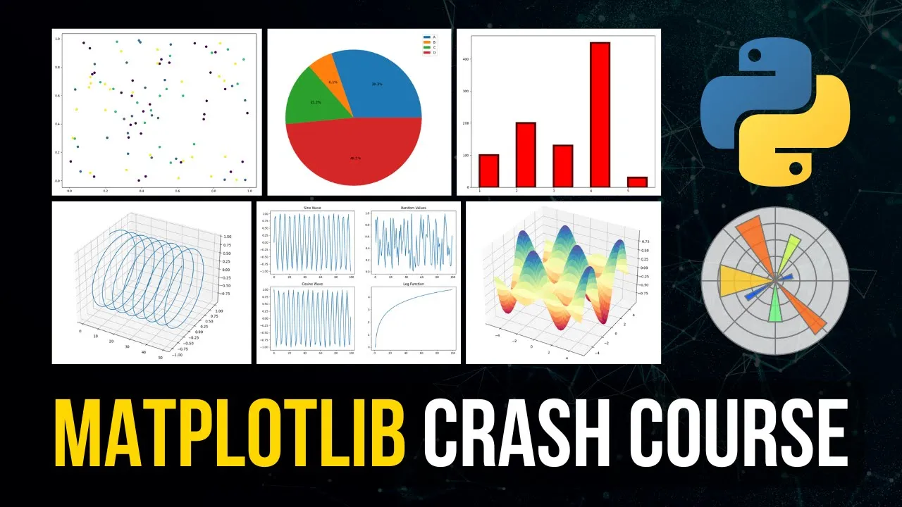
What is going on guys welcome back this video today is going to be a complete matte plot lip crash course from scratch matplotlip is a data visualization package for python it's to go to the most used data visualization package in Python and today we're going to cover the different plot types the different styling options uh how we can plot multiple plots at the same time with subplots with multiple figures we're Going to talk about animations we're going to talk about 3D plotting so this is going to be a comprehensive matplotlib crash course so let us
get right into it all right [Music] now before we get into the actual tutorial I would like to mention that this video is sponsored by formula Studio which is a GPT powered Google Sheets extension that can be very Interesting to a lot of you guys so don't skip this part now we can look at the functionality here in this example I'm going to open it up in a new tab here this is an animated image and we can see here one of the features is this editor on the right side which allows us to edit
these Google Sheets formulas in a way that we would also edit python code with syntax highlighting and with multiple lines and the second feature here is we can ask GPT to generate the Google Sheets formulas for us I have prepared a simple example here we have two columns first name and last name and then we also have an empty mail column and now we want to just take the first name the last name I want to concatenate them into an email which has the pattern first name dot last name at mail.com a very simple example
but it's going to show you how this tool works so I'm just going to open up the extension here formula Studio open editor And then we're going to go to the formula Ai and I'm going to I'm going to say from the two name columns take the first and last name and combine them to an email lowercase using this pattern and then I can provide a pattern first name dot last name at mail.com and I can just generate the formula here And this is going to give me something that I can just copy paste into
the mail column and if I'm not satisfied with the result of course I can change the query but in this case I'm going to just copy paste this here there you go and now I can just drag this down and you can see that this produced a result that I was expecting now as I mentioned this is a very simple and trivial example but you can do much more with this tool so make sure you Check it out at the link in the description down below alright so we're going to do a full crash course
on matplotlib in this video today and as I already mentioned matpatlib is the most used data visualization package in Python and it's super important for data science and machine learning processes because a lot of these steps in those processes involve data visualization or at least can benefit from data visualization so for example what you Usually do is you get data you explore data you pre-process data you train a model on the data and then you evaluate the model using test data and for example in the exploration part you usually don't want to just look as
text or at uh numbers at statistics that are not visualized but you usually want to look at histograms box plots or any other uh graphical representations of the data to get into intuitive understanding of the data and to see Certain patterns immediately that you would not see if you just look at a bunch of numbers and then you can also have some more advanced visualizations like correlation heat maps and of course when you evaluate a model you can have certain uh graphical representations of the results that are more intuitive especially when you have to present
it to a business person not to a technical person that might make a lot of sense and then you also have certain Situations like in k-means clustering to choose the optimal number of clusters you have certain plots that you can you can draw so that you can find the quote unquote optimal number of clusters so there are a lot of use cases in data science and machine learning where visualization can help you not only understand the results but also to to find better parameters for the training itself and to actually understand the data before you
build the model in an Intuitive way and Matlab is a very powerful tool that allows us to do that and today we're going to cover the different aspects of matplotlip we're going to start with some basic plot types then we're going to go into styling into plotting multiple plots into um into animations into 3D plotting and stuff like that so it's going to be uh very beginner friendly we're going to start from scratch and then we're going To go into some more advanced topics as we go on here everything in one video today so of
course the first thing that you need to have is you need to have matplotlip installed on your system and for that we're going to open up the command line and we're going to use pip in my case pip3 and we're going to install mat.lib now in this video today we're also going to use numpy now numpy is not necessarily a prerequisite for matplotlib you can use matplotlib with Ordinary python lists but in data science usually you have data sets that you process with pandas you have the visualizations that you do with matlablip and you have
numpy that you use for basically everything for for working efficiently with a race for taking data and feeding it into machine learning algorithms for transposing it for pre-processing in general for doing all sorts of things you use numpy so I also have a numpy crash course on my Channel if you want to check that out but for this video today we don't need some Advanced numpy we're just going to generate some data that we can then visualize using numpy but because of that we're going to also install numpy here so pip install matplotlib and numpy
and once you have that you can just go into a python into a python file and you can import numpy SNP and we can import matplotlib dot Pi plot splt this is the usual convention because most of the Stuff that we need is going to be provided by the pi plot module of matplotlib and because of that we import it specifically and we import it as PLT this is just an alias here which is used everywhere essentially so what we're going to need first is we're going to need some data that we can visualize as
I said you can use ordinary python lists as well but we're going to just use numpy to generate some random data so we're going to say here x Underscore data equals and then numpy random let me just lower my microphone a little bit so that I can see my keyboard to minimize the mistyping here so nprandom dot random we're going to have 50 values uh and we're going to multiply with 100 then we're going to get Y data here as well same principle and then we're going to use the first plot type that we're going
to learn about in this video today which is the scatter plot the scatter plot is Just a bunch of different data points plotted as dots as points so in order to create a scatter plot we just have to say plt.scatter and we pass the X data and the Y data and then every time you make a plot in Matlab you need to also show the result specifically unless of course you're working in some jupyter notebook environment then the plot is displayed automatically usually uh but if you are working in an application like this you Have
to say PLT show to actually show the graph to actually see the result and when you run this you can see this is the first plot of this video today so essentially we just have the individual data points in this case randomly generated points uh between 0 and 100 so that's the logic of these two lines we have random numbers and when you just use the random function of numpy you get values between 0 and 1 we get 50 values between 0 and 1 and we multiply all of Them by 100 to get data points
between 0 and 100. um and this is the result so a scatter plot is just taking individual data points and plotting them as points and of course when I run this again we will get different data every time because the points are randomly generated now for those of you who have no intuition of numpy we can print the X data and you can see those are just the X values those are just 50 values Between 0 and 100. nothing special about it and the Y data same thing so we just have a hundred values for
the x-axis 100 values for the y-axis and then the combination of these two values is a point so we have this x value this y value and this is the data point and thus we plot it we're going to get into styling later on I'm not going to discuss the different parameters that we have here like color Line width line type or in this case we don't have lines but you can have markers you can have sizes you can have colors but for now we're just going to cover um or actually we're going to do
it like that I'm going to show you the basic styling options for the individual functions but later on we're going to get into styling in general into more detail but of course if you want to have the Complete picture for every function that I show here today for every concept for every plot type there's a lot more than I can show in one video so if you want to have the complete parameters the complete descriptions all the different values that you can have it's always a good practice to go into the documentation and look up
the individual functions the individual parameters to individual examples because of course you have Um a lot of options here but we're going to say here now for example if I want to have a different color what I can do is I can say C equals and I can say red for example S as a word and now you can see I have red points instead of Blue Points here in the scatter plot but of course you don't have to provide color names you can also provide hex colors so I can say hashtag to specify a
hex color code and I can say for example zero zero zero Which would be black um or technically it's zero zero zero zero zero zero but you can abbreviate it or you can write it in a short form by just using three zeros and then you can also do for example green RGB means 0 255 0 would be 0 f 0 for green so you can specify colors like that as well and then what we can also do is we can provide a different marker we can say okay I don't want to have points I
want to have stars so I can provide this Asterisk symbol here and you can see now that the data points are stars and maybe you can see that better if I go for a blue color there you go so those are the individual data points now with a different marker and if you think that those are too small you can just go ahead and say s equals 150 I think this should be larger there you go uh but I deleted the marker so now we have points again Let's go for stars again there you go
um and of course I can also make them transparent so you can see that this might make sense if I have a thousand or actually this is number to change if I have a thousand data points instead of 50 you can see that a lot of them are overlapping and uh to see where I have more elements I can just go ahead and say Alpha equals 0.3 meaning there is some Transparency here and you can see if those Stars overlap we have darker zones here I mean actually now when I zoom in they don't overlap
but if we have some overlap you can see that we have darker areas and we have some more lighter areas if there is no overlap so yeah those are some basic interesting parameters for Scatter Plots you can adjust the color the size the marker and the transparency now sometimes you don't want to plot Um data points because you don't just have two attributes and you want to scatter the points you want to have actually some connections you want to plot a line because you have for example uh time series data you have certain years and
you have another attribute that you want to keep track of over time in this case it makes sense to not use a scatter plot but to use a line chart and for this an example would be to say I'm going to use an ordinary python list Here now let's say I have years and the years are let's say 2006 and I'm going to use a formula for this because I don't want to use uh I don't want to write out all these values here myself I can say plus x 4x in range 16 so I'm
going to half now 16 years so I'm going to print this so that you can see what this actually does it's like a 2006 7 8 9 10 and so on up until 2021 so I just generated some years here and I'm gonna do the same Thing with weights or actually the weights I'm going to put in myself and the idea is that I want to visualize the weight change of a person over all these years here and how can I do that I just have the years and I have some weight so I'm going
to use kilograms 80 83 84 85 86 then maybe 82 81 79 83 [Music] Uh now how many how many values do we need we need 16 so one two three four five six seven eight nine let's go with 80 10 so now we have 82 82 83 81 80. 79 I think this should be 16. um we can actually confirm that by saying length of years and length off weights but that is some typical data of course that you would want to plot as a line chart and Here what we can do is we
can just say plt.plot we don't need to say PLT line because the default plot function plots a line chart so PLT plot years and weight or weights and then PLT show again to actually display the chart and then you can see now we have a line chart so the points are interconnected and not just individual points now of course I can also plot this as a scatter plot this would still work of course but then you Get a different picture so I have the individual data points instead of a connection which doesn't make a lot
of sense here because we have progress over or change over multiple years and of course these points are connected they're not just individual data points here so it makes sense to use a line chart as you can see here um and of course here we have again different customization options so I can Say that I want to have a certain color again same thing I can say color equals red and I have a red line chart I can also by the way just say color equals R and if R is unique it's going to be
red so in this case r is red I think if I go with blue it's going to be blue if I go with or if I go with B it's going to be blue if I go with G it's going to be green yeah so you can do it like that as well and then we can do stuff like line width So I can say Okay I want to have a thicker line so LW is going to be equal to 3. and now you can see the line is thicker I can even make this more
extreme by setting this to 10 and you can see that we have a very thick line here and also I can change the line type so I can say for example I want to have a dashed line I want to say line Style is going to be equal to dash dash like This hyphen hyphen and this is going to produce a dashed line and of course in this case it doesn't look too good because we have such a thick line but yeah this is how you can also change the styling here uh by the way
this can also be done uh by just specifying a positional parameters so I can say years and weights and then I can pass a string here and I can say R dash dash to have a red dashed line so this also works I think though the line width needs to be passed separately so I would have to say LW and three there you go so this also works here now so now we have basically just scattering just plotting out different points connecting them on on a Time series for example and now we want to look
at categorical data so sometimes you might have a poll you might ask the people what is your favorite programming Language and then you want to visualize the results of that poll of that survey so for example you could have uh let's go ahead and say x equals and I'm going to say C plus plus C sharp python Java and go and then we have the Y data would be the votes so I could say we have 20 votes for C Plus plus we have 50 votes for C sharp we have 140 for python we have
one for Java and we have I don't know 45 for go and then I would like to have a bar chart uh showing this now I'm not sure if by default I'm going to try that now I think by default it should actually also work like that but the function we use here is plt.bar and we can pass this oh it actually works right out of the box I thought that maybe I have to pass first of all so numerical values and Then have to label them but it actually works if you have just uh
the text values right away so you can see here this is a simple bar chart I just have uh the Y values the X values and this makes sense of course for categorical data if I want to say okay how many people voted for python how many people voted for Java and so on um which is of course not to be confused with a histogram which we're going to talk about here next because the Histogram is a statistical plot that shows the frequency of the values on the x-axis and not just categorical um amounts here
so this is not a histogram even though a lot of times histograms and bar charts look quite similar one thing that you can remember in most histograms you're not going to have gaps in most bar charts you are going to have gaps um but yeah here of course we can also do some Some styling we can say okay uh color is going to be red I can say also the alignment you can say alignment equals etch uh what's the problem here oh actually here we need to say color not C and Alignment Edge essentially tells
us that the bar itself is going to start here at the specific point so here we have C plus plus here's the point and you can see the bar it is at the right Of C plus plus end this is true for all the languages here if I omit this parameter you can see that the line is actually in the center of the bar chart so we have the C plus plus Point here and the bar above it centered so this is something we can do a line equals Edge um then we can also say
the width of the bars shall be 0.5 for example and then you have some smaller thinner bars I can also say 0.1 And now you can see we have very slim bars then we can also say we want to have a different Edge color so let's say the edge color is going to be green and now you can see I don't know if you can see that in the video so well but you can see we have some green edges around the red bars now we should be able to see that better if I say
line Width equals six for example there you go now you can see we have green lines around the red bars so yeah you have a bunch of styling options here as well now let's move on to the histograms that we just mentioned for this we're going to just generate some data here using a normal distribution so I'm going to say ages for example equals numpy and random or actually not numpy sorry NP random and Then normal so a normal distribution with a mean of 20 years old and a standard deviation of 1.5 years and then
we want to have a thousand different ages generated so I can print that so that you can see what this looks like we have a bunch of Ages with a mean of 20 and with a standard deviation of 1.5 and now I can just go ahead and say plt.histogram on the ages so plot a histogram based on the edges and then PLT not show the result and now We have a histogram you can see the mean here at 20 and you can see that we have I think the smallest value is somewhere around yeah 16
15 something like that um and yeah so this the histogram of course here we can also change certain things we can say uh that [Music] um we can specify the bins so we can Customize the bins manually now I'm not sure if we can also provide a number here let me just look up the function because I know that in pandas we can set bin equal to a number and then we can get uh that many bins I'm going to actually try this to see if this works seems to actually also work here yeah so
we can do it like that we can specify a number of bins we can say 20 bins and then we have 20 different bins in the histogram but what we can also do Is we can specify specific bins as a collection here so I can say ages dot minimum up until 18 is going to be a bin um or actually from from zero up until ages Min is going to be a bin from Aegis Min up until 18 is going to be a bin from 18 up until 21 and then from 21 up until ages
dot Max up until the highest uh or actually this is already the minimum so we only have this to this to this to this that's the basic idea here and I think actually yeah this works as you can see here so you can either pass a number here or you can pass a collection of actual bins so either you want to force it to have 20 different bins or you just specify the 20 different bins yourself if you want to do that we can also change the values a little bit if I change the standard
deviation to 7.5 for example you can see that we now have values ranging uh actually we have values below Zero which is of course not what we want but this is what happens when you have a normal distribution with this standard deviation it will probably go if you generate the Thousand values below zero uh but yeah this is how we can plot histograms we can also plot a cumulative uh histograms so we can say actually here cumulative equals true to plot the cumulative distribution function so you can see it goes from 0 to 1000 basically
telling us how many uh people Are at this or at this age or below this H so the max age seems to be somewhere around 24 point something uh all all of those people 1 000 people because we have 1 000 data points here are below that H or equal to that H and you can see if we go to this age only all the people uh below 18 are or or how many do we have here it should be around 100 around 100 people are of H 18 or below that's how you read that
function All right so uh what else could we do we can also do a pie chart sometimes we have um independent plots so so sometimes we have independent categories so for example you're either that or something else you don't overlap necessarily and then it makes sense to show the ratio of the different uh people and to do that we can use a pie chart so so let's say this time we don't ask for just programming languages in general Which programming language do you use but we want to know okay which is the one programming language
which is your favorite so you can only have one if your favorite programming languages python it cannot be C plus plus at the same time so we can do that by saying again languages is going to be equal to python C plus plus Java C and go I think before we had C sharp so let's do consistency Sharp and then we have the votes again and we're gonna have 24 python or let's go with 54 python 24 for C plus plus 14 for Java 6 for C sharp and 17 for go and then we're going
to just say PLT pi I'm gonna have the votes and the labels for these votes are going to be the languages PLT show you'll see the result And now you can see we have a pie chart and you can see we have python is Blue C plus plus is orange green is Java red is C Sharp and purple is go and of course this chart makes sense if the communities are not overlapping so if the question is for example how many of you guys use Python how many of you guys use C plus plus a
person using python might also use C plus plus but if that is the case if that is our question here Um this plot doesn't make a lot of sense because it shows how many people use python versus C plus plus and not it shouldn't be overlapping when you use a pie chart in the optimal case now here we do have a lot of customization options so for example one thing that we can do is we can explode certain pieces so we can take certain pieces from the chart and we can pull them out of the
pie chart a little Bit to highlight them for example so we can say here explodes equals and then we can say for python maybe we want to pull it out a little bit 0.3 and the rest stays where it is so zero zero zero and then we can see here explode equals explodes and what this results in is that we pull python out a little bit or maybe we want to do that with C sharp because it's the smallest number so it would go to that position here and I would say 0.2 for Example and
now you can see it's dragged out of the out of the pie chart a little bit um other customization options of course you can also um write the percentage inside of the or outside of the pie chart by saying Auto percent equals and then you can specify a format for example percent to uh or percent point to F so two decimal places percent um So we have these two percentage signs and inside we have a floating Point number up until two decimal places percent I think that already is enough to show the percentages here as
you can see so 45.05 python for uh or five point four one percent for C sharp and then of course we can also specify the distance of the percentage so we can say percentage distance uh equals to 0.8 For example two not have it completely in the middle we can also increase that actually to I think 1.88 is too much maybe we should go with 1.2 uh maybe 1.3 yeah I mean it's it's fine so we have the percentages now distanced from the center uh and what we can also do is we can choose a
starting angle so when you look at this you can see that the histogram Or not the histogram sorry the pie chart starts here and then it goes full circle you can also start it at uh at 90 degrees so if you go this is zero 90 degrees is here so you can start it at the top and you do that by saying start angle equals 90. and then you can see it starts actually here and it seems to go actually backwards so it seems to go uh counterclockwise to the left but it starts at the
top here So those are some customization options for the pie chart now the last plot type that we're going to look at is the box plot so the box plot diagram basically a statistical plot showing you the different uh quartiles showing you the median showing you the maximum in the minimum and showing you outliers so for this what we're going to do is we're going to again do a normal distribution we're going to say this time we have Heights height is going to be NP random Dot normal and we're going to have a normal distribution
with 172 centimeters as the default eight centimeters as the standard deviation and we're going to generate 300 Heights so again this is what the numbers look like whether that's realistic or not it doesn't really matter but this is what the numbers look like um and what we're going to do now is we're going to plot a box plot by saying Box blonde Heights and then PLT show and you can see here now we have a box plot and how do you read a box plot you have the median here the second quartile you have the
third the first quartile and um basically you have the minimum value the maximum value and all these dots are outliers that's how you read it and within these boxes here so from here to here you have equally as many values as here the reason this box is wider is Because the values are uh farther apart so it goes from here to here and here's an extremer example so the values range from here to here but it's the same amount of values that we have as here it's just a deranges uh wider that's the basic idea
for box plot and this can also be useful to explore the data to see how is the distribution of a certain feature in the data science process Um so actually I'm going to copy paste an example that I have here on my second screen because I prepared some code here and I'm going to show you um that this is the case so I'm going to copy that real quick I'm gonna paste it here we have artificially created sections here for the box plot I'm going to copy or actually I'm going to write this myself data
equals NP concatenate We're going to just concatenate these numpy arrays here first second third and fourth and this needs to be put into brackets all of this then we're going to just say PLT box plot data PLT show and you can see now that we have a pretty extreme box plot meaning that we have a very wide range of values in here this is I think uh the second one so you Can see in the first one we have values from 0 to 10 in the third one we have 200 to 210 and here we
have 210 to 200 230 but here we have from 10 to 200 which is a wide range but you can see that all of these have 25 values and this is why we have uh where is it the box plot that we have here because the amount of values we have from here to here is the same amount of values that we have from here to here um but the range here is much wider so Yeah this is the effect that such numbers produce in the box plot all right so those are some basic plot
types the list is not complete you can always come up with some fancy plots there are a lot of plots that we don't cover here today because I don't want to just go through all the different types of plots that we have those are very important plots you should know about them but of course you have also some more advanced plots like heat maps and Like crazy silhouette plots and stuff like that but of course it also makes sense to sometimes use some more advanced packages like Seaborn to plot heat Maps because they make it
easier than when you do it every when you do everything from scratch in matplotlip but that's it for the plot types now we're going to move on to customization of axes and titles and stuff like that because all the plots we had up until This point uh were just the plot itself and maybe we had some text here and there but the plot wasn't telling us what it's actually visualizing so uh what we're going to do now is we're going to say here some sample data years equals 2014. actually let me copy this as well
because the tutorial should not be about just typing stuff uh so let me just copy this here and then we're going to paste this here so what we have here is Some sample data we have years we have income and we have income ticks so income ticks are just uh for for the uh for the Y act for the for the y-axis so that we have the actual uh text that we want to plot I'm going to show you here what this means in a second but we can just go ahead now and we can
say plt.plot years and income and of course we need to show the plot there you go you can see the income is Rising which is optimal but now we want to do some customizations here so first of all we want to do is want to have a title actually explaining what we're visualizing here because we can see okay we have some years down here we can assume that those are years we don't actually know that um and then we have some values here but what is this actually so the idea is that those are years
those are numbers of income so this is US dollar income in Thousands so it's not 55 dollars per year it's actually 55 000 per year the whole chart is the income of John let's say and this doesn't tell us much yet so we just have a line we have probably some years and we have some values on the left side but we want to make this more explicit I want to actually explain what's happening in the chart and this is actually why we have these income ticks here we just have from 50 to 81. um
so this includes all of these values This range uh and want to take these income ticks to actually format them into something saying that this is in thousands US dollars so we have not 50 but we have 50 000 US dollars so what we're going to do here is we're going to say after or before plotting doesn't really matter we're going to say plt.title is the first thing if we want to do the title function sets the title of the Plot so if I say here income of John this is what we're going to see
at the top here so this tells us actually that this graph is the income of John and maybe I want to add in uh US dollars or something like that there you go now for every axis for the X and the y axis we can also specify a label so I can say PLT X label for the x-axis is year and PLT y label Is income in US dollars so we have the year we have the income in US Dollars and we have the income of John as a title here now of course this is
not entirely correct yet because we have not 55 uh 55 dollars of income we need to add a k here to make this correct and maybe I should also specify that this is the yearly income in US Dollars now to actually format the Y ticks now we use The income tax we generated here again just to explain this the only reason I generated like this is because we have values from 55 to 75 and if I want to plot uh if I want to show all the ticks between 50 and 81 I can just I
I can include all of this range here and I have more than just the data that I want to show so I want to go a little bit below the minimum and a little bit above the maximum so instead of doing 55 And 75 I'll go with 50 and 80 and I use 81 because that's then not included um but yeah what I can do now is I can say plt.y ticks and I can say here income ticks for the actual values and then we're going to specify a list comprehension here in F string which
says some value X and then K US dollars four x in income tax so this is the logic here and what happens here now as you can see On the y-axis we have now 80k US dollars 78k US Dollars and so on and so forth uh so that is now the correct representation or maybe you want to do it with a dollar symbol like that this also works of course um and yeah this is how you can um or this is how you should also customize your plots because you don't want to just plot something
and not explain what it is you want to show in the plot itself what is this exactly Um now what we can also do here is we can style the individual elements we cannot just say okay there's a title there's a label we can also set the font size the font family and stuff like that so I can go ahead and say here for the title I want to have a font size of 30 which is quite big but you can see that this then sorry this then transforms the title into a very big title
and I can also change the font family Or actually the font name is the keyword I can change this to Ariel I'm not sure if this is the default maybe we can change it to Comic Sans no actually I don't have this on my system uh what is the font that I have on my system jetbrains mono nerd font doesn't work as well let me just check out the fonts let's pick a font that's easy to recognize Maybe something like uh something with a simple name free serif maybe that there you go you can see
I can change the font family here the font name and this can be done for all the different uh functions here I can do that with X label as well with Y label as well just use the same parameters font size font name and this is going to change the styling of the actual labels now what we can also do is we can also Add a legend to the plot so maybe you have uh different things that you want to plot and this is also something you can do by the way you can just call
the the plot function multiple times and when you do PLT show you're going to see the different line charts for example in the same plot and then in order to explain the difference between them you can use a legend so let's delete all this here and I'm going to give you an example for this again I'm going to copy The data that I have prepared not not too complex here just some artificial stock data we have stock a Stock B stock C and we have some stock prices over time here and we want to visualize
those so what I can do is I can say PLT plot and then we can say Stock A Stock B and stock C and now we have these different line charts by the way you can see if I only provide the values the X values are generated so if I only provide one list Here not X and Y but just Y in this case X is going to be generated automatically with enumeration so 0 1 2 3 4 5 6. but you can see we have now the different line charts with different colors and what
we want to do is we want to add a label somewhere in the graph for example in the upper right corner that explains to me okay the orange graph is Microsoft the green graph is Tesla and the blue graph is Apple for example of course that's not the case in This graph here but this could be the case and how we do that is we first of all set in the plot function the label equal to a name so for example company one then we have label company two then we have the label company three
now this alone won't do anything I can run this and you're not seeing a legend but now all I have to do is I have to Say plt.legend and this is going to add a legend to the plot and here in this case by default it positions it in the upper right corner I can of course also change this location by providing the lock keyword and setting it to lower right or was it bottom right not sure no lower right is fine or I can also say lower Center I think there you go so you
can reposition that Legend how you want But this is also way of adding information to the plot making it more understandable more readable and this works for all the different plot types if you have a pie chart we can also do that with pie chart here I can say uh maybe let's call this votes and we're going to say 10 to 5 16 22 and then we're going to say people we're going to just say a B C D and E And here we're going to now say PLT Pi votes and uh what we want
to do here is we want to label the vote so we have the different votes uh we're not going to actually um we're not going to actually label in the pie chart so we're going to actually say here labels equals none because by default of course um we we could also just add the labels as we did with the programming languages And they would be displayed in uh the pie chart itself but we can also say labels equals none and then we can say PLT Legend and we can actually specify the labels here directly bypassing
the people list and what this results in is we have the pie chart without the labels inside of the pie chart or around the pie chart but we have them in a legend here so this is also way of labeling pie charts all right so let's move on to style Sheets because what we can do in python or what we can do in Matlab is we can also customize The Styling I'm going to keep that example here to show you that this works in a very simple way and for this however we need to import
something specific we need to say from matplotlib import style and then we can just use some style sheets so we can say for example style dot use ggplot to get this particular style sheet and Then you can see okay we have a different style than we had before and then we can also go with dark underscore background and this is going to give us a dark theme and to get a full list of that um you can actually visit it doesn't copy from my prepared script here you can actually go to these two websites the
first one will give you an overview of the existing style sheets That we have so we have here a classic we have dark background which we just saw we have grayscale we have all these different style sheets you can play around with those are the defaults but we also have the possibility to customize our own style sheets now this would go beyond the scope of this video also I think I have a video on this separately but you can customize your own you can create your own customized style sheets and use them afterwards Uh but
as I said this is a little bit too too much for this video today you can just visit the documentation and check this out or you can watch my video on the topic I'm pretty sure I have one on the channel uh but yeah that's that now let's move on to something more functional which is not just about styling but actually about functionality sometimes we want to plot multiple things side by side so maybe I want to have six different histograms in the Same plot or in the same window or sometimes I want to have
different uh figures so I want to have one line chart here one pie chart here in different windows we can do that quite easily with mat.lib all we have to do is we have generate X1 X2 let's say we're actually X1 y1 is going to be NP random dot random 100 nprandom dot random 100 again and then X2 Y2 is going to be for a different Plot it's going to be NPA range 100 values and nprandom Dot random 100 values so range basically just we're going to use this for the x-axis to make this a
a line chart to make this more reasonable and we can say now plt.figure I'm going to say figure one I'm going to say PLT scatter X1 data and the y1 data and then on PLT figure 2 this is how I specify that I Want to have a second separate figure here I'm going to say PLT plot um then X2 Y2 then PLT show and you will see that this plots two figures here in separate Windows because I'm defining two figures and then I'm calling the show function after I plot it on both the figures and
those are now two independent figures two independent windows that I can look uh look at while interpreting the data for Example so this is one way of doing it what you usually do is you do subplotting so you use one window one figure but you have different subplots in that one window so for this what we're going to do is we're going to say um X is going to be equal to NP arrange a range 100 figure axis equals now we're going to use the function called subplot so PLT Subplots we're going to define a
grid we want to have a two by two grid so two rows two columns you can see the parameters are n rows and columns and now we have basically one figure with four different axes we have zero one one one or actually zero one or sorry we have zero zero zero one one zero and one one so this is a grid of four subplots in one figure and we can access the individual uh axes here by saying axis 0 0 for example plot X and then maybe NP Sine of x so we're just going to
plot some functions here then we can say axis 0 0 dot set underscore title now we cannot just say dot Title Here we have to set uh say set title on the axis so set title sine wave for example and then I can copy this here I can change this to zero one so the first parameter here indicates the row and the second one the column so this would be row 0 column zero this would be row 0 Column one and you wanna do a cosine for example cosine wave and then we can copy this
again one zero one zero and then want to do x uh and then plot it against some random noise so random random uh 100s and then we're gonna say random function and then finally we want to say one one one one I want to plot maybe the logarithm effects so log function and then we can just say PLT show and we're going to see that we have four plots in the same figure here so you can see we have sine wave cosine wave random function log function and of course on each of those subplots we
can now actually specify all the different parameters that we talked about before so the title The X label the Y label but we have to do it with this set type of function so X is or axis 1 1. set X label test for example and then you can see that this particular plot has this x label test here and of course the whole figure itself can also have a super title so we can say figure sub title four plots for example and of course we want to do that before the show and then we
have sine wave cosine wave Random function log function we have the four plots subtitle up here so this is how you do subplotting now before we get into the more advanced stuff I want to show you how you can export something how you can export a graphic instead of plotting it instead of showing it actually and how we do that is we just call the plt.safe figure function so PLT say fix and then we're going to say for example uh four plots dot PNG and I think that Already should be enough to produce um to
produce a plot there you go we now have a PNG image of the plot as you can see here um so that works but of course we can also specify different parameters here so you saw that the quality isn't that high so you can see that this is not a very high resolution so what we can do is in the save figure function we can specify the DPI to be equal to 72 for example and I think that this should Result in or does it not sure doesn't seem to result in a higher quality maybe
if I go for 300 oh yeah then it results in a higher quality there you go uh so that is something we can change then we can also say that we want to have transparency so Trends parent equals true which basically makes it uh without the white background then I can also set this to false again so that we can see The results actually B box boundary box inches is going to be equal to tight and uh yeah this just I think cuts off the distances here now I'm not sure if if I call I
think they should be able I should be able to do that with PLT tight layout um yeah then we don't have this overlap between the labels and the headings or the ticks and the headings so PLT dot tight layout basically Structures everything so that it doesn't overlap unnecessarily uh and this basically just cuts Cuts away the boundaries or the padding so if I don't do this we have I think more space towards the edges if I'm not mistaken uh and then we can also say I think pad underscore inches 0.2 what does this do again
I think it just adds more padding so I think we should see that if I set this to 20 this should be No it actually doesn't change much does it say what this parameter does I'm pretty sure it's about padding but maybe it doesn't work in this particular case with a subplot but we can you can read that up into documentation and maybe I'm going to add some annotation here of uh what it actually does but you can also specify this is the important thing you can also specify some parameters here to decide how exactly
the picture is going to be Exported but instead of doing PLT show you can do PLT save figure or say fake and then you're going to actually export it into an image so now we're going to move on to some more advanced stuff to 3D plotting and animations so up until this point we plot it in two Dimensions we had Scatter Plots line plots and stuff like that in two Dimensions now we want to get into three dimensions and for this we're going to Create a new axis we're going to say axis equals to PLT
axis projection equals 3D three-dimensional projection and now what we can do is we can Define X Y and Z value so NP random random 100 I can copy that two more times and I can change this to x y z and then instead of scattering in two Dimensions so I can say axis scatter x y z then I can say axis dot set underscore title uh yeah 3D Plot and then PLT show and you can see we have a three-dimensional visualization now and I can also rotate this you can see we can look at all
these scatter plotted points on the different axes and of course we can also do the same thing here so X is set X label test and this of course then labels the x-axis and the same goes for y and z so all the stuff that we already know About also works in three dimensions now if I want to say uh if I want to plot a line plot instead of a scatter plot I can just use the plot function here again so in this case of course it would make sense to use different values I
would not use random I would use a range for X so I would say for example a range from 0 to 50 with a step size of 0.1 and then I would say NP sine of X is going to be the Y value and NP Cosine of x is going to be the Z value and then I'm going to just say plot x y z it doesn't make a lot of sense necessarily but you can see this is the result of that or maybe I can just say here arrange from 0 to 50 with 0.1
here as well and then this is just going to be cosine of x plus y or something and then you can see we get this function here in three dimensions yeah so that is a simple line plot now The interesting thing here to do in three dimensions is a Surface plot so we want to have actual areas actual surfaces being plotted and how we can do that is we can generate X and Y values then we can create a mesh grid a so-called combination um so so basically you can imagine it like that we have
the the X values one two three four five for example and then we have the bio the Y values one two three four four five and What we want to do now is we want to plot all the combinations so one one uh one two one three and so on one have a grit of all these values so that we can plot surfaces um how we do that is actually not too difficult so we're going to just change the range here a little bit for the example from negative five up until 5 with 0.1 step
size negative five I'm going to five zero point one step size And then in order to actually create the mesh grid we're going to say x y capital x capital y equals NP mesh grid from X and Y and then the Z value is going to be or actually capital Z is going to be NP sine of x times NP cosine of Y for example and to actually plot the surface we need to call the plot surface function and call x y and z and you can also specify a color map Here uh Z must
be two dimensional what's the problem here let me just check um we have the axis 3D we have the values we create a mesh grid oh I'm using the lowercase x and the lowercase y this is the problem there you go now you can see we have this surface plot here and of course the surface plot can also be made more interesting by specifying a color map by Specifying the cmap parameter and we can use spectral as a color map here for example and then we have this beautifully looking surface plot here in three dimensions
and what you can also notice here in the in the lower right corner when you look at it while I rotate the graph you can see we have this Azimuth and this elevation parameters you can see that basically when I rotate it to the left Or right we change the Azimuth and when I rotate it or when I shift it up and down you can see the elevation changes and we can of course also just set this automatically so I can say axis Dot View underscore init can be set to an Azimuth of zero and
an elevation of 90. then we would get a different detail view from from above but of course I can still rotate it but this view would be the default then yeah so that's it for the 3D uh plotting Now we can finally get to the animations because we don't have to constantly just um look at a static image we can also see some animations and one animation I want to show you here is a as an example and then you can apply the same principle to all the other plot types you know is we're going
to flip a coin we're going to flip um a 50 coin so heads or tails and then we're going to just keep track of the results so we're going to say here Import random from core python we're going to say heads underscore Tails equals 0 0 by default and then we're going to just say four some placeholder in range we're gonna do a hundred thousand coin flips and we're going to say here head tails is going to be random Dot randint 0 or 1 is going to be added we're going to add one to that
so we have either index 0 which is heads or index one which is Tails and one of those two is Going to be increased by one with every iteration 100 000 times now we're going to plot a bar plot so PLT bar with uh heads and tails here and we're gonna pass heads Tails as the Y values we're going to say color is going to be equal to red and blue for the different uh bars so we can also pass a list here as the color um and instead of now just showing it we're going
to use the PLT pause function so 0.001 delay and this function is like show but it's it animates actually uh the procedure so it shows but then it continues with the plotting and in the end we want to do show so that we can see the final result and this is what we get then as an animation and due to the law of large numbers we should eventually get something like 50 50 since it's a 50 50 procedure uh in between the values might be farther Apart but at some point they should be roughly the
same and you can see that tails is catching up here um slowly but yeah you can see how many times we get heads how many times we get tails you can see the progress on the y-axis and this idea this is just one example here but this idea of doing something and then using pause instead of show this animates the function so whatever you do Uh you can you can actually animate it by using pause instead of show because then it just shows it continues to to do an iteration then shows it again and so
on and so forth so this is how you animate the functions so that's it for today's video I hope you enjoyed it and hope you learned something if so let me know by hitting a like button and leaving a comment in the comment section down below and of course don't forget to subscribe to this Channel and hit the notification Bell to not miss a single future video for free other than that thank you much for watching see you next video and bye