hey folks welcome back this is the second video in a three-part series on topological data analysis or tda for short in this video i'll be talking about a specific technique under the umbrella of tda called the mapper algorithm what this approach allows you to do is translate your data into an interactive graphical representation which enables things like exploratory data analysis and finding new patterns in your data i'll start with a discussion of how the algorithm works before diving into a concrete example with code and with that let's get into the video so in the previous
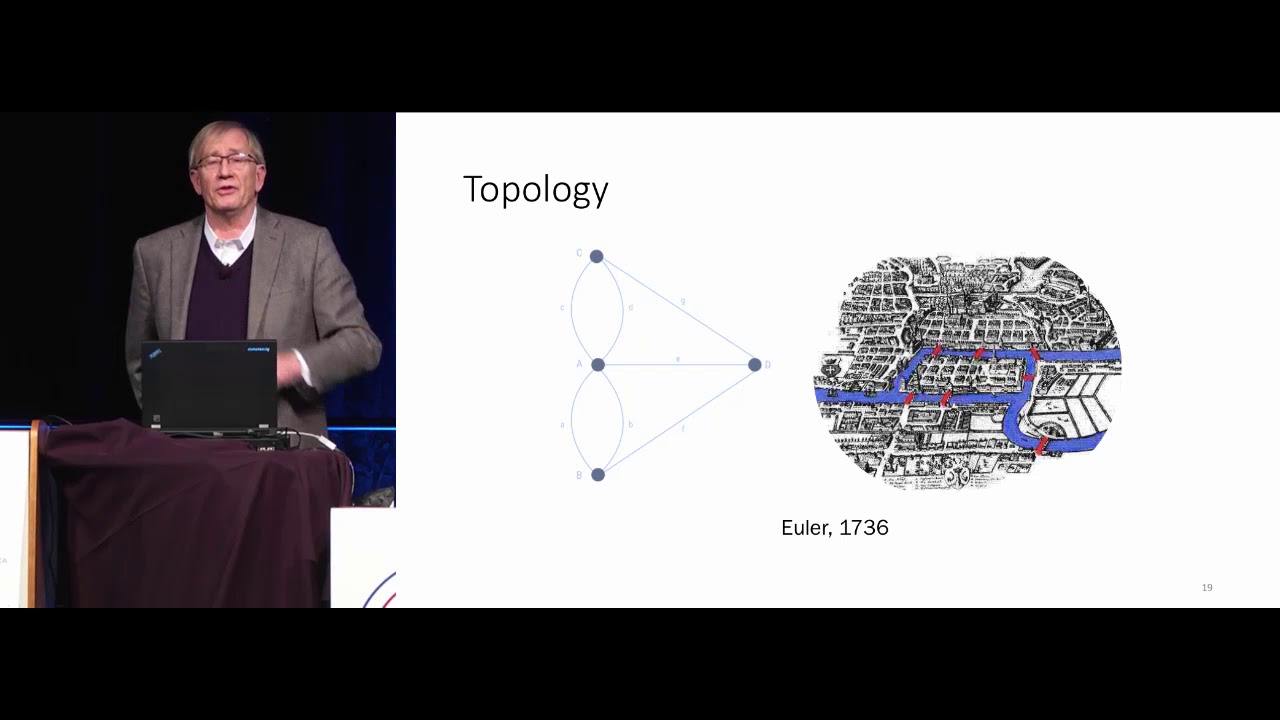
video i discussed a famous problem in math called the seven bridges of koenigsberg so i won't go into all the details of the problem but it was eventually solved by famous mathematician leonard euler and the way he solved it was by drawing a picture and this picture is what we now call a graph and so a graph consists of dots connected by lines more technical term for these things the dots are called vertices and the lines are called edges another equivalent terminology is instead of calling this thing a graph we can call it a network
and we can call the dots nodes and we can call the lines links so these are all equivalent terminology that i'll probably use interchangeably for this video and so graphs or networks they typically represent something from the real world so in this case euler drew a graph representing konigsberg where each of the nodes represented a land mass and each of the lines connecting two nodes represented a bridge and so what this does is it boils down the problem to its essential elements and this is what allowed euler to famously solve this problem and as i
mentioned in the previous video this is essentially what we're doing when we do topological data analysis we are translating data from the real world into its essential elements or in other words into its underlying shape and so one way of doing this is via the mapper algorithm and the main topic of this video so the mapper algorithm allows us to translate data into a graph so key applications of the map or algorithm one is exploratory data analysis it allows us to take a data set and generate a visually engaging and interactive visualization another application is
that it allows you to compress and visualize very high dimensional data so imagine trying to visualize a 500 dimensional data set with mapper algorithm we can take our data set compress it into a two-dimensional graph and then visualize it and try to highlight some key insights and we saw some examples of this in the previous video with discovery of cancer subtypes defining new roles in basketball and characterizing the evolution of the two political parties in the u.s so at a super high level the mapper algorithm takes data and translates it into a graph but how
exactly does it work i've broken down the algorithm into five steps and i apologize in advance because it's a bit sophisticated but i will do my best to explain it in plain english so the first step is we start with our data set so here we have a two-dimensional data set because we have two variables x1 and x2 then the second step is we project our data into a lower dimensional space so here we're going from two dimensions and we're projecting down to one dimension and we can do this with any dimensionality reduction strategy like
we do something standard like pca we can do something more sophisticated as we will see in the example later another popular strategy is to take just basic statistics to project out into one dimension in other words you could consider two variables x1 and x2 so each point will have a corresponding x1 and x2 value you could take the average of those two and organize them onto a one-dimensional axis you could take the max you could take them in so they're all these different strategies so we've gone from two dimensions down to one dimension so nothing
too fancy yet so the next step is we define something called a cover so basically what this means is we're going to define two subsets indicated by this red circle and this green circle and we will have these two subsets have some overlap so we can see here that the red subset and the green subset indeed have some overlap and these are indicated by the yellow points in the center of this picture and so that's what we mean by cover we just define a collection of subsets that have some overlap which include the entirety of
the data set another thing is we could do more than just two subsets we could have three subsets four subsets so on but just for this toy example i chose two because it's easy to see what's going on here okay and then the fourth step is we cluster the pre-image there's a lot of jargon here so i'm just gonna break it down so if we look at step three we have these red points green points and yellow points but if we remember that each of these points has a corresponding point in our original data set
so what's being shown in this picture in step four is our original data set but the points are colored based on which subset they appear in from step three and so the next step is we're going to iteratively go through all our subsets so we only have two subsets we have a red subset at green subset and we're going to apply our favorite clustering algorithm we'll start with this red subset so in other words we're going to look at the red and yellow points only and we're going to do a clustering algorithm and let's say
it looks something like this then we will go to our next subset which is the green and yellow points here and we will cluster those and let's say we get something like this so now we have these four clusters defined with some overlap between them now we're set up to create a graph so we can create a graph where the nodes are these clusters so four nodes corresponding to four clusters and then two nodes are connected by an edge if the clusters have shared members so this middle cluster shares members with the other three and
so that's what's being shown here okay so this is just a toy example i hope that was somewhat clear of what's going on here but i'm going to try to make things more concrete with an example with code so in this example we're going to do exploratory data analysis of s p 500 data so our first step is to import some modules so we have the yahoo finance module which allows us to get the stock data we have this k-mapper module which allows us to do the mapper algorithm stuff so we're importing this umap module
sklearn and then something from sklearn and we're using these for our dimensionality reduction and then we have numpy and matplotlib to do some standard math and visualization stuff okay so the first step as with any data science project is you're gonna get your data so this is pretty straightforward you just define your ticker names and you define the date range for which you want your data and then with one line of code you can pull all that data and so this code is available on the github everything should just work out of the box and
once we have our data we can do some more preparation to make it ready to go to do our analysis so the first step is we're just going to look at adjusted close prices and so now what you can imagine is we have columns corresponding to ticker names and then we have rows which are corresponding to days that the markets open and then what we're going to do is convert this pandas data frame into a numpy array and then we're going to standardize each of the columns so basically what that means is we're going to
consider a column compute its mean and standard deviation and then we're going to subtract the mean from each value in this column and we're going to divide it by the standard deviation and then the last step here is we do a transpose just because later this will allow us to compare takers together as opposed to days so we could also not do a transpose and then the analysis wouldn't so much be comparing different tickers together but comparing days that the market was open and then the last step here is we're going to compute the percent
return of each of the tickers because later when we generate this interactive network we can color the nodes in the network based on the percent return value of each of the tickers okay so all this talking and explaining and we still haven't really gotten into any topological data analysis so if we think back to that visual overview from earlier this is all still step one we're still getting our data so now we can finally get into the mapper algorithm stuff first we will initialize this object next we're gonna do step two in the process which
is project our data into a lower dimensional space so we actually have 495 tickers here and what we're going to do is project that down into two dimensions and the way we do this is a two-step process first we use iso map from this manifold library in sklearn so that'll take us from 495 dimensions down to 100 then we'll use umap which will take us further from 100 down to two dimensions so the nice thing about this syntax is we can define a custom data pipeline to do our dimensionality reduction so we can see this
projection keyword is being set to a list and this list is actually a list of functions element in this list is manifold.isomap with all the input arguments there and then the second element of the list is umap with all its input arguments but we could have gone further we could have added a third element and made that pca which took us from two components down to one component or we could have done a completely different data processing pipeline so you can already start to see that you have a lot of flexibility in using the mapper
algorithm in practice so we essentially will combine steps three four and five from the overview earlier into one line of code so defining a cover clustering the pre-image and generating an output graph is all compressed down to a single function call in that we pass in the projected data from the previous step the original data set and we defined the clustering strategy that we want to use here we use the db scan with a cosine similarity metric yeah you can also customize the details of the cover but here we're just using the default values and
in less than a second it generates the graph and so the next step here i define a file id which isn't really necessary i just like to do it because every time i've used the mapper algorithm i'll try different choices of cover i'll try different projection strategies i'll try different clustering algorithms and so on and i'll typically have these going in a for loop and i don't want the output graphs to get overwritten so i'll define this file id which will automatically generate a unique file name for each output graph and then the last step
is we visualize the network you just pass in the graph you define a file name you can give the graph a title you can have these custom tool tips which is the label for each of the members so basically this is our ticker names we can define color values which we will define as the log percent returns we can give a name to the color function and then we can also have multiple options of how these color values are aggregated though we could just do a simple average we could compute the standard deviation the sum
the max the min and so on and so what the output of the mapper algorithm looks like is something like this it actually generates a web page which allows you to interact with the graph and blends itself very well to explore to our data analysis which we're doing right now okay so the code that we just walked through will actually generate an html file which we can go ahead and open so first look this does not look like the network i showed earlier but if we go to this help menu we will find different viewing
options so we can click e on our keyboard to do a tight layout and already it's starting to look a bit nicer and then we can click p for print mode which will just give the graph a white background and then next we can click on any node we like and it'll start to kind of radiate this glow and then we can go over to this cluster details click on this plus sign and so remember that the nodes in this network are actually clusters of data points and then the way we do the analysis here
is we actually have clusters of tickers or in other words stocks so down here you'll see the names of the members of this cluster listed and so this was generated from that custom tool tip option in that last function call we made and then here we also have a histogram which is showing distribution of the log percent returns of the members of this selected cluster so right now the weighted average of the log percent returns of each cluster is what generates each node's color but we could use other statistics so if we go over here
to this node color function we can click this drop down menu we could do the standard deviation which doesn't look too exciting we could also do the sum which also looks pretty uniform but then we could also do max so now we're starting to see some variation we then might be curious about the clusters that contain members with high returns so we can click on this yellow node here and then we can look at these ticker names and maybe do some further analysis so i'm no financial expert so i don't have much intuition to offer
here but when working with data that you are familiar with you may immediately start to see interesting patterns just by jumping around and you can really do this all day you can click on a particular node see what members are in that cluster and then you can click on adjacent nodes and see what members are in those clusters and then you can go back try out different projection strategies try out different clustering algorithms generate new graphs and then repeat this whole process all right so that's basically it again the code for this example is freely
available at the github if you want to learn more check out other videos in the series in the next video i will discuss another specific tda technique called persistent homology if you enjoyed this content please consider liking subscribing and sharing this video like many of you i am still learning so i would also appreciate your questions concerns and feedback in the comments section below and as always thanks for watching you