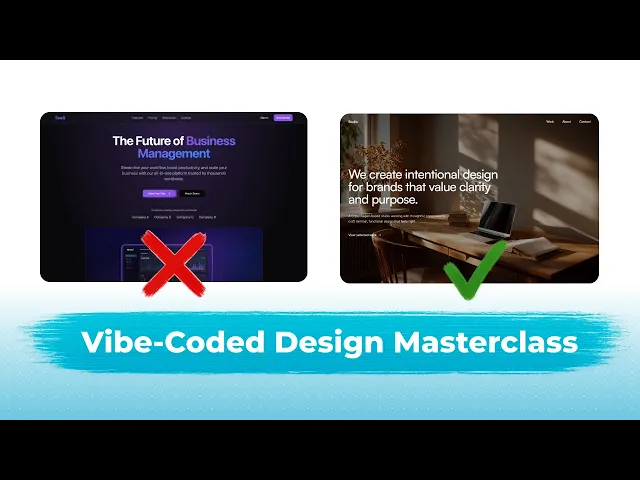
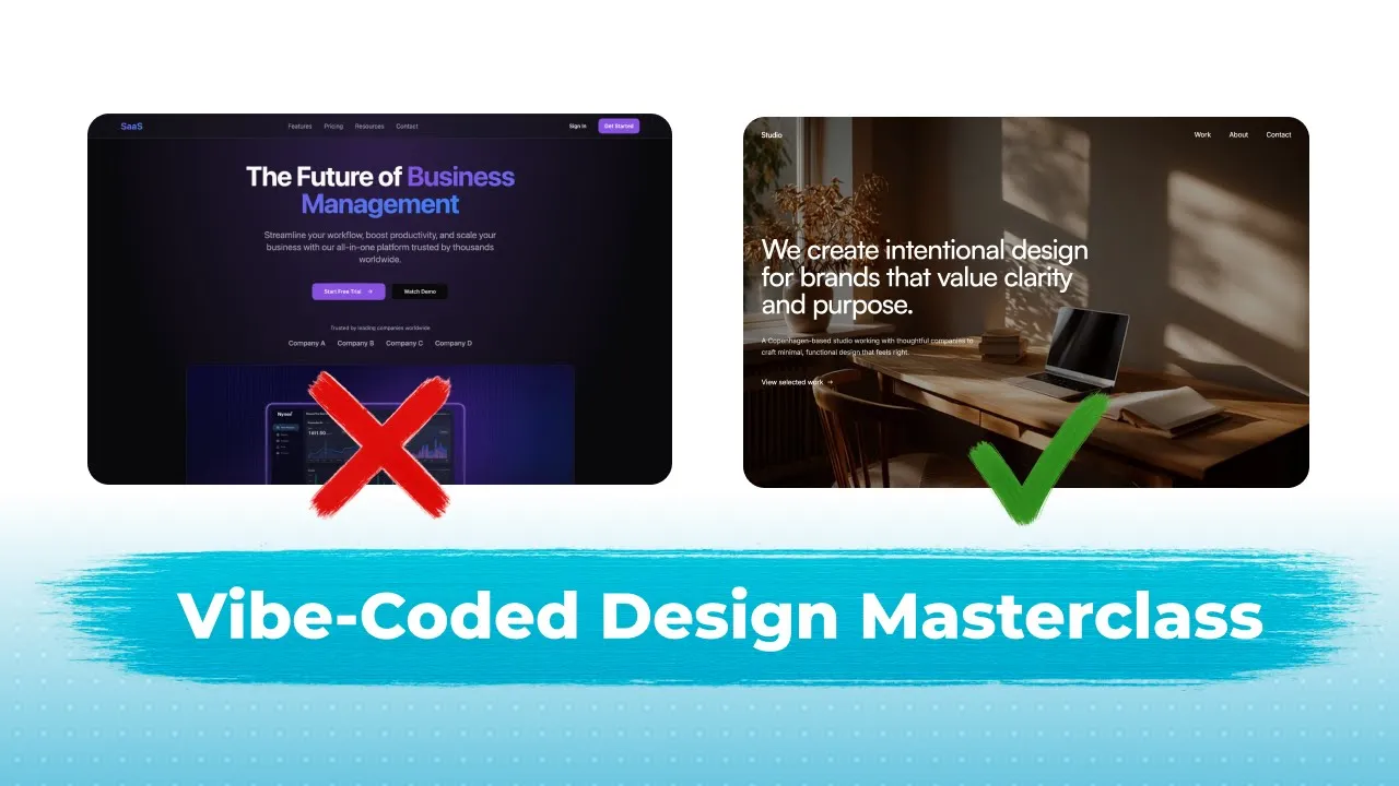
Hi guys, welcome back to another video. I'm Mikey and today I'm going to give you guys a master class on how to generate quality design and UI using AI and how to make your vibe coded designs look professional. So we've broken this down into four parts and we've got part one which is what does AI generated design look like. So we're going to talk about the tells of AI design and what AI slot looks like. Part two is how to generate good design using AI. Part three, stealing like a pro. And part four, becoming a
pro. So these are the topics we're going to cover today. And let's get straight into it. So first, if we want to know how to make good-looking design, we need to kind of understand what bad or generic or AI slop looks like. So what I'm going to say going to simply say create a SAS landing page and I'm going to use lovable MV0 for this. Going to enter this on this and here as well. And we're going to see what happens when you don't give any other details or context and you simply say to the
AI generate me this or generate me that. We're going to see exactly what happens. So, in a few minutes, we're going to see the final results, and I'm going to check back in with you guys. Now, you can see with Lovable, it's already defaulted to this purple and deep indigo. As you can see, this is an instant tell that your design is generated with AI. I'm not saying that purple is bad, but normally most five coded things tend to use and default to using purple. And as you can see, we've got an image that's low
quality, AI generated. Again, doesn't really make sense. We got a feature section, very basic, a lot of purple, simple pricing section as well. Simple testimonials, simple CTA, simple or basic footer. As you can see, everything's very simple, and it's using this purple color. Another thing to note, it uses a lot of gradients, too. So that's another thing that you have to keep in mind is that AI generated design uses a lot of gradients. Now it seems like the better you are as a designer, the more careful and cautious you are when it comes to things
like gradients and over the top effects as well. So that's the first thing you can notice. Now if we go to V0, you can see that it's created something very basic. The font doesn't really make sense. That's another thing as well. I should have said the font normally uses either system UI or it uses inter. So what I'm going to do I'm going to check the font and to check the font of any web page website you can download a chrome chrome extension called what font or something similar and simply click on it and you
can hover over and you can see system UI and so is this. So you can see it's using the default system UI font which is not what we want to do. I'm going to talk about fonts in part two, but back to V0ero. You can see the font is very basic. Again, it's using black and white here, not the purple. But you can still see how simple, how basic it is. We got a different looking hero section. Typical with SAS. Same uh layout as this one. Actually got the content and then the dashboard underneath or
an image placeholder in this case. We got some logos here, but no actual logos were produced. Again, the same 3x two basic features section and a very similar basic looking CTA and a very similar footer. You can see everything's very basic basic lacks personality, lacks thoughts and craft. So, what we can understand from what we've just done is that AI generated design, what does it use? It uses purple colors a lot. also uses a lot of gradient and blur slash shadow effects and then we can also create new posting note and we can talk more
about the layout. You can see that there's a lot of generic looking layout. generic and simple layouts. And we can put a dash and say uses a lot of grids. And what else does it do? Well, the fonts as well. You can say the fonts are generic and basic. and put system UI or enter. Now you can go ahead and use enter if you know how to make typography look good but for the sake of just mastering AI design I would stay away from in because it is overused even by designers top designers it is
overused at this point so I would say stay away from inter and we'll get more into fonts as I said in part two. So, that was a brief overview into what bad AI design looks like, what AI slop tends to look like as well. And I'll leave a cleaned up version of this Figma link in the description below so you guys can use it for your own projects and just to learn as well. Okay, let's swiftly move on to part two. So, how to generate good-looking design with AI. And these are the sort of things
we're going to cover as well. Let's get straight into it. So if we go back to our V0ero SAS landing page, what you can see here is that it's very basic as I said. And the first thing we want to do, we want to change the font. And I've actually created a AI powered font suggest that is free to use that you guys can use for fonts. So if you guys come straight to typ.com which is my tool that I built, you can simply describe your use case and you can enter it and then it'll
give you some font suggestions and font pairings that all free to use from Google font or from font share. You can also click on explore pairings as well and you can see some nice looking font pairings that you can also use and copy for your own sites. And it also has some CSS import and code stuff you can use and you can also check the links out on Google fonts or font share. So let's go back to home now. Let me say we need a I creating a SAS landing page for an analytics app. Let's
click on generate suggestions. And very quickly, we can see we have some font suggestions here. And it's suggesting enter because it's a very standard font. But again, I'll stay away from enter. And we've got our font share examples here. And we've also got our Google fonts ones which are in the white and gray. So I like DM Sands. So let's simply go back and say use DM Sands for the headings. And for font text, you can also use this for font text as well. So hopefully it'll generate some font pairs that we can use. So
it's suggesting this serif, but for a s landing page, we don't really want a serif. So let's stick to sans serif. So sans serif is the type of fonts that don't have the little like endings at the end of each letter. Just to explain it better, I've just gone into Google. So the main difference is that serif fonts have these feet or small lines as you can see here and here. And serif sans serif sorry don't have these feet and small lines. They're more cleaner, more geometric. So that's the main that's the difference between serif
and sans serif. So for our SAS landing page use case, we normally want a sans serif heading and a legible sans serif body font as well. And in is a great body font to use. Even though I said it's generic, when I mean it's generic and everyone uses it, I normally mean for the headline and the headings. For body text, you want something that's clean and legible. Something like in orist or something similar like that. So what I'm going to do is that it should have changed all the headings to DM sands. And you can
already see that it's elevated the design a little bit. I'm going to say change all body text to enter. Don't touch the headings. We can enter that. And you're going to see it's going to elevate the whole site instantly just by making sure the typography is on point. The next thing is colors. And I'm going to put styling as well. So colors slashstyling and what you can do for this you can literally talk with AI and generate a good like styling and design system or as I've shown in many videos you can go to Twecm
which is a design system builder which builds on top of Shadzen which is a component library and you can see that they have a lot of different themes you can choose. You can simply go down and choose one you like. For example, this one, something more clean like this, something more playful like this neo brutalism one. And you can simply go here and choose your own, the one that you like. Or you can also edit and create your own by simply coming into here and you can tweak the colors like this. Or you can tweak
the typography. Maybe you want PT serif instead of PT serif. Maybe you want to change this to gist. And you can see everything will change here. Another useful resource is coolers. And you can simply click on this and you can create your own color palette by simply remixing this and you can change them as well. So if I you can also remove the colors or you can click on this to change as well. And if you press the space bar everything will change. And you can use this as inspiration. Maybe you like this color. You
can say to the AI can you use this color for a certain element. So let's go back to tweaken and let's say I wanted to use this design theme or design system for my own SAS landing page that we built using lovable can simply click on the code and click on copy and I can come to loable and I can say restyle my whole website using this design system and I can paste in here and press enter. As you can see, the typography has already uplifted the level of quality of this generic SAS landing page.
Another pro tip you can use is that you can reduce the spacing between the letters to make this look even better. So, I'm going to say reduce the spacing of the headline and the headings. Let me put letter spacing. And I'm going to say by 0.02. And this is like a stand unit called rem. And you can simply say 0.02 and it'll reduce the letter spacing by 0.02 em and make them closer together. So when you put 0.2 it will simply understand what that means. And you're going to see in a minute that the letter
spacing will reduce and it's going to look a lot better. So back in lovable it has applied our theme. But I think it's applied the light mode version of our theme. We can simply say apply the dark mode version of my theme that I pasted. Okay. And it's applied the dark mode theme. We can still see it looks very AI generated because we still need to change typography. So I'm going to use one of my favorite. I'm going to say use plus Jakarta sounds for typography. I'm going to change everything to plus Jakarta sounds which
is a much nicer looking font than this generic system UI. Okay, we came into an issue in V 0. I'm just going to say reduce the letter spacing of the headline text without any numerical value. And hopefully it should understand this better. And you can see the letter spacing has been reduced. It looks a lot tighter and lot looks a lot more clean and modern than what it was before. Now, another tip for designing great UI with AI is to use emotive language and keywords. And one of the designers at Loverable has a great blog
where he talks about this kind of stuff called Felix S. And I'm going to link this blog in the description so you can use it as well. And as you can see, he mentions that you should start with a feeling and not features. So, for example, something feels like a commute in Copenhagen. Minimal, intentional, and warm. Every detail considered. So, I'm going to copy this. And then if I go and let's create a new let's create a new product actually. And I'm going to apply everything we've covered so far. I'm going to say create a
website for a design studio. Then I can paste something like feels like a cal student in Copenhagen. Minimal intention and warm every detail considered. I can also say use and then what we can we can do actually is that we can copy this. Go back to type Eva. Go to home. Paste this. And we can see we already have some fonts that we can use. And click on generate pairings. And let's see what it cooks up. So, okay, we got this this. Okay. I'm not a fan of this Mayweather. So, I'm going to use Satoshi.
I'm going to use enter for body text. So, what I'm going to do, I'm going to go back to my prompt. I'm going to say use Satoshi. font for all headings and enter font for body text. Another pro tip is that I didn't really mention this before, but AI generated like stuff apps, websites, AI slop, they tend to use bold font weight. So we can see 700 which is bold. It uses bold font weight and normally modern sites stay away from bold. The max they might go up to is semi bold but they normally use
regular or medium for the headings and definitely regular for the text too. So I'm going to say I'm going to change this for from Satoshi to Satoshi medium for headings and then enter font for body text. And I can say make sure the body text is 18 px 18 pixels which is the size of the font on desktop and scale accordingly for smaller break points and then can enter this. I'm going to see what it creates. The next thing we're going to look at is layouts and variation. And with layouts and variation, what you can
do and then give you a quick hack. If you're not familiar with design, you can simply go and look for inspiration. But first, before I give you the hacks, let me go and show you what I mean. So, we saw this original site or this site we've been building in Loable. As you can see, the layout's very generic, very basic. We got this feature section with six cards. We've got a three card pricing section. Another three card. Everything's very basic. Three cards grid. Three cards grid. Maybe another card. Maybe another card. There's nothing moving. There's
nothing a little bit inventive at all. Now, if you're not familiar with design, I'd suggest looking at inspiration. And to look at inspiration, you can simply go to an inspiration gallery like Landbook and look at example websites and see what they do. And you can literally screenshot this and tell Loble to recreate. So for example, if we like something like find something I like, maybe something like this hero section. I can simply screenshot this. Go back to lovable and I can say redo the hero section and make it look like my image attached in terms
of layout and paste my image and click on enter. Another place you can go is existing component libraries. For example, there's a brilliant component library for framer creators called compa. And if you click on here, we can go to maybe content. They have different sections and blocks. And we can take inspiration from some of the layouts in here as well. You can just scroll through and find the sections you like. And you can do the same thing. Copy the image, screenshot the image, paste into lovable. Another one I like is one called frame blocks. And
they have lots of different nice features sections they can use as inspiration. Lots of different sections as well here as you can see in the sidebar they can use from inspiration. So this part's really just about finding inspiration using component libraries and using existing like curation sites like Landbook as well. So we can see the layout's changed from what it was before to the content on the left and the image on the right which is very similar to the example that I pasted into lovable. So just by using inspiration you can really change and uplift
the site. And the final thing which is more difficult to understand and to recognize if you're not familiar with design is spacing. So I'm going to give you an example of what I mean. For example, this navbar, if you're looking at it, something's off. You can see that it's this part is not properly aligned in the middle. If I drew a straight line down here, you can see the middle of this doesn't align with the middle of the page. But there's an equal distance between this and this and this and this. So, what we could
do, we can simply say I can simply actually select this and say make sure this navbar anchor div or navbar anchor links. These are navbar anchors. Make sure the this nav anklinks div is positioned in the center in the center of the page and not the middle of the navbar. And I can simply add horizontal center just so it has additional context. Press enter. Now if we come to our design studio website that we just prompted with loable, you can see just that enhanced prompt has created something that doesn't look AI generated as well. It
looks a lot cleaner and you can see the sections are more inventive already without you having to do anything else. You can see the typography as well really is more intentional because we've used something that helps us to create our typography. And then we can still apply some principles that we've talked about to make this a little bit cleaner. We could say reduce the letter spacing of the headline. And we can also note that this hero section, while it looks really clean, is a little bit blank. So, we could go ahead and edit that later.
And boom. We reduce the letter spacing. And you can see it's a lot cleaner already. Like you can see how everything's tied together and just looks more modern and clean and professional. Okay, let's move on to part three, which is stealing like a pro. And this is where your design is really going to elevate itself, really going to come to life. So, I've already talked about how you can use existing websites, existing inspiration to copy and use in your own site. So, let me just do another example as well. Okay, I've pasted a pricing section
I've got from Greyblock. So, I like this one. I just screenshotted this and I paste it inside Lowel and hopefully it can redesign it in a way that's more visually appealing and less generic and basic looking like this three grid layout. Just like that, we have something that's a lot nicer and it's functional as well. So, we got this little toggle here and the all all the pricing cards, the colors, and even the layout of the actual text inside the cars looks a lot cleaner and nicer and less generic than it was before. So, I
can just use say use existing component libraries and websites for inspiration. And I will put all the websites that I recommend to use for inspiration somewhere under here so you guys can look at it and use it for yourselves. Now, what else can you do? Well, instead of coming to these component libraries where you screenshot things, you can go to component libraries that have actual code. For example, 21st Dev is one I really like. And another one is React bits as well. These are my two favorites. And you can click on browse components. So let
me log in first. And let's say for example, we don't like this features section. We want to change it. What we can do in 21st dev, we can simply click on this. We can go down to features. We can scroll and find something that we like. So, let me find something I actually like. For example, this. This is nice. It has nice motion, nice movement. It's not generic. What I can do, I can click on open component. And I can copy this prompt. And then I've got a custom rule. And this custom rule basically tells
it that when you're implementing this component, make sure you're using the existing styling that we've already created on our existing website or app. So you select your AI builder that you're using here. We've got V 0 B loable replicable. So copy prompt and then I can say to global replace the existing features section and in brackets I can tell it what it is. So everything you need to succeed. I like doing this to give it extra context just so it doesn't mess up. And I can say with this component below and I can once again
I can reiterate use our existing styling. Please use the styling we have already established. Can paste that. And let me just make sure this makes sense. And I can press enter. And you're going to see this feature section totally transform. And let's say we want a actual proper logo section for this VZ site. We can go to 21st dev. Once again, we can go back and we can find something that we need. So it might be something like okay, it'll be in clients. And if you're stuck, you can also search whatever you're looking for in
the search bar as well. So, clients. And you can see we have a lot of different nice logo sections. Some of that are moving, some that are tickers, some that are static. And let's say I like this one. Or let's use let's use this one. This one's quite nice. Has a nice sparkles. Another thing you can do with 21st dev is that you can save by pressing the book bar tab any section that you like. So you can reuse for future projects as well. So in the copy prompt, select my rule, but this time select
v 0. Click on copy prompt. Go back to v 0 and say replace the existing logos section in brackets. Once again, I'm going to describe what what it is. So trusted by leading companies worldwide and say with this component below and once again I'm going to say please use the styling we are already using in our existing sites. Then clean this up. Paste the code below. And in visor, we paste it as a file. Press enter. And we're going to see this transform. Let's go back to lovable. And we can see it's been implemented perfectly.
And already it's elevated the look and the polish of our section and our site overall by adding some motion, adding a layout that's not generic as well. Now, React Bits has similar components and sections. So, we have lots of text components here, which is cool. If you want to animate your text, you can simply go here and you can copy all this code, which I'll show you in a second. So, let me find something I like. So, let's say I like this navbar and I want to use this navbar. I can come to code and
first I have to copy this. Go to global and say replace our existing navbar with this below. And then let me also say use our established styling. I'm going to copy this first. MPM install gap. Now gap's an animation library that makes really clean and smooth looking animations. And then I can copy this usage. So underneath I'll paste this usage. Then finally copy the code. Well, not finally actually there's one more part. So underneath I copy the code and then finally I copy the CSS as well. Paste CSS and press enter. So first in V
0 we can see that it's implemented this nice looking logo section. And you can simply prompt it to replace these logos with actual logos that you want. And then back in Lovable, we have this nice navbar that actually works as well. It looks beautiful. But it doesn't quite match the theme of our site, but it still looks really nice and better than the one we had before. I know I've called this section or this part stealing like a pro, but these components and 21st dev and react bits are free to use. So, don't worry about
getting in trouble for using them. And there's nothing wrong with using a site as inspiration to create your own project. Before we finish this section, part three, let me just give you a tip. Don't use too many of these components or else your project, your app, your website will be very slow and laggy. So just use them in specific areas and try and use your own prompting skills for the majority and then use these to add final touches unique sections where needed. Okay, let's move on to part four, becoming a pro. Now we're going to
talk about adding motion, adding effects, adding different things that really elevate and give your site and app the final polish. But the most important thing here is to practice, practice, practice, and build. The more you build, the more you do this, the better you'll become. The better be able to spot the differences between bad AI design and good AI design, and how you can more often produce good AI design as well. So, let's talk about merging and adding movement. Now obviously the first thing you can do you can go back to the component libraries I
mentioned 21st dev and react bits and other ones which I'll put in the Figma file as well and you can just copy their components a lot of them already have motion but if you want to add motion by itself via prompting there's a simple thing we can do so let's say you want to add an image not an image a logo section below this hero section and above the how it works section so in this space here so we You can say add a logos section in the in the space below the hero and above
the how it works section and I can say I can get some logos from the internet and use. So let's do that. Another tip I want to just mention as well is that another tell or way you can tell an AI site is AI generated or a site is AI generated is if they have a really basic text logo. Now there's many places you can go to build your own logo. So you can use Canva, you can use Figma or you can just get one from logo ipsom which I'll show you now. You can simply
come here to logo.com and just copy any logo you like. So, you can copy this as your own logo, but I'm going to use these dummy placeholder logos for the logo section or the like the trusted by these companies section underneath the hero. So, I'm just going to copy a lot of these and get back to you guys. And you're seeing a lot of text here because I copied the SVG, which is like a load of numbers and code. Um, what I'm going to do, I'm going to make this a carousel moving ticker. So, I
can simply say make the make these logos a moving infinite ticker with no visible start or end points. I can simply add the word loop somewhere. So, I'm going to say moving looping infinite ticker with no visible style endpoints. And another thing I've noticed from previous videos is that often it resets. So, I'm going to say also make sure that ticker never resets. I'm going to put it should loop infinitely and I'm going to paste and hopefully it understands this. What I normally do, I would actually go into chat mode and make sure it actually
understands step by step what it's meant to do and then proceed with the plan. Let's see if you can get it right first time. Another thing you can add is a slido, a slideshow section, should I say. And let's say I want to add something below here. So, we're going to say underneath the logo section, let's add a past work section with text, content, and button on the left. and a image slide show on the right side. So let's add a two column. So two columns means I'm going to have one column here, one column
here, and this column I want it to be text. So text on the left and this image carousel, sorry, slideshow on the right. And I'm going to press enter. And hopefully it understands what I'm trying to build. Again, another pro tip is to try and talk and describe your layouts as well. So not only can you copy and paste existing layouts to use as references, you can also describe something like you can have two columns with something on the left, something on the right, you can have something here. So for example, this image here, this
placeholder image is peeking above the fold. And what do I mean by peeking above the fold? The fold is this bottom line here, the bottom of the viewport. And as you can see, the image is peeking above this bottom line, which I call the fold. And when you say peeking above the fold, the eye will understand that some of the image is above the fold and some of the image is below the fold. And just by that simple prompt, we have the text, the button, and an image slideshow on the right. And we can just
add some images, maybe our own images by just dragging and dropping and uploading in here if we wanted to. Another thing we can do, we can add videos to our designs. I'm going to show you how you can create videos using Midourney. So, you need a paid plan of Mid Journey for this. So, it's about $10 a month to actually pay for it, which is relatively cheap compared to the amount of hours you're getting. And you can simply say something like design studio if you don't want to create your own. Sorry, not there. I've actually
generated my own image. I mean here, design studio. Press enter. Click on videos. And you can get pretty much videos for whatever use case you want. Doesn't seem that there's any. Can I search videos? No. Okay. When you search, it goes directly to images. But you can use the explore page to find something that you like. And once you like something, you can copy the image, sorry, the image or the video URL and use it in your design. But let's say I wanted an actual nice video to put in the background of this. I'm going
to show you the method I would do. So the first thing I'd do if I had no ideas of what I wanted to put behind, if I had an idea, I'd skip this step completely. If I had no idea what I do, I just screenshot this. So, let me actually screenshot this properly. I'd go into an an AI or an LLM like chat GBT. Then I'd ask it what video background would match this hero. Let's see what Chad GBT can come up with. Okay, so it recognizes my minimalist Scandinavian purpose- driven aesthetic, which is nice.
That's even, I guess, because have Copenhagen based in here, but we can change it obviously. And soft light texture recommended, gentle moving shadows, a shifting light across a neutral surface. And then we have this, we have this. Okay, I like this one actually. So, what I'm going to do, I'm going to copy this. I'm going to say create a midjourney prompt to create an image in this style. And let me put an excellent image any prompt. You can also create images using chat GPT as well and Gemini using Nana Banana. So I'm going to copy
this And I can go back to midjourney. I can paste. And now since we are making something for a wide desktop background, we can see we can put the style code aspect ratio. This AR means aspect ratio and 16 to 9, which is a common aspect ratio that you normally find when you're watching videos on your phone, but it will do the job for this wide desktop layout. I'm going to put a image or a couple images about aspect ratios in the Figma file as well so you can look at and understand the different ratios
that are used when creating images and videos. So once I've checked that this is fine and once again you can just search up on the internet on X or midjourney or use chat GBT to learn what these style codes mean. For example, V7 don't really need this. That's just the midjourney version and mid journey is on version seven. So you don't really need that. But you can see style raw that's a style code that makes it more raw looking and more realistic. Q2 that's a quality and think S is stylized. So this is slightly stylized.
So it might be not completely realistic but a little bit more like animated or cartoonish. So, I'm going to paste this. I'm going to have four different images that we can choose from. Okay, mid jenn is done. And let's say I like this one the best. These aren't the best images. They're quite basic. Obviously, we've just got a laptop here. We could go back and improve the prompts using our own thinking if we have any ideas. Or we can go to chat GPT and describe what we want to change and then get a new prompt.
For the sake of this video, let's click on this. And let's say we like this. What we can do, let me go back to the image without scrolling. We can simply come to this sidebar and we can animate this directly by choosing animate image and let's say we want a looping video with low motion. You can click on that and then it will automatically submit that and create a looping video with four variations we can choose from. So let's wait for this to finish. Okay, back in our lovable project, we can see it accidentally duplicated
each logo twice and there's a visible gap at the end. So, we can describe saying there's, let me just screenshot this actually. We can say there's a visible gap at the end of the ticker. This should not happen. And then we can also say that also each logo has been duplicated and placed below. And then I can paste my image alo cleaned up this text. I'm going to use chat mode. Always use chat mode if you're trying to debug and fix an issue. Use chat mode. And another tip I mentioned in a previous video is
say do a deep dive into the problem and it'll more often than not find the problem for you that you can fix. So we're going to say do a deep dive and find the exact issues. Press enter. Okay, there's a lot of back and forth, but we're just trying to juggle quite a few things. So we have our mid journey video. I'm going to come back to this later. Let's just try and fix this lovable issue first. Okay. So, loables defined all the issues. So, the issue on invisible gap at the end of the ticker
like I said the clone is being appended to the ticker container to being part of the ticker inner. And now I don't really understand sometimes what this means but we can assume that it's found the fix. And if you're really unsure you want to understand it deeper, you can simply ask the lovable chat AI to break it down into more simple basic terminology they can understand or you can just paste it into an LLM like chat GBT and try to understand it that way. Okay, the issue two logo duplicated and placed below and it recognizes
that. And it's found another issue as well. And it's got a fixed strategy here. And once again, I don't really understand this, but I just hope that it fixes it. We click on implement the plan. While we're waiting for this to load, if you like this video, please consider subscribing. Please like this video as well because a lot of these longer videos don't tend to perform very well. the most valuable and useful information out there, more valuable than me, just like creating a random website with, I don't know, a tool. These videos are really valuable
and useful. So, if you really like the video, I appreciate if you left a like and consider subscribing for more videos like this. Also, let me know if you have any future video suggestions as well in the comment section. Okay, Lower has implemented the fix and we can see it's looking a lot better now. There's no duplication. the whole ticker looks smoother. And I'm just going to wait to see if we can see any visible gaps. So, we got one, two, three, four, five, which means the next one should appear. Perfect. It's fixed it. So,
just by describing the issue, screenshotting the issue, pasting the issue using chat mode. I didn't even understand half the stuff the chat mode said, but I understand that if I give it enough context, it should be able to fix my issue. Okay. in Mid Journey. What I did, I just chose the video that I like the best. I rightcicked and I clicked on copy video URL and I went back to lowerable and I said for the hero section, remove the background fill. I shortened it to BG. It understands what that means. Remove the fill color,
which is this creamy off-white color. And use this video and make sure it fills the hero section. Okay, it's done that. But as you can see, the video is not visible. So once again, I'm going to go into chat mode. I'm going to screenshot this and I'm going to say, oh, pressed that by mistake. I'm going to say, why is the video not visible? Going to say do a deep dive and find the issue. Going to press enter again. Again, the same formula. screenshot, describe the problem, ask to do a deep dive to find the
issue. Okay, the issue is what I suspected. Using video URLs from MidJourney doesn't seem to work well anymore. So, what I'm going to do is I'm going to download the video. So, I'm go back in here and I'm going to click this download button. Download this. And hopefully the file size isn't too big. Okay, five megabytes. We're going to see if it can handle that. And then I can just simply drag this video. I'm going to say use this video instead. And I'm still in chat mode because it hasn't finished fixing the issue. That's a
good thing with Lable now. You can now drag and drop docs, images and videos, not just images like it was before. But another thing would be to you can host it on a platform like cloud binary which I also put in the Figma file for you to look at and it's implemented a or come up with a plan. I'm going to click on implement the plan and hopefully we should see the video in the background. Okay, we are still having issues. Let me refresh this and see. Okay, it's visible. That's perfect. Now, this looks fine,
but as you can see, there's probably a couple issues I've already noticed. Firstly, we can see that the text is not quite visible here. And we can also see that this text is also clashing a little bit with the background. So, what we can do, we can implement this. number one. So, another good tip is to number your different fixes or iterations. Say number one, the logo and navbar links are not visible on top of the video. So make them white by default instead of gray. And then number two, add a dark overlay over the
video so that the text is more visible. on top of it and click on enter. Now adding a dark overlay will just make this video darker so we can see the text here more clearly. So you can see here that the top text and links are more visible and because of the darker overlay we can see the text more clearly as well. when we scroll down the text becomes invisible. So, let me show you how you can implement a fix for that. So, what I'm going to say is that there's two ways we can do
this. Number one, we can use something called a blend mode. We can say make sure the text at the top of the navbar or the text in the navbar uses blend mode difference. So, what it's going to do, it's going to take the difference of the background and this text and that way the text will always be visible. But what I can what I can do is that I can make two variants of this navbar. So I can say when the navbar is below the hero in brackets all sections below the hero. The navbar should
have a fill color using our existing background color and the text should be the text color we are using dark slash brown. I'm not quite sure what it is, but I think it's a dark brown. I'm going to say just clean this up a bit and press enter. So that change has now been implemented and as you can see when we scroll below the hero the navbar changes which is exactly what we want. That way it's always visible and the text is always visible. Now a couple things we can do to elevate this. There's no
animation. So what we can do we can simply say add framer motion animations and make them subtle and let's say luxury. Now frame of motion is another or just motion now it's called is another motion or animation library that we can use to add nice effects to our text and to our sections. And you can see I've added the keyword subtle and luxury so that it's not over the top. And the luxury kind of fits our theme of our design studio which looks really luxury actually if you take take into account the typography, the colors
and the context and loss implemented that. Let me just make this wider a little bit if I can. Perfect. Now, if I refresh this, you can see we have appear animations. We have a nice animation on the button. See, everything just comes really smoothly and nicely as well. It's exactly what I wanted. Now, the last thing I want to do, basically, when I hover on one of these projects, I want there to be an image to pop up in the middle here. So, what I can do, I'm going to try this by prompting, but another
trick, actually, let me do this another way. What I'm going to do, I'm going to screenshot this. So, let me screenshot this now. Actually, I want to screenshot while I'm hovering on one of them. So, I can screenshot this now. Screenshot that. And what I'm going to do, I'm going to go into Figma. I'm just going to use this as an example. Oh, let me delete this. Let me get my image and paste it in here. So, I've got my image and I'm just going to turn this border off. And I'm going to press command
and drag this. And it's going to crop it. You can also use this crop tool here if you want. Just going to crop this and crop this. And basically, as I said, I want I want an image to appear when I'm hovering over one of these projects. So, what I can do, as you can see, I'm hovering over this connected identity. I can simply drag this rectangle. I can remove the border. I can add a fill color. And I can move this to the center like this. And maybe scale it down a tiny bit. Perfect.
And what I can do, I can simply screenshot this. I don't even have to save it. Screenshot this again. And I can go back into Loable. And what I'm going to say is that when I'm hovering over a project, eg kinetic identity. Given it additional context, it knows exactly what I want to do. Make it so that an image appears in the middle of the page. I'm going to put this image should correspond to the hovered project. I'm going to say see my attached screenshot for what I mean. Very basic language I'm using here, but
it works and it's effective. I'm going to paste the screenshot I've made using Figma. I'm going to use chat mode just to make sure it actually understands. Going to press enter as well. And chat mode again is breaking it down and even think about things that I've not personally thought of to make this a more seamless animation and motion. And then I can click on implement the plan. Okay. So it's implemented that. Now if I hover, you can see the image appears but not in the middle of the page. So what I can do, I'm
going to screenshot this again. So let me just move this stuff out the way. So I can hover and I can screenshot this again and I can see at the moment the image that appears when I hover is at the bottom and not the middle like I requested. Please fix. And actually what I'm going to say is that I want it at the m in the middle of the appropriate project div. I want the image to appear in the vertical center of the corresponding project card slashd going to use chat mode and press enter. So
basically when I hover hover on this the image will be in the middle of this. If I hover this, the image will be in the middle of this and so on. Okay. So, it's made it a little bit better, but still offset a bit down. So, I'm going to simply say when I'm going to say the image that appears is not in the vertical center of the project. It's slightly down slash offset slightly below. I'm going to say do a deep dive into the issue and fix. I probably should have said this before. Maybe that's
the reason why it's taken me a few times to actually fix this. Actually, when I hover, a lot of them are actually okay because if I put at the center, then it might actually be below or above the viewport. So, we're going to see what it generates and fixes and then we can adjust accordingly from there. But anyway guys, without making this video too long, you get the point of what I was trying to just do at the end. And hopefully this was a useful and informative guide on how to really create stunning, beautiful design
using AI, how to avoid generic looking and AI slop looking design and how you can use different words, keywords, phrases, techniques, different tools, different websites for inspiration to really enhance your AI design process. And before I end this video, let me make a quick part five, which will be when to use AI. And this is going to be simply just me brainstorming and describing when you might want to use AI and when you might want to use something else. So you want to use AI tools, maybe lowerable, bolt, cursor, when you're building like an app.
or internal tool, maybe just for fun. That's a great use case. But if you're building something, I don't know, maybe you're building a landing page slashmarketing site, you probably don't want to use an AI builder to be honest because not only will you spend a lot of credits, you can also use tools that are more suitable for the job. For example, Framer. I'd recommend if you're making a landing page or marketing site, use Framer. I would use these AI tools, these vibe coding tools when you're making an app or a tool that maybe needs to
incorporate some more complex features and something that's not just a basic website as well. That's just a quick part five on when you should use AR and when you should think about using other tools. But that was all I've got for the video. If you enjoyed the video, if you liked it, please I appreciate if you left a like. As I said before, these longer videos don't actually perform as well, but they're the most valuable and useful videos. So, I appreciate if you left a like and consider subscribing for more videos. I'll be dropping a
video soon on how we can actually graduate from vibe coding into something more useful. So, stay tuned for that. So, if you have any more video suggestions, leave them in the comment section down below and I'll see you guys in the next video.