[Music] hey everybody Tyler anyone here illustrator concept artist and instructor and so I'm gonna do for the next few videos is I'm actually taking one subject and that is shadows part of color and light I'm breaking it down into three parts and I'll release these videos every few days the first part will be talking about the types of shadows and what makes up a shadow the second part will be going over some examples and techniques and then the third part I'll be going over a demonstration so let's begin now let's go over first what exactly
makes up the parts of a shadow so think of this like the anatomy of a shadow now I don't think doing an example and even a demonstration in value you know black and white will be the best way to showcase this it particularly the first component here and that first one is a local color so imagine the innate or the default color of any given object in the world or universe copy paper is white fire trucks are red taxis are yellow right but if you shine different lights on those particular objects right the color is
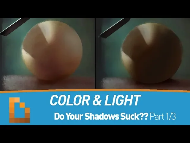
gonna change the shadows gonna change as a result of that but the first real kind of component we need to figure out calculate our shadows is a local color so we're just gonna start with this kind of skin tone --is-- color here to get us going now again to really showcase this next point what we need to do is drop this fear which is again affected by no light whatsoever because we do need light to show what shadow is doing so here we're gonna add a little bit in the mint with a cooler light source
coming in from the upper left and now that second one becomes once we have our object our local color object whatever that may be it can be anything in an environment it could be outside could be inside it has to exist somewhere so this actually makes up the ambient light and so that's showing right if we have this shadow area here which this course in our example here is making up for like you know 90% of the sphere what is going into that well we have a little bit of that default local color and often
what the core mistake with this is when finding a shadow of a local color typical person what they're gonna do is if you see the color selector over here they're just gonna drop the value like that it's essentially kind of like adding black into it so it's shading it so this is what I most commonly see from students oh this is the shadow version of this right if no matter how kind of dark you want to go it's kind of usually some variation of this right so we we know which way the light's going we
know where the shadow is that is usually by default what a student typically thinks and tries to do it's like a darker version of that color and well they're not entirely wrong it can get a little bit more juicy than that a little bit more deep so what what I try to do is again bring in some of that environment right that's what really starts bringing things a little more interesting so I make that base default color a little bit darker but I start adding in little subtle bits of these neutrals around it that's blues
that screens whatever actually is making up the environment and I bring that into the shadow so that shadow becomes a combination of those two different colors already kind of making it feel more dynamic so at this stage with the ambient light in the and you can really see it coming in on the back here the last major part of you know the equation here would be the reflected light so let's say if the ground for example is a little bit warmer right we could see some of that light coming and bouncing in and underneath it
so right here we have the the major kind of components we have the key light coming in right here all of this is the shadow we can see the fill light coming in the deeper part of the shadow here that's that's the core shadow then we get the bounce light coming in and that's really what makes up for the most part most shadows that are particularly set up in environments now if we want to look at all of this in context let's look at this great kind of watercolor painting here by here so look at
what his shadows are doing there is actually all kinds of colors going on you see these blues in the deeper parts of the shadow that's because the environments blue right we have the sunlight with a blue atmosphere so you see lots of Blues coming in but if you know if the shadow is taking place on parts of the green and dirt I'd imagine right you're gonna see parts of those colors greens very earthly colors making their way into the shadow so the shadow is actually fairly dynamic right so moving forward here's our example again let's
look next at the two types of shadows so we look up what is making up shadow looks like a the two different types of shadows the first one is a form shadow so this is gonna look differently depending on the shape or the form of whatever object we're talking about whether it's like a rectangle or in our main example here as sphere it's just how that light travels around it or over so of course with a sphere right we're gonna see it very gradual like a gradient wrapping around the object but with objects with harder
surface you're gonna see clean shifts of that that color and that value light medium and dark in this particular case and so a form shadow just basically shows us what is the shape of an object we're looking at now the the next type of shadow is a cast shadow so let's just assume there's some kind of object interrupting that light coming down and we could see that cache shadow getting cast right onto the sphere now depending on how close an object is to another object where it's interrupting that light that will dictate how hard or
soft that edge actual is so and it's really close you'll see a pretty firm edge but it was much further away you're gonna see it quite a bit softer and so what is nice about an example like this is that we have soft transitions on the form shadows and harder transitions here or a harder edge on this part of the shadow and that all makes it feel fairly dynamic when you can kind of switch gears up like that and when you create situations that can feature both types of shadows alright let's look at a great
example here from Sam Nielson now this kind of shows everything we just talked about right we have this flying whale going on we could see how round it is coming in here there you go so that's a form shadow right it's really light in a gray date - a shadow we could see a little bit of a blue light from the clouds coming in on the bottom now this cloud is obscuring the light coming in from the upper right so we see a fairly soft shadow casting being cast from the out of view cloud and
we can also see that you know the whale itself is kind of casting this shadow on the cloud so it's kind of toppling over you see parts of the background cloud in here there in shadow as well another great place to observe this see the wing or the fin rather of the whale that has casting this very nice and subtle delicate cast shadow on the body right it's a nice little hard line and then it gets lost in to this softer area here right it's one - its form shadow cast shadow so again that's one
thing you always want to ask yourself when you're figuring out a particular area of your character your environment whatever it may be is am i trying to show a cache at all or a form Shadow the last and perhaps the most important thing we need to address next because it makes up such a large part of our shadows is color temperature now if we understand anything about lighting so far it's that there's usually two distinct families of light and dark colors also have two distinct families as well and that is warm and cool alright there's
warm and there's cool colors we can divide the color wheel almost right and 1/2 to kind of find where that point of transition is now this can be a little bit more tricky because there is no way to really measure a colors temperature we can always draw that clear line between what's light what's shadow and classify the two but with temperature it's far more subtle and really this is strictly because color temperature always relies on context there's quite a bit more subtlety to it now if we look again at this color wheel the warm and
the cool colors they're actually complementary that means they're at opposite ends of the color wheel and the major thing to observe here is that colors are always in transition they're in transition from one color to the next constantly moving so like for example here if we are picking this paint color what we may want to ask ourselves when were when we're considering it for an image of our painting is it is it moving closer toward the cool colors or are we gonna pick a color that's closer moving toward the warms so when we're considering colors
for selection we really want to know is is it a warm or a cool version of that color right here's just a basic generic red not really enough information but see once we make a few subtle transitions we can have a cooler version of that red and we can certainly go in a warmer version of that red as well so see here is a very neutral red a cool version and a warm version we can always transition one way or the other so to conclude this section keep your colors temperature in mind now are your
light sources warm like the Sun then have your shadows feel cooler in comparison or your light sources cool like on our first example today that's alright then have your shadows feel a little bit warmer in comparison I keep saying comparison because that is the context and that's what color temperature needs if you have warm on warm or cool on cool you will get mud you will get flat lifeless dull shadows your light source will dictate what direction your colors will move in for lights and shadows so don't forget colors are always in motion and that
they can bring your shadows to life so remember everybody color temperature is unmeasurable it's contextual that's also the key to dynamic shadows see this warm feels warm only because it's next to a cooler color and it's the cooler color that definitely makes it feel warmer because we put this next to a warmer color it now feels cool in context the same thing applies to cool colors as well any color can feel cool if it's next to a color that is warmer like this blue and a neutral now take away that neutral and suddenly that color
is the warm one in the conversation and that's what this is at the end of the day it's a conversation about the direction a color temperature is moving in let the colors live and breathe in your shadows it's where they truly thrive your painting will lose a lot of life if you just shade by adding black to your colors in the next part we will look at some techniques through some professional examples and then we will compare that to some student examples and where some people commonly slip and then until then folks leave me any
questions or feedback in the comments below don't forget to subscribe and have a great day thank you for checking out my video you can support the channel if you'd like by subscribing liking or commenting on my videos you can find me on the web on Facebook art station and Instagram those are the social media outlets I utilize I also teach two courses at the computer graphics masters Academy architecture design and the fundamentals of design feel free to check those out now if the classes aren't few I also teach one-on-one join the hundreds of students around
the world for one-on-one learning and for more info just send me an email also feel free to join the brush sauce discord community there's links below it's fun we do weekly hangouts there's the challenges and it's great place to make friends take care you you