[Music] let's now start this lesson by defining what data visualization is data visualization is the technique to present the data in a pictorial or graphical format it enables stakeholders and decision makers to analyze data visually the data in graphical format allows them to identify new trends and patterns easily well you might think why data visualization is important let's explain with an example you are a sales manager in a leading global organization the organization plans to study the sales details of each product across all regions and countries this is to identify the product which has the
highest sales in a particular region and up the production this research will enable the organization to increase the manufacturing of that product in the particular region the data involved for this research might be huge and complex the research on this large numeric data is difficult and time consuming when it is performed manually when this numeric data is plotted on a graph or converted to charts it's easy to identify the patterns and predict the result accurately the main benefits of data visualization are as follows it simplifies the complex quantitative information it helps analyze and explore big
data easily it identifies the areas that need attention or improvement it identifies the relationship between data points and variables it explores new patterns and reveals hidden patterns in the data there are three major considerations for data visualization they are clarity accuracy and efficiency first ensure the data set is complete and relevant this enables the data scientist to use the new pattern's yield from the data in the relevant places second ensure using appropriate graphical representation to convey the right message third use efficient visualization technique which highlights all the data points there are some basic factors that
one would need to be aware of before visualizing the data visual effect coordination system data types and scale informative interpretation visual effect includes the usage of appropriate shapes colors and size to represent the analyzed data the coordinate system helps to organize the data points within the provided coordinates the data types and scale choose the type of data such as numeric or categorical the informative interpretation helps create visuals in an effective and easily interpretable manner using labels title legends and pointers so far you have learned what data visualization is and how it helps interpret results with
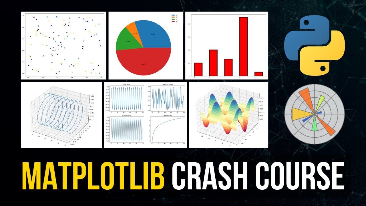
large and complex data with the help of the python programming language you can perform this data visualization you'll learn more about how to visualize data using the python programming language in the subsequent screens many new python data visualization libraries are introduced recently such as matplot library vispy boca seaborne pigel folium and networks the matplot library has emerged as the main data visualization library let's now learn about this matplot library in detail matplot library is a python two-dimensional plotting library for data visualization and creating interactive graphics or plots using python's matplot library the data visualization of
large and complex data becomes easy there are several advantages of using matplot library to visualize data they are as follows it's a multi-platform data visualization tool built on the numpy and scipy framework therefore it's fast and efficient it possesses the ability to work well with many operating systems and graphic back-ends it possesses high quality graphics and plots to print and view for a range of graphs such as histograms bar charts pie charts scatter plots and heat maps with jupiter notebook integration the developers have been free to spend their time implementing features rather than struggling with
cross-platform compatibility it has large community support and cross-platform support as it is an open source tool it has full control over graph or plot styles such as line properties fonts and axis properties let's now try to understand a plot a plot is a graphical representation of data which shows relationship between two variables or the distribution of data look at the example shown on the screen this is a two-dimensional line plot of the random numbers on the y-axis and the range on the x-axis the background of the plot is called grid the text first plot denotes
the title of the plot and text line one denotes the legend you can create a plot using four simple steps import the required libraries define or import the required data set set the plot parameters display the created plot let's consider the same example plot used earlier follow the steps below to obtain this plot the first step is to import the required libraries here we have imported numpy and pi plot and style from matplot library numpy is used to generate the random numbers and the pi plot which is built in python library is used to plot
numbers and style classes used for setting the grid style matplot library inline is required to display the plot within jupiter notebook the second step is to define or import the required data set here we have defined the data set random number using numpy random method note that the range is 10. we have used the print method to view the created random numbers the third step is to set the plot parameters in this step we set the style of the plot labels of the coordinates title of the plot the legend and the line width in this
example we have used ggplot as the plot style the plot method is used to plot the graph against the random numbers in the plot method the word g denotes the plot line color as green label denotes the legend label and it's named as line one also the line width is set to two note that we have labeled the x-axis as range and the y-axis as labels and set the title as first plot the last step is to display the created plot use the legend method to plot the graph based on the set conditions and the
show method to display the created plot let's now learn how to create a two-dimensional plot consider the following example a nutri worldwide firm wants to know how many people visit its website at a particular time this analysis helps it control and monitor the website traffic this example involves two variables namely users and time therefore this is a two dimensional or 2d plot take a look at the program that creates a 2d plot object web customers is a list on the number of users and time hours indicates the time from this we understand that there are
123 customers on the website at 7 am 645 customers on the website at 8 am and so on the gg plot is used to set the grid style and the plot method is used to plot the website customers against time don't forget to map plot library in line to display or view the plot on the jupiter notebook the website traffic curve is plotted and the graph is shown on the screen it's also possible to change the line style of the plot to change the line style of the plot use define the line style as dashed
in the plot method observe the output graph changes to a dashed line also note that the color is defined as blue using matplot library it's also possible to set the desired axis to interpret the required result use the axis method to set the axis in this example shown on the screen the x-axis is set to range from 6.5 to 17.5 and the y-axis is set to range from 50 to 2000 let's now understand how to set the transparency level of the line and to annotate a plot alpha is an attribute which controls the transparency of
the line lower the alpha value more transparent the line here the alpha value is defined as 0.4 the annotate method is used to annotate the graph the syntax for annotate method is shown on the screen the keyword max is the attribute that denotes the annotation text h a indicates the horizontal alignment va indicates the vertical alignment xy text indicates the text position and x y indicates the arrow position the keyword arrow props indicates the properties of the arrow in this example the arrow property is defined as the green color the output graph is shown on
the screen so far you've learned how to set line width title x-axis and y-axis label title of the plot legend line color and annotate the graph for a single plot the plot we created for website traffic in the previous screens is for only one day let's now learn how to create multiple plots say for three days using the same example the data set number of user for monday tuesday and wednesday is defined with respect to its time distribution use different color and line width for each day to distinguish the plot in this example we have
used red for monday green for tuesday in blue for wednesday the output graph is shown on the screen a subplot is used to display multiple plots in the same window with a subplot you can arrange plots in a regular grid all you need to do is specify the number of rows columns and plot the syntax for subplot is shown on the screen it divides the current window into an m by n grid and creates an axis for a subplot in the position specified by p for example subplot 2 1 2 creates two subplots which are
stacked vertically on a grid if you want to plot four graphs in one window then the syntax used should be subplot 2 1 4 layout and spacing adjustment are two important factors to be considered while creating subplots use plt subplots adjust method with the parameters h space and w space to adjust the distances between the subplot and move them around on the grid in this demo you can see how to create two subplots that will display side by side in a single frame two subplots stacked one on top of the other or vertically split in
a single frame and four subplots displayed in a single frame first import matplotlib plot and style type percentage matplotlib inline to view the plot in jupiter notebook define the parameters such as temperature wind humidity precipitation data and time data you can see the data being typed here next to create two subplots to be displayed side by side in a given frame for one two one and one two two specify the figure size subplot space title the color for time and temperature data which is blue here and line style and width similarly specify the color for
wind which is red its line style and width you can see the temperature and wind subplot charts displayed side by side in a given frame here to create subplots 4 2 1 1 and 2 1 2 specify the parameters this will create two subplots stacked one on top of the other or vertically split in a given frame let's use humidity and precipitation data to plot the graphs specify the title color line style and line width for both the graphs you can see the two subplots stacked one on top of the other with two different colors
indicating precipitation and humidity here the two graphs are separate finally let's draw four subplots four two two one 2 2 2 2 2 3 and 2 2 4 that will display in a given frame specify the title subplot data color line style and line width for all four subplots you can see the four subplots displayed in a single frame in this demo you learned how to create subplots displayed side by side vertically split subplots and four subplots displayed in a single frame using matplotlib you can create different types of plots using matplot library histogram scatter
plot heat map pie chart error bar histograms histograms are graphical representations of a probability distribution in fact a histogram is a kind of bar chart using matplot library and its bar chart function you can create histogram charts a histogram chart has several advantages some of them are as follows it displays the number of values within a specified interval it's suitable for large data sets as they can be grouped within the intervals scatter plots a scatter plot is used to graphically display the relationship between variables a basic plot can be created using the plot method however
if you need more control of a plot it's recommended that you use the scatter method provided by matplot library it has several advantages it shows the correlation between variables it's suitable for large data sets it's easy to find clusters it's possible to represent each piece of data as a point on the plot in this demo you'll learn how to generate a histogram and scanner plot using matplotlib let's import a data set called boston dataset which we will use to create the histogram and scanner plot from the scikit-learn library let's import matplotlib pi plot type percentage
matplotlib inline to view the plot in jupiter notebook let's use the data in boston real estate data set to create the histogram and scatter plot load this data you can view this data by using the print command now define the x-axis for the data which is boston real estate data likewise define the y-axis for the data which is boston real estate data with the target extension specify the plot style figure style number of bins and labels of the x-axis and y-axis use the show method to display the histogram created by you specify the style size
data sets and labels of the scatter plot that you want to create use the show method to display the scatter plot created by you heat maps a heat map is a better way to visualize two-dimensional data using heat maps you can gain deeper and quicker insight into data than those afforded by other types of plots it has several advantages it draws attention to the risky prone area it uses the entire data set to draw bigger and more meaningful insights it's used for cluster analysis and can deal with large data sets in this demonstration you'll learn
how to generate a heat map for a data set using matplotlib let's import the required libraries matplotlib pipot and seaborn type percentage matplotlib inline to view the plot in jupiter notebook let's load the flights data set from the built-in data sets of seaborne library use head to view the top five records of the data set we have to arrange the columns to generate the heat map let's use the pivot method to arrange the columns month year and passengers let's view the flight data set that's now ready to generate the heat map let's use the heat
map method and pass slight data as an argument this will generate the heat map which you can see here in this demo you learned how to create and display a heat map pie charts pie charts are typically used to show percentage or proportional data note that usually the percentage represented by each category is provided next to the corresponding slice of the pie matplot library provides the pie method to make pie charts it has several advantages it summarizes a large data set in visual form it displays the relative proportions of multiple classes of data the size
of the circle is made proportional to the total quantity in this demonstration you'll learn how to create a pie chart and display it first import matplotlib pie plot type percentage matplotlib inline to view the plot in jupiter notebook type the job data within parentheses using single quotes separated by commas specify the labels as i t finance marketing admin hr and operations specify the slice i t to explode use the show method to display the pie chart you can see the pie chart with the slices labels and i t the largest slice error bars an error
bar is used to show the graphical representation of the variability of data it's used mainly to point out errors it builds confidence about the data analysis by unleashing the statistical differences between the two groups of data it has several advantages it shows the variability in data and indicates the errors it depicts the precision in the data analysis it demonstrates how well a function and model are used in the data analysis it defines the underlying data seaborn is a python visualization library based on matplot library it provides a high level interface for drawing attractive statistical graphics
it was originally developed at stanford university and is widely used for plotting and visualizing data there are several advantages it possesses built-in themes for better visualizations it has tools built-in statistical functions which reveal hidden patterns in the data set it has functions to visualize matrices of data which become very important when visualizing large data sets hey want to become an expert in big data then subscribe to the simply learn channel and click here to watch more such videos to nerd up and get certified in big data click here